Some notes on exhibitions at the MoMA and the Jewish Museum.
Driven by cabin fever (I’ve been cooped up in the home studio rendering video for three hot days) and hungry for inspiration, I met up with NM and visited the MoMA and the Jewish Museum of New York. The shows we attended were excellent. I couldn’t be happier with our selections.
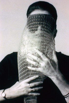
Lygia Clark wearing Máscara abismo com tapa-olhos (Abyssal mask with eye-patch, 1968), a work made of fabric, elastic bands, a nylon bag, and a stone, in use. Courtesy Associação Cultural “O Mundo de Lygia Clark,” Rio de Janeiro. Photograph: Sergio Gerardo Zalis, 1986 // Source: moma.org.
Lygia Clark: The Abandonment of Art, 1948-1988
Museum of Modern Art
Through August 24, 2014
- The curatorial premise of the show is that the Brazilian artist started off as a Modernist painter of geometric abstraction, transitioned into making interactive sensorial objects, and finally left art to practice psychotherapy. (This seems unusual, as the default curatorial impulse is to historicize and affirm the importance of an artist within art history.)
- The size, texture, and visuals of the early paintings reminded me of Constructivism. However, Clark expanded beyond the rectangle and engaged in a reflexive investigation. (NM and I wished to shape our own practices around questions more, as open-ended inquiries.)
- A room of black and white, 2-D, Neo-Concretist compositions had a lot of energy—lots of visual tension and concision. I especially loved the wall text explaining how Neo-concretism differed from the Concretist aim to rid all external referents, acknowledging that (We are always embodied!):
“the work of art is a projection of the body”
- The final room invites interaction with replicas of her iconic mirror goggles, and instructions for actions, including a surprisingly delightful Möbius strip activity. This is a rare participatory space in a museum that is completely authentic and appropriate.
- Clark met resistance in art and psychotherapy—as a wall text explained, “her work was an abyss, an absence pointing to open, unresolved questions in both disciplines.” (Art is presumed to take all kinds, but then why is it so uncomfortable when projects become too akin to other realms? I think Clark is totally underrated, and I hope the exhibition and substantial monograph act to remedy this.)
- Installation notes: [Sometimes I wish I could turn this habit off, as it detracts from my experience of the art; on the other hand, I hope it hones my exhibition-making craft.] Most of the work is installed very high on the wall—I’m guessing on a 66″ centerline. I felt like I was craning my neck to look at the pictures. The last room, however, featured projections flush to the floor, so maybe the height was designed to emphasize Clark’s evolution to participation.
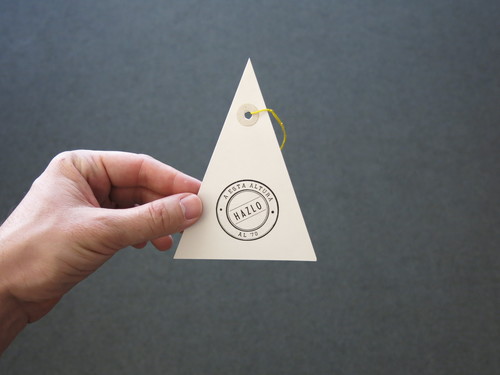
Edgardo Antonio Vigo. Hazlo (Do it). 1970. Photo: David Horvitz // Source: moma.org.
The Unmaker of Objects: Edgardo Antonio Vigo’s Marginal Media
Museum of Modern Art
Through June 30, 2014
View the exhibition site.
“This exhibition celebrates the mail art, visual poetry, performative works, and publications of the Argentine artist Edgardo Antonio Vigo (1928–1997).” —MoMA site
- Gorgeous typography. Much of the ephemera was beautifully produced letterpress or woodcut prints with custom cutout shapes. Hailing from the late 1960s, it was stylish, exuberant and not overly complicated. It wasn’t on fancy paper with a pronounced de-boss, or dream-of-the-1890s-hipster-baroque. It was tasteful and original. In my thinking about simple gestures and conceptual works, I tend to recall Stanley Brouwn’s scribbled scraps or Fluxus’ typewritten instructions. However, elemental/conceptual gestures can be accompanied by killer graphic design, too.
- One piece of paper, one cutout, two words = more than most art achieves.
- Many of the works bore prompts or procedures. I’ve wanted to improve my atrophied Spanish skills, and this became one more reason.
- Installation notes: Four vitrines in a mixed-use atrium. Not the most ideal venue, but the display inside was great. The ephemera was laid out on wool or some other non-woven fabric, and the grey texture contrasted the paper nicely, grounding it in everyday usage.
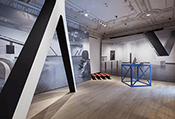
An unfortunately small thumbnail of an installation view of Other Primary Structures at The Jewish Museum, New York. Photo: David Heald/The Jewish Museum. // Source: thejewishmuseum.org.
Other Primary Structures
The Jewish Museum
Through August 3, 2014
- Jens Hoffman, formerly of the Wattis Institute, restaged the seminal Minimalist exhibition with non-Western artists.
- The physical space was challenging—ornate architecture, small rooms. But Hoffman bent the space to his will with his stylized, almost aggressive exhibition-making. Reproductions of the original exhibition loomed on billboard-sized temporary walls. They crowded the small spaces, and positioned the actual physical works in a more literal relationship to the original show.
- There was a surprisingly great amount of tension in the show. The works were present, palpably.
- The minature model of the original show, fabricated by Bay Area artist Andy Vogt, is a treat.
- Museum notes: The Museum’s identity is being re-designed by Sagmeister…. Jon Sueda and Jens Hoffman were an unstoppable duo, IMHO. Also, the way the Upper East Side building had been selectively renovated as a contemporary museum reminded me of places like the Ikon Gallery in Birmingham, UK. Being reminded of such history in physical spaces makes totally-white cubes seem boring.)
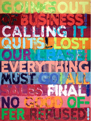
Mel Bochner, Going Out of Business, 2012, oil on velvet, 93 ½ × 70 ¼ in. (237. 5 x 178.4 cm). Private collection, New York. Artwork © Mel Bochner. // Site: thejewishmuseum.org.
Mel Bochner: Strong Language
The Jewish Museum
Through September 21, 2014
- I’ve been a huge Bochner fan since seeing his retrospective at Whitechapel.
- This is another great exhibition. See it! Reproductions of Bochner’s text paintings do not do them justice!
- Bochner’s exhibition reviews—including Primary Structures—dating back to the 1960s are also on view. It’s not often that artists’ critical writing practices are acknowledged alongside their gallery work.
- Bochner has talked about his love of graph paper—numerous drawings attest to his usage of printed grids of all sorts as a medium for sketching and expanding the conceptual bounds of portraiture.
- Installation note: In the final room, three subtle text paintings use interference paints (reflecting light in different colors), but it’s nearly impossible to tell they way they are installed.
Excellent venues, exhibitions, and curatorial vision are bountiful, if you know where to look, or find them with good luck and/or persistence.

, 1968/2003. Photo: Bill Jacobson.")
, 1968/2003. Photo: Bill Jacobson.")


