Art & Development

Musings on artifice, optimism, and synthetic happiness

Cute ___ Calendar, 2010, collage of found calendars, 12 x 12 x 0.5 inches / 30 x 30 x 1.2 cm

Cute ___ Calendar, 2010, collage of found calendars, 12 x 12 x 0.5 inches / 30 x 30 x 1.2 cm


In my most recent work about happiness, such as Irrational Exuberance (Asst. Colors), I thought about being unafraid of artifice. Since optimism, in my view, is a choice, deliberately choosing to find and take the optimistic perspective in any given situation is a bit artificial. Rather than making optimism seem less genuine, it made me think that optimism is more accessible. I may not have been born an optimist, but that doesn’t mean I can’t become one.

In a similar vein, the objects I constructed were blatantly about pleasure. People seem to have a hard time with that; their skepticism colored the work with futility. But I do really see these objects, for all their cheap materials and modest ambitions—maybe something as innocuous as to brighten one’s day—to also express my sincere interest in optimism and the benefit of small pleasures, no matter how naked their (modest) ambitions.

We synthesize happiness, but we think happiness is something to be found.

We believe that synthetic happiness is not the same as what we might call “natural” happiness. What are these terms? Natural happiness is what we get when we get what we wanted. Synthetic happiness is what we make when we don’t get what we wanted. In our society, we have a strong belief that synthetic happiness is of an inferior kind. Why do we have that belief? Well, it’s very simple. What kind of economic engine would keep churning, if we believed that not getting what we want would make us just as happy as getting it?…

I want to suggest to you that synthetic happiness is just as real and enduring as the kind of happiness that you stumble upon when you get exactly what you were aiming for… (Dan Gilbert, “Why are we happy?” delivered at a TED conference, 2004)

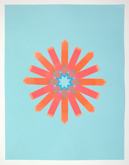
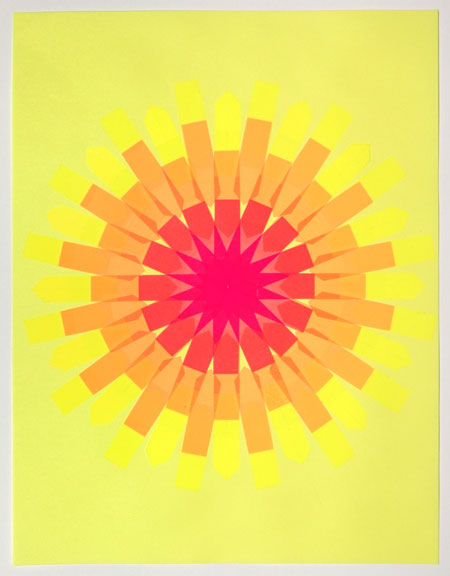
I recently just finished a new series of works on paper using more discount store goods. This time, I made 18 works using only stick-on flags arranged on “neon” paper. (As dollar-store goods are wont to do, the packaging’s promise fulfilled expectations from its own alternate universe—in other conditions, the blue and green papers would be considered pastel. I’m not complaining: “Neon” paper isn’t really neon anyway; inert gasses wouldn’t make good collage substrates.)

Working with the materials, I discovered their small potentials: while the number of available colors was very limited, the flags’ translucence and adhesive—which enhances saturation—creates the illusion of a wider color spectrum. The flags’ matte surfaces also draw attention to the paper’s reflectivity. It’s amazing how even cheap, everyday materials can convey exuberance and pleasure.

Flag Snowflake No. 2, 2010, stick-on flags on neon paper, 8.5 x 11 inches / 21.5 x 30 cm

Flag Snowflake #2, 2010, stick-on flags on neon paper, 8.5 x 11 inches / 21.5 x 30 cm

Flag Snowflake No. 12, 2010, stick-on flags on neon paper, 8.5 x 11 inches / 21.5 x 30 cm

Flag Snowflake #2, #12, & #17, 2010, stick-on flags on neon paper, 8.5 x 11 inches / 21.5 x 30 cm

Flag Snowflake No. 17, 2010, stick-on flags on neon paper, 8.5 x 11 inches / 21.5 x 30 cm

Flag Snowflake #2, #12, & #17, 2010, stick-on flags on neon paper, 8.5 x 11 inches / 21.5 x 30 cm

To support Kearny Street Workshop, I’m donating the above three selections from the Flag Snowflake series to One Size Fits All, an online sale. Bid on works by 48 artists who created 8.5×11 works on paper—all for the stunningly affordable price of $100 each. Artists include Jenifer K Wofford, Mike Arcega, Stephanie Syjuco, Weston Teruya, and many, many more.

Kearny Street Workshop is the nation’s oldest Asian Pacific American multidisciplinary arts organization. They have supported me in the past by exhibiting my work in their emerging arts festival, inviting me to present my work, and in 2008, supporting the development of all new work for a three-person exhibition. They have been continuing their work with the dynamic leadership of Ellen Oh—recent projects include partnerships with the de Young Museum. I’m very honored to support KSW, and hope you do too if you can.

Especially for artists: Some thoughts about setting goals and heeding cautions—

Yes, some things are better than others. We should have preferences that lead us into one future over another. But when those preferences drive us too hard and too fast, because we have overrated the differences between these two futures, we are at risk. When our ambition is bounded, it leads us to work joyfully. When our ambition is unbounded, it leads us to lie, to cheat, to steal, to hurt others, to sacrifice things of real value. When our fears are bounded, we’re prudent, we’re cautious, we’re thoughtful. When our fears are unbounded and overblown, we’re reckless, and we’re cowardly. The lesson I want to leave you with, with these data, is that our longings and our fears are both overblown to some degree, because we have within us the capacity to manufacture the very commodity we are constantly chasing when we choose experience. (Dan Gilbert, “Why are we happy?” delivered at a TED conference, 2004)

Standard
Art & Development

Points of Reference

Assorted sources of gratification, amusement, and inspiration.

Sol Lewitt at Dia:Beacon

Sol LeWitt, Wall Drawing #1085: Drawing Series-Composite, Part I-IV, #1-24, A+B, (detail), 1968/2003. Photo: Bill Jacobson.

Sol LeWitt, Wall Drawing #1085: Drawing Series-Composite, Part I-IV, #1-24, A+B, (detail), 1968/2003. Photo: Bill Jacobson. Image Sources: Dia:Beacon

Sol LeWitt, Wall Drawing #1085: Drawing Series-Composite, Part I-IV, #1-24, A+B, https://cwongyap.wordpress.com/wp-admin/post-new.php(detail), 1968/2003. Photo: Bill Jacobson.

Sol LeWitt, Wall Drawing #1085: Drawing Series-Composite, Part I-IV, #1-24, A+B, (detail), 1968/2003. Photo: Bill Jacobson. Image Source: Dia:Beacon

Learn why this combo rocked my world in the previous post, “Good New for Art Lovers.”

Designer and happiness evangelicist Stephen Sagmeister’s TED talk videos

Graphic designer Sagmeister wants to promote happiness. He’s compiled some advice on living in an exuberantly designed book called “Things I Have Learned in My Life So Far.” In his TED talks, he presents his ideas in a very elemental, approachable style. At the risk of making a huge generalization, I found his demeanor self-possessed in a European way—dry wit and nonchalance just short of indifference. (It makes American enthusiasm—wide eyes, big smiles—seem like ostentatious over-sharing.) Presenting simple, innocent gestures with such unconcerned confidence can sometimes come off with a whiff of entitlement, but for all his success—which is evidently abundant—he is modest and gracious, always using the pronoun “we” to share the authorship of his work (but never naming names).

Anytime designers can break free from the conventional corporate path is great; Sagmeister’s direction—happiness—is an interesting choice.

Some of Sagmeister’s projects look like art. He makes installations, photographs and other creative gestures, often on his sabbaticals. Some of the appropriations of contemporary art techniques seem a bit apparent. At one point during his slide show, I winced, because a text made of shadows so recalled the work of Fred Eerdeckens. I haven’t got a problem with designers, or other artists, trying creative approaches that have been done before. It’s just that designers’ images aren’t held to the same critical standards that the works of contemporary artists—the creative risks are not the same. With Sagmeister’s office located in Chelsea, it’s safe to assume that he sees lots of art; a nice gesture, if he does borrow from what he sees, would be to collect art, rewarding those whose inspiration has enhanced your life (if not also your firm’s bottom line).

[On a related note, M is currently studying design that moves beyond visual style. I’m eager to see what he discovers. As designers generate content, and become authors and researchers, with what criteria should their work be judged?]

Designer Ed Fella charms and confuses young ‘uns with talk of photostats and Letraset at the Walker

Ed Fella is an interesting counterpart to hip Sagmeister. Fella, known for his handmade design work and typographic doodles, has a cult-like following among art and design students. His work is delightfully old-school. He’s also completely transparent about his appropriation of styles, and of the insignificance of the content of his work beyond the design community.

In his lecture at the Walker Art Center in Minneapolis, he’s got a kindly conversational style, both grandfatherly and professorial. With his quirky hoarding of images of vernacular signage, his pursuit of offbeat methods, his unapologetic borrowing of historical styles, and his insistence on making room for young designers, Fella is generous and forthright.

[Can I just say how great it is to be able to access museum lectures online? It’s a proper extension of museum’s purposes.]

Chris Duncan
Eye Against I
Baer Ridgeway Exhibitions, San Francisco

Chris Duncan, Eye Against I, installation view

Chris Duncan, Eye Against I, installation view. Source: Baer Ridgeway Exhibitions, San Francisco, CA.

Chris Duncant, Obstructed Image 14, 2010  Found paper and tape  14 x 20 inches

Chris Duncan, Obstructed Image #14, 2010, Found paper and tape, 14 x 20 inches. Source: Baer Ridgeway Exhibitions, San Francisco, CA.

This show manages to be sparse but massive. In encompassing and altering the gallery’s architecture, it brims with Duncan’s ambition. It places the viewer literally within his vision. The smaller works look brilliantly simple and expertly executed. I think the tape-out pieces are sublime.

Wish I could be in San Francisco to experience it firsthand.

Standard