I loved this show! I love Maurice Sendak’s drawings, hand-lettering, and the whimsy, compassion, heart, and sensitivity in his work. This exhibit features Sendak’s sketches, watercolors, storyboards, and dioramas illustrating his designs for the theater. I really makes me want to draw more, and explore absurdism.

I can’t stop thinking about these sketches for costume designs. The first is from Where the Wild Things Are. The second is from A Love for Three Oranges.

Sendak-wild-things

Maurice Sendak (1928-2012), Study for Wild Things costume, with notes (Where the Wild Things Are), 1979, watercolor, pen and ink, and graphite pencil on paper. © The Maurice Sendak Foundation. The Morgan Library & Museum, Bequest of Maurice Sendak, 2013.103:19. // Source: TheMorgan.org.

Drawing of costume designs. Three figures. The two figures on the left show the front and back of the same person, "prince" in a body suit showing organs and bones. The third figure is a man a boat.

My photo of a page in the exhibition catalog, “Drawing the Curtain: Maurice Sendak’s Designs for Opera and Ballet.” // Find it in the Morgan shop.

There’s something just nice thinking about these drawings together. About bringing the inside out (your beastly feelings becoming a monstrous suit you wear and control), or making your outsides show your insides (the soft, vulnerable organs we’re all made of).

Through October 6
Drawing the Curtain: Maurice Sendak’s Designs for Opera and Ballet
Morgan Library & Museum


Also, if you’ve never listened to the Teri Gross’ interview with Maurice Sendak on Fresh Air, give it a listen. It will break your heart.

Sights

See: Maurice Sendak at the Morgan Library

Image
Sights

See: Patrick Killoran: Passage, and more

What I get from Killoran’s conceptually-oriented practice.

I keep thinking about Patrick Killoran’s intriguing artist’s talk yesterday, delivered at the beautiful Central Branch of the Queens Library in Jamaica. It was part of Opening Day of the library installations in the Queens Museum’s Queens International.

Killoran’s projects are often conceptual and phenomenological. His projects offer aesthetic situations in unorthodox media and environments. His practice relates to other practices at the merging of art and life. He spoke about how dependence on the white cube to frame something as art is almost a political liability of exceptionalism. 

Killoran is interested in making art as simply and elegantly as possible, trimming away anything that’s unnecessary. He doesn’t locate ‘the work’ in the objects he makes solely—he locates it in viewers’ interactions with each other as mediated by the object, with their bodies in the space.

man sticking his head into his t-shirt that has a grommet in the center of the fabric.

Patrick Killoran demonstrating “Insight,” his project that turns a t-shirt into a camera obscura. This is the first project he made when he moved to NYC 20 years ago. I think it’s so smart to introduce his work with this. It helps audiences come along on a journey of his thought process.

The new book cover reads, "To whom it may concern, I am a book intended to be passed on and shared. If you choose to read me, please sign-in on my back cover. When you are finished reading, give me to another person. Do not keep me in storage or put me on the shelf, deliver me to the next reader. If you find me in storage, or with someone who is not reading me, you are authorized to take me as your own and read me. I HAVE NO OWNER, ONLY READERS."

Rebound is Killoran’s dispersed library project. He re-covers books he’s reading with the instructions that commit the book to become a common resource, meant to stay in circulation at the responsibility of each reader. Here is the front cover, which explains how people participate.

A book with a fold-out back cover. It looks like an inter-office envelope, but the top says "readership," and the table headers say, "Name, location, date."

The back cover of the Rebound books have a sign-in form. While it resembles a inter-office envelope, I liked thinking about it as a counterpoint to the sign-in book you’d find at a trail summit. The latter marks a place and an achievement. This sheet, in contrast, documents whose hands the book has passed through, marking movement via sharing.

Shelves of library books, with a plywood box with no face. Inside the box is a photo of shelves of library books.

Killoran’s Passage, an intervention in the stacks at the Central Queens Library. The inside of the box is laminated with a photo of the actual stacks that the box is located in. It’s actually a little hard to find the artwork in the library—I walked right past it. Discovering it is part of the pleasure.

A view of Passage, a portal of perfectly-lined up boxes that create a negative space through the library book shelves.

When you squat down and look through Passage, this is what you see. At first, when I saw a similar photo on a flyer, I thought it was an illusion created with mirrors. When I looked through the actual artwork, I had an “Inception” moment: what seemed like 2-D or shallow 3-D is actually deep 3-D. In other words, the project isn’t about the illusion of depth, it is actual spatial depth. It extends the length of the entire library—over 100 feet. 

There’s a lot of wonderful openness in Passage, from seeing other people look through the box, to when patrons re-shelve books in the space, to seeing other patrons observe still other patrons interacting. I think this is an incredibly successful project. I think it achieves what Killoran’s after, with a maximal implications using minimal means.

This type of work may appear very simple. The solution is so ingenious as to seem inevitable. But making this type of art is intellectually laborious, time-consuming, and rigorous. I really respect this practice, and am grateful for the chance to hear it explained thoughtfully.

Visit PatrickKilloran.com to learn more about his work. (It’s a nicely organized, selective site with just enough text to describe each project.) I think his overarching practice is about interrogating public life: the unspoken rules, behaviors, and manifestations of courtesy, kindness, greed, compliance and non-compliance. He is interested in social relations in a neutral way. His works are experiments that say more about us than about him. 


The artist’s talk reminded me of when I was making elemental, conceptual, phenomenological installations. I remember struggling to convey the nature of my interests in single images. Two-dimensional images just don’t capture experiential phenomena. I remember wondering how many people viewed my slides and didn’t “get” my practice. Sometimes your art is best shared as stories, jokes, surprises, or upendings of expectations, and the artist’s talk is a better form than slides.

In preparation for this project, Killoran held many conversations with library staff members. It made me want to have more space for conversations in my own research. Conversations can evolve and be more natural and spontaneous than writing. I’ll need to get out of my shell more. 


Learn more about all the installations at the Queens Library (which includes The People’s Guide to the Queens International, a collaboration between Brian Droitcour and me).

Wooden display holding forms and a submission box, located at the end of stacks of library books.

You are invited to write about your response to Killoran’s installation. Find The People’s Guide to the Queens International writing station, located at the end of the stacks where the installation begins. Or, just look for the stacks hold books on “Unexplained Phenomena.” Complete a form and enter it into the submission box below. We’ll print submissions in our zine and on ThePeoplesGuideQI.org.

Standard
3 Flags by 3 artists

Revised US Flag by Maya Misra. Cunt Quilt by Coralina Rodriguez Meyer. Artist’s Arm by Jevijoe Vitug. // Source: ChristinaFreeman.net

While I like Creative Time’s Pledges of Allegiance artist-designed flag project, it seemed like a missed opportunity to not include more emerging artists. Air Rights, a project flying artist-designed flags curated by Christina Freeman at Flux Factory, is just the right antidote. The artists were less well-known. The flags were weirder. And it was in Queens.

Sights

See: Air Rights @ Flux Factory, Queens

Image
Citizenship, Sights

See: Processions (UK)

This checks all boxes that make me happy: DIY flags. Processions. Participatory art. Empowering women, especially right now. Check, check, check!

Join us on 10th June for PROCESSIONS, a mass artwork celebrating 100 years of women voting, in Belfast, Cardiff, Edinburgh and London.

On Sunday 10th June, women* (*those who identify as women or non-binary) and girls from across the UK will come together to create a vast participatory artwork taking place simultaneously for one day. PROCESSIONS will be a living portrait of UK women in the 21st century.

Screen Shot 2018-06-07 at 7.01.46 AM

Flags made by Helen De Main and participants at the Glasgow Women’s Library. // HT: Rosie O’Grady (@OGradyRosie) // What’s not to love about this? You’ve got Helen De Main’s gorgeous design sensibility [Helen was a contributing artist to my make things (happen) project in 2014] and with participants at the only accredited museum in the UK dedicated to women’s history.

Check out Processions’ Make Your Own Banner guides for extensive downloadable PDF toolkits and school resource kits.

My only wish is that I could be there in one of those four amazing cities this Sunday.

Standard
Sights

See: Mel Chin @ Queens Museum / Read: On Chin’s Prefigurative Politics

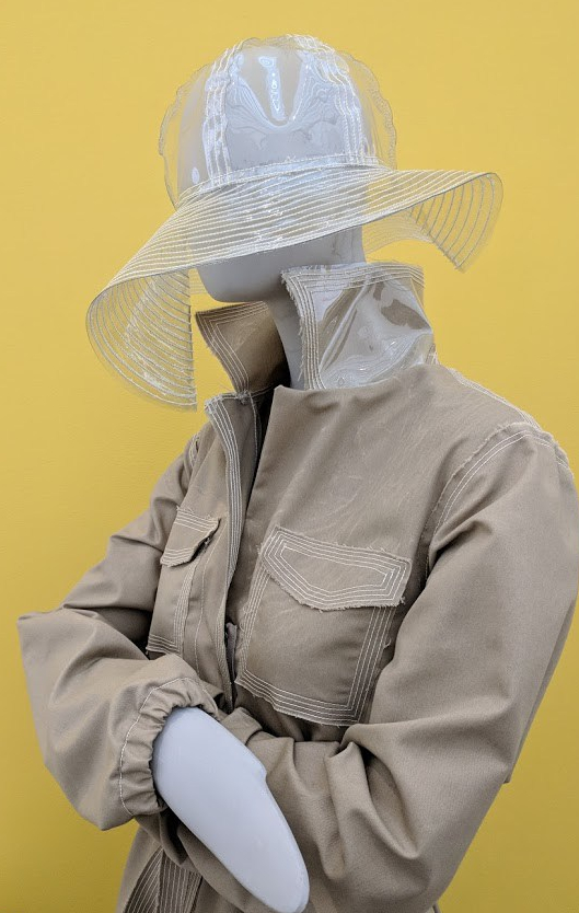
Rainwear garments made of recycled bottles, designed by Tracy Reese and sewed by a women's empowerment organization in Detroit. Mel Chin, “Flint Fit,” (2018-ongoing). // Photo: CWY.

Rainwear garments made of recycled water bottles, designed by Tracy Reese and sewed by a women’s empowerment organization in Flint. Mel Chin, “Flint Fit,” (2018-ongoing). // Photo: CWY.

I’ve been a fan of Mel Chin’s art since I learned of the Fundred dollar bill project (inviting students to color in bills, collecting them, and presenting them to Congress to request funds to fix local environmental injustices). And I’ve been a fan of the idiosyncratic artist since hearing him speak at the College Art Association conference in 2011. Chin’s a smart, collaborative, humble social practitioner and an unpretentious famous artist. He’s Chinese American and a through-and-through, singing, guitar-strumming Texan. He’s obsessed with the flawed human condition and environmental injustice, and makes art that earnestly and optimistically seeks change.

See Mel Chin: All Over the Place at the Queens Museum through August 12 (with auxilliary public artworks in Manhattan). I especially love the Flint FIT project.

Read an astute review, “Mel Chin’s Tongue-in-Cheek Encyclopedia of the World,” by Ryan Wong in Hyperallergic. This passage sums up some of the contradictions and poetics of working in social practice:

“Revival Field” and “Flint Fit” fill a unique role in the spectrum between art, social practice, and activism. In political terms, they might be called prefigurative — gestures that are both effective in themselves and utopian, albeit on a small scale. While Chin acknowledges that there is more work to be done in Flint, the project both embodies a new politics and gestures towards more. As he puts it, “You gotta show it can be done.”

The term “prefigurative” is intriguing. Here’s a definition from Wikipedia:

Prefigurative politics are the modes of organization and social relationships that strive to reflect the future society being sought by the group. According to Carl Boggs, who coined the term, the desire is to embody “within the ongoing political practice of a movement […] those forms of social relations, decision-making, culture, and human experience that are the ultimate goal”.[1] Prefigurativism is the attempt to enact prefigurative politics.

Standard

Ann Hamilton’s “Fly Together,” part of the Creative Time-led project, Pledge of Allegiance. // Source: creativetime.org // Photo: Guillaume Ziccarelli

On June 14 (Flag Day), Creative Time launched Pledge of Allegiance, a new project commissioning 16 artists to create flags fly simultaneously at 12 art institutions around the country.

I love the project—there are flags, new artists’ commissions, opportunities for artists to make topical political statements, opportunities for art organizations to self-organize and take risks.

Caveat: NYC’s public art programs can host some of the most exciting and ambitious art here, but it’d be nice to see them take more risks with emerging, non-blue-chip artists, especially with new and auxiliary programming.

Sights

See: Pledges of Allegiance

Image

With my 1,000-balloon project and interest in happiness, I enjoyed learning about this UK artist’s project. It’s cool, ambitious, and experimental. And it’s about challenging fears. Welcome, 2017.

Noëmi Lakmaier, Cherophobia, 2016, a 48-­hour durational living installation with 20,000 helium party balloons.

Noëmi Lakmaier, Cherophobia, 2016. Photo: Grace Gelder // Source: East End Review.

“Cherophobia is a durational 48-hour live installation. It is an attempt to lift the artist’s tied and immobilised body off the ground using the force of 20,000 helium-filled multi-coloured balloons. Cherophobia is a performance and a gathering, a one-off event that intertwines people in their shared suspense and anticipation. It takes its title from a psychiatric condition, defined as ‘an exaggerated or irrational fear of gaiety or happiness.’”

“Commissioned by Unlimited, a festival celebrating extraordinary new works by disabled and Deaf artists, in September 2016.”

Checkout a sweet video. More project info at noemilakmaier.co.uk.

Sights

See: Noëmi Lakmaier’s Cherophobia

Image
Sights

See: Denim @ the Museum at FIT

Three garment exhibitions.

Lately, as part of a larger project, I’ve been researching garments, especially workwear. The more I learn about sewing, the more I realize what I don’t know and can’t yet do. Though I’ve sewn flags and banners, I’m thinking about more complicated items and garments. I have a long way to go, but it’s nice that even my modest experiences help me appreciate construction better.

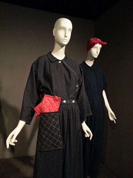
Front: Reproduction of Claire McCardell's "Popover" dress, circa 1942, blue denim and red cotton. Also: denim jumpsuit, as women joined manufacturing for WWII.

Front: Reproduction of Claire McCardell’s “Popover” dress, complete with a matching oven mitt, circa 1942, blue denim and red cotton. Also: denim jumpsuit from when women joined manufacturing for WWII.

Denim: Fashion’s Frontier @ the Museum at FIT
Through May 7, 2016

Though it’s less than two blocks from the Center for Book Arts (where I’m a current resident; learn more about the AIR program at the 2015 AIRs’ exhibition, which opens tonight), I first visited this museum yesterday. They have good spaces, quality shows, and strong exhibition design; I look forward to seeing more shows there. I went for their exhibition on denim—one of the workwear fabrics I’ve been printing on. Here are a few thoughts:

  • The show is composed of garments from the museum’s collection arranged in chronological order. I was most intrigued by the earliest garments. The curatorial statements insisted that denim has been used for workwear for men and women since its earliest days, exemplified by a women’s skirt-set for work from 1912-15.
  • There’s a great video (though the audio is too quiet) about a pair of cotton pants with denim patches. A conservator explains the clues in the garment’s construction that helped her deduce that they were probably made in the 1840s. I love it when invisible museum work is made visible in this way.
  • Chambray became an official union shirt in the 1940s. The blue in “blue collar” probably comes from that. (Growing up as the daughter of a car mechanic, I’d associated work with stain-resistant synthetic blends that were dyed blue.)

The rest of the exhibition reviews how jeans became symbols of rebellion, and emerged as leisure, popular, and luxury goods. The connection to work became symbolic at best. Cheers to MFIT for providing an online exhibition.

Fairy Tale Fashion @ the Museum at FIT
Through April 16, 2016

Coming from the denim exhibition, with its theme of women’s labor, I couldn’t help but see this show’s content in an unfavorable way. The fairy tales here are Eurocentric (maidens with fair skin, gold hair as symbols of gold) and hetero-orthodox. (It’s 2016. I want heroines who kick ass like Ronda Rousey or Rey, who change the game like Missy Elliot and Awkwafina. Also, what’s up with the ageism of fairy tales? Why aren’t there ever evil maidens and heroic middle-aged women?) This show is not for me.

  • If you want to see beautiful gowns, dramatic capes, and nice beadwork, have a look.
  • I was impressed by the exhibition design. The space is underground, with very high ceilings. The exhibition designers did a great job using scrims and dramatic lighting to set a slightly menacing tone.
  • I noticed the use of the word, “sculptural,” to describe functionless elements that diverged from the silhouette or body. Coming from an art/sculpture point of view, it’s interesting to think that a three-dimensional object is not inherently sculptural, but becomes so after adding superfluous parts.

"Workwear/Abiti da Lavoro," at the Sheila C. Johnson Design Center,  Anna-Maria and Stephen Kellen Gallery. // Source: http://www.newschool.edu/

“Workwear/Abiti da Lavoro,” at the Sheila C. Johnson Design Center, Anna-Maria and Stephen Kellen Gallery. // Source: newschool.edu

Workwear/Abiti da Lavoro @ The New School/Parsons
Through April 18, 2016

This was also my first visit to the Sheila C. Johnson Design Center’s Kellen Gallery. While the FIT museum had carefully calibrated the lighting to preserve the garments, this space is an airy white cube with dramatic windows and plentiful natural light. I will visit again, as they’re clearly interested in pushing boundaries (check out the concurrent exhibition on mass incarceration).

  • I was intrigued by this exhibition of “garments for hypothetical, invented, coveted, imaginary jobs.” Unfortunately I felt underwhelmed by how little creativity was on display, how the speculation sometimes only made small leaps from present reality. These garments evinced whimsy, not reinvention. I am not sure that this is a valid critique—I think it comes out of an expectation that designers are technologists, and thus futurists. But sometimes designers are just designers. (I love the name of AIGA NY’s “monthly series of provocations where practitioners and critics discuss the changing nature of design and visual culture.” It’s “We used to ____, now we ____.” It’s a worthy prompt for designers and artists to consider.)
  • I was struck by how many garments were simply garments in recognizable silhouettes and forms—size o dresses, suit-shirt-slacks-tie—that were embellished to fit a theme—’girl who picks carrots,’ ‘girl who picks strawberries,’ for example. (Maybe I shouldn’t expect fashion to be less gender-binary, but I can’t help but feel disappointed.)
  • There was an outfit for a “Post-Fordist,” comprising of ready-made vacation separates, a laptop, and a Blackberry in a vitrine. I get that the banality of immaterial labor is what makes it so insidious, but that doesn’t mean creative work about it can’t be more interesting artistically.
  • Men’s ties suggest an outfit of rags under a shabby jacket—a garment for “a migrant”—in a particularly fraught misstep.
  • OK, I liked the exhibition design. An aluminum I-beam was suspended from the ceiling at an angle. Clamps on the beam held up monofilament, which allowed the garment to spin. It signaled the work theme and avoided a static display well.

Other observations:

The Garment District

One of my favorite things about living in NYC is access to all the garment district shops. The district near Hell’s Kitchen is so vital that shops can specialize in selling only one type of thing: linen, spandex, notions, textiles for men’s wear, textiles for quilting, etc. On occasion, I’ll stumble into a building full of garment industry services. Earlier in the week, I got to peek inside a huge embroidery studio. I felt so grateful that so much industry still happens in Manhattan. I hope these small businesses—and the workers doing such skilled labor—keep going strong.


Standard