Community, Research

MDR, Balloons, Exuberance

MONSTER DRAWING RALLY PHOTOS & VIDEO. Check out this slideshow of the Monster Drawing Rally by Hanna Quevedo on SFWeekly.com! There’s also a short video on VidSF.com.

—–

BALLOONS. Thinking about them lately, and came across this awesome photo sequence of a sculpture made of balloons by Hans Hemmert on thepigments.com. Sweet.

—–

IRRATIONAL EXUBERANCE. This economics term, coined by Alan Greenspan, shook markets worldwide in the 1990s. What a paradox. I’ve been thinking about pleasure and its crucial role in the formation of happiness since I started studying positive psychology last year. I’ve also been using unabashedly exuberant typefaces, especially high-contrast Didot faces, despised in their day and seen as both high-class and slightly cheap today. The idea that exuberance is irrational to be equally ludicrous as the idea of exuberance should be rational. It’s a delicious paradox.

Standard
Art & Development

Two Brothers named Design and Art

To be considered a “serious” artist, there’s pressure to downplay one’s non-art practices — even visual ones like graphic design. Art professionals need to distinguish between dabblers and lifers, but that shouldn’t be hard. It’s perplexing that this dissociation persists.

Consider art since 1960, and the typographic sensitivity of many Conceptualists.

on kawara, lawrence weiner, yoko ono, barbara kruger

So you think you are a typophile? Faces named below.

Consider how aspiring artists and designers learn. My early creative interests were unbounded — drawing horses and floorplans as a kid, making zine collages as a teenager, studying printmaking (AKA graphic arts) in college.

Further, my making skills — whether tinkering, bookmaking, or print and web design — enhance my art capacity, especially now that I’m making text-based installations and producing multiples. It seems obvious that design is a useful skill set for artists; fellow artists and art institutions need graphic design, too.

Good design conveys risk-taking and visual sophistication. For example, Stripe‘s print and signage design for the Wattis and Cinthia Wen’s/Design at Noon’s identity design for YBCA* are innovative, flat-out gorgeous assets.

So I’m excited to have the chance to bring my design skills to a contemporary art context. After a terrific experience creating new work for Southern Exposure‘s Bellwether exhibition, I was invited to design the poster for SoEx’s next show. The alternative arts organization has a history of working with award-winning designers like McFadden & Thorpe and Post Tool, so I earnestly accepted. The poster will be arriving in mailboxes and shop windows in the coming weeks. You can’t miss it.

In the meantime, worlds (art and killer typography) collide: Emigré is having a show at Gallery 16.

EMIGRE at Gallery 16
December 18 – January 29, 2010
Opening reception on Friday December 18 from 6 – 9pm

Emigre, Inc. is a digital type foundry in Berkeley, whose magazines were an inspiration since year zero B.M. (Before Macintosh). You can bet that there will be gorgeous posters, publications and, quite possibly, some hand-thrown pots. Because designers can be artists too.

An outro in the rock ballad of this blog post:

I’m not so idealistic as to pretend that there aren’t differences between being a graphic designer and being an artist. Last week when M, a workaholic early-bird designer, started staying up late to obsessively photograph his design portfolio, I told him that he’s becoming an artist. His response:

“Noooooooooooooooooo!”


(*Disclosure: Occasionally I work at the Wattis and YBCA doing design/vinyl/preparator work.)

Avant Garde Medium, DIN Cond Bold, American Typewriter, Futura Bold Oblique

Standard
Community

Points of Reference: posters, typefaces, Lake Merritt

The artists behind Shotgun Review are doing some really interesting individual and collaborative projects.

I’m SUPER digging the two projects on Joseph del Pesco‘s site right now.

pile of artist's funding posters
State of the Arts, The Present Group & Horwinski Press, December 2008.
Image source: http://delpesco.com/

Beautiful posters influenced by wood type and mixed-fountain printing, demanding better working conditions for artists. What’s not to like?

Black Market Type & Print Shop
Joseph del Pesco, Black Market Type & Print Shop, Articule, Montréal, June 2008
Image source: http://delpesco.com/index.php/P1/

Artist’s typefaces—I love it! It’s a great coincidence, because after working on hand-lettering during the Breathe Residency, and reading Ellen Lupton’s Thinking with Type recently, I decided I’d like to design a typeface. It’ll probably be a display face, exuberant and expressive at the risk of legibility. But I figure it’ll be an art project, not a design project; I know enough to leave the development of extensive type families to the pros.

There are so many crappy fonts in the world already, why bring another one into existence? Well, the fact is, even typographic design can be a little subjective; Blackletter was considered very legible in the early 20th century among Germans and inscrutable in other parts of the world. And history, as well as Lupton’s book, is filled with other examples of typefaces that were reviled in their time. For example, Baskerville, a typeface that many modern eyes would consider just another serif roman font, rather boring and not particularly distinctive, was reviled for

Blinding the Readers in the Nation; for the strokes of your letters being too thin and narrow, hurt the Eye.

–as quoted in Ellen Lupton’s Thinking with Type
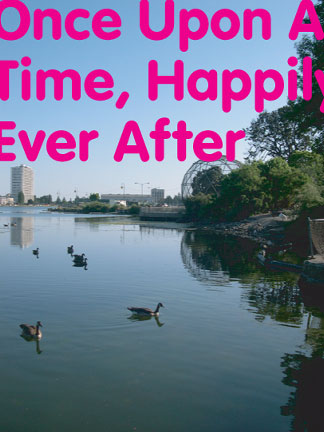
Scott Oliver's Once Upon A Time, Happily Ever After, audio tour of Lake Merritt, Oakland, CA

Scott Oliver's Once Upon A Time, Happily Ever After, audio tour of Lake Merritt, Oakland, CA

I’ve always liked Scott Oliver‘s material investigations/post-conceptual modifications of everyday objects, and his next project—an audio tour of Oakland’s Lake Merritt—totally floats my boat for two reasons.

A. I love Lake Merritt, it’s one of the few things that keep my regard for living in Oakland really high.

It’s a nice open space in the middle of the tree-starved flatlands, and while it’s not the most natural of places, it plays an important role larger ecosystems. Lake Merritt is not a “man-made lake,” but an estuary, which is why it’s a unique habitat for migratory birds.

It’s also a nice public space used by a cool cross-section of residents: runners, walkers, people who put on jogging suits to get coffee at Peet’s, guys hanging out in their cars all day, serious athletes running the stairs, office workers and families from all walks of life.

B. Oliver’s working with some really bright collaborators, and bringing onboard a lot of local arts organizations. Any local histories can be tricky, but Oliver’s got the right approach.

Oliver’s got a matching grant, so he needs to raise matching funds in the form of donations from individuals. Matching grants are challenges in any situation, but I don’t envy his position in this economy.

Once Upon A Time, Happily Ever After: An Audio Walking Tour of Lake Merritt will offer an immersive audio experience to listeners—using a mixture of ambient field recordings, interviews, music and narration to weave an idiosyncratic but approachable narrative that will guide listeners through the various natural and artificial elements that surround Lake Merritt. With an emphasis on local history, cultural diversity, urban ecology, and the power of imagination, Once Upon A Time, Happily Ever After will explore the invisible that surrounds the visible—the stories and forces that shape the lake and our perceptions of it. Once Upon A Time, Happily Ever After will be free to the public and widely accessible to Lake Merritt visitors through both on-site and remote locations.

To support the audio tour of Lake Merritt, email Scott Oliver at: knot (at) sbcglobal . net.

Standard