organization

Tools & Resources for Organization and Resilience

Updated November 10, 2022 in advance of a Visiting Artist lecture at CSUMB.

I’m doing an Instagram Live studio tour/artist’s talk/Q&A with the San Francisco Center for the Book today at 3pm Pacific/6pm Eastern. Some question’s I’ve received in advance are:

  • How do you keep motivated?
  • Please share admin/organization/project management skills.

I’m posting some notes with links here.

Resilience

Journaling helps me be resilient.

There can be a perception that journaling is for self-obsessed, angst-ridden teens. I do not only write in my journal when I feel shitty. In fact, I limit how much I write when I’m distressed, because venting or “processing” can actually be rumination, which decreases mood and prolongs pain (Guy Winch, Emotional First Aid).

Journaling provides space for self-reflection—space for me to listen to myself. When I listen to myself, I can celebrate my wins, so I can need less external validation. I can be grateful by recognizing the good in my life and in other people. I name my feelings (which itself can bring relief) and sort out my needs, priorities, goals, and action steps. When I properly reframe an event, and when I find meaning, it makes me feel energized and purposeful.

Gratitude Journal

There are many ways to keep a gratitude journal. A great introduction to a simple practice can be found at “The Science of Happiness, Episode 1: Three Good Things.” This podcast is produced by the Greater Good Science Center at UC Berkeley, so it is a legit, science-backed, positive psychology podcast.

I have been using a “what went well and why” method described by Martin E.P. Seligman. It’s easy: just write about what went well in your day, and why you think it happened. Sometimes I’ll keep asking “why,” drilling down deeper, or expanding wider. This has helped me recognize my own agency in situations, or the kindness of others, or the conditions or privileges broader than my immediate reality. I’ve also used this practice on great days, and it’s helped me identify particularities and savor them, multiplying my joy. A caveat: I’m careful not to mindlessly re-list my day’s to-do items.

Goal-setting, Habit Tracking, & Purpose

It’s easier to stay motivated when your actions and goals feel aligned with your values and life’s purpose.

Goals

Informed by Creative Capital’s Professional Development workshops, I set three professional goals, each with three action steps, for myself as an artist every year. I schedule weekly and quarterly check-ins.

Habit Trackers

I sometimes use an app to log my physical therapy and cardio. This is helpful for reinforcing good habits and holding myself accountable. It helps me see the connections with how my body feels. You can use a plain notebook or a habit-tracking notebook, too—whatever works.

If you’re dealing with an injury or health side effects, tracking the frequency and intensity of different dimensions of your experiences can help you can recognize the process you’re making over time. It can give you reasons to celebrate, instead of only seeing loss. Not to mention that it can give you more data to discuss with your doctor.

Purpose

No one else can give you a sense of life purpose, only you can. In Grit by Angela Duckworth, you can learn exercises to identify what your life purpose might be, and how your small and medium goals relate to your purpose. When you are able to see your short-term actions in concordance with your values and your purpose, it feels integrated, which is very powerful.

Reframing

I loved this episode of On Being with Krista Tippett, interview with Pauline Boss, “Navigating Loss Without Closure.” Here are some of my key take-aways:

  • Closure is a myth. Americans are too focused on problem-solving negative emotions.
  • Expectations or time limits on sadness, grief, or loss can be harmful. Humans can and do live with sadness, oscillating over time. That’s OK!
  • Find meaning. When nonsensical events happen, and you can’t make sense of that event, you can find “good enough” meaning in another area of your life.

While I’ve been very fortunate to have not been directly affected by coronavirus, the pandemic has entailed coping with fear, loss, grief, uncertainty, and stress in a drawn-out, fatiguing way (I liked my friend KQB’s phrase: “low-key horrified”). It found it helpful to recognize that Americans and the media love predictable narrative arcs (beginning, middle, end) and that’s cognitively dissonant from the realities of the pandemic (no end in sight). It’s good practices to let go of perfectionism and the urge to fix everything now, to get more comfortable with holding opposing ideas, and to find meaning where you can.

Grounding

This episode is also really great: On Being with Krista Tippett, interview with Resmaa Menakem, “‘Notice the Rage; Notice the Silence.’” I especially loved this:

“..all adults need to learn how to soothe and anchor themselves rather than expect or demand that others soothe them. And all adults need to heal and grow up.”

Resmaa Menakem

A great way to self-soothe is through grounding practices—being in your body, focusing on your breath, or your feet’s connection to the ground, or visually on the room around you. The idea is to practice this, even on your good days, until it becomes second nature, so that it’s easy to implement on your bad days. Often, emotional distress is tied up with physiological stress reactions, and grounding helps regulate those physiological reactions, which can shorten the duration and decrease the pain of emotional distress.

I think this idea of practice is helpful across all these resilience strategies. I think these practices are how you incrementally increase your subjective wellbeing over years, so that your happiness set-point gets a little higher, and your ability to bounce back becomes stronger.


Admin/Digital Organization

This is going to be super nerdy and ‘brass tacks.’ Well, artists wear a lot of hats outside of making art—administrators, bookkeepers, registrars, archivists, art handlers, fund raisers, marketers and PR people, etc. Administration is legit labor. It could be a time-suck or you can try to be more effective where you can. Since the pandemic started, I’ve spent a lot more time on the computer, and I realized that there are some basic things we do everyday—such as email and managing files—which everyone sort of figures out on their own. These are some best practices I’ve found.

Email 

I like to use Mac Mail (even with my Gmail), and I try to reserve my inbox for items that require follow-up. I try to keep folders to a minimum with a hybrid system:

  • project-specific folders (for important art projects, exhibitions, and freelance gigs, etc.)
  • time-delimited folders (the time stamp indicates when it’s safe to delete emails. It’s like the principle of cleaning out your closet—if you haven’t worn it in a year, get rid of it):
    • Deep storage (this is for stuff like taxes)
    • 1-year keep
    • 3-month keep
    • hold/1-month keep (for temporary things like shipping notifications)

Receipts go into a folder such as “2022” or “To be entered” which means yet to be entered into a bookkeeping software. More on that below.

File management

I like to keep two Finder windows in Mac’s column view, stacked one on top of each other. This allows me to find a file and file it in its destination folder more quickly. This is super helpful when resizing images for my website, for example.

Three navigational shortcuts:

  • For switching between studio, professional practices, and day-job work: I keep multiple tabs in each Finder window open. This helps me switch quickly and pick up where I left off. It’s a little like the beauty of having a studio (or a dedicated studio table) where you can leave your messy work-in-progress, as opposed to clearing the table for dinner and then setting up your art project again.
  • For quickly accessing active projects: I also put folders for active projects in the sidebar. For example, when I’m working on an application for an art competition, I’ll put the folder there, even if it’s just for a few days.
  • For quickly accessing current projects: Alternatively, I make aliases of current project folders, and put them in a folder called “_Current Projects.” (I use an underscore at the start of names for folders I want to keep at the top of a list.)

Naming conventions for files and folders

I use multiple strategies to make sense of all my files:

  • Project code. I try to assign every project a name or code, and then start the file name of every digital art file with that. This makes it much easier when searching for files.
  • Iteration number-letter system. When I work on digital art files, I iterate a lot. Saving lots of versions forces me to save often, keep earlier options, and have recent back-ups in case a file gets corrupted (especially true when working on large PSDs!). To make sense of all of these, I use a number followed by a letter, (“1a,” “1b,” “2a,” etc.) The number usually refers to the design round, the letter usually refers to a variation, like the same design in different colors.
    • I never name anything “final.” When you use that system, if you have to change that file, and then have to name it “final-final,” or “final-2,” and then what’s the point?
    • I just keep every previous version in a “_Drafts” folder, and the one most recent file outside of that drafts folder. That, plus the iteration code, means it’s always clear what’s the most recent file.
  • Pixel dimensions. For any file saved for the web, I append the pixel dimensions, width x height (example: ACB8j-AnnieYee-p3-01a-889×1080) to the end of the file name. This is much more descriptive and useful than “-web” or “-small.” In web design, dimensions are always width first, then height (though it’s reversed in art handling).
  • YYYYMMDD. Starting names with the date in an 8-digit code keeps files or folders chronological and easier to search. I use this for folders for exhibitions, for example, for receipt PDFs, Google Drive folders, etc.
  • 01, 02, 03. Another way to keep folders tidy is to start the name of sub-folders with numbers, so they stay in the order of a process. For example, if you have different files from different stages in a process, you might have folders named “01 Text content,” “02 Image references,” “03 Digital mock-ups,” “04 Scans,” “05 Composite PSDs,” “06 JPGs.”

Image management

For my photo documentation, I keep the source/raw files in a projects folder. Then after I make my selections, I copy and rename them, and place them in nesting folders that looks basically like this:

Documentation > Projects > YYYY Project name > Artwork Name--[pixel-dimensions].[file extension]

The code can indicate different shots of the same artwork. I've found this is a nice way to manage lots of installation views (as opposed to "detail of X" and "detail of Y"). After these are renamed consistently, then I'll do the resizing.

Image sizing

I generally keep three to four resolutions of files:

  • high-res (source res at 300 dpi)
  • medium-res files for screen display for competitions (these files are usually 1-2 MB JPGs, I'd say 1920x1080 is a good new standard nowadays)
  • two sizes of web-res (which is specific to my own website, but obviously at 72 DPI).

I use Photoshop actions to batch process resizing. I've set up different destination folders for different sized images. I use the Finder renaming tool to update the file names as needed.

Artist's Inventory Software & Estate Planning

It's important to manage your inventory: to track inventory numbers, framed and unframed dimensions, prices, where the actual artwork is (whether on loan or in storage), etc.

There are lots of options for inventory software. I don't know what's good out there as I don't have time to test and review them. Many of the options now are cloud-based. I don't love the software I currently use, so I'm not going to name it here. The reason I use it is because it's a desktop version, and I like the permanence of that for reasons I'll explain below.

Artist's inventory software is for your own studio management, but more importantly, it's also part of your estate planning. Each of us will die. Making plans and putting systems into place are act of care for our loved ones, to make it easier for them to deal with our stuff after we're gone.

If you need to start or improve your digital or physical artist's inventory, I recommend the Joan Mitchell Foundation's Creating Artist's Living Legacy "Career Documentation for the Visual Artist: An Archive Planning Workbook and Resource Guide." It's free.

While we're on the subject, I also recommend:

  • Everyone should write a will. I found Nolo Press' Online Will to be an easy and cheap way to draft one. Note: Print it out and take it to a notary public to make it legally binding.
  • It's a good idea to discuss your end-of-life wishes with your loved ones, and to fill out an advanced health care directive. Kaiser Permanente offers info and forms in multiple languages—you don't have to be a patient to access them. You'll also need to print this out and take it to a notary public to make it legally binding.
  • CALL also has an Estate Planning Workbook.

Bookkeeping

As an artist I usually get paid as an independent contractor (by 1099-MISC and 1099-NEC forms), so there's no withholding (such as if you're paid as an employee on a W-2 form). As a result, I usually pay a lot of taxes for the whole year. Artists can write off certain expenses, but then you must also file a Schedule C (not just a 1040). My taxes are complicated enough to warrant paying an accountant to help me file.

I've used Quickbooks Desktop for years to track deductible expenses, invoices, and payments. It makes reporting my expenses for the tax accountant a breeze. It's also easier to create requests for reimbursements if you track billable expenses per project and client. It's a little bit of labor to do all this, but it's less painful than doing a year's worth of bookkeeping in the spring before taxes are due.

Unfortunately Quickbooks Desktop is no longer supported, and currently (2022) the cheapest cloud version of Quickbooks is $50/month, which doesn't seem worth it, so I'll be moving to another cloud-based software, maybe Wave, which seems highly recommended.

I've also started using a mileage app called DriversNote to track my business mileage for tax purposes. Currently (2022) there's a free plan that allows 20 tracked journeys per month, and then the basic plan is $15/month.

How did I learn this admin stuff?

  • From working at no- or low-paid office positions in non-profit art organizations.
  • From working as a freelance graphic designer/sole proprietor.
  • From co-workers, partners, colleagues, mentors.
  • From trying different things and evolving over time.
Standard
Mirror hanger in rotary cutter. Locks blade cover in place for transport.

Mirror hanger in rotary cutter. Locks blade cover in place for transport.

Techniques

my submission for things fitting perfectly into other things

Image
Research

happiness is… research note #14

Complete overkill, but one can dream, right? Alvin 4x8' self-healing cutting mat.

Complete overkill, but one can dream, right? Alvin 4×8′ self-healing cutting mat.

Happiness is having the right tools for the job. 

I brought two small 12×18″ cutting mats to this residency. What I saved in shipping costs is lost in time and accuracy. I’m constantly re-positioning the mats and fabric, snipping threads in the gap between the mats, and can’t trust the mats’ printed grids to line up.

The uses and limitations of my sewing ruler is also clearer. It’s great for cutting seam allowances (always 5/8″ or 1/4″) and holds up very well to use and even dropping it! The density and hierarchy of information is just right (a principle that  anyone whose used a tape measure with too much info can attest).  But, while cutting ninety-six 6-7/8-inch squares for a checkerboard flag, I wished I had a square quilter’s ruler.

Source: google.com via Christine on Pinterest


As I learned from my Portland Sewing lesson, you don’t adjust the shape as you’re sewing; when you sew, trust your cuts. Accurate cuts and tools means I get closer to actualizing things as I envisioned them.

Standard
Research

happiness is… research note #10

You never know what you’ll use for art.

I’m working on a drawing with lots of little text. It’s big enough to be uncomfortable on a table, and I can’t work on a wall as my gel pens don’t defy gravity. So I get the best results working on the floor, with me kneeling on top of the drawing. It has been very helpful to have:

A yoga mat. Kneeling on the concrete floors would have been torturous. Folded over, the mat has been a secret weapon in my drawing endurance.

A 4″-roll of masking tape / homemade anti-ant moat. A previous artist-in-residence left this super wide tape. It was actually too wide for my needs until rainstorms pushed ants into the studio. I’m using inks that smudge easily; wayward, tiny feet traversing the paper would not do. I made an ant-repelling “moat” of sticky-side out masking tape, big enough to fit the drawing, yoga mat, and me. Non-toxic, effective, and free!

Hyperflexion. Only during a recent visit to the acupuncturist did I learn that what I assumed was a normal range of flexibility is not. (I have a particularly well-honed creativity for discounting physical merits; I’d figured that I could easily touch my toes because I have short legs.) It probably helps to be limber in long days spent curled over drawing 12-point text.

Standard
Community, Impressions, Travelogue

Points of Reference: West Coast

Some aesthetic impressions from a Portland-San Francisco tour:

Looking east up the Columbia River Gorge, from Crown Point in Oregon, USA. Author: Hux. // Source: Wikimedia Commons.

Looking east up the Columbia River Gorge, from Crown Point in Oregon, USA. Author: Hux. // Source: Wikimedia Commons.

Columbia River Gorge. The more I visit grand vistas, the more I understand Romanticism.

Landscape paintings don’t usually affect me—but imagine living in a crowded, dirty city in the Industrial age, then exploring such vast, stunning locales like the Columbia River Gorge, the Catskills, or the Lake District in the UK. Post-postcard, post-Ansel Adams, I might be desensitized to the images of these places, but I never fail to experience awe—smallness in light of something greater—when I visit these places. It seems natural to want to capture the grandeur and qualities of light, as much as preserve the environment for future generations. [Go Parks!]

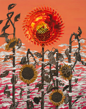
Ryan Pierce. Preview image for New World Atlas of Weeds and Rags. // Source: ElizabethLeach.com.

Ryan Pierce. Preview image for New World Atlas of Weeds and Rags. // Source: ElizabethLeach.com.

Get excited:
Ryan Pierce: New World Atlas of Weeds and Rags
Elizabeth Leach Gallery

Portland, OR
Through June 23

Really happy to catch the solo show of my CCA MFA classmate. Ryan specializes in hard-edged, post-apocalyptic narrative painting over luminous Flashe washes. He constructed this show around weeds, with tight botanical renderings of thistles, milkweeds, etc., as well as giveaways of pesticide-resistant seeds. My favorite paintings were from a sequence featuring the sun and the moon. I sensed some Charles Burchfield-esque visionary heat.

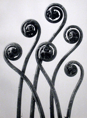
Karl Blossfeldt, Adiantum pedatum, Maidenhair fern, young unfurling fronds, 12x. // Image source: PortlandArtMuseum.org. Caption source: karlblossfeldtphotos.com.

Karl Blossfeldt, Adiantum pedatum, Maidenhair fern, young unfurling fronds, 12x. // Image source: PortlandArtMuseum.org. Caption source: karlblossfeldtphotos.com.

Karl Blossfeldt’s New Objectivity photos of botanical geometry.
70 Years/70 Photographs
Portland Art Museum
Through September 9

My knowledge of photography is a bit anemic, but this means that I get to enjoy many discoveries in the repair process. Blossfeldt’s images were a delight. See more at karlblossfeldtphotos.com.

Portland Sewing

The short: Private lessons with Sharon Blair. Highly recommended.

The long: My sewing knowledge comprised making clothes for Puffy, my stuffed Crocker Spaniel, under the guidance of my mother. (Mom’s an excellent seamstress who made some of my favorite childhood dresses. She still uses a Montgomery Ward Singer dating from the late 1970s/early 1980s; to change stitches, she manually changes a baffling array of stamped metal gears.)

Remarkably, this experience, along with much experimentation, has girded me through sewn sculptures and ribbon projects over the past few years. In the same time though, I’d accumulated a battery of questions about fabrics and techniques. Sharon, the instructor, patiently answered them all. She has tons of industry experience, and started the lesson with a quick history of sewing machine manufacturers. <Tool nerd swoon>

I got a crash course in cutting and sewing, and practiced three of the six kinds of fell seams, which will be critical for an upcoming flag project.

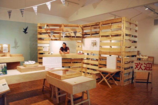
The Marianas (Michael Arcega and Stephanie Syjuco), Montalvo Historical Fabrications and Souvenirs (A Pop-up Shop), 2012. // Source: StephanieSyjuco.com.

The Marianas (Michael Arcega and Stephanie Syjuco), Montalvo Historical Fabrications and Souvenirs (A Pop-up Shop), 2012. // Source: StephanieSyjuco.com.

The Marianas (Michael Arcega and Stephanie Syjuco)
Montalvo Historical Fabrications and Souvenirs (A Pop-up Shop)
Montalvo Project Space
Woodside, CA
Through July 20

Friends’ first collaboration. It’s good. Go see it, and bring cash!

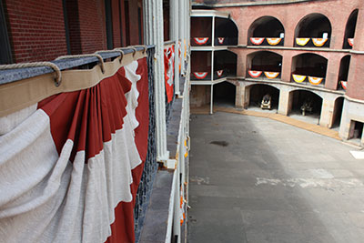
Allison Smith, Fort Point Bunting, 2012. // Source: international-orange.org. Photo: Jan Stürmann.

Allison Smith, Fort Point Bunting, 2012. // Source: international-orange.org. Photo: Jan Stürmann.

International Orange
FOR-SITE Foundation
Fort Point
San Francisco
Through October 28

Really good show in an amazing site. Go! I went on a foggy, chilly Monday (no crowds) and it was lovely.

My favorite was Allison Smith‘s Fort Point Bunting. Each of the 75 swags is accompanied by quotes from servicewomen printed on linen and framed in waxed canvas cording. The narratives were empowering. While military intervention is fraught, this insight in the battle for equal access to combat is pretty thrilling.

Stephanie Syjuco‘s International Orange Commemorative Store (A Proposition) establishes a standard of finish and level of production that is sublime, and should have most artists quaking in our boots. Anadamavi Arnold‘s crepe paper gowns were magnificent. I read Kate PocrassAverage Magazine off-site, but found it to be the most entertaining and insightful look at the Golden Gate Bridge. I also loved Andy Freeberg‘s portraits of workers on the bridge, for the diverse, recognizable subjects, rarely-seen perspectives, and cool tools.

Fort Point’s history and vistas were great to explore. I enjoyed how the show engaged the site, so that viewers browsed historical/permanent displays in the course of visiting the exhibition. I expected a strong show due to the roster of international artists; I was pleased to find that the projects that resonated with me most form a collection of articulate, accomplished female artists.

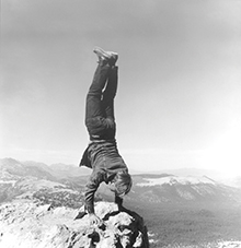
Robert Kinmont: 8 Natural Handstands (detail), 1969/2009; nine black-and-white photographs; 8 1/2 x 8 1/2 in. each; courtesy of Alexander and Bonin, New York. Photo: Bill Orcutt. // Source: bampfa.berkeley.edu.

Robert Kinmont: 8 Natural Handstands (detail), 1969/2009; nine black-and-white photographs; 8 1/2 x 8 1/2 in. each; courtesy of Alexander and Bonin, New York. Photo: Bill Orcutt. // Source: bampfa.berkeley.edu.

State of Mind: New California Art Circa 1970
Berkeley Art Museum
Through June 17

I’d heard rumors that this is the best show  many locals had seen in a long time. Unfortunately, I had only one hour, so I didn’t have the quiet mind required for uncovering the historical significance of the performance documentation and historical ephemera that ran through the show.

I loved that the show brought the major West Coast art initiative Pacific Standard Time up to Bay Area. Also, it’s not often you get to see an major survey exhibition about California art that doesn’t have a Los Angeles bias. I enjoyed learning more about seminal artists like Gary Beydler, William Leavitt, Bas Jan Ader, and Guy de Cointet (these de Cointet text drawings are fantastic, backgrounding Tauba Auerbach’s text paintings). It’s always nice to see Bruce Nauman‘s video pieces installed—here, Come Piece, two closed-circuit televisions with different halves of their lenses taped off.

The only thing that struck me negatively was the way that political art (works by artists of color and feminist artists) was the last thematic section. The architecture of the last room especially made the agit-prop David Hammons seem like an afterthought. I can’t pinpoint it, but I suspect that the early earth and performance work relates to a spiritual quest in merging art and life, and I intuit a bit of a woo-woo factor there, reinforced by the fact that my contemporaries who are especially fond of these artists tend to make transcendental works themselves.

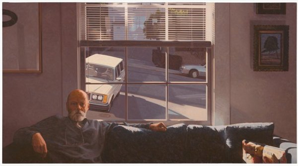
Robert Bechtle, Potrero Hill, 1996; painting; oil on canvas, 36 in. x 66 in. (91.44 cm x 167.64 cm); Collection SFMOMA, Ruth Nash Fund purchase; © Robert Bechtle  Source: http://www.sfmoma.org/explore/collection/artwork/104616##ixzz1xQHskP3n  San Francisco Museum of Modern Art. // Source: SFMOMA.org.

Robert Bechtle, Potrero Hill, 1996; painting; oil on canvas, 36 in. x 66 in. (91.44 cm x 167.64 cm); Collection SFMOMA, Ruth Nash Fund purchase; © Robert Bechtle Source: http://www.sfmoma.org/explore/collection/artwork/104616##ixzz1xQHskP3. San Francisco Museum of Modern Art.

Robert Bechtle, Potrero Hill (1996)
SFMOMA 

Bechtle is a perennial favorite of the SFMOMA’s, and mine too. This late, great painting—on view in the second floor galleries—is like five paintings in one. The JPG doesn’t do it justice. Bechtle’s understanding of reflected light and surfaces is phenomenal. This work was the highlight of my SFMOMA visit, along with Anthony Discenza’s The Effect in  the contemporary language art show, Descriptive Acts.

I expected that The Utopian Impulse: Buckminster Fuller and the Bay Area and Parra: Weirded Out shows would be more extensive. In fact, the Fuller show has two huge wall graphics that leads to a room of fantastic, large screenprint posters and transparencies. That’s followed by a group show by local, contemporary designers that is so un-related visually that my companion and I assumed that we’d drifted into the permanent design exhibit. The Parra exhibit is a massive mural, that is lovely and loads of fun, but I would have loved to see some works on paper, to get a little more intimate with the person behind these famous graphics.

I also would have loved to see more of Mark Bradford‘s video and performance works, especially documentation of his intervention at the San Diego-Tijuana border, though those could have been in the Bradford show I just missed at YBCA. The extensive selection of Bradford’s collages helped me understand the depth of his innovation with the materials (posters and curling papers) and tools (rope and power sander).

Standard
Art & Development

Spring Cleaning, Part 1: Dad’s Garage

Can I just say, my dad had a roto-tiller?
That he built a play structure out of a barrel, a 2×6, and an old rotor he pulled off of a car?
That when I as 8, he gave me and my sister a huge saw and had us cut down a small tree?

I took it for granted that dads have workbenches. Of course, this is a dwindling phenomenon in the U.S., squeezed out by manufactured obsolescence and injection-molded everything (even car motors are socked away from view when you lift a hood of a new car).

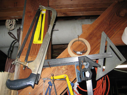
In the face of disposable, virtual culture, I’d like to share some photos of my dad’s workbench and tools, and raise a wrench to tinkerers worldwide.

Yup, that's a tofu carton.

Of course Dad built his own workbench. No fancy slides for his drawers. Just a scrap of door frame moulding and some nails do the job.

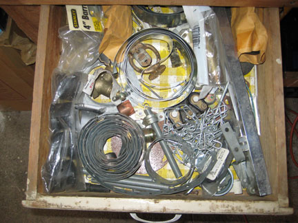
Knick-knack drawer!

Making use of architecture!

Filled to the rafters.

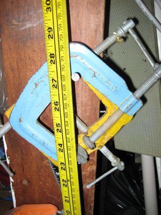
In my opinion, it was a bad idea to stop making tools in baby blue.

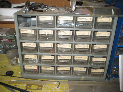
Caboodle!

Machine caboodle!

More bits and bobs in a Danish-but-so-Chinese cookie tin. You know you're Asian when your breakaway boxcutter is pink.

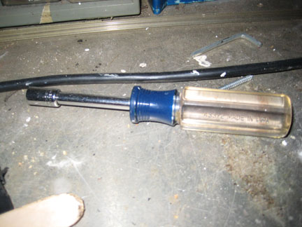
These transparent handles are so iconic. If they're not part of a design museum collection, they should be.

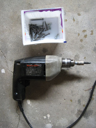
Dad's drill is so old the forward/reverse switch is one of those square bobbers on the back side of the handle. It sounds like forks in a blender but still packs a hefty punch.

That's what you call graphic and industrial design. Note the drill is operated with a chuck key.

Standard
Art & Development, Research, Travelogue

notes from the southland

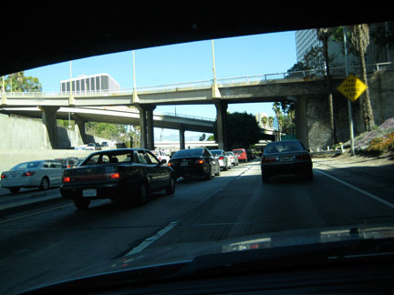
la_traffic

LA. Traffic.

Just got back from Los Angeles, where I de-installed my work at Tarryn Teresa Gallery. A few notes from my mental scrapbook:

mailinvoice

Packing up mailinvoicegetcarsmogged, 2006, plastic and ink on paper, 48 x 66 x 12 inches

Packing tools? I’ll never doubt you again, needle-nose pliers and extension cords! I should expect map pin heads to come clean off by now. I should know better than to rely on the palm sander’s cord. Thankfully, I erred on the side of caution, and it paid off.

NPR and classic rock. Apparently there’s no public radio along the I-5 in Fresno and Merced Counties, or they’re all run by evangelicals. Sans audio books, my substitute of choice was a Bakersfield-based classic rock station. If you could forgive the gratuitous misogyny, you’d discover a playlist spanning Zep, GNR, Def Leppard, Van Halen, Metallica, and Journey. Those bands once inspired repulsion in me, but I think we can all agree now that hair bands made some pretty great pop music. Last week, I heard Thin Lizzy’s “The Boys Are Back in Town” on an early morning grocery run, and it instilled a good mood that lasted hours. So I’m reclaiming this music from the heshers/burnouts/metalheads/bullies who gave it a bad name in high school, and you’re welcome to join me. For those about to rock…

Charles Burchfield, Glory of Spring, 1950, Watercolor on paper. Collection Parrish Art Museum, Southampton, New York. Gift of Mr. and Mrs. Alfred Corning Clark, 1959.6.6. Photo by Gary Mamay. Image source: Hammer Museum


Charles Burchfield at the Hammer Museum. I couldn’t see what Robert Gober, the contemporary hyper-realist sculptor, would see in a mid-century painter of landscapes. The Hammer exhibition, however, is fantastic. It makes clear that Burchfield was vastly under-recognized and portentious. His interest in abstraction, background in Asian-influenced Art Nouveau wallpaper design, experience with social realist pictorialism, and probable mental illness (see Dave Harvey’s great write-up in the LA Weekly) led to an innovative body of paintings that manages to embody countless references (to traditional Chinese scroll painting, Japanese woodcuts, OCD doodling, Cubism, and modern-day fantasy art) while forging a distinct visual language — psychedelic, immersive. I also admire his sheer conviction — after a successful stint as a Regionalist painter, Burchfield wrote in his journal,

“It seems to me, more than ever, imperative that I somehow get these fantasies into finished concrete form even tho there is not sale for them. How we will live, I do not know.”

Burchfield’s final paintings are really tremendous pictures. Some of them are breathtaking. The show is accompanied by extensive notes which provide welcome keys to the artist’s process, thoughts, doubts and motivations.

Nic Hess’ Hammer Project. Pretty great too. Masking tape drawings, a ton of vinyl decals. The placement of imagery in the space was cheeky and unexpected.

Robert Crumb’s Book of Genesis at the Hammer. I always feel the same way after viewing Crumb’s drawings: slightly dirty and tawdry, like I’d stayed at a cheap motel and watched Entertainment Weekly. More of my base self and less of my ideal self. It’s brilliant for Crumb to do a literal interpretation of the first book of the Bible in all its wretched, meaty drama. Of course Crumb can draw like no other, and there’s something vaguely appropriate, like Chick Tracts, to visualize this content in a sensational manner. The curators took pains to point out Crumb’s attempts at historical accuracy in regards to robes and architecture, but his comically zaftig female figures seem excepted from revision.

The historical exhibit at the Japanese American National Museum. I went for the Giant Robot Biennale, but two items from the historical exhibit were like punches to the stomach. First: a small girl’s cape. An internee mother modified a disused Navy peacoat for her daughter. It makes tangible the completely deranged skewing of context (where giving old military coats to forcibly-relocated families is like compassion; where modifying said coat is an act of love and resilience). Second, a massive diorama reified the scope of the internment camp at Manzanar. It was conceived and created by Robert Hasuike, a Mattel Toys model maker. It was effective and, by extrapolation, nightmarish.

Exhibition in Pasadena featuring some high-profile artists from the past 20 years of the institution’s programming. Ambitious show, disappointing reality. Only a few works emerged unscathed from the poor presentation and compromised spaces. I think the less said about this exhibition, the better. So I’ll pose, then, a series of questions:

1. When you’re an artist, and have identified artists you admire who embody rigor, quality, thoughtfulness and professionalism, and you see their work suffer due to poor presentation, how does that make you feel? Do you have similar experiences in your own history so that you can relate to these established artist’s possible regrets? And does this make you hopeful (that you’re not alone) or sad (that even established artists can’t avoid partnerships with presenters who don’t deliver)?

2. Is it the artist’s burden to accept the limitations of a non-commercial presenter? Or is it the artist’s responsibility to push them to expand their capacity and raise the level of exhibition installation and management towards professionalism?

3. When you’re a viewer and your expectations of an exhibition are raised by professionally-produced promotional collateral, who is at fault when the actual show’s installation reads on a lower level of quality, like student-grade?


On Whinging. This post is a bit more critical than usual, but I do grapple with these questions and criticisms wholly. I’m invested—I drove all over LA on a beautiful holiday afternoon and selected a a few shows to focus my attention on. I don’t set out to be critical of these shows—I try to keep an open mind and hope to be surprised for the positive.

Happy Halloween!

halloween

Standard