Sights

Impressions: No More Place, Christopher Williams, and Robert Gober

Art, through a cold-induced fog.

Post-Eve Of… and pre-day-job-slam, I saw an artist-organized show in Newark, and subjected myself and GQ to the pain and pleasure of the MoMA. I have a cold that’s largely fueled by brainpower, so pardon if these impressions lean extra impressionistic.

Julie Nymann, Shreds of Laughter, 2014, 0:06:00, 9:16 HD, Vertical projection, stereo, wood shavings // Source: julienymann.com.

Julie Nymann, Shreds of Laughter, 2014, 0:06:00, 9:16 HD, Vertical projection, stereo, wood shavings // Source: julienymann.com.

Through 19, 2014
No More Place
93 Market Street, Newark, NJ
Gallery hours: M-F 1-5; Sat & Sun 3-6

No More Place is an artist-organized group show featuring 20 participants who met in the Bronx Museum of the Arts’ Artists in the Marketplace program. I made the trek to Newark to support my colleagues’ grassroots efforts,* and was impressed with several new works on view.

There’s lots of strong work displayed over two large, open floors. It ranges from painting, sculpture, video, installation, and photography, to site-specific wall drawings (notably, Margaret Inga Wiatrowski’s window project engaged Newark history, and she seemed to make a strong personal connection with passersby).

Some of the works that left the most lasting impressions on me were videos. Catherine Telford-Keogh’s video of an act of extreme intimacy—eyeball-to-eyeball contact—will haunt the squeamish. Tatiana Istomina’s edit of a film of a Ronald Reagan speech didn’t include any words by the former president. He’s shown pausing, sighing, and breathing. Yet the audience reactions sounded occasionally, at a slightly-above-comfortable volume. Compellingly, the absences became provocative.

Julie Nymann’s video installation, Shreds of Laughter (2014) was shot as a bird’s eye view of the artist hand-planing a wood panel, but the surface of the wood was replaced with a video portrait of the artist laughing (though it also seemed like crying at times). As she scraped, she obliterated her own image. The projection was in a stairwell covered in wood shavings. Viewing it offered time for reflection: Was she silencing the ego? Overcoming emotions? Facing mortality? Nymann’s technical proficiency as both a performance and video artist made it engaging, while the gesture’s poetry was satisfying.

Also mesmerizing were David Gregory Wallace’s 3-D animation using drone footage (it’s under the stairs; don’t miss it), and Brian Zegeer’s installation using macramé, bicycle tires, wallpaper, and audio. This latter work seemed the most successful in negotiating the second floor’s quirky architecture, specifically the angled mirrors chamfering the space—vestiges of once-ubiquitous retail surveillance preceding our security camera-studded present.

[*As in The Eve Of…, the artists had to change over a rough space, using time, money, and skills to make an exhibition out of an idea. I heard that Tasha Lewis took on much of the leadership and responsibility for the install. It’s challenging for one person to assume so much responsibility; but it’s also hard to know how groups of artists can distribute labor more evenly. I’ve been thinking about this a lot: how to step up and step back, and how groups of individuals equitably contribute.

I also enjoyed the chance to check out Newark’s art scene. It’s easy for New Yorkers to complain about the same old same-old; it’s harder to get off the beaten path. Crying about how you can’t see art at openings? Then make the extra effort to frequent spaces where you won’t be “seen” or “run in to” “people.”

The Newark scene seems anchored by Gallery Aferro, which made No More Place possible. In a cluster of galleries on one block, there were window interventions, a community-based art exhibition, and an exhibition of works examining queer African identity. One gallery was selling Newark-pride T-shirts, including an 80s retro overall print on a tiny crop top. It felt buoyant. Looks that sassy don’t just happen anywhere.]

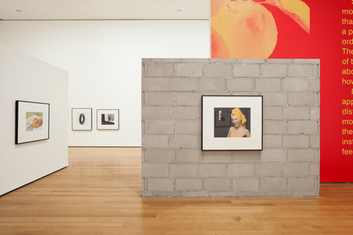
Installation view of Christopher Williams: The Production Line of Happiness, The Museum of Modern Art, 2014. Photo by Jonathan Muzikar. © The Museum of Modern Art, New York // Source: moma.org.

Installation view of Christopher Williams: The Production Line of Happiness, The Museum of Modern Art, 2014. Photo by Jonathan Muzikar. © The Museum of Modern Art, New York // Source: moma.org.

Through November 2
Christopher Williams: The Production Line of Happiness
MoMA

I don’t know much about Williams, but what I take away from this show is that he’s fearless. The list of things he’s not afraid of include:

  • boring subjects
  • a seemingly-random range of subjects
  • shooting in an almost-no-style style, reminiscent of any product shot ever
  • hanging things on a exaggeratedly low (48″?) centerline
  • showing only modest-sized (16×24″) prints in one’s MoMA retrospective
  • not pandering to audiences by:
    • evincing technique and craft
    • including didactic texts in the galleries
    • including a curatorial statement in the foyer
  • displaying what text there was inscrutably, running off walls like pages of RayGun Magazine, and set in McDonald’s-like yellow on red.

Indeed, it seemed like most visitors I saw didn’t “get” the Williams show—most were walking through too fast, like flicking pages in a waiting room magazine. Without wall labels to anchor the images in information, they hadn’t any signposts to orient themselves. Is that a fault of viewers or curators? Is it a sign of a poor experience, or an unusual challenge? Does everything have to be contextualized?

Robert Gober (American, born 1954). Untitled Leg. 1989–90. Beeswax, cotton, wood, leather, human hair, 11 3/8 x 7 3/4 x 20″ (28.9 x 19.7 x 50.8 cm). The Museum of Modern Art, New York. Gift of the Dannheiser Foundation. © 2014 Robert Gober // Source: moma.org.

Robert Gober (American, born 1954). Untitled Leg. 1989–90. Beeswax, cotton, wood, leather, human hair, 11 3/8 x 7 3/4 x 20″ (28.9 x 19.7 x 50.8 cm). The Museum of Modern Art, New York. Gift of the Dannheiser Foundation. © 2014 Robert Gober // Source: moma.org.

Through January 18, 2015
Robert Gober: The Heart Is Not a Metaphor
MoMA

The 2009 Charles Burchfield survey curated by Robert Gober blew me away, and made me re-consider this mysterious sculptor of sinks and white collar, White guy legs. Rumors of installation feats were also going around the art handler gossip mill, so I was really looking forward to this retrospective. It exceeded my expectations.

Yes, there are sinks.

They are made of wood, wire mesh, plaster, and paint. When I’ve seen them before, they looked like regular old sinks. But maybe because I am a bit more familiar with the laboriousness of actually sculpting something, or maybe because the lighting’s better, or maybe because I looked harder, the handmade-ness of these works came through better.

Yes, there are legs.

They stick out of walls, wear leather dress shoes, long grey socks, and slacks. They also wear tennis shoes and no pants. They also are burrowed out with drains, or project candles. They get whiter and whiter until they seem no longer attempt to simulate flesh tones. They evolve to include children’s legs, taking a hyperrealist-surrealist gesture further into nightmarish territories.

And, there are prints.

But they look like scraps of paper: ads, clippings, receipts. And yet they are intaglio prints, wood engravings, and unbelievably, potato prints. The absurdist rendering of one disposable thing in a labor-intensive fine art medium reminded me of works I wanted to make in grad school, which I had neither the mastery nor patience to see through.

And there was much more.

Many rooms were completely wallpapered in custom prints. Some were fun, some were trippy. There was a church-like installation, with two similar but significantly different peephole-like views. There were two rooms generously dedicated to showing other artists (no artist is an island). There were oddly rough sketches and wacky oil paintings that were strange to square against such precise realism and craftsmanship. There was, in fact, an installation feat worthy of even jaded art handlers’ gushing, and though most people had an “Oh, cool!” reaction, they missed crucial elements seen from only one view.

Throughout, Gober seems to be saying, “Look again!” Yet there were times when I also thought about Felix Gonzales-Torres, Tom Friedman, and Marcel Duchamp. The verdict? Definitely worth a visit. Be prepared to be both unnerved and amazed.

Exhibition design challenge: Compare and contrast the use of labels in the Williams show (where they were absent) and Gober show (they were informative, revealing disguised techniques and media, and ultimately, more understanding of Gober’s craft and interests). 

Standard
Impressions

A Surprisingly Visual and Aesthetic Science Festival

Despite only mild curiosity about medical history and an easily grossed-out constitution, I was consistently enthralled at yesterday’s Festival of Medical History at the New York Academy of Medicine (NYAM).

The festival’s organizers—which included art writer Lawrence Weschler—suffused the conference with programming that could have easily been presented at visual criticism symposia. Though it’s ostensibly a science-oriented festival, I loved the integration of aesthetics. Here are my highlights:

Competitive Slide Slam: Images of the Cosmos vs. Images of the Brain

Filmmaker/editor Michael Benson jocularly presented photos of the universe (see some here, click on ‘Prints’), which neuroscientist Carl Schoonover tried to match or top with images of the brain (see some here, click on ‘Portraits of the Mind’). Both speakers offered insightful factoids emphasizing immensity—either the space’s grandness or the brain’s complexity. It was entertaining, playful, visually stunning, and expansive.

The compositions where surprisingly similar, yet aesthetically divergent. The images of the cosmos exuded high resolution and definition, while the images of the brain were either painterly or graphic, with subjective use of color. It raised questions about the selectivity of image-processing. What drives the desire to bring distant galaxies into crystal clear focus? What does it mean when color is cleaved from visual reality, making some gases visible to the human eye, or differentiating microscopic parts of the brain in fantastical neon colors?

Both speakers limned the question of what constitutes consciousness. Benson’s images could be tools in the search for extra-terrestrial life, while Schoonover showed a video of active brain cells in a Petri dish, reaching out to build connections.

(Bonus: Check out the transcendent Cat’s Eye Nebula on the Hubble site.)

Spaces to Read, Research and Work

NYAM’s building on Fifth Ave is grand, with lots of beautiful, symbolic architectural features. We visited its rare books library (open to the public by appointment), which housed a display of Renaissance-era books with fantastic wood engravings and etchings, and 19th- and 20th-century ephemera—always a typographic treat.

Conservation lab at the New York Academy of Medicine.

Conservation lab at the New York Academy of Medicine.

The conservation lab, however, was exactly my kind of dreamy: a spacious, light-filled, dust-free, and organized workspace. Everything had its place, from fabric yardage in a gridded shelving system, to boards in flat racks, to a few real-bone folders on display. The workbenches—laminate tops, ergonomic heights, on casters—made me miss the clean room in the old CCA Printshop, and fantasize about a dream studio with an enclosed clean/storage room.

A drill press was fitted into a corner next both a hand vacuum and a dust-collection machine: a Virgo’s paradise.

(Side note: The three conservators were female; one mentioned how traditionally, women sewed bindings. In my experience, contemporary book binding and book arts seem practiced by women more often than men. Why is that? The fact that sewing is involved can’t be determinate, even today, can it? Or is there something about temperament, and the quietude of books? Or both?)

Modes of Display

Amy Herzog‘s talk about dioramas was fantastic. I hope she publishes an essay, it was one of the most well-crafted visual criticism presentations I’ve heard, connecting the reflection of the self in daguerreotypes, Daguerre’s coining of the term diorama, and the recognition of self through encounters with the other and a confrontation with death. Here’s the synopsis:

Momento Mori: Reflections on Death and the Art of the Tableau

This talk surveys a spectrum of artistic and museological dioramas, waxworks, and post-mortem photographic practices, and the hermetic, frozen worlds each offer to the viewer. There is something profoundly fetishistic, and mildly necrophilic, at the heart of the diorama, an apparent desire to encapsulate and reanimate those items on display. This paradoxical tension between preservation and regeneration seems germane to the 19th-century imaginary in general, the moment at which many of the visual practices I will discuss came into being. And while the diorama in particular is driven by a certain pedagogical directive, my talk will suggest that their lessons are more ambiguous than their creators likely imagined, and offer uncanny insights into our contemporary condition.

(Weird bonus! Learn about a book of Walter Potter’s bizarre anthropomorphized kitten taxidermy or see pics on The Daily Mail.)

Early 20th-c. Obsession with Rays via Fritz Kahn’s Fantastical Illustrations

As employee of the US National Library of Medicine, and therefore, the federal government, Michael Sappol‘s talk was at risk of cancelation. In a brilliant sidestep of the government shutdown, someone else read Sappol’s written remarks.

Sappol wrote that rays, beams, and waves became an obsession and a base metaphor of modernity in the 1920s-1940s. Kahn was a physician who lived from 1888-1968 (what a spectacular period in which to live!). Using commercial illustrators, he used pipes and rooms to create body-as-factory illustrations, and then adopted lines to signal electricity within and outside of the body, like flow charts a with spare diagrammatic language for engineers.

Fritz Kahn (author), Der Mensch als Industriepalast (Man as Industrial Palace)  Stuttgart, 1926. Chromolithograph. // Source: National Library of Medicine.

Fritz Kahn (author), Der Mensch als Industriepalast (Man as Industrial Palace) Stuttgart, 1926. Chromolithograph. // Source: National Library of Medicine.

I love Sappol’s ideas of developing an iconography of “occult forces” invisible to the human eye; of “electricity, magnetism, mesmerism;” connecting light and radios and radiology for images of “radiant modernity;” and the merging of German mechanist tradition with Kahn’s Romantic leanings. Indeed, some of the radiant images reminded me of Charles Burchfield’s visionary paintings, like Radiant Spring.

 Fritz Kahn (author), Das Leben des Menschen... (The Life of Man). Vol. 5  Stuttgart, 1931. Relief halftone. // Source: National Library of Medicine.

Fritz Kahn (author), Das Leben des Menschen… (The Life of Man). Vol. 5 Stuttgart, 1931. Relief halftone. // Source: National Library of Medicine.

Kahn’s pictures are immediately appealing, and Sappol explains why: they harmonize the discordant in modern life via the flow of life and energy.

Learn more about Kahn and his work at Fritz-Kahn.com.

Or set yourself a Google alert for Sappol’s book (currently in production), How to Get Modern with Scientific Illustration: Fritz Kahn, Pictured Knowledge and the Visual Rhetoric of Modernity.

Get excited: NYAM plans to make the festival an inaugural event. I hope they keep it free, open to the public, and strongly integrated with art and aesthetics!

Thanks for bringing the festival to my attention, M and New York Today, NYT’s fantastic picks list (also a great reference for ultra-concise yet warm writing, to which I will aspire, however wordily I fail).

Standard
Community, Impressions, Travelogue

Points of Reference: West Coast

Some aesthetic impressions from a Portland-San Francisco tour:

Looking east up the Columbia River Gorge, from Crown Point in Oregon, USA. Author: Hux. // Source: Wikimedia Commons.

Looking east up the Columbia River Gorge, from Crown Point in Oregon, USA. Author: Hux. // Source: Wikimedia Commons.

Columbia River Gorge. The more I visit grand vistas, the more I understand Romanticism.

Landscape paintings don’t usually affect me—but imagine living in a crowded, dirty city in the Industrial age, then exploring such vast, stunning locales like the Columbia River Gorge, the Catskills, or the Lake District in the UK. Post-postcard, post-Ansel Adams, I might be desensitized to the images of these places, but I never fail to experience awe—smallness in light of something greater—when I visit these places. It seems natural to want to capture the grandeur and qualities of light, as much as preserve the environment for future generations. [Go Parks!]

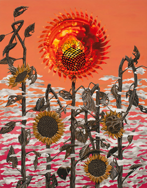
Ryan Pierce. Preview image for New World Atlas of Weeds and Rags. // Source: ElizabethLeach.com.

Ryan Pierce. Preview image for New World Atlas of Weeds and Rags. // Source: ElizabethLeach.com.

Get excited:
Ryan Pierce: New World Atlas of Weeds and Rags
Elizabeth Leach Gallery

Portland, OR
Through June 23

Really happy to catch the solo show of my CCA MFA classmate. Ryan specializes in hard-edged, post-apocalyptic narrative painting over luminous Flashe washes. He constructed this show around weeds, with tight botanical renderings of thistles, milkweeds, etc., as well as giveaways of pesticide-resistant seeds. My favorite paintings were from a sequence featuring the sun and the moon. I sensed some Charles Burchfield-esque visionary heat.

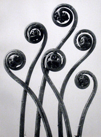
Karl Blossfeldt, Adiantum pedatum, Maidenhair fern, young unfurling fronds, 12x. // Image source: PortlandArtMuseum.org. Caption source: karlblossfeldtphotos.com.

Karl Blossfeldt, Adiantum pedatum, Maidenhair fern, young unfurling fronds, 12x. // Image source: PortlandArtMuseum.org. Caption source: karlblossfeldtphotos.com.

Karl Blossfeldt’s New Objectivity photos of botanical geometry.
70 Years/70 Photographs
Portland Art Museum
Through September 9

My knowledge of photography is a bit anemic, but this means that I get to enjoy many discoveries in the repair process. Blossfeldt’s images were a delight. See more at karlblossfeldtphotos.com.

Portland Sewing

The short: Private lessons with Sharon Blair. Highly recommended.

The long: My sewing knowledge comprised making clothes for Puffy, my stuffed Crocker Spaniel, under the guidance of my mother. (Mom’s an excellent seamstress who made some of my favorite childhood dresses. She still uses a Montgomery Ward Singer dating from the late 1970s/early 1980s; to change stitches, she manually changes a baffling array of stamped metal gears.)

Remarkably, this experience, along with much experimentation, has girded me through sewn sculptures and ribbon projects over the past few years. In the same time though, I’d accumulated a battery of questions about fabrics and techniques. Sharon, the instructor, patiently answered them all. She has tons of industry experience, and started the lesson with a quick history of sewing machine manufacturers. <Tool nerd swoon>

I got a crash course in cutting and sewing, and practiced three of the six kinds of fell seams, which will be critical for an upcoming flag project.

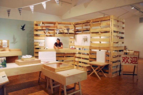
The Marianas (Michael Arcega and Stephanie Syjuco), Montalvo Historical Fabrications and Souvenirs (A Pop-up Shop), 2012. // Source: StephanieSyjuco.com.

The Marianas (Michael Arcega and Stephanie Syjuco), Montalvo Historical Fabrications and Souvenirs (A Pop-up Shop), 2012. // Source: StephanieSyjuco.com.

The Marianas (Michael Arcega and Stephanie Syjuco)
Montalvo Historical Fabrications and Souvenirs (A Pop-up Shop)
Montalvo Project Space
Woodside, CA
Through July 20

Friends’ first collaboration. It’s good. Go see it, and bring cash!

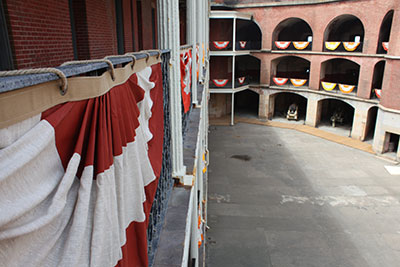
Allison Smith, Fort Point Bunting, 2012. // Source: international-orange.org. Photo: Jan Stürmann.

Allison Smith, Fort Point Bunting, 2012. // Source: international-orange.org. Photo: Jan Stürmann.

International Orange
FOR-SITE Foundation
Fort Point
San Francisco
Through October 28

Really good show in an amazing site. Go! I went on a foggy, chilly Monday (no crowds) and it was lovely.

My favorite was Allison Smith‘s Fort Point Bunting. Each of the 75 swags is accompanied by quotes from servicewomen printed on linen and framed in waxed canvas cording. The narratives were empowering. While military intervention is fraught, this insight in the battle for equal access to combat is pretty thrilling.

Stephanie Syjuco‘s International Orange Commemorative Store (A Proposition) establishes a standard of finish and level of production that is sublime, and should have most artists quaking in our boots. Anadamavi Arnold‘s crepe paper gowns were magnificent. I read Kate PocrassAverage Magazine off-site, but found it to be the most entertaining and insightful look at the Golden Gate Bridge. I also loved Andy Freeberg‘s portraits of workers on the bridge, for the diverse, recognizable subjects, rarely-seen perspectives, and cool tools.

Fort Point’s history and vistas were great to explore. I enjoyed how the show engaged the site, so that viewers browsed historical/permanent displays in the course of visiting the exhibition. I expected a strong show due to the roster of international artists; I was pleased to find that the projects that resonated with me most form a collection of articulate, accomplished female artists.

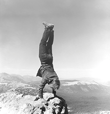
Robert Kinmont: 8 Natural Handstands (detail), 1969/2009; nine black-and-white photographs; 8 1/2 x 8 1/2 in. each; courtesy of Alexander and Bonin, New York. Photo: Bill Orcutt. // Source: bampfa.berkeley.edu.

Robert Kinmont: 8 Natural Handstands (detail), 1969/2009; nine black-and-white photographs; 8 1/2 x 8 1/2 in. each; courtesy of Alexander and Bonin, New York. Photo: Bill Orcutt. // Source: bampfa.berkeley.edu.

State of Mind: New California Art Circa 1970
Berkeley Art Museum
Through June 17

I’d heard rumors that this is the best show  many locals had seen in a long time. Unfortunately, I had only one hour, so I didn’t have the quiet mind required for uncovering the historical significance of the performance documentation and historical ephemera that ran through the show.

I loved that the show brought the major West Coast art initiative Pacific Standard Time up to Bay Area. Also, it’s not often you get to see an major survey exhibition about California art that doesn’t have a Los Angeles bias. I enjoyed learning more about seminal artists like Gary Beydler, William Leavitt, Bas Jan Ader, and Guy de Cointet (these de Cointet text drawings are fantastic, backgrounding Tauba Auerbach’s text paintings). It’s always nice to see Bruce Nauman‘s video pieces installed—here, Come Piece, two closed-circuit televisions with different halves of their lenses taped off.

The only thing that struck me negatively was the way that political art (works by artists of color and feminist artists) was the last thematic section. The architecture of the last room especially made the agit-prop David Hammons seem like an afterthought. I can’t pinpoint it, but I suspect that the early earth and performance work relates to a spiritual quest in merging art and life, and I intuit a bit of a woo-woo factor there, reinforced by the fact that my contemporaries who are especially fond of these artists tend to make transcendental works themselves.

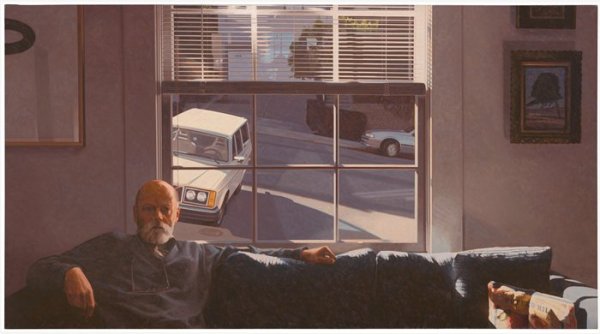
Robert Bechtle, Potrero Hill, 1996; painting; oil on canvas, 36 in. x 66 in. (91.44 cm x 167.64 cm); Collection SFMOMA, Ruth Nash Fund purchase; © Robert Bechtle  Source: http://www.sfmoma.org/explore/collection/artwork/104616##ixzz1xQHskP3n  San Francisco Museum of Modern Art. // Source: SFMOMA.org.

Robert Bechtle, Potrero Hill, 1996; painting; oil on canvas, 36 in. x 66 in. (91.44 cm x 167.64 cm); Collection SFMOMA, Ruth Nash Fund purchase; © Robert Bechtle Source: http://www.sfmoma.org/explore/collection/artwork/104616##ixzz1xQHskP3. San Francisco Museum of Modern Art.

Robert Bechtle, Potrero Hill (1996)
SFMOMA 

Bechtle is a perennial favorite of the SFMOMA’s, and mine too. This late, great painting—on view in the second floor galleries—is like five paintings in one. The JPG doesn’t do it justice. Bechtle’s understanding of reflected light and surfaces is phenomenal. This work was the highlight of my SFMOMA visit, along with Anthony Discenza’s The Effect in  the contemporary language art show, Descriptive Acts.

I expected that The Utopian Impulse: Buckminster Fuller and the Bay Area and Parra: Weirded Out shows would be more extensive. In fact, the Fuller show has two huge wall graphics that leads to a room of fantastic, large screenprint posters and transparencies. That’s followed by a group show by local, contemporary designers that is so un-related visually that my companion and I assumed that we’d drifted into the permanent design exhibit. The Parra exhibit is a massive mural, that is lovely and loads of fun, but I would have loved to see some works on paper, to get a little more intimate with the person behind these famous graphics.

I also would have loved to see more of Mark Bradford‘s video and performance works, especially documentation of his intervention at the San Diego-Tijuana border, though those could have been in the Bradford show I just missed at YBCA. The extensive selection of Bradford’s collages helped me understand the depth of his innovation with the materials (posters and curling papers) and tools (rope and power sander).

Standard
Art & Development, Research, Travelogue

notes from the southland

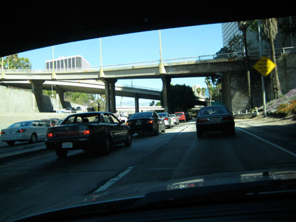
la_traffic

LA. Traffic.

Just got back from Los Angeles, where I de-installed my work at Tarryn Teresa Gallery. A few notes from my mental scrapbook:

mailinvoice

Packing up mailinvoicegetcarsmogged, 2006, plastic and ink on paper, 48 x 66 x 12 inches

Packing tools? I’ll never doubt you again, needle-nose pliers and extension cords! I should expect map pin heads to come clean off by now. I should know better than to rely on the palm sander’s cord. Thankfully, I erred on the side of caution, and it paid off.

NPR and classic rock. Apparently there’s no public radio along the I-5 in Fresno and Merced Counties, or they’re all run by evangelicals. Sans audio books, my substitute of choice was a Bakersfield-based classic rock station. If you could forgive the gratuitous misogyny, you’d discover a playlist spanning Zep, GNR, Def Leppard, Van Halen, Metallica, and Journey. Those bands once inspired repulsion in me, but I think we can all agree now that hair bands made some pretty great pop music. Last week, I heard Thin Lizzy’s “The Boys Are Back in Town” on an early morning grocery run, and it instilled a good mood that lasted hours. So I’m reclaiming this music from the heshers/burnouts/metalheads/bullies who gave it a bad name in high school, and you’re welcome to join me. For those about to rock…

Charles Burchfield, Glory of Spring, 1950, Watercolor on paper. Collection Parrish Art Museum, Southampton, New York. Gift of Mr. and Mrs. Alfred Corning Clark, 1959.6.6. Photo by Gary Mamay. Image source: Hammer Museum


Charles Burchfield at the Hammer Museum. I couldn’t see what Robert Gober, the contemporary hyper-realist sculptor, would see in a mid-century painter of landscapes. The Hammer exhibition, however, is fantastic. It makes clear that Burchfield was vastly under-recognized and portentious. His interest in abstraction, background in Asian-influenced Art Nouveau wallpaper design, experience with social realist pictorialism, and probable mental illness (see Dave Harvey’s great write-up in the LA Weekly) led to an innovative body of paintings that manages to embody countless references (to traditional Chinese scroll painting, Japanese woodcuts, OCD doodling, Cubism, and modern-day fantasy art) while forging a distinct visual language — psychedelic, immersive. I also admire his sheer conviction — after a successful stint as a Regionalist painter, Burchfield wrote in his journal,

“It seems to me, more than ever, imperative that I somehow get these fantasies into finished concrete form even tho there is not sale for them. How we will live, I do not know.”

Burchfield’s final paintings are really tremendous pictures. Some of them are breathtaking. The show is accompanied by extensive notes which provide welcome keys to the artist’s process, thoughts, doubts and motivations.

Nic Hess’ Hammer Project. Pretty great too. Masking tape drawings, a ton of vinyl decals. The placement of imagery in the space was cheeky and unexpected.

Robert Crumb’s Book of Genesis at the Hammer. I always feel the same way after viewing Crumb’s drawings: slightly dirty and tawdry, like I’d stayed at a cheap motel and watched Entertainment Weekly. More of my base self and less of my ideal self. It’s brilliant for Crumb to do a literal interpretation of the first book of the Bible in all its wretched, meaty drama. Of course Crumb can draw like no other, and there’s something vaguely appropriate, like Chick Tracts, to visualize this content in a sensational manner. The curators took pains to point out Crumb’s attempts at historical accuracy in regards to robes and architecture, but his comically zaftig female figures seem excepted from revision.

The historical exhibit at the Japanese American National Museum. I went for the Giant Robot Biennale, but two items from the historical exhibit were like punches to the stomach. First: a small girl’s cape. An internee mother modified a disused Navy peacoat for her daughter. It makes tangible the completely deranged skewing of context (where giving old military coats to forcibly-relocated families is like compassion; where modifying said coat is an act of love and resilience). Second, a massive diorama reified the scope of the internment camp at Manzanar. It was conceived and created by Robert Hasuike, a Mattel Toys model maker. It was effective and, by extrapolation, nightmarish.

Exhibition in Pasadena featuring some high-profile artists from the past 20 years of the institution’s programming. Ambitious show, disappointing reality. Only a few works emerged unscathed from the poor presentation and compromised spaces. I think the less said about this exhibition, the better. So I’ll pose, then, a series of questions:

1. When you’re an artist, and have identified artists you admire who embody rigor, quality, thoughtfulness and professionalism, and you see their work suffer due to poor presentation, how does that make you feel? Do you have similar experiences in your own history so that you can relate to these established artist’s possible regrets? And does this make you hopeful (that you’re not alone) or sad (that even established artists can’t avoid partnerships with presenters who don’t deliver)?

2. Is it the artist’s burden to accept the limitations of a non-commercial presenter? Or is it the artist’s responsibility to push them to expand their capacity and raise the level of exhibition installation and management towards professionalism?

3. When you’re a viewer and your expectations of an exhibition are raised by professionally-produced promotional collateral, who is at fault when the actual show’s installation reads on a lower level of quality, like student-grade?


On Whinging. This post is a bit more critical than usual, but I do grapple with these questions and criticisms wholly. I’m invested—I drove all over LA on a beautiful holiday afternoon and selected a a few shows to focus my attention on. I don’t set out to be critical of these shows—I try to keep an open mind and hope to be surprised for the positive.

Happy Halloween!

halloween

Standard