Impressions

Claes Oldenburg @ MoMA

Claes Oldenburg: The Street and The Store 
Claes Oldenburg: Mouse Museum/Ray Gun Wing
April 14–August 5, 2013
Museum of Modern Art, NYC

It’s likable. Dive in.

Claes Oldenburg. Pastry Case, I 1961—62 Burlap and muslin soaked in plaster, painted with enamel, metal bowls, and ceramic plates in glass-and-metal case. 20 3/4 x 30 1/8 x 14 3/4" (52.7 x 76.5 x 37.3 cm). The Sidney and Harriet Janis Collection. © 1961—62 Claes Oldenburg. Photo: The Museum of Modern Art, Imaging and Visual Resources Department, Kate Keller. // Source: moma.org.

Claes Oldenburg. Pastry Case, I, 1961—62. Burlap and muslin soaked in plaster, painted with enamel, metal bowls, and ceramic plates in glass-and-metal case. 20 3/4 x 30 1/8 x 14 3/4″ (52.7 x 76.5 x 37.3 cm). The Sidney and Harriet Janis Collection. © 1961—62 Claes Oldenburg. Photo: The Museum of Modern Art, Imaging and Visual Resources Department, Kate Keller. // Source: moma.org.

I’ve found that there are two common ways of responding to Pop art inspired by familiar objects. The first is skeptical: viewers resent low culture intruding in high museums, and/or presume an underlying oppositional agenda when none is proffered. The second response is more open and instinctual; viewers delight in identifying with common objects and enjoy the humor in the familiar made strange.

For me, Claes Oldenburg’s works in The Store are imminently likable. The objects are ultra quotidian: hats, men’s dress shirts with ties, canvas lace-ups, ice cream sundaes. They are rendered in drippy, cragged plaster covered in vibrant gloss enamels. The forms are rough and exaggerated; the effect is both grotesque and comical.

Some of the genius in these sculptures comes from Oldenburg’s selection of common yet iconographic sources. Traces of the early 1960s appear, but do not pervade. For example, the 7-Up logo and other trademarks are obsolete. And I surmise that the preponderance of sundaes may correlate to a midcentury ice cream parlor vogue. But most others objects—such as burgers, shoes, and pants—have not changed much in the past five decades, and they remain current and relatable. Indeed, the shiny enamel is beautifully preserved (or probably, simply durable), and still conveys commerce’s exuberant newness.

Oldenburg’s project expanded the boundaries of art, helping to merge high art and low commerce. The exhibition also makes other equivalences clear too. This is exemplified by a vitrine containing a model plane, a salad, and a man’s hat. It suggests that food and possessions are alike as objects of consumption. They call us with our desire for them and reaffirm us as reflections of our identities.

From a historical perspective, the show allowed ample opportunities to think about zeitgeists and simultaneous developments. Oldenburg’s display cases full of pies (or tartines, created for a show in Paris) recall the luscious frosting-like paintings of Wayne Thiebaud. An oversized wall calendar made of stuffed, sewn fabric numbers brought to mind Jasper Johns’ number paintings. Neither comparisons diminish said works.

Claes Oldenburg. Floor Burger 1962 Canvas filled with foam rubber and cardboard boxes, painted with acrylic paint. 52" x 7' x 7' (132.1 x 213.4 x 213.4 cm). Collection Art Gallery of Ontario, Toronto. Purchase, 1967. © 1962 Claes Oldenburg. Photo: Sean Weaver. // Source: moma.org.

Claes Oldenburg. Floor Burger, 1962. Canvas filled with foam rubber and cardboard boxes, painted with acrylic paint. 52″ x 7′ x 7′ (132.1 x 213.4 x 213.4 cm). Collection Art Gallery of Ontario, Toronto. Purchase, 1967. © 1962 Claes Oldenburg. Photo: Sean Weaver. // Source: moma.org.

Oldenburg’s monumental soft sculptures provide a nice climax for the show. Floor Cone, Floor Burger, and Floor Cakewere designed for a spacious gallery that was meant for the display of luxury cars. This use of scale brilliantly addresses the massive spaces that have become so common today, while remaining totally appropriate to the works (in contrast to many contemporary works’ use of monumental scale to convey power and wealth). These individual portions of dishes at preposterously large scale, in sewn and stuffed painted canvas, exude comfort and welcome. They suggest an invitation to play, if not literally, than imaginatively. Taking a nap on one might be an entirely reasonable way to relate to it. I appreciated that these floor-specific works were actually exhibited on the floor, not on white plinths that keep viewers at bay. The Street, in an adjoining gallery, is installed this way, with ample space, which formalizes the seemingly-abstract cardboard shapes and seems remote from the original inspiration—colorful 1961 Lower East Side. The works fall flat in a disappointing compromise between a lively street-level feel and the MoMA’s staggeringly-trafficked museum needs.

Also on view are Mouse Museum and Ray Gun Wing, two exhibition halls housing found, readymade and created objects, developed for Documenta in the 1970s. The wall text explains that Oldenburg demonstrates an equivalence between creating and collecting. The installation seemed to reward prolonged viewing. The more you look at dissimilar objects, such as the children’s toys, sex toys, gloves, and food sculptures in Mouse Museum, the more similarities you’ll see. The longer you look at similar objects, such as the gun-shaped things in Ray Gun Wing, the more acute the differences become. A brief look was like an insight into Oldenburg’s thought process. But the nature of the long queues for these structures at MoMA made it seem indecent to linger for long.

Oldenburg’s plaster-and-enamel sculptures of everyday commodities has been an important reference point for me for several years. They signal a way to think about merging art and life, embracing the everyday non-art materials and subjects around us, and the viability of artist-initiated exhibitions (Oldenburg exhibited The Store as an immersive installation in his studio). MoMA’s and Museum Moderner Kunst Stiftung Ludwig Wien’s decision to exhibit precisely these seminal works is a testament to the mandate of these collecting, preserving and presenting institutions, for which I am grateful.
Standard
Impressions

Tom Friedman @ Luhring Augustine, Jeffrey Gibson @ Participant, more

Given my underwhelming art show attendance record in NYC, I took a quick jaunt through galleries in Chelsea today, followed by a pilgrimage to the East side for an LES space. I’ve linked to gallery photos when available, to spare you and the artists from my low-res snapshots.

Doug Wheeler at David Zwirner 

This light-and-space artists’ major installation is this month’s must-see show, but I couldn’t see it.

Last weekend, I tried to get in line one hour before closing time, but was told to come back another day.

Today, the wait time was estimated to be about 90 minutes, with a growing line outside, and a longer line inside. Unlike Disneyland, there weren’t signs estimating the wait time; I came by this information covertly, and I promptly gave up.

The gallery ought consider extending the show as well as opening hours.

Photos on DavidZwirner.com.
Read Randy Kennedy’s review on NYTimes.

Terry Winters (borrowing from Mihaly Csikszentmihalyi) at Matthew Marks

Big abstract paintings in the big space, small transparency-and-Xerox collages in the smaller storefront. The collages were fun and psychedelic with rainbow-colored data visualizations.

What made me stop was recognizing a chart borrowed from  psychologist Mihaly Csikszentmihalyi, whose research on flow and creativity has inspired many of my Positive Signs drawings. Winters appropriated a X-Y graph on how challenges and skill can lead to apathy or flow. He overlaid it on a paint chip page. Worked for me.

Photo at matthewmarks.com.

Klaus Weber at Andrew Kreps

Sun Press looked cool, and would have been really cool if the sculptural contraption was working. Sunlight streamed in the windows and hit a mirror attached to hydraulic pistons on a wooden base. Several yards down a hall, another mirror (actually silver mylar pulled taut on a frame) was meant to catch the reflected light and re-direct it onto glass-plate-mounted transparencies, which would have acted as masks for incredibly slow, one-at-a-time, sun-bleached reproductions. Architecture and astronomy conspired against Weber, however, throwing the solar rays inertly on a wall.

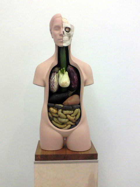
The rest of the show was very good, however. A wall of death masks had two subtle surprises—humorously, a cartoonish character, and unnervingly, an empty spot with lone, expectant nail. I also liked some large, black-on-black screenprints made with honey, more for the food materials, á la Ed Ruscha. In an anatomical model, real produce filled in for organs, updating Giuseppe Arcimboldo’s veggie portraits, plus real-time decay. The brain, so inscrutable, is a cauliflower. As in my fridge, the cucumber, which stands in for the esophagus, mutinies first, shrinking as if in anaphylactic shock.

The gallery site hasn’t got any photos yet, so enjoy my grainy mobile phone photo.

A sculpture from Klaus Weber's show, "if you leave me I'm not following" at Andrew Kreps Gallery.

A sculpture from Klaus Weber's show, "if you leave me I'm not following" at Andrew Kreps Gallery.

John Miller at Metro Pictures

Puzzling theatrical sets made with b/w vinyl murals, fake trees and rocks, and sparkly automotive-painted file cabinets.

Photos at MetroPicturesGallery.com.

The carpet that spells “NO” reminded my of Amanda Curreri’s Leveller. Similar materials, very different intentions and effects.

Tom Friedman at Luhring Augustine

Really superb show by the master conceptualist-craftsman. Friedman’s sculptures and wall-works seem epitomize idiosyncrasy. There is hyper-realism, psychedelia, minimal text works, and miniatures; all result from a persistent attraction to labor. Friedman is a artistic daredevil, unafraid of the impossible.

Thankfully, full photo documentation is at LuhringAugustine.com.

Over and over, I thought of other artists who might appreciate this show, whose works resonates with specific projects. For example, I thought Steven Barich, who has made tiny pixel graphite drawings, might appreciate this pixellated acrylic painting. Anthony Ryan, who was painstakingly inlaying and weaving paper the last time I visited his studio, might enjoy this interpolated paper collage. This wrinkled photo of itself was not unlike Zachary Royer Schultz’ Crumple projects. And for yours truly, who has been dreaming about a kite project, there was this tiny figure, and his far, faraway kite (not pictured, and actually, it’s so tiny it’s barely visible in person).

AIGA’s 50 Books/50 Covers 2010 Competition 

[Full disclosure: my husband contributed to the interactive components of this exhibition.]

Graphic design aficionados who find themselves ogling covers rather than shopping for books in bookstores, this is the exhibition for you. Come and ogle away.

Graphic designers, beware: visiting this exhibition will only whet your appetite for expensive and unusual printing and bindery—gloss varnishes, rich textiles, and extraordinary boxes. Come anyway; this is the best way to see them, better than the mind-numbing sameness of printed catalogs.

Too many covers were stunners, but I especially loved the covers for Frank Rose’s The Art of Immersion and the book series, Themes of Psychoanalysis, elegantly illustrated with only one or two letters, symbols, or ornaments. The affect and emotion book, for example, bears a mirrored ampersand, which looks like two figures in intimate exchange.

Also: good spurs for home town pride: Rebecca Solnit’s The Infinite City, Mark Dion’s OMCA monograph, McSweeney’s, Tartine, etc.

Info and installation photos at AIGA.org.

Selected book covers can be seen at AIGA.org’s design archives.

Jeffrey Gibson at Participant, Inc.

[At one time, Jeffrey was a studio neighbor in Oakland, CA.]

Jeffrey, who is Native American, populates Participant’s not-insubstantial space with sculptures using rugs, beadwork, masks, leatherwork, and drums. As soon as I saw these tchotchkes, painted to look like art, I thought of another LES installation/performance wherein white artists appropriated Native American culture to articulate nature-inspired mysticism. Americans in general are guilty of participating in this ongoing cultural imperialism; it’s just that the conscious acts seem so overt, privileged, and repellant. I wondered what Jeffrey would have made of them.

A series of circular drums are painted with hard-edged geometric shapes and stripes, with some whisks of aerosol. These seem to most clearly convey the show’s inspiration, a 1940s exhibit of Native American art situated in modern art history. Other works, like the pink fluorescent tube shooting out of a hide satchel adorned with two beaded balls, queer up the theme. A b/w video displays time-lapse photos of the drum-paintings in progress. Moving blankets, heavy with paint and Native ornamentation, ground floor works and, as a flag, worry a hardwood dowel.

More info at ParticipantInc.org.

Standard
Art & Development

See: Domus Magazine (Italy)

I’m really enjoying the graphic design of Domus Magazine, out of Italy. Or more accurately, I’m enjoying its web design: large, handsome photos and just two type families on a very clean grid. With the selective use of color and scale, there’s typographic contrast that expresses style and energy. Fanciful and functional.

Long texts on the web doesn’t have mean that the text has to be tiny or spread across several pages. Domus sets type huge, with a comfortable column width; they break the text flow often with the liberal use of photos. Domus’ designers didn’t fret that there’d be too much “under the fold” or too much scrolling. Good for them. The daring design is well worth it.

There’s also some good art reporting from around the world. Here’s three of my favorite things together: a review of Dan Graham’s exhibition at Eastside Projects (Birmingham, UK) in Domus Magazine. I love that there’s a Google Map at the end of the review for viewers’ convenience.

Standard
Community

See: Florian Maier-Aichen & SVA MFA Open Studio Picks

Florian Maier-Aichen’s show of large face-mounted photographic works at 303 Gallery is pretty great. There are some eerie, manipulated landscapes and strange photographs of paintings and mixed media works. The result is baffling in a good way. I especially liked:

Florian Maier-Aichen, Östersjön I, 2011

Florian Maier-Aichen, Östersjön I, 2011. Source: 303gallery.com.

Florian Maier-Aichen,Untitled, 2011.

Florian Maier-Aichen, Untitled, 2011. Source: 303gallery.com

The exhibition continues through June 25. 303 Gallery is located at 547 W 21st Street in Chelsea, NYC. (Thanks to Glen Helfand and Mills Art Museum for providing my introduction to Maier-Aichen’s work in the 2006 exhibition, Particulate Matter.)

R* and I took a very late, very quick jaunt through SVA’s MFA Open Studios. Here’s what jumped out at me from the maze of barely-drywalled studios…

First, I sought out the studios of three artists who happened to be interns at Art in General. Their practices couldn’t be more different: Elán Jurado subjects himself to physically demanding performances, Kim Smith makes sluice-y abstract paintings with fluorescent underpainting, and Jonathan Rider crafts meticulous and tiny punched paper assemblages. Rider’s work conjured “In the Reign of Harad IV,” Stephen Millhauser’s beautifully crafted short story about a miniaturist who works beyond the barrier of visibility. (Listen to Cynthia Ozick read it in a New Yorker Fiction podcast. Highly recommended for any artist, especially those aware of the dilemma that refining sensibilities may result in diminishing audiences.)

While grad school should be about experimentation, and indeed much of the work in the studios doesn’t appear on the students’ websites, there were some studios that seemed to exhibit freshness and coherence, which appealed to me from the chaotic quarters.

Perhaps the riotous surroundings further enhanced the appeal of minimal installations by Oh Jong and Aken Wahl. Or maybe I just like brainy, minimal, barely perceptible art that uses glass, wires and multiples. Nothing wrong with that.

Max Glaser had some really interesting polished metal ingots and polished pennies in his studio. There was an emphasis on material and process that seemed to convey a confidence in his inquiry. But the inquisitive mood was completely destroyed by a dead mouse, smashed against the glass in a picture frame and encased in acrylic. Displaying decomposing flesh in such an aestheticized manner (in white frame on a white wall) struck me as cruel and profane. As MA pointed out after a recent visit to the Mütter Museum in Philly, displays of mortality often beget questions of morality.

Rebecca S. Ward’s investigations of tape as an installation material is interesting. She also had some various colored roll media standing on end on the floor, as very simple, ingenious sculptures. Eli Gabriel Halpern’s paintings alternated between figuration and abstraction, unified by a pastel palette that was attractive and slightly repulsive. Aaron Hillebrand walks the good/bad/ugly line with his crumple-paintings, with oddball paintings and video works nestled between and behind.

SVA’s MFA Open Studios continue tomorrow from noon to 6pm.

*She’s a good photographer. Check it out.

Standard
Community

Duke Riley, Gary Hill, Erik Wysocan

I took a very brief jaunt around NYC’s Chelsea a few days ago and was enamored with the following shows:

Duke Riley: Two Riparian Tales of Undoing
Magnan Metz Gallery, 521 West 26th Street
Through April 9 (Last day is tomorrow!)

I’d adored a prior show at Magnan Metz Gallery on West 26th Street, and I was impressed again with the scope of Riley’s exhibition. There are two large, detailed shows that remind me of historical museums in different ways. The first, on one of Riley’s train-riding, hobo, antecedents was an immersive installation dotted with videos, dense smells and a massive-window-turned-lightbox featuring a handmade drawing. The second tells of Riley’s attempt to recover an island near Pennsylvania where said antecedent once squatted. This is told through mosaics, a delft-inspired plate collection, artifacts, rubbings, and a documentary video. I love that Riley, additionally a tattooist, clearly has a love of the drawn line, but his draftsmanship enhances—rather than defines—the scope of his inquiries.

The MM site appears to be down at the moment, so have a look at the photos that accompany Time Out’s review of the show.

Gary Hill: of surf, death, tropes & tableaux: The Psychedelic Gedankenexperiment
Gladstone Gallery, 515 West 24th Street
Through April 23

Hill presents a series of trip-out psychedelic projects, including 3-D videos, animations, a stereoscopic photo, and a video installation that exploits optical after burns. A molecule model, presumably of lysergic acid diethlyamide, recurs throughout, in a instance where constancy does not reassure. Nice install photos on Gladstone’s site.

Erik Wysocan: A Thousand and One Nights
Andrea Rosen, 525 West 24th Street
Through April 23

I originally plotted to see David Altmejd’s exhibition in the main gallery. His oversized plexiglass vitrine displaying thread and human anatomy of clay was interesting, however, I lingered much longer in Wysocan’s installation in the back room. Viewers pass through mock metal detectors to a security clearance and storage area.

What I loved most was the way Wysocan used light, lightboxes, plexiglass, and optical media to unique effects. He had two lightboxes featuring polarizing film sandwiched between glass sheets, one of which was broken. That, in turn was in front of a wrinkled sheet of clear cellophane. I spent a long time trying to figure out how it worked, what I was looking at, appreciating the optical effects, as well as the nice installation touches (such as running electrical leads behind the drywall).

He also had bass-ackwards vitrines where, presumably confiscated objects were on display, or not, in the case of one vitrine made of dark-tinted plexiglass where each object was carefully masked out. A number of reversals occurred where exterior-grade plywood pedestals were perched upon clear vitrines. Especially charming was a still-life of flowers in rococo vases, colors muted by their encasement in a tinted vitrine. Lots of great photos on Rosen’s site.

Standard
Community

New online art journals

I’m cheered by these two new art journals. In addition to providing a platform for emerging critics, these outlets have the potential to cover under-publicized exhibitions and offer fresh perspectives.

On-Verge is CUE Art Foundation’s website for “Alternative Art Journalism.”

Temporary Art Review was co-founded by Sarrita Hunn (CCA MFA 2004) and James McAnally. It’s “a platform for contemporary art criticism that focuses on alternative spaces and critical exchange among disparate art communities.” Founded in the Midwest, there are already reports from Houston, Saint Louis, San Francisco, New Mexico, and Portland.

I would encourage any artist interested in writing criticism to develop submissions for these journals, or get in touch with Art Practical about writing a 250-word Shotgun Review.

Writing about art affords artists:
• more opportunities to look at art, whether it’s merely the extra motivation created by deadlines, or invitations to press previews;
• the experience of thinking more deeply about media, forms, messages, and presentations;
• new perspectives on art shows—that is, critical distance to others’ art as well as your own;
• a critic’s perspective on the art world, at least in terms of how galleries receive writers into their spaces or contact them in their publicity efforts;
• experience honing the craft of writing, if you’re lucky enough to work with great editors.

In grad school, I expressed fear of taking the leap into criticism—who am I to judge?—when MP advised me that I already know everything I need to know in order to write about art. I think she was saying that you don’t need permission to write about art—you just need the skills of perception, and the ability to turn those observations into thoughts and sentences. Of course having an understanding of media, materials, artists and spaces helps, but for those artists who are at all interested in criticism, I’d say: take the leap.

Standard
News

Art Practical: Talking Shop / Review of Curtain Call

The latest Art Practical is online, and it features a new collaboration with SFMOMA.

Have a look at Zachary Royer Scholz’ essay, “San Francisco and the Art World of Tomorrow” and Christian L. Frock’s “Notes on Alternative Autonomy.” While you’re there, you can also read my latest art review: “Curtain Call”, by sculptor Robert de Saint Phalle at Dodge Gallery, NYC.

Over at SFMOMA’s Open Space (where I posted Positive Signs #2 yesterday), you’ll find “Shadowshop: Recipe for Boiling Water,” by Renny Pritikin, posing a series of questions inspired by Stephanie Syjuco’s Shadowshop project at SFMOMA.

Standard