Some aesthetic impressions from a Portland-San Francisco tour:

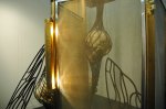
Looking east up the Columbia River Gorge, from Crown Point in Oregon, USA. Author: Hux. // Source: Wikimedia Commons.
Columbia River Gorge. The more I visit grand vistas, the more I understand Romanticism.
Landscape paintings don’t usually affect me—but imagine living in a crowded, dirty city in the Industrial age, then exploring such vast, stunning locales like the Columbia River Gorge, the Catskills, or the Lake District in the UK. Post-postcard, post-Ansel Adams, I might be desensitized to the images of these places, but I never fail to experience awe—smallness in light of something greater—when I visit these places. It seems natural to want to capture the grandeur and qualities of light, as much as preserve the environment for future generations. [Go Parks!]
—

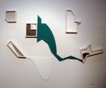
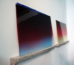
Ryan Pierce. Preview image for New World Atlas of Weeds and Rags. // Source: ElizabethLeach.com.
Get excited:
Ryan Pierce: New World Atlas of Weeds and Rags
Elizabeth Leach Gallery
Portland, OR
Through June 23
Really happy to catch the solo show of my CCA MFA classmate. Ryan specializes in hard-edged, post-apocalyptic narrative painting over luminous Flashe washes. He constructed this show around weeds, with tight botanical renderings of thistles, milkweeds, etc., as well as giveaways of pesticide-resistant seeds. My favorite paintings were from a sequence featuring the sun and the moon. I sensed some Charles Burchfield-esque visionary heat.
—

Karl Blossfeldt, Adiantum pedatum, Maidenhair fern, young unfurling fronds, 12x. // Image source: PortlandArtMuseum.org. Caption source: karlblossfeldtphotos.com.
Karl Blossfeldt’s New Objectivity photos of botanical geometry.
70 Years/70 Photographs
Portland Art Museum
Through September 9
My knowledge of photography is a bit anemic, but this means that I get to enjoy many discoveries in the repair process. Blossfeldt’s images were a delight. See more at karlblossfeldtphotos.com.
—
The short: Private lessons with Sharon Blair. Highly recommended.
The long: My sewing knowledge comprised making clothes for Puffy, my stuffed Crocker Spaniel, under the guidance of my mother. (Mom’s an excellent seamstress who made some of my favorite childhood dresses. She still uses a Montgomery Ward Singer dating from the late 1970s/early 1980s; to change stitches, she manually changes a baffling array of stamped metal gears.)
Remarkably, this experience, along with much experimentation, has girded me through sewn sculptures and ribbon projects over the past few years. In the same time though, I’d accumulated a battery of questions about fabrics and techniques. Sharon, the instructor, patiently answered them all. She has tons of industry experience, and started the lesson with a quick history of sewing machine manufacturers. <Tool nerd swoon>
I got a crash course in cutting and sewing, and practiced three of the six kinds of fell seams, which will be critical for an upcoming flag project.
—
, Montalvo Historical Fabrications and Souvenirs (A Pop-up Shop), 2012. // Source: StephanieSyjuco.com.")
The Marianas (Michael Arcega and Stephanie Syjuco), Montalvo Historical Fabrications and Souvenirs (A Pop-up Shop), 2012. // Source: StephanieSyjuco.com.
The Marianas (Michael Arcega and Stephanie Syjuco)
Montalvo Historical Fabrications and Souvenirs (A Pop-up Shop)
Montalvo Project Space
Woodside, CA
Through July 20
Friends’ first collaboration. It’s good. Go see it, and bring cash!
—

Allison Smith, Fort Point Bunting, 2012. // Source: international-orange.org. Photo: Jan Stürmann.
International Orange
FOR-SITE Foundation
Fort Point
San Francisco
Through October 28
Really good show in an amazing site. Go! I went on a foggy, chilly Monday (no crowds) and it was lovely.
My favorite was Allison Smith‘s Fort Point Bunting. Each of the 75 swags is accompanied by quotes from servicewomen printed on linen and framed in waxed canvas cording. The narratives were empowering. While military intervention is fraught, this insight in the battle for equal access to combat is pretty thrilling.
Stephanie Syjuco‘s International Orange Commemorative Store (A Proposition) establishes a standard of finish and level of production that is sublime, and should have most artists quaking in our boots. Anadamavi Arnold‘s crepe paper gowns were magnificent. I read Kate Pocrass‘ Average Magazine off-site, but found it to be the most entertaining and insightful look at the Golden Gate Bridge. I also loved Andy Freeberg‘s portraits of workers on the bridge, for the diverse, recognizable subjects, rarely-seen perspectives, and cool tools.
Fort Point’s history and vistas were great to explore. I enjoyed how the show engaged the site, so that viewers browsed historical/permanent displays in the course of visiting the exhibition. I expected a strong show due to the roster of international artists; I was pleased to find that the projects that resonated with me most form a collection of articulate, accomplished female artists.
—
, 1969/2009; nine black-and-white photographs; 8 1/2 x 8 1/2 in. each; courtesy of Alexander and Bonin, New York. Photo: Bill Orcutt. // Source: bampfa.berkeley.edu.")
Robert Kinmont: 8 Natural Handstands (detail), 1969/2009; nine black-and-white photographs; 8 1/2 x 8 1/2 in. each; courtesy of Alexander and Bonin, New York. Photo: Bill Orcutt. // Source: bampfa.berkeley.edu.
State of Mind: New California Art Circa 1970
Berkeley Art Museum
Through June 17
I’d heard rumors that this is the best show many locals had seen in a long time. Unfortunately, I had only one hour, so I didn’t have the quiet mind required for uncovering the historical significance of the performance documentation and historical ephemera that ran through the show.
I loved that the show brought the major West Coast art initiative Pacific Standard Time up to Bay Area. Also, it’s not often you get to see an major survey exhibition about California art that doesn’t have a Los Angeles bias. I enjoyed learning more about seminal artists like Gary Beydler, William Leavitt, Bas Jan Ader, and Guy de Cointet (these de Cointet text drawings are fantastic, backgrounding Tauba Auerbach’s text paintings). It’s always nice to see Bruce Nauman‘s video pieces installed—here, Come Piece, two closed-circuit televisions with different halves of their lenses taped off.
The only thing that struck me negatively was the way that political art (works by artists of color and feminist artists) was the last thematic section. The architecture of the last room especially made the agit-prop David Hammons seem like an afterthought. I can’t pinpoint it, but I suspect that the early earth and performance work relates to a spiritual quest in merging art and life, and I intuit a bit of a woo-woo factor there, reinforced by the fact that my contemporaries who are especially fond of these artists tend to make transcendental works themselves.
—
; Collection SFMOMA, Ruth Nash Fund purchase; © Robert Bechtle Source: http://www.sfmoma.org/explore/collection/artwork/104616##ixzz1xQHskP3n San Francisco Museum of Modern Art. // Source: SFMOMA.org.")
Robert Bechtle, Potrero Hill, 1996; painting; oil on canvas, 36 in. x 66 in. (91.44 cm x 167.64 cm); Collection SFMOMA, Ruth Nash Fund purchase; © Robert Bechtle Source: http://www.sfmoma.org/explore/collection/artwork/104616##ixzz1xQHskP3. San Francisco Museum of Modern Art.
Robert Bechtle, Potrero Hill (1996)
SFMOMA
Bechtle is a perennial favorite of the SFMOMA’s, and mine too. This late, great painting—on view in the second floor galleries—is like five paintings in one. The JPG doesn’t do it justice. Bechtle’s understanding of reflected light and surfaces is phenomenal. This work was the highlight of my SFMOMA visit, along with Anthony Discenza’s The Effect in the contemporary language art show, Descriptive Acts.
I expected that The Utopian Impulse: Buckminster Fuller and the Bay Area and Parra: Weirded Out shows would be more extensive. In fact, the Fuller show has two huge wall graphics that leads to a room of fantastic, large screenprint posters and transparencies. That’s followed by a group show by local, contemporary designers that is so un-related visually that my companion and I assumed that we’d drifted into the permanent design exhibit. The Parra exhibit is a massive mural, that is lovely and loads of fun, but I would have loved to see some works on paper, to get a little more intimate with the person behind these famous graphics.
I also would have loved to see more of Mark Bradford‘s video and performance works, especially documentation of his intervention at the San Diego-Tijuana border, though those could have been in the Bradford show I just missed at YBCA. The extensive selection of Bradford’s collages helped me understand the depth of his innovation with the materials (posters and curling papers) and tools (rope and power sander).

, 2011, Digital offset printing on mohawk superfine paper, 3200 pages, linen, binder's board, acrylic paint Measurements for closed book Binding: Daniel E. Kelm and Leah H. Purcell at the Wide Awake Garage in Easthampton, USA Edition of 3 / SOTA/S 2011-036/1. // Source: StandardOslo.no.")
. // Source: Rhizome.org.")
. 1994 Paul Elliman (British, b. 1961). My Typographies (2). 1994. Photogram, 11 x 14\" (27.9 x 35.6 cm) Courtesy the artist. © Paul Elliman. // Source: moma.org.")


 // Source: ElizabethDee.com")
 // Source: ElizabethDee.com.")

, 2008, installed at the Museo Nacional Centro de Arte Reina Sofía, Madrid. Courtesy of artist, photograph by Ivån Caso Lafuente.")


