
Iran do Espírito Santo, Water Glass 2, 2008, crystal, edition 23/25, 14 x 8.5 x 8.5 cm. // Source: Ingleby Gallery, inglebygallery.com. If you’re ever not sure what to get me for my birthday, look no further.
Tonight’s artist talk by Iran do Espírito Santo, a Brazilian sculptor and installation artist, energized me. It was part of the Public Art Fund’s excellent series of talks at the New School’s Vera List Center.
Santo constructed a slide lecture that began with a sequence of formally related artworks—a room with circular cutouts, followed by a plaster block with Swiss cheese holes dug out with coins from different currencies, followed by an installation of plaster hemispheres on gallery walls. From there, Santo showed site-specific wall paintings that referred back to the existing architecture, such as floor-to-ceiling brick pattern painted inside SFMOMA in 1997 referring to the brick façade outside. He showed “folding” glass plate installations, wall paintings of gradations of grey, and solid sculptures based on specific forms, such as tin cans, pint glasses, and lamps.
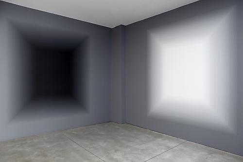
IRAN do ESPÍRITO SANTO
SWITCH, 2012
latex paint on wall
dimensions variable
unique // Source: Sean Kelly Gallery, skny.com.
Santo delivered his talk in a matter-of-fact way: In this project I did this, this site was that. He didn’t get into what he was thinking or trying to do. At first, I wanted to hear more—to ask what Jon and Anna from Eastport asked me, because they wanted to ask all artists:
Why do artists make art?
I wanted to know why Santo made what he made.
As the images continued, however, the question seemed less pressing. Though Santo worked in many media, they all seemed to make sense as a body of work. There was a coherence of sensibility and thought to them, even if I couldn’t spell it out how or why.
I still tried to find a logic or connecting thread to them, and here’s what I formulated: Santo’s work is rarely representational but often mimetic (having a referent), while some of his work, such as the gradient paintings, aren’t mimetic. They are about perceptual experiences. What these divergent works shared is open-endedness, a need to be interpreted or looked at, which seemed to suggest generosity or consideration of the viewer.
Santo spoke beautifully about his concern for the viewer. He explained that he (I’m paraphrasing)
envisions his work operating cinematically, because as viewers, we are moving cameras.
I love this idea, because I think a lot about how the aesthetic experience unfolds over time, and how looking is a process that at times is simultaneous and at times sequential.
He also said something like
how the viewer accesses the work is part of the works’ poetics.
That’s a fantastic and fascinating choice of words. I am excited to continue to consider the idea of poetics in terms of art, mulling over theories of how things take an effect on viewers, in Santo’s art, and my own.
—
A few more insights I learned tonight are below. If you already like Santo’s work, you can skip this paragraph. The following info will not better equip you in your encounter with the work, as you already have what you need. Read on, however, if you’ve yet to be won over.
While I don’t want to conflate the artist with the art for oeuvres like this, more facts about Santo help contextualize his work. First, he has a background in photography, which he discussed during the Q&A when someone asked about the tension between the Platonic ideal and the found. (This is an uncommon case where the Platonic ideal is actually relevant, as so many of Santo’s work are in such a state of material perfection that they seem otherworldly.) Santo explained that perhaps his photo background relates to his interest in reducing images, simplifying forms, and seeing light. Another audience member’s question prompted Santo to discuss his interest in architecture, which formed the support and informed the content of his wall paintings. But for his objects, too, I can see a rigorous, almost severe formalism that seems related to architecture, or what we mean when we describe something as “architectural.”
—
Playground, Santo’s project for the Public Art Fund, is on view through February 16, 2014 in Central Park.
A few of Santo’s works will also be on view in a group show at Sean Kelly gallery that opens Friday.


