Art & Development

Center for Book Arts Residency Wrap-up

Notes on a year(-and-a-half)-long residency.

IMG_20170310_160655

Printing linoleum cuts on the Vandercook letterpress.

WHAT:

I was awarded the Center for Book Arts’ 2016 Workspace Artist-in-Residence Grant. The program offers a materials stipend, 24-hour access to the Center for Book Arts’ letterpress print shop and bindery studios, a group exhibition, and the chance to take nearly unlimited classes in printing, book arts, and related workshops on paper marbling, making bone folders, etc. (Read my Residency Notes, Part 1, penned practically a year ago for more about the classes I took.) The Center also has an exhibition program and weekly events, so there are always book arts to view and new perspectives to be exposed to.

1471577718856

The steps in binding a pad of Color | Cootie | Feeling | Catcher, a collaboration with Leah Rosenberg. Make a guide to evenly space the holes. Use a pin tool to punch holes (put a weight on the text block to hold it steady). Wax your thread. Start your thread so the tail goes out the side of the block (to hide the knot later). Sew down the length of the book, and back. Tighten each stitch. Tie a knot in the middle of the pad (to hide the knot, see?). Use a bone folder “beat the swell,” which is to smash down any additional thickness gained from binding.

IMG_20160818_235845

Steps in adding an endpaper-wrap: Use a triangle and bone folder to score a line in the endpaper. Fold along the score. Mark the depth of the pad on your end paper. Score and fold at the mark. Use pieces of newsprint as a mask to apply PVA only to one half of the end paper. Glue down to your text block and beat down with a bone folder. Smooth the edge with a bone folder too. Flip the book over and apply glue to the last segment of endpaper and smooth with a bone folder. Tada!

WHEN:

The residency is from January to December, theoretically. In reality, it’s looser than that. As a live-out studio program for local artists, they don’t have to enforce strict end dates. In fact, they offer AIRs the chance to continue working in the studios until their exhibitions, which are typically scheduled in April of the following year, affording three ‘bonus’ months of studio access. (I returned my keys for incoming AIRs and thus was keyless those last three months. It worked out most—but not all—of the time.) Additionally, AIRs are required to complete letterpress and binding classes before using the studio, and may be screened additionally before printing unsupervised, so matching schedules is advantageous.

My residency started in January 2016. I had already made a three-month, out-of-state commitment last year, so I tried to make the most of the rest of the year. I expected to be more active in the fall, but my seasonal job sapped my time and energy, and I got sick often. Moving forward, I have a more realistic sense of what I can achieve in the fall.

The Center underwent through renovations in December and January, through the spring. The space is modest, storage is limited, and programming can interfere with studio access. As mentioned in my prior post, flexibility and forbearance are helpful.

I was able to dedicate more time in the lead-up to the exhibition, so the bonus months were critical to my growth.

1469824400631

In Bookbinding II, I learned how to pare leather to make hardcover books with a decorative cord on the spine.

WHO:

There are usually 5 AIRs every year. Every year’s cohort of artists is different. Some years’ AIRs are very tight, and other years’ are less present and supportive. If you’re thinking of applying, here are some tips (I was on the selection panel for the 2017 program): You don’t have to be experienced in book arts or printing. You should have a well-developed, thoughtful body of work. You should be prepared to make the most of the opportunity. And you should contribute to the Center with your presence and practice.

There are also three Scholars—who have more bookbinding experience and propose specific book projects—who start their residencies in the fall. In addition, there is a community of renters—often artists and bookbinders who produce their own work or work for clients there. The Center also regularly books Stewards to provide technical advice during certain nights of the week (ask regularly, and double-check).

I was very grateful to be able to turn to the Scholars, renters and Stewards for help. They answered questions and provided technical advice and feedback. I couldn’t have made my final project without their help! I also learned from them by osmosis, observing different styles of working, and expanded scopes of what I thought possible in book arts.

The Center for Book Arts is a small non-profit. The staff work hard, pull long hours, and do unglamorous tasks to keep the place running. Renters, teachers, and supporters supplement by pitching in or bearing with inconveniences. I’ve been thinking about how print shops are communal spaces that foster interdependence. I have had opportunities to reflect on the ups and downs, and the boundaries that make for healthy relationships.

WHERE:

One of my favorite aspects of this residency is the great location at 27th and Broadway, in NoMAD (just north of Madison Square). It took refreshingly little effort and time to get there after work. It’s very easy and convenient to get there by subway. I also got a Citibike membership, which was worthwhile. There are ample options for healthy food and groceries nearby. (That may sound trivial, but it amounts to more studio time and focus.)

1479532114512

Printing a “pressure plate” of cut paper, and wood type.

WHY:

I also really appreciate the way that the residency and access to the Center enhances my skills and capacities. One of my most memorable moments was responding to an evolving situation quickly by printing a poster, and being able to distribute it while still printing to appreciative people. I’ve adapted to having access to printing; my foray into Riso printing while the Center was being renovated was an expensive reminder of printing otherwise.

Of course, I wouldn’t have been able to create my final project without this residency. I greatly increased my book arts skills. Though I’d done relief printing in undergrad, I hadn’t ever gotten very comfortable with letterpresses. By the end of the residency, I’d gotten more fluent at solving problems, and working with, not against, the nature of lead type.

My final project is Working Together: a mix-and-match book of nice and not-so-nice modes of collaboration. It’s inspired partly by investigating collaboration as a subject and a practice over the past two years, and partly by politicians’ disregard for others over the past several months. While mix-and-match books—as well as teaching cooperation—might be associated with childhood, I have come to think that collaboration is not a skill once mastered, but a lifelong series of choices.

I’m very grateful to the Center for Book Arts for this opportunity, and by extension to the NEA, NYS Council on the Arts, NYC Department of Cultural Affairs, and NY City Council for supporting the Center for Book Arts.

I feel like I’ve worked my way into the rhythms or the fabric of the Center. It’s nice to feel a sense of kinship with the other shop users, and to feel that I have a place I can go to, belong, and do my work. The Center welcomes AIRs to stay on with affordable studio rental rates, an option I’ll likely explore in the future.

Working Together is on view, in the Workspace Artists-in-Residence exhibition, through June 30.

Standard
News

2016 Holiday Sale

I’ve assembled some projects as gift sets this holiday season.

Thank you for your support. I’m a working artist, and I mostly engage with non-profit organizations. It’s been a pleasure to share my participatory projects over the past year. If you enjoy my work, consider giving or collecting one of these specially assembled sets, so I can keep making and sharing.

Payments are accepted through Paypal. Prices are listed for US shipping only. For international shipments or alternative payment methods, please email me.

Ways and Means Activity Kit
Set of 8 letterpress printed activities, plus bonus items

Ways and Means Activity Kit, 2016, letterpress prints with hot foil, pencils, crafting extras, dimensions variable.

Ways and Means Activity Kit, 2016, letterpress prints with hot foil, pencils, crafting extras, dimensions variable.

Get or give a set of 8 letterpress-printed activities to explore how we rely on and support each other. Cut and assemble linoleum prints to visualize your chains of cooperation. Set up a buddy system to reach goals with pledges and postcards. Draw a portrait of the friends and family who keep you afloat. Send a letter (four sheets of letter paper, including a bear with a top hat!) in a make-your-own envelope.

Also included are three hot-foil stamped Ways and Means pencils, a Ways and Means postcard, and a bell and ribbon (color may vary) to assemble your own Interdependence Door Charm.

The printing methods span hand-set lead type, hand-carved relief printing, pressure printing, polymer plate, and hot foil stamping. Printed by the artist on Vandercook presses at Kala Art Institute in Berkeley, CA and the Center for Book Arts, NYC. Learn more about the Ways and Means project. While the project was on exhibit last fall, individual activities were available on a limited, take-one basis; this set offers a chance to enjoy 8 activities at once.

Ways and Means Activity Kit
$45 + $10 shipping and handling via USPS Priority Mail 
PayPal

Ways and Means Decorative Pattern Postcards
Set of 10 blank cards

Ways and Means notecards, 2016, letterpress polymer plate print on cream laid paper stock, 5x7 inches each, set of 10.

Ways and Means notecards, 2016, letterpress polymer plate print on cream laid paper stock, 5×7 inches each, set of 10.

These letterpress-printed cards with blank backs can be used as postcards or notecards. They feature icons representing interdependence in my recent Ways and Means project. For example, balloons represent peers who keep us afloat, a drill and thread is for our skills and resourcefulness, and links stand for being part of a chain of cooperation.

I printed these 5-by-7-inch postcards on a Vandercook press at Kala Art Institute in Berkeley, CA. Each card was printed with soft green ink on cream laid paper.

Ways and Means Cards
Set of 10
$10 + $2 shipping and handling via USPS First Class Mail

PayPal

Positive Messages Postcards
Set of 10

Set of Five Postcards, 4x6

Five postcard designs, 4×6″ each.

This set of ten postcards features a selection of the five cards pictured above. Six cards depict three installations using only ribbons to create texts that are inspired by positive psychology. A make things (happen) postcard—which can be colored in—is included, as well as a postcard from the Irrational Exuberance (Asst. Colors) project using discount store products to explore pleasure.

The backs have just caption info and a URL, with plenty of space for writing special notes to mail to friends.

Sample postcard back.

Sample postcard back.

Set of ten postcards
$10 + $1 shipping & handling via USPS First Class

PayPal

Solidarity Poster
Set of five to benefit NYC immigrant empowerment

Nos Cubrimos Las Espaldas/We Got Each Other's Backs, 2016, letterpress pressure print with hand-set wood type, 12x18 inches.

Benefit set of five prints of Nos Cubrimos Las Espaldas/We Got Each Other’s Backs (2016, letterpress pressure print with hand-set wood type, 12×18 inches).

I made these in response to Trump’s election to express solidarity with marginalized groups. I have been giving individual posters out to local protestors and allies, and offering a downloadable file for self-desktop printing, but now you can order a set of 5 to distribute as you please.

I printed each of these posters on a Vandercook letterpress at the Center for Book Arts, NYC. The image is made with pressure printing using a hand-cut paper stencil; the text is handset wood type. I used fluorescent pink and royal blue ink on smooth, bright white, Cougar 80# text paper. The handmade nature makes each of these prints highly unique.

Five dollars from every order will be donated to the Make the Road (New York), a 501(c)3 non-profit organization that “builds the power of Latino and working class communities to achieve dignity and justice through organizing, policy innovation, transformative education, and survival services.”

Set of 5 Solidarity Posters
$15 + $3.50 shipping & handling via USPS 

PayPal


You might also like to see the multiples for sale on my website, including a holographic sticker sheet, and pinback buttons about overcoming setbacks.

Standard
Meta-Practice

Center for Book Arts Residency Notes, Part 1

ways-and-means-toolroll-outside-web

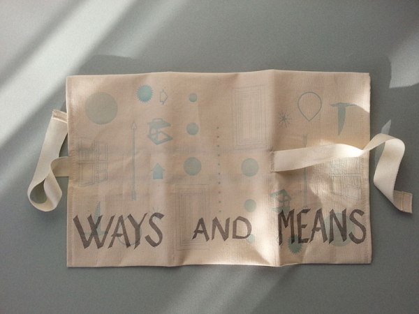
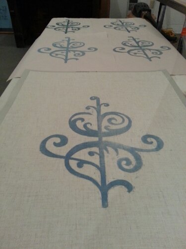
Ways and Means tool roll, 2016, two-color print of line cuts, linoleum, and moveable type (not shown) on canvas.

For the past three months, I’ve been taking classes and doing lots of letterpress printing at the Center for Book Arts in their Artist-in-Residence Workspace Grant program. It’s been neat to get to know this compact Manhattan non-profit printshop, bindery, and gallery, and the community that keeps it running and makes it vital.

Right after returning from Kala in February, I dived straight into a five-day, intensive Bookbinding class at the Center for Book Arts. The class was taught by Nancy Loeber (see her beautiful books of reduction woodcut portraits). I loved the pace of the class—she kept a phenomenal energy up, and exposed students to a tremendous amount of technical knowledge. We made many different soft and hard cover book structures, made our own book cloth, and practiced techniques to make our books more precise and tidy. The class was also a great way to spend time at the Center, and get to know a few of my fellow AIRs, Scholars, and other students.

I learned about pressure printing in a fun weekend class with Macy Chadwick. I’d never heard of pressure printing before. It’s a sort of ingenious process, similar to collagraph. You make a plate out of paper or other thin, flexible materials, only instead of inking up the plate, you sandwich it with your printing paper that you set in the grippers. That all goes around the cylinder, where your paper picks up ink from a thick acrylic plate. The result is a print that is mostly solid, with texture and ghostly halos. It’s loose, quick, and experimental—qualities that are opposite of most other letterpress methods.

I also took a broadsides letterpress printing class with Rich O’Russa, who encouraged my wacky experimentations printing on cloth and locking up type on angles. It was a great way to get more practice setting type and learning the quirks of some of the Center’s seven letterpresses.

After taking these classes and the Renter Training class, and printing during the Supervised Printing nights, I was recently given the go-ahead to print unsupervised in May.

I’ve been printing activities for activity kits using moveable type, linoleum, and polymer plate.

I find setting moveable type to be incredibly time-consuming, frustrating, and both antagonistic and contiguous with my typographic sensibilities. On one hand, I have a pretty good sense of typography from doing graphic design and calligraphy, so the shapes of my typeface of choice, Lydian, is familiar. On the other hand, my discernment is also the source of friction—it’s hard to express how much it gets my goat when I find an italics or condensed letter in the roman job case, or worse, in my lock-up when I’m already on press.

Letterpress is physical in the extreme. Every letter, every point and pica of space, has to be accounted for with a corporeal material, which has to be stored and organized to some extent in a communal printshop. The reward is an ineluctable perfection of slight imperfection, that polymer plate doesn’t achieve. After setting type for a few projects, polymer plate feels so fast and painless—and the painlessness is both relaxing and unnerving. I got the feeling I’m not learning anything right now. But it’s also nice to go home at a reasonable hour.

The Center is located in NoMad. As the site is not capacious, and is also used for classes and events, it is helpful to approach with flexibility, cooperation, and forbearance. The location is great—close to many options for transportation, food, and art stores around 23rd Street, Madison Square, and Koreatown.

The 2015 Workspace AIRs’ exhibition, along with two other shows, are on view through June 25. Stop by to see eclectic interpretations of the book form; you will also see the studios as well.

Standard
Travelogue

Process photos

A story in photos on the making of letterpress labels for a set of semaphore flags representing the VIA Character Strengths and Virtues.

image

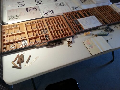
California Job Cases of lead type.

image

Setting type in the composing stick, which for an Indistrial Age metal contraption, is amazingly ergonomic.

image

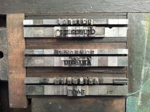
The type locked up with wooden furniture and ingenious locking quoins.

image

The printed labels.

image

Label assembly. There are 24 character strengths in all.

image

Labels are sewn onto cotton twill tape that forms the hoist end of each flag.

image

Each flag is sewn from linen and features an interpretive, abstract icon appliqued in ribbon.

image

The first five prototype flags.

image

The semaphores alongside other projects at the Open Studio

Standard
Travelogue

Greetings from Eastport

image

Across the bay, Canada.


image

View of downtown Eastport from the pier.

Months ago, I applied to an open call with a proposal to make banners inspired by maritime history and semaphore flags.  

Today, I am posting this from Eastport, Maine, one week into the Studio Works residency at the Tides Institute and Museum of Art to which I am so grateful for the opportunity.  

Eastport is the easternmost city in the U.S., but it is more like a small town (so small, in fact, that my very definition of “small town” seems to be expanding while the conceptual parameters are diminishing). Coming from New York, it feels a bit anachronistic to me. Many of the buildings are beautifully preserved from the 1800s, when Eastport flourished. My lodgings are similarly historic,  so it seems fitting that my digital and online capacities are reduced while I’m here. For that reason, my posts this trip will be infrequent and concise, if I can help myself.  

image

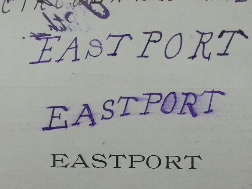
Page from an 1800s Eastport directory in the collection at the Tides Institute.

A few reflections, great and small, in no particular order:  

image

New woodblock print of a flourish (typographic ornament) on linen.

• Printmaking is a little like riding a bike. Though I printed most actively in my undergrad years, once I got back in a print shop it seemed quite familiar. I enjoyed many “I remember this” moments: feeling my arm fatigue mixing cold inks straight from the can, listening to the sound of the brayer to learn about the tackiness of the ink, and all the peripheral tips and tricks in setup and cleanup to save time, like making little tabs of scrap materials to use for skimming inks or modifiers.    

image

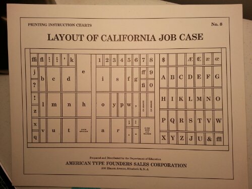
A very handy reference chat for the organization of letterpress type. Without it, I'd be helpless.

• Printmaking is nothing like riding a bike. It’s a long slow process of proofing, refining, modifying, adjusting pressure, adding packing, and so on. The ideal is perfect craftsmanship demonstrated through identical reproduction. I was never into that. And I don’t want to get hung up on it now. I’m trying to let this be more experimental, not having to produce an edition, unless it’s an edition varie. To let my hand, indeed, my ability, however lacking, show. I’m interested in decoration and domestic production–e.g. how individuals, not corporations, made flags for hundreds of years–so I think it makes sense that the banners aren’t perfectly mass editioned like Victorian collectibles.  

The most rewarding place from which to learn has been, for me, the mistakes. At the same time, perhaps there are no mistakes–there’s just more than one right way to do things. –Marcia Tucker, A Short Life of Trouble

Standard
Research

recommended: Eric Gill, Iconographer, at USF

Eric Gill is the man behind the sublimely timeless Gill Sans. He’s also one of the 20th century’s notable wood-engraving artists, handling line and form in geometrically-stylized, gorgeous English Arts and Crafts way. He was a bit of a fanatic and nutter (what the gracious might call an eccentric, or what the unpretentious might call a freak).

The University of San Francisco (where I’ve had the pleasure of sitting in for E., a faculty member) holds a broad collection of Gill’s prints, books, bookplates, blocks and even a little sculpture. They’re on display in the Thatcher Gallery in the USF library through December 20. If you can make it through the imposing swipe-card turnstiles (hope the desk aides look your way, so you can inform them that you’d like to see the exhibition), you’ll find dozens of fine, detailed prints to peruse.

It’s a pleasure. I’m not one to warm to religious art easily — like Howard Belsey in Zadie Smith’s On Beauty, my tastes in art are secular — but Gill’s prints are winsome. He employs the Arts and Craft’s simplicity and elegance of line with a rudimentary, stylized geometry echoing Byzantine icons, yet Gill’s resolutely-embodied figures are lithe, muscular, and slightly Medieval in appearance. The result is a mythological aura, suiting fables, moralism, the life of someone seeking transcendence.

The artwork veers between deeply religious to sensual to erotic. I found the bookplates and illuminated letterpress blocks to be the most delicate, whimsical and endearing. These, according to a didactic banner, were considered by the artist to be mere decorations, “flowers of the graphic designer” or some such utterance of regret. Yes, they are illustrative, but one in particular, with a large, well-balanced drop-cap “O,” featured a captivating illustration of a subterranean skeleton pulling at roots while a man tugged at leaves of the same plant. Free of its movable body text, the image perplexes, and its message, however unspoken, is still communicated confidently and clearly.

I also enjoyed two prints, with the texts, “THEN” and “JESUS,” in which figures populate a landscape formed by the handsome roman capitals (his Perpetua typeface, perhaps). After leading a typography crash-course in my Sketchbook class at ASUC last night, it was a treat to see top-notch text and image compositions.

On view are also a number of intaglio prints, as well as Gill’s carved blocks. These are finely detailed, and bring, even in their reversed, inky pitch-blackness, Gill’s precision and craftsmanship to life.

The exhibition was produced with the help of a number of USF departments. Upon exit, do browse the interactive design on a computer near the entrance — it’s thorough and nicely designed (and unfortunately, it’s not online). In contrast, I found the installation — even accounting for the architectural limitations — to be wanting; I’m just tall enough to study the tiny prints hanging on what seemed to be 59″ or 60″ centers. Still, it’s too high for such modestly scaled works. Yet Iconographer creates a great dialogue with the papercuts of Nikki McClure, and, across town at the Wattis Institute, the wood-engravings by Gill’s coeval, the American Rockwell Kent.

Standard