Just completed my first printmaking residency: I spent the month of June in Eastport, ME, making prints in the Tides Institute and Museum of Arts’ new StudioWorks building on the main street in the historic downtown.

The Studioworks building is a historic preservation effort by the Tides Institute, assisted by talented masons. The renovation work is proceeding. For really cool photos of the process of turning a historic building into a working printshop, check out the Tides Institute’s Facebook page.
It’s been a productive experience: I’m coming away with three projects involving woodcut and letterpress printmaking, banners, and semaphore flags. Some projects are nearly finished, others are series with initial pieces completed and more ready for production.

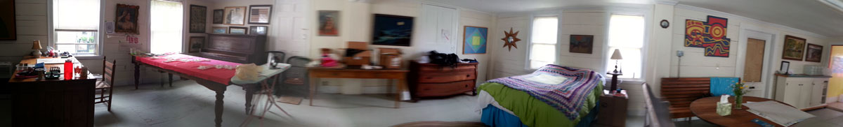
Finished projects on display in the Open Studio. Supported by the STUDIOWORKS/Tides Institute & Museum of Art, a private not-for-profit organization.
—

Eastport on a Nat Geo map.
Eastport: Neighborliness in Abundance
It was quite an adjustment, coming from the metropolis of NYC and adapting to small town life, where everyone knows each other and many are quite curious to meet new people such as myself. In the city, anonymity feels safe and efficient. In Eastport, the standards of common courtesy are exceptionally high. For example, drivers will often wave to pedestrians. It’s baffling at first. Did they mistake me for a friend of theirs, I’d wonder. Did they wave because I was walking in their way?
To me, Eastporters’ investment in welcoming and learning about every individual living alongside them, if only for a summer month, is practically astounding. The weave of the social fabric was so tight. Many years ago, I made paintings that I thought were about the psychology of public space. But I see now that they were specifically about urban space, and isolation and distrust.
Eastport is technically a city, though it feels like a small town. In every direction from the house where I stayed there were people who made my welfare their concern. Most of all they wanted to know that I enjoyed my time in Eastport. The pride in their town was very clear.
The pace of Eastport made it possible for me to get a lot of work done; the distractions were few (though that will change this week with the Fourth of July). The past few weeks were restorative for me. It was quiet and very easy to spend the day and evenings working, then wind down and get a good night’s rest. Very sociable artists might find the town’s night life in adequately lively, those who can tolerate a lot of studio time will find it perfect.

I stayed in an old Veteran’s Hall, where I also did a lot of sewing. This was a great second space for working—spacious, quiet, and light-filled—as the StudioWorks building’s renovations are underway.
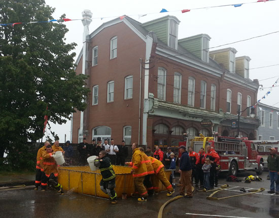
Eastport’s Fourth of July festivities are the largest in the state of Maine. I got to catch part of Eastport’s Fourth of July festivities, such as the Fireman’s Muster. Independence Day seems to kick off the busy summer season. Even in the four weeks of June, I could sense the town emerging from the winter and spring.
I enjoyed meeting many amazing, friendly people. The town’s demographic skews grey, but there are some very sweet and funny young parents with creative interests in the arts as well as local food. I attended some fantastic potlucks with great homemade eats, lively conversation and smart folks.
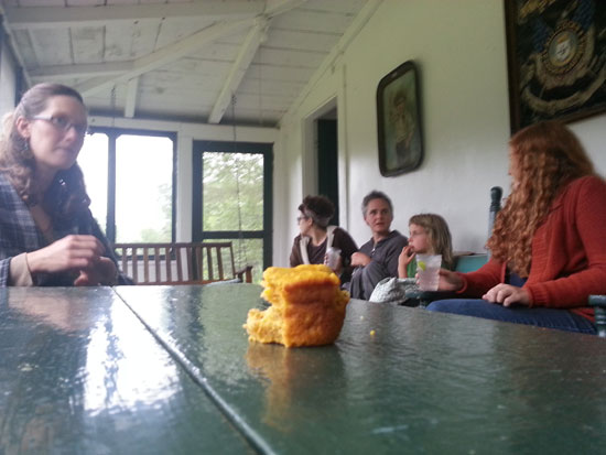
Butternut squash muffin, fellows from near and far, on Marit’s family’s camp porch. This would be after the swimming, and before the fireworks.
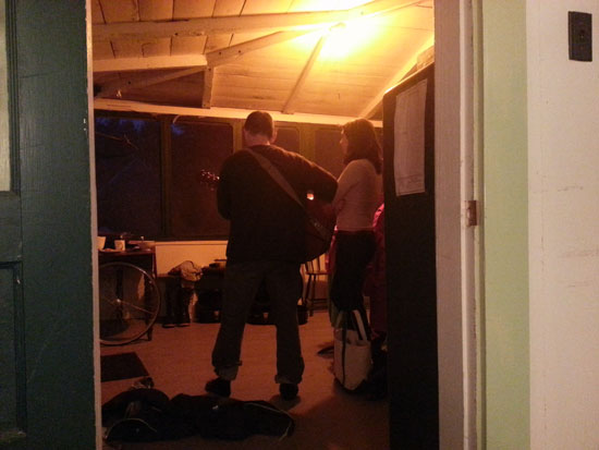
Porchlight songs.
—
Artists thinking about applying will be happy to hear that Kristin McKinlay, who coordinates the residency, is good humored, accommodating, and also a working artist. See her embroidered wall works at her site.
I also really enjoyed meeting Anna Hepler. Via conversations and a studio visit with her and her husband Jon, I felt a great support and intellectual camaraderie. Both accomplished in their fields, they close to relocate to Eastport as a home base for being citizens of the world (with their two young children in tow; very inspiring!). Luckily, the Eastport Gallery invited Anna to do a talk this month, so I had the chance to learn more about her work and the development of her thinking. (Future residents can enjoy a talk by Kristin!)
—
The area is has so much history, much of it persists into the present in the form of amazing artifacts.
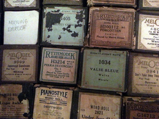
Boxes containing player-piano tunes.
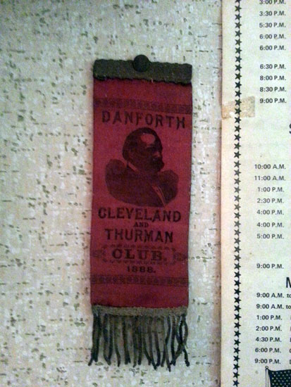
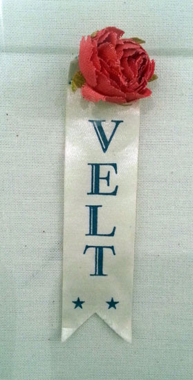
1888 campaign ribbon at Marit’s.

A sweet “rose-velt” campaign item from FDR’s Rosevelt-Campobello Park on neighboring Campobello Island in Canada.
—
For those artists influenced by landscape and light, or people who savor them, Eastport is amazing.

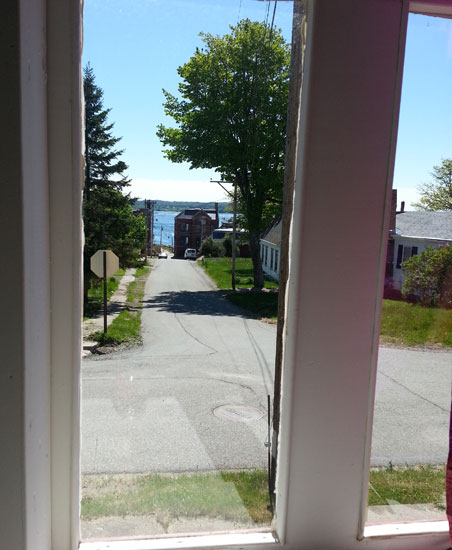
Artist-in-residence at the GAR building can watch the tides go in and out, just past the Tides Institute, from their breakfast nook.

The view from Harris Point, a nice walk from downtown.

A school of fish, perhaps herring, plashing in the bay.

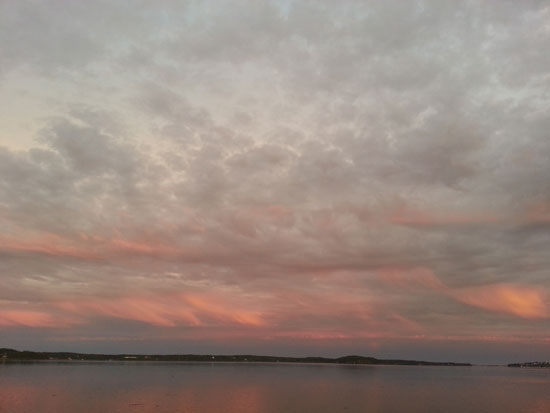
Looking out towards Campobello Island at sunset.

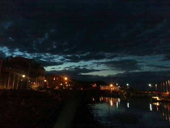
Twilight over Eastport.