Impressions, Make Things (Happen), The Eve Of..., Travelogue

c3:initiative Residency Day 12 Update

Some things I’ve done, thought about, and seen in the first 12 days of a 17-day residency in Portland, OR.

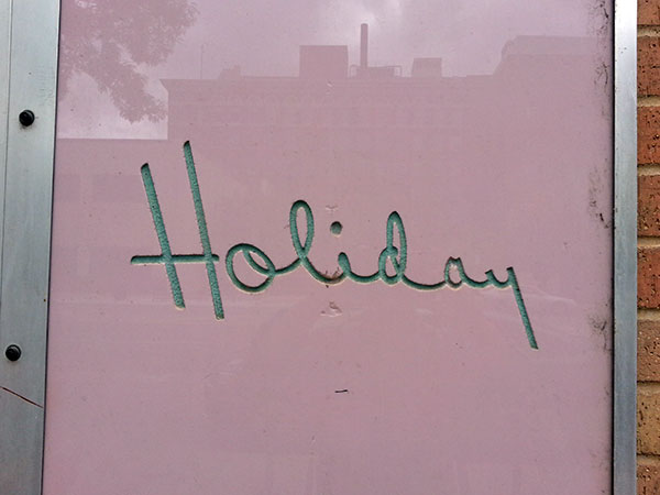
On Saturday, I installed two pieces from The Eve Of… in the window project space at PDX Contemporary, with a little help from JZ, DH, Caitlin, and James. It’s viewable 24/7 at the corner of NW Flanders and NW 9th.

It’s a satellite of the larger exhibition at Portland ‘Pataphysical Society (‘Pata), which opens Thursday (First Thursdays) from 6-9pm, at NW Everett and NW 6th.

The exhibition at ‘Pata will include new works—four large pieces of handmade cotton rag paper, which I made with the tutelage of Jenn Woodward at the Pulp and Deckle paper making studio thanks to support from c3:initiative. The paper is created for display in the ‘Pata windows, which will also be viewable 24/7.

Make Things (Happen) PSU Assembly brochure page. Illustrations of activities by Kari Marboe & Erik Scollon, Piero Passacantando, and Tattfoo Tan.

Make Things (Happen) PSU Assembly brochure page. Illustrations of activities by Kari Marboe & Erik Scollon, Piero Passacantando, and Tattfoo Tan.

Last Wednesday, I had a chat about Make Things (Happen) in PSU Assembly. It was sponsored by c3:initiative and located at Portland ‘Pataphysical Society. I invited Make Things (Happen) participating artists Lexa Walsh and Julie Perini to present their activity sheets and have a dialogue. Lexa asked me how I felt about shared authorship—I am interested in exploring it, and talked about the creative freedom I tried to offer artists, since I wasn’t able to offer remuneration. This spurred an audience member to ask Lexa and Julie what motivated them to participate. Lexa mentioned that this was a easy extension of an existing project, and Julie explained it’s hard to think of who would fund projects to fight white supremacy.

We also talked about if I’ve met resistance to my work about happiness, and I mentioned how much inspiration I take from Susan O’Malley‘s commitment to make art that is whole-heartedly positive. (At Harvester, I talked about how people can easily underestimate the amount of courage that making art about happiness can require.) Another person asked about where else I’d like to see this project, which reminded me of the last message I got from Susan:

I really think it would be amazing to see this project at the airport or library or DMV or city hall or some kind of public space…..

She was so smart about curation and public space. I should heed her words. These are just one more example of so many bits of wisdom she shared.

Thanks to everyone who attended, and who made it happen: Julie, Lexa, Shir, Erin, Josephine, David, Harrell, and many more.

I made paper before, once, in Nance O’Banion’s Bookmaking class as an undergrad. My memory of it pretty hazy, except for an image of the sheet collapsing as I unsuccessfully tried to “kiss” the wet paper pulp off the mold and onto the drying screen.

A few thoughts about paper making:

It’s technical, but much of it, like in printmaking, is by feel. You screw it up to know where it goes wrong, and then by experience feel when it’s right. For example, you figure out how much retention aid is enough, which you can feel in the softness of the water.

It’s physical. I made four 43×56″ sheets, each comprised of twelve sheets from a ~15×15″ mold. The water’s surface tension provides a good amount of resistance when you pull the mold. You sometimes have to lift and pour big buckets (30-40 pounds). A backache after the first day was all the reminder I needed to use my core and legs on subsequent days.

Oddly, I think having done vinyl signage helps. Though the materials couldn’t be more opposite in many ways—natural vs. plastic, historical or niche vs. ubiquitously modern—the processes share releasing a fragile sheet from one surface to another. It’s about timing and pressure.

It’s pretty magical. There’s no binder. The fibers just stick together. Because it’s very physical and intuitive, it’s a great process for finding flow. Jenn is a great teacher—very knowledgeable, patient, and no-stress. Pulp & Deckle‘s classes and private workshops are affordable. Recommended!

Time management. You might think that artists who are also art handlers will take less time to prepare for and install an exhibition. This is not necessarily true.

1. We can nerd out on details. I built a plinth for a work that usually sits on the ground, and a box for A/V that could just sit a shelf. I’m also sewing light blocks for ‘Pata’s clerestory windows and sheer window coverings to layer behind the paper.

2. It takes time. I underestimated how long it would take me to build boxes and pack my work to ship out here. Yet I work on crews where we do that for several days or weeks at a time. The scale of my work is smaller; but still, in this case, it included two large boxes the sizes of doors.

3. Because you never know when you’ll need to problem-solve. What can go wrong when you’re traveling, using local sources, unfamiliar tools, and new spaces? The patience and generosity of friends and strangers go a long way.


Bathing in the afterglow of the Postcards from America opening at Newspace Center for Photography; it was pretty cool to see dudely big-deals like Alec Soth and Jim Goldberg mixing it up with local subjects (a retiree, a girl named Cherish, a physical therapist who served vets, an advocate for Iraqi refugees) and PSU Social Practice students. The event was part of PSU Assembly. Susan Meiselas‘ project to raise the visibility of VOZ, a worker-led organization to empower immigrant workers is a smart, worthy way to use photography in social practice; limited edition screenprint posters are available to raise funds for printing. It’s super cute and signed by the Portland Postcards from America photogs. I was tempted. I previously thought Magnum was just a hotshot agency, but in a recent talk at Portland Art Museum, they explained that it’s a co-op run by photographers for photographers, and had to find new ways to support the work they want to do.

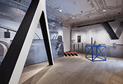
Yale Union/YU Contemporary‘s new exhibition by Willem Oorebeek. We were only there for a few minutes between engagements, and my largest impressions are of the space (a huge renovated industrial space not unlike Mass MOCA or DIA:Beacon, with beautiful light) and the architect-made exhibition design (2×4 framing on 12″ centers, very selectively sheathed). There were reproductions from magazines, and sheets of glass over rubber flooring with round nubs intended to read as pixels, though I thought of LEDs. There were black-on-black prints (black lithographic prints over a variety of mediums) that had optical or durational effects—you had to stand right in front of them to see them, which was engaging in how it forced an intimate relationship with the image within a massive space.

Woodwork. Borrowed tools from a suspension-tree-house maker named Devan. A 12″ compound miter saw, Skil saw, and compressor and nailer (yes!). Nice blades, smooth sailing. I forgot to pick up clamps, though, so I nailed a 1×2 as a guide wherever I needed it. It hit 92ºF and the patio umbrella was a savior.


Standard
Impressions, Travelogue

Found Typography in and around Wichita

Signs, packaging design and more.

type-holiday-20150415_134121-600x450

Such exuberance. Douglas Street.


Library sign.

Fitting sign for a sturdy, spacious, modern building. Main Street.


clock with rounded sans red numerals, serif black numerals

A study in function and typographic contrast. Wichita Public Library, Central Branch.


type-harpers-20150409_124827-600pxw

Such a high-minded engraving. I love how prominently the arts feature; hard to imagine a corollary image today. Framed and on display the library, in the genealogy section.


University yearbook spines.

Decades of typographic whimsy. University yearbooks.


Neon sign in the Delano district. Bell Floor Co.

Neon sign in the Delano district. The two different sized strokes on the sides of “co” are kind of sweet.


Big Brutus t-shirt, West Mineral, Kansas

Better than Google: Sean: “Have you been to Big Brutus?” “What’s that?” (Opens shirt and explains that Big Brutus is the world’s largest power digger.)


JR's private club, open 11 am to 9 pm. Serving Daily Fare, lunch 11-2:30 pm, open mon-sat. Bully good. Breakfast Special 7-11am

Diner era conjuring a wood type era.


type-circsaw-20150420_191156-600x450

Bubble letters with drop shadow and Helvetica. The saw is indeed avocado green. And it still cuts like a beaut. Turn the wingnut to adjust the cutting depth.

Avant Garde outline above aqua and pink stencil with ribbon.

Avant Garde outline above aqua and pink stencil face with ribbon.


Committed to serving citizens. November 1994.

Get it? It’s copperplate script cast in bronze. What I do like is Kansas’ state motto: Ad astra per aspera (To the stars through difficulties).


Coleman Silk Lite Mantles.

From Coleman’s museum and store. Coleman was founded and operated out of Wichita (along with many aeronautics companies, and Pizza Hut). Another period of effusive typographic contrast; this one, a heyday of illustration.


type-rett-20150418_183717-600x450

Strong City, KS. I was mostly attracted to the numbers which could be on a heavy metal album cover, but now I’m noticing the  right triangle, and how it seems a bit Masonic…


Wichita Work Release Facility

Maybe not a happy place, but someone probably made these letters, and decided how to stagger them across the checkerboard granite wall.


Santa Fe railroad car.

Adjacent to the Transportation Museum, on Douglas Street.


Old Mill Tasty Shop, Fountain service and sandwich

Trajan-eqsue Roman capitals over brush script, painted and re-painted? Yes, please.

Standard
Impressions

Impressions: Jos de Gruyter & Harald Thys @ the Wattis

_____ness, overexamined.


Longtime New Yorkers, including Martha Rosler, like to point out how suburbanized New York City has become. However, I could argue that, as real New Yorkers, they do not truly know suburbia. I thought about this as I stepped off the SFO-originating BART and into the slow, foggy town of my teenage years, where, over the coming days, I would complain about how the Home Depot’s layout is backwards from its usual lumber-on-the-right floor plan, and, for even the most middling of needs, visit Target  at a mall whose property line would encompass two subway stops on the N/Q. No stranger in a strange land, I’m a prodigal daughter in an ur-burb. I mull “basic culture”—the concept, terminology, and usage, and all the classism and cultural elitism it entails—while consuming it too.

With this in mind, Tram 3 struck me as extremely _____, in multiple ways. Here, rather than a symbol of purity, it’s a non-color, a normative default, nothingness. It pervades the works with the angst of pointlessness.

For Tram 3, the Wattis is a large, airy, sky-lit cube immaculately painted in matte, cool _____. Nary a patch glinted. Several oversized, oversimplified human-like cutouts populate the space. They’re simply constructed from steel plates, but are painted so matte and so _____ that they could well be Sintra (a rigid foam board). Casually taped on them are quick sketches of portraits on _____ paper, drawn as if the artist was short on graphite and time. On the walls are similar drawings of trams and tram riders. They’re framed but unglazed. The whole space is luminous with soft, reflected light. Even the track incandescent lighting approximates ambient fluorescents.

In a cavernous neighboring space, the artist’s video, Die Aap van Bloemfontein [The Ape from Bloemfontein] (2015) plays. Or, rather, the media advances. It’s a spectacle of inaction, a series of painfully long shots of tableaux in which actors imitate motionlessness. The actors are all _____. They are shot under hot lights, in unflattering, tight close-ups. Moles glisten. Crooked teeth are bared. A narrator’s voiceover describes transformations of objects into subjects and back. Rather than magical, it’s passively futile. Nothing happens, acutely. It’s not liberating Zen; it’s oppressive sameness. It’s monolithic culture, Northern European social order, and suburban predictability. It’s ennui born of (first-world) boredom. Sartre flat-packed in IKEA.

The exhibition signage is black text in Times Roman, a signature that Wattis director Anthony Huberman imported with him from the Artist’s Institute in NYC. Simple, black-and-___, and open is a quietly loud differentiation from predecessor Jens Hoffman, who with graphic designer Jon Sueda gave each exhibition assertive identities via color, typography, and architectural interventions. Under Huberman’s lead, the Wattis’ collateral has become restrained and cerebral. The website features no images, as if to say that art is not objects and visuals, but a series of open-ended ideas and exercises best experienced temporally and ephemerally. Thankfully, the exhibition brochure is written with concision and wit. While it ascribes absurdism to de Gruyter’s and Thys’ work, I didn’t see this lightness. If there is humor, it’s only black.


Through April 18
Jos de Gruyter & Harald Thys: Tram 3

Wattis Institute
San Francisco, CA


Standard
Impressions

Impressions: Anthony Discenza: Trouble Sleeping @ Et Al Projects  

Conceptual horror. 

Text-based works and a sculpture are selectively lit by un-diffused LED arrays. The lights are staged, but rather than theatrical, they feel forensic.

A light box displays a long textual description of a super-sensing machine. The gist of it—I found it a little too bright in the darkened space, with afterimages hindering reading—could be science fiction. Or like Gary Shteyngart’s Super Sad True Love Story, it seems like a description of the very near future or a depressing parable for the life of a current screen-addict.

Nearby, a panel of black and white encoding is mounted and displayed like a photograph. The dense, random pattern recalls a Magic Eye picture (no 3-D illusions appear). By withholding signification, it seems anomalous in the oeuvre of this literary artist.*

Standing on end in the far corner, a large red LED sign scrolls text about an exorcism.

A smaller LED bank illuminates a hyperrealist sculpture of detached fingers. It seems like a continuation of a fascination with horror as explored in HalfLifers, Discenza’s performance/video project in collaboration with Torsten Z. Burns, here manifesting as a phobic vision.

There’s practically no ambient light in Et Al’s long, narrow basement space in this show. Thankfully the architecture is well renovated—while it is entombed without natural light or airflow, it doesn’t feel as creepy or claustrophobic as say, the subterranean levels of Sculpture Center or the now-defunct Triple Base. The lack of human hand in the work and clean, white box display mostly refrain from theatricality, in contrast horror’s tendency to be cliché, campy, or funny. The bloody, detached fingers are revolting—the realism is accomplished—yet there’s something absurd in knowing that they are representations… fakes. Discenza’s work can have misanthropic and despondent notes. Considering the works in Trouble Sleeping again makes me think about how adolescent interests in horror and existentialism give way to mid-life mindsets informed by real encounters with aging and mortality.

*Examples of Discenza’s work—including projects that are like one-page books—can be seen in a group show at Catherine Clark Gallery through February 14.

Through February 27
Anthony Discenza: Trouble Sleeping
Et Al Projects, San Francisco   

[I visited on Friday, January 30; the exhibition will change week-to-week.]

Standard
Impressions

Impressions: Carrie Hott @ Interface Gallery

An immersive installation of light shades and globes.

[Full disclosure/Take this with a grain of salt: I’ll be showing at Interface Gallery next, and Hott and I share ties to Ortega y Gassett, an artist’s collective.]

Closing 2/1
Carrie Hott: After Hours
Interface Gallery, Oakland, CA

In After Hour, Carrie Hott employs a restrained set of materials: lamp shades and diffusers, textured gold paint, wobbly black cutouts (perhaps of MDF or wood), and curved cuts of polished metal. Hott combines these in modestly-scaled, floor- and wall-based sculptural assemblages. They are packed densely in the small, darkened space and lit with soft, blue-green lights. A soundtrack of glass pings in increasing frequency has a soothing effect while adding a sense of mystery. It is a pleasing physical environment—the textured gold catches and reflects teal glints as you move around. There is so much to navigate that surprising works and angles appear.

It’s dramatic to see an installation transform Interface Gallery’s compact space. After Hour creates an unfamiliar environment whose poetics unravel over time visually and spatially. In that way it made me recall Ola Vasiljeva’s Jargot at Art in General last year. Some of the shelf-based works read as landscapes, while others as a collection of objects, and when the objects seemed more discrete, Haim Steinbach came to mind. But Hott’s interest is unique—it’s is in electricity, light, and how both have changed human society. The Oakland sunshine outside seemed to be begging to be let in.


Standard
Impressions

Impressions: ZERO: Countdown to Tomorrow, 1950s–60s @ Guggenheim NYC

Through January 7, 2015
ZERO: Countdown to Tomorrow, 1950s-60s
Guggenheim Museum, NYC


Pulled in by the preview image of a swirling light-based installation, I visited this exhibition of experimental artists who emerged from post-war Europe. I’m surprised I hadn’t learned about these predecessors playing with light and kinetics prior. The show succeeds as a well-organized, beautifully displayed art historical survey with a concise amount of text and context. I especially admired the artists’ futurism and optimism.

The Guggenheim’s website features a smartly designed and scored exhibition site. An exhibition trailer shows additional works. Together, the two form a good substitute if you can’t make it to NYC. I’ve linked to the images there for your reference.

I found it rewarding to approach the works as art historical objects, and consider the works’ technical or mechanical accomplishments, the development of industrial materials, and the period of art history that was still very painting- and sculpture-oriented. For example, at least half of the artworks use two-dimensional, rectangular substrates, even when the artists were not interested in painting per se. These flat-ish works offer experiences that fluctuate between illusion and materiality. There’s a pleasant appropriateness to placing the earlier, more two-dimensional works in the lowest and narrowest part of the rotunda walkway, and the later, larger installation works in the higher and wider end of the ramp.

At first I was surprised that there were so many paintings and painting-like objects, but I enjoyed some real stunners: Walter LeBlanc’s painting-sculpture using twisted poly-vinyl strips (1965) made for high-impact Op-Art, and Lucio Fontana’s large slashed canvas Concetto spaziale, Attese (1959)—soft lighting heightened the matte paint and perfect slashes.

The inclusion of several works by Yves Klein, including a field of blue pigment, was a treat, as these works losing vibrancy and tactility in reproduction. I also wondered why Klein’s prints of women are seen more often; these monochromes possess more potency to me.

The kinetic sculptures of louvered glass by Heinz Mack [see the exhibition trailer at 3:00] dazzle, and I wavered in my critical reactions. Their shapes are content-free, geometric, and ultimately inoffensive, yet they represent an unique expression of the group’s interest in movement and vibration. It was also interesting to see the use of acrylic and think about the contemporaneous experiments by California Light and Space artists like Larry Bell and Robert Irwin.

Perhaps the most stunning display was the theatrical reinterpretation of the original ZERO exhibition held in a warehouse [see the exhibition trailer at 0:18]. Included was an effective Vibration painting/assemblage by Jésus Raphael Soto. As a fan of Fluxus associated artist Daniel Spoerri and his attempts to merge art and life, I was delighted to see that one of the most compelling works in the space—a kinetic, mirrored sculpture with three different scores on scrolls—was Spoerri’s, made with Jean Tinguely [see on the right of the trailer at 0:18]. Yet Auto-Theater was intended to spur action and participation, so while it was compelling to look at, viewing seems like an incomplete engagement, unfortunately. Similarly, Spoerri’s Variations on a Meal, by Noma Copley (1964), was probably remnants of an action that was the locus of the artwork, and not meant to be viewed as an autonomous art object. The wall texts for this work, and Jan Henderikse’s Bottle Wall (1962) alongside it, seemed to call for more context about the merging of art and life.

Many of the artists reclaimed the tools and experiences of warfare for positive acts of artistic creation, using unconventional media and techniques to create optical and sensorial artworks. Mack’s Light Grid in Space (1961-69) [see the exhibition trailer at 2:53], a series of long, twisted strips of chromed brass, is a reflective, proto-Cornelia Parker hanging installation that turns reflections a surreal 90º. Digging deeper, it’s inspired by “chaff”—metal strips dropped by warplanes to interfere with enemy radar. While attempts at transmogrification—of making something beautiful out of something as heinous as war—sometimes feel insubstantial, I believe the ZERO artists’ lived experiences of immense devastation imbue these actions with courage.

Otto Piene’s Light Ballet (1961) motorized-light installation is a transcendent, celestial experience. But it’s also lent gravity by the fact that Piene was inspired by watching nighttime aerial campaigns when he was tasked with anti-aircraft duties as a member of a youth corps.

A section was devoted to artists using fire and smoke for mark-making. Wielding a flamethrower post-war must have been shocking, yet the artists insisted on the positive.

Publications including ZERO magazines and an exuberant poster set in Futura were on view. Graphic design nerds will enjoy them. I could have seen more, but it seems that the Guggenheim exhibition was geared toward sensorial experiences with the works themselves, which is fine too.

The show culminates with a recreation of a late exhibition: a large installation of several light-based kinetic works. There’s something very sweet about a group of artists who’ve developed their interests both discreetly and collaboratively being exhibited in this setting with a unifying score. As Piene said:

teamwork is nonsense if it … rules out individuality or personal sensibility.”

Perhaps this fundamental autonomy is the basis for ZERO artists’ faith in the freedom and transformative power of art-making.

Standard
Impressions

Impressions: Bay Area

Some art shows I saw in San Francisco and Oakland.

When I visit California during holidays, I recall the familiar, discover what’s changed, and encounter weird schedules. It’s catch as catch can.

Baby (Medium for Intercultural Navigation): An installation by Michael Arcega @ SFAC Grove Street. Kids dream of floating down a river, and MA has made a real outrigger sailing canoe. It works. Hope you got to ogle it, suspended in flight.

The Point: Kirk Crippens in Collaboration with the Bayview-Hunters Point Community @ SF City Hall The SF Arts Commission’s humanizing portrait series continues, and currently ties in to The Last Black Man in San Francisco moment.

Here’s an interesting line-up of spaces to visit back-to-back: Kiria Koula (nice fluorescent white cube with cool, linear, geometric interventions), the expanded Ratio 3 (terrifyingly perfect and high-ceilinged white cube with hard edged, linear, oft black-and-white interior design and architectural installations) and CULT/Aimee Friberg (b/w architectural interventions/wall paintings/geometric sculptures).

Stephanie Syjuco @ Workshop Residence. A combination of things difficult not to like: a residency, workshop, and artist’s multiple store, with very desirable objects. Even shopping-agnostic-I couldn’t resist a tote bag to support the artist and program. The price points were mostly out of my range, but nobody said that manufacturing things in SF would be cheap.

Dud: Oakland Black Friday. I tried not to spend money, out of respect for Ferguson, and lingering memories of Adbusters’ Buy Nothing Day. I had some help—parking meters were free thanks to “Plaid Friday” (Is the Oakland Chamber of Commerce targeting lumber-sexuals?) and Arizmendi was closed (in an almost-throwback against the creep of retail hours into the holidays). But I was only able to visit three of four galleries on my list. Admittedly, I failed to look closely enough at their websites to see if they were, indeed, actually open. So Royal Nonesuch Gallery, Random Parts, and City Limits Gallery, I guess I’ll have to check you out another time. Thanks, Johannson Projects, for opening your doors.

Standard
Impressions

Impressions: Lygia Clark, Other Primary Structures, Mel Bochner, and more

Some notes on exhibitions at the MoMA and the Jewish Museum.

Driven by cabin fever (I’ve been cooped up in the home studio rendering video for three hot days) and hungry for inspiration, I met up with NM and visited the MoMA and the Jewish Museum of New York. The shows we attended were excellent. I couldn’t be happier with our selections.

Lygia Clark wearing Máscara abismo com tapa-olhos (Abyssal mask with eye-patch, 1968), a work made of fabric, elastic bands, a nylon bag, and a stone, in use. Courtesy Associação Cultural "O Mundo de Lygia Clark," Rio de Janeiro. Photograph: Sergio Gerardo Zalis, 1986 // Source: moma.org.

Lygia Clark wearing Máscara abismo com tapa-olhos (Abyssal mask with eye-patch, 1968), a work made of fabric, elastic bands, a nylon bag, and a stone, in use. Courtesy Associação Cultural “O Mundo de Lygia Clark,” Rio de Janeiro. Photograph: Sergio Gerardo Zalis, 1986 // Source: moma.org.

Lygia Clark: The Abandonment of Art, 1948-1988
Museum of Modern Art 
Through August 24, 2014

  • The curatorial premise of the show is that the Brazilian artist started off as a Modernist painter of geometric abstraction, transitioned into making interactive sensorial objects, and finally left art to practice psychotherapy. (This seems unusual, as the default curatorial impulse is to historicize and affirm the importance of an artist within art history.)
  • The size, texture, and visuals of the early paintings reminded me of Constructivism. However, Clark expanded beyond the rectangle and engaged in a reflexive investigation. (NM and I wished to shape our own practices around questions more, as open-ended inquiries.)
  • A room of black and white, 2-D, Neo-Concretist compositions had a lot of energy—lots of visual tension and concision. I especially loved the wall text explaining how Neo-concretism differed from the Concretist aim to rid all external referents, acknowledging that (We are always embodied!):

“the work of art is a projection of the body”

  • The final room invites interaction with replicas of her iconic mirror goggles, and instructions for actions, including a surprisingly delightful Möbius strip activity. This is a rare participatory space in a museum that is completely authentic and appropriate. 
  • Clark met resistance in art and psychotherapy—as a wall text explained, “her work was an abyss, an absence pointing to open, unresolved questions in both disciplines.” (Art is presumed to take all kinds, but then why is it so uncomfortable when projects become too akin to other realms? I think Clark is totally underrated, and I hope the exhibition and substantial monograph act to remedy this.)
  • Installation notes: [Sometimes I wish I could turn this habit off, as it detracts from my experience of the art; on the other hand, I hope it hones my exhibition-making craft.] Most of the work is installed very high on the wall—I’m guessing on a 66″ centerline. I felt like I was craning my neck to look at the pictures. The last room, however, featured projections flush to the floor, so maybe the height was designed to emphasize Clark’s evolution to participation. 
Edgardo Antonio Vigo. Hazlo (Do it). 1970. Photo: David Horvitz // Source: moma.org.

Edgardo Antonio Vigo. Hazlo (Do it). 1970. Photo: David Horvitz // Source: moma.org.

The Unmaker of Objects: Edgardo Antonio Vigo’s Marginal Media
Museum of Modern Art
Through June 30, 2014
View the exhibition site.

“This exhibition celebrates the mail art, visual poetry, performative works, and publications of the Argentine artist Edgardo Antonio Vigo (1928–1997).” —MoMA site

  • Gorgeous typography. Much of the ephemera was beautifully produced letterpress or woodcut prints with custom cutout shapes. Hailing from the late 1960s, it was stylish, exuberant and not overly complicated. It wasn’t on fancy paper with a pronounced de-boss, or dream-of-the-1890s-hipster-baroque. It was tasteful and original. In my thinking about simple gestures and conceptual works, I tend to recall Stanley Brouwn’s scribbled scraps or Fluxus’ typewritten  instructions. However, elemental/conceptual gestures can be accompanied by killer graphic design, too.
  • One piece of paper, one cutout, two words = more than most art achieves.
  • Many of the works bore prompts or procedures. I’ve wanted to improve my atrophied Spanish skills, and this became one more reason.
  • Installation notes: Four vitrines in a mixed-use atrium. Not the most ideal venue, but the display inside was great. The ephemera was laid out on wool or some other non-woven fabric, and the grey texture contrasted the paper nicely, grounding it in everyday usage.
An unfortunately small thumbnail of an installation view of Other Primary Structures at The Jewish Museum, New York. Photo: David Heald/The Jewish Museum.  // Source: thejewishmuseum.org.

An unfortunately small thumbnail of an installation view of Other Primary Structures at The Jewish Museum, New York. Photo: David Heald/The Jewish Museum. // Source: thejewishmuseum.org.

Other Primary Structures
The Jewish Museum
Through August 3, 2014

  • Jens Hoffman, formerly of the Wattis Institute, restaged the seminal Minimalist exhibition with non-Western artists.
  • The physical space was challenging—ornate architecture, small rooms. But Hoffman bent the space to his will with his stylized, almost aggressive exhibition-making. Reproductions of the original exhibition loomed on billboard-sized temporary walls. They crowded the small spaces, and positioned the actual physical works in a more literal relationship to the original show.
  • There was a surprisingly great amount of tension in the show. The works were present, palpably.
  • The minature model of the original show, fabricated by Bay Area artist Andy Vogt, is a treat.
  • Museum notes: The Museum’s identity is being re-designed by Sagmeister…. Jon Sueda and Jens Hoffman were an unstoppable duo, IMHO. Also, the way the Upper East Side building had been selectively renovated as a contemporary museum reminded me of places like the Ikon Gallery in Birmingham, UK. Being reminded of such history in physical spaces makes totally-white cubes seem boring.)
Mel Bochner, Going Out of Business, 2012, oil on velvet, 93 ½ × 70 ¼ in. (237. 5 x 178.4 cm). Private collection, New York. Artwork © Mel Bochner. // Site: thejewishmuseum.org.

Mel Bochner, Going Out of Business, 2012, oil on velvet, 93 ½ × 70 ¼ in. (237. 5 x 178.4 cm). Private collection, New York. Artwork © Mel Bochner. // Site: thejewishmuseum.org.

Mel Bochner: Strong Language
The Jewish Museum
Through September 21, 2014

  • I’ve been a huge Bochner fan since seeing his retrospective at Whitechapel.
  • This is another great exhibition. See it! Reproductions of Bochner’s text paintings do not do them justice!
  • Bochner’s exhibition reviews—including Primary Structures—dating back to the 1960s are also on view. It’s not often that artists’ critical writing practices are acknowledged alongside their gallery work.
  • Bochner has talked about his love of graph paper—numerous drawings attest to his usage of printed grids of all sorts as a medium for sketching and expanding the conceptual bounds of portraiture.
  • Installation note: In the final room, three subtle text paintings use interference paints (reflecting light in different colors), but it’s nearly impossible to tell they way they are installed.

Excellent venues, exhibitions, and curatorial vision are bountiful, if you know where to look, or find them with good luck and/or persistence.


Standard