Signs, packaging design and more.
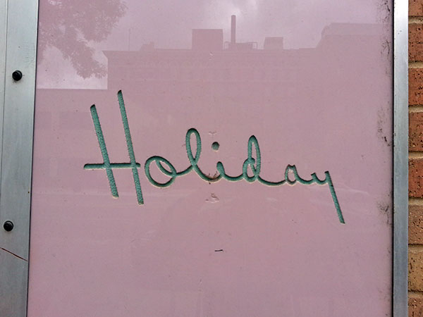
Such exuberance. Douglas Street.

Fitting sign for a sturdy, spacious, modern building. Main Street.

A study in function and typographic contrast. Wichita Public Library, Central Branch.

Such a high-minded engraving. I love how prominently the arts feature; hard to imagine a corollary image today. Framed and on display the library, in the genealogy section.

Decades of typographic whimsy. University yearbooks.
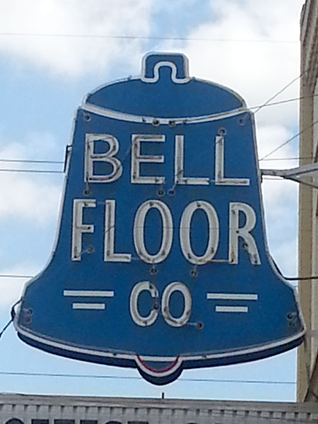
Neon sign in the Delano district. The two different sized strokes on the sides of “co” are kind of sweet.
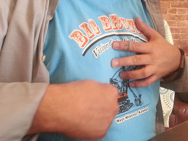
Better than Google: Sean: “Have you been to Big Brutus?” “What’s that?” (Opens shirt and explains that Big Brutus is the world’s largest power digger.)

Diner era conjuring a wood type era.

Bubble letters with drop shadow and Helvetica. The saw is indeed avocado green. And it still cuts like a beaut. Turn the wingnut to adjust the cutting depth.
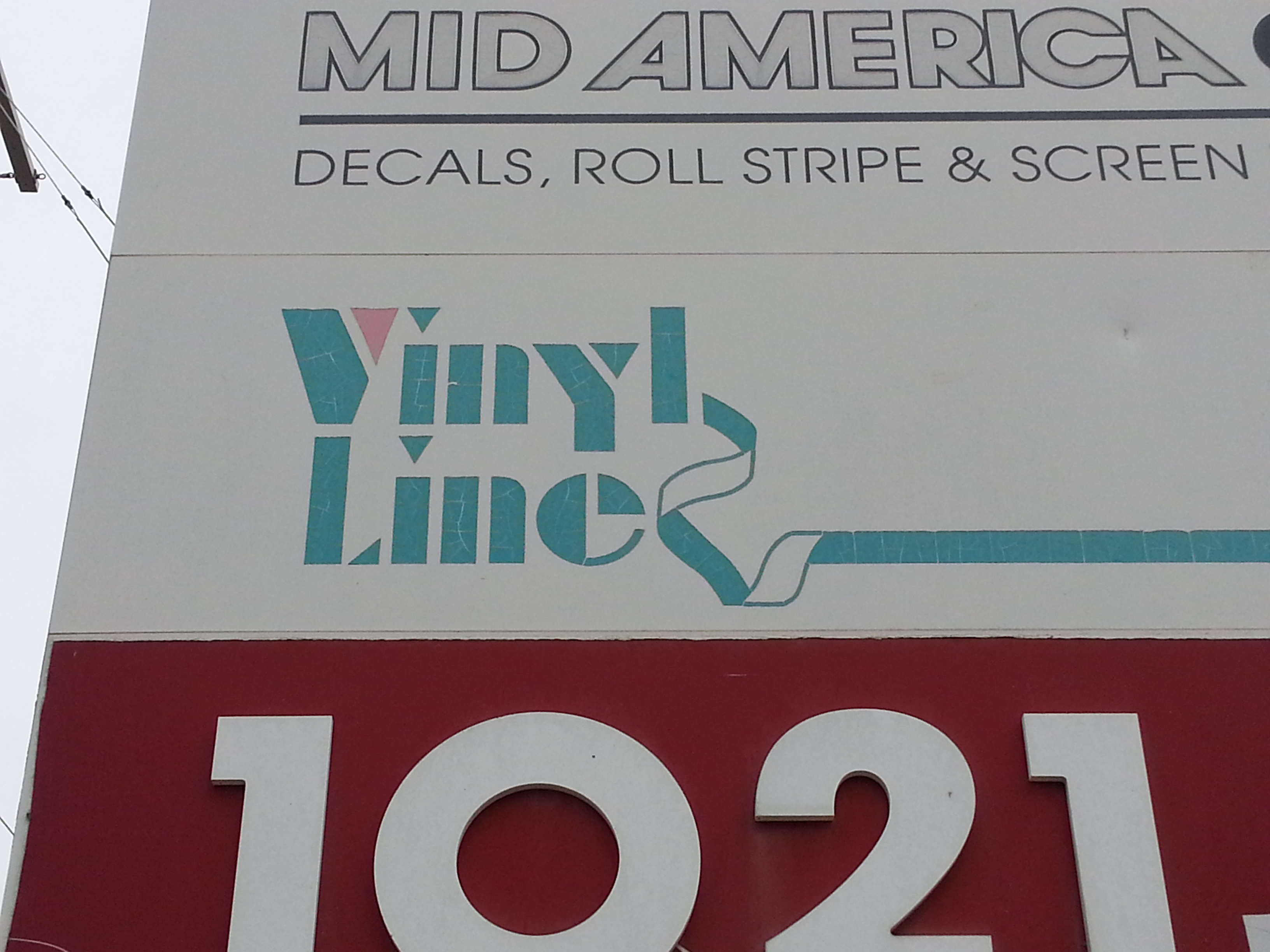
Avant Garde outline above aqua and pink stencil face with ribbon.

Get it? It’s copperplate script cast in bronze. What I do like is Kansas’ state motto: Ad astra per aspera (To the stars through difficulties).
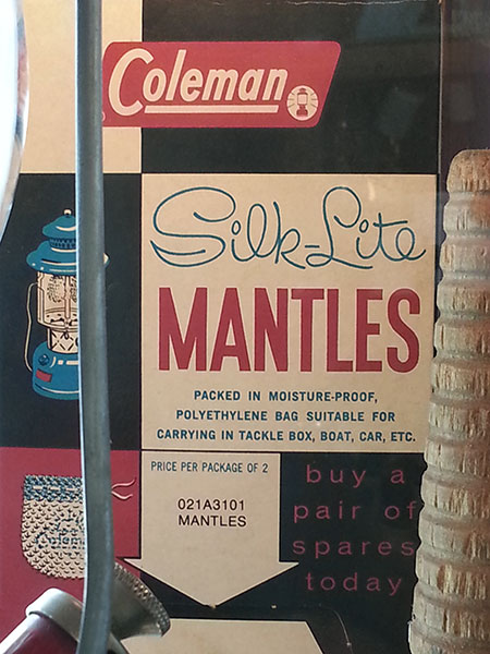
From Coleman’s museum and store. Coleman was founded and operated out of Wichita (along with many aeronautics companies, and Pizza Hut). Another period of effusive typographic contrast; this one, a heyday of illustration.

Strong City, KS. I was mostly attracted to the numbers which could be on a heavy metal album cover, but now I’m noticing the right triangle, and how it seems a bit Masonic…
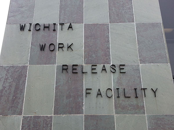
Maybe not a happy place, but someone probably made these letters, and decided how to stagger them across the checkerboard granite wall.

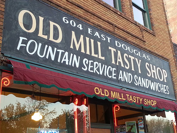
Adjacent to the Transportation Museum, on Douglas Street.
Trajan-eqsue Roman capitals over brush script, painted and re-painted? Yes, please.
