belonging

What is the Bay Area?

I’m asking the public to tell me where they feel belonging in the “nine-county Bay Area.” What does that even mean? 

There’s a paradox in studying belonging while excluding people outside of the nine counties. Yet, there has to be some parameters, and the nine-county definition is a commonly-used one.

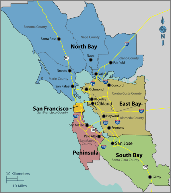
682px-Bayarea_map

Map of the nine-county Bay Area. Source: Wikipedia // Wikimedia Commons.

I would like this project to be as inclusive and diverse as possible. I aim to achieve geographic diversity within the nine counties. When I was stressing out about this, Haas Arts & Cultural Strategy Coordinator (and artist) Evan Bissell wisely reminded me that no matter how many contributors participate, I can’t possibly be comprehensive in this limited art project.

Here’s my reality check:

“These nine counties include 101 cities, 7.4 million inhabitants and approximately 7,000 square miles of land.”

—Metropolitan Transportation Commission website

The nine counties cover a lot of area

It’s a little intimidating to realize how large this undertaking is when you realize the nine counties’ vastness.

The nine-county Bay Area is larger than Delaware (1,949 square miles) and Connecticut (4,842 square miles) combined.

It’s almost as large as New Jersey (7,354 square miles).

Another way to think of it is if you imagine the municipal organizations that manage transit or air quality in the region, and how many people and levels of staff are needed to assess the area.


A lot of people live here

If the nine counties formed a state, it’d rank 13th most populous below Virginia (8.4 M), and above Washington state (7.2) (Wikipedia).

The nine counties are more populous than the eight least populous states combined.

In fact, more people live in the city of San José (1.035 M) than the five least populous states (South Dakota, North Dakota, Alaska, Vermont, and Wyoming). More people live in San Francisco than South Dakota. More people live in Oakland and Berkeley combined than in Vermont.


I’m mostly familiar with population-dense areas

When I look at the nine-county map, I’m struck by how many outer regions I’m unfamiliar with.

Though I’ve lived in the North Bay, East Bay, and peninsula over 30 years, I don’t know much about Sonoma, Napa, and Solano counties north of Santa Rosa, Napa, and Vallejo. Same with Alameda County east of the regional parks, and the peninsula west of 280. Nor have I ventured often south of San Jose, yet a vast expanse of Santa Clara County extends southward.

This map of population density shows generally less people living in these regions:

wherewelivenow-700x1062

Map: “Where we live now — 2010 household density and priority development areas” produced by Darin Jensen, Madeleine Theriault and Mike Jones of the CAGE (Cartography and GIS Education) Lab at U.C. Berkeley’s Department of Geography, and by Thomas Guffey and Michael Stoll of the Public Press. // Source: sfpublicpress.org.


How Areas and Population Compare

To put this in perspective, I did a quick-and-dirty comparison of percentage of square miles versus percentage of population. The colors correspond to the five subregions in the first map of the nine-county Bay Area.

nine-county-bay-area-area-population-comparisons-01a-1200x289

Comparison of percentages of area and population in the nine-county Bay Area.

While 61% of the square mileage of the nine counties falls in the North Bay (Marin, Sonoma, Napa and Solano Counties), only 18% of the population lives there.

About 25% of residents call Santa Clara County home, which covers only 10% in area. And 37% of people live in East Bay (Contra Costa and Alameda Counties), though it constitutes 20% of the square mileage.


Density and San Francisco, Oakland, and San José

I know that many cultural resources are concentrated in San Francisco, Oakland, and Berkeley. I’ve been making an extra effort to reach people outside of those cities.

Though San Francisco, Oakland, and San José make up only 3% of the square mileage, one in five people in the nine counties live in those three cities.

What this means to me is that my outreach efforts to the suburbs and exurbs are worthwhile, but I shouldn’t be surprised if SF, Oakland, and San Jose are well-represented (if not overly represented due to network effects).

There’s roughly equal numbers of people living in the entire North Bay as there are in San Francisco, Oakland, and San José. But I’m not sure how to conduct a comparable amount of outreach in the North Bay, which is 21X the area of the three major cities.


More info

For a friendly 8-minute intro to the nine-county designation, listen to KQED’s Bay Curious episode, “How Do You Define the ‘Bay Area’?

Find more maps in “Where Exactly Is “the Bay Area” by Egon Terplan and Sarah Jo Szambelan (June 19, 2018) on SPUR.org. 


See all Belonging Project posts.

Standard
Impressions

Points of Reference: Embodied Memory

Recent notes on memory, navigation, and embodiment.

I love thinking about embodied cognition (how our mental life is shaped by the physical roots of experience). Recently, a spate of articles has me thinking about where memory lives in the brain, and how the body moving through space is tied to recollection. It’s interesting to consider what impressions you’re embedding physically or mentally. Maybe you’re an art viewer noticing how your eye “moves” through a picture. Or, you’re an art handler “walking through” an exhibition design in SketchUp. Perhaps, you’re an artist envisioning how people interact with an installation or your participatory artworks. I wonder about the many ways in which aesthetic experience is one of navigation, envisioning, recording, and recall.


Through the DOT's Adopt-a-Highway program, artist Katarina Jerinic utilizes a parcel next to the Brooklyn Queens Expressway as land art for site-specific interventions. Katarina Jerinic, PSA for Passers-by #2 (video still), 2014, digital video, 57 seconds. // Source: KatarinaJerinic.com // HT: The Center for Book Arts' Map as Metaphor lecture series.

Through the DOT’s Adopt-a-Highway program, artist Katarina Jerinic utilizes a parcel next to the Brooklyn Queens Expressway as land art for site-specific interventions. Katarina Jerinic, PSA for Passers-by #2 (video still), 2014, digital video, 57 seconds. // Source: KatarinaJerinic.com // HT: The Center for Book Arts’ Map as Metaphor lecture series.


Kim Tingley’s “The Secret of the Wave Pilots” (NY Times, March 17, 2016) is a fascinating look at a Marshallese form of seafaring using knowledge of waves only. She writes beautifully about the neurological and social ties between memory and navigation, as well as the fascinating history of the Marshall Islands. I highly recommend the entire article. My favorite passages to think about for art practice follow.

On how we know where we are in space, and how that shapes who we are and our social relationships:

“[Psychologist Edward] Tolman hypothesized that humans have cognitive maps…, and that they are not just spatial but social. ‘Broad cognitive maps,’ he posited, lead to empathy, while narrow ones lead to ‘‘dangerous hates of outsiders,’ ranging from ‘discrimination against minorities to world conflagrations.’ Indeed, anthropologists today, especially those working in the Western Pacific, are increasingly aware of the potential ways in which people’s physical environment — and how they habitually move through it — may shape their social relationships and how those ties may in turn influence their orienteering.”

“…our ability to navigate is inextricably tied not just to our ability to remember the past but also to learning, decision-making, imagining and planning for the future.”

Though journey and destination can be clichéd metaphors (not to mention signposts, road maps, off the beaten track, forge your own path), what Tingley seems to suggest is that these are fundamentally human concepts. It’s part of our evolutionary legacy to think and understand in terms of physical journeys, because we each have this kind of brain in this kind of bipedal body.

On the connections between mapping and memory:

The cognitive map is now understood to have its own physical location, … in the limbic system, an evolutionarily primitive region largely responsible for our emotional lives — specifically, within the hippocampus, an area where memories form. … [neuroscientists] found that our brains overlay our surroundings with a pattern of triangles. Any time we reach an apex of one, a ‘grid cell’ … delineates our position relative to the rest of the matrix… [an] ‘inner GPS’ that constantly and subconsciously computes location….”

“…a new unified theory of the hippocampus [imagines] it not as a repository for disparate memories and directions but as a constructor of scenes that incorporate both. (Try to recall a moment from your past or picture a future one without visualizing yourself in the physical space where that moment happens.)”

I’m always amazed by the peculiar concreteness of dreamed environments: the fully rendered qualities of light, the verisimilitude of prioperception. How awesome that this takes dozens of AI specialists and servers to re-create, and yet our brains achieve this when we’re literally not even thinking about it.

Exploring the world through our bodies is the root of imagination and creativity:

“[Others] hypothesized that our ability to time-travel mentally evolved directly from our ability to travel in the physical world, and that the mental processes that make navigation possible are also the ones that allow us to tell a story. ‘In the same way that an infinite number of paths can connect the origin and endpoint of a journey,’ Edvard Moser and another co-author wrote in a 2013 paper, ‘a recalled story can be told in many ways, connecting the beginning and the end through innumerable variations.’”

Nobutaka Aozaki, From Here to There, 2012–ongoing, questions, various pens and paper, 10' x 3' 2" / dimensions variable. // Source: NobutakaAozaki.com

A series of hand-drawn maps made by strangers upon request of the artist, who posed as a tourist and refused directions via app. The installation approximates a map of Manhattan. Nobutaka Aozaki, From Here to There (image as of June 15, 2012), 2012–ongoing, questions, various pens and paper, 10′ x 3′ 2″ / dimensions variable. // Source: NobutakaAozaki.com // HT: Nobu is a fellow Center for Book Arts 2016 resident

“…people who use GPS, when given a pen and paper, draw less-precise maps of the areas they travel through and remember fewer details about the landmarks they pass; paradoxically, this seems to be because they make fewer mistakes getting to where they’re going. Being lost … has one obvious benefit: the chance to learn about the wider world and reframe your perspective.”

That’s a good reminder: Be where you are. Don’t worry about the fastest route. Learn about your environment and build up your mental map.

The same can be said about the creative process. I need reminders to stop over-valuing productivity, and to experiment in the studio. This is partly my nature, and partly not—as Barnaby Drabble points out, “the increasing application of time and resource management methods to our personal lives”* is symptomatic of larger forces like neoliberalism, and the conditions of immaterial labor, etc.

Furthering the connection between exploring space and imagination:

“All maps are but representations of reality: They render the physical world in symbols and highlight important relationships … that are invisible to the naked eye. If storytelling, the way we structure and make meaning from the events of our lives, arose from navigating, so, too, is the practice of navigation inherently bound up with storytelling, in all its subjectivity.”**

Maps are subjective, and could be more transparently so.

“Many of our [mapping studios] students began the semester enamored with the sublime, totalizing visions afforded by exhaustive data-sets and sleek visualizations. Yet by the end, nearly everyone’s mission and values shifted – from a pursuit of ‘accuracy’ and ‘exhaustiveness,’ to an interest in the personal and the partial, the subjective and the speculative. They sought to find ways to express ambiguity, to insert cartographic ‘buts,’ ‘ifs,’ ‘howevers,’ and other qualifying statements to convey the ‘interpretative nature of the mapping process.'”

—from Shannon Mattern’s excellent slide lecture at Maps as Metaphor at the Center for Book Arts. It’s posted online on her equally excellent blog, Words in Space.


These subjectivities can work for us. Memory palaces, for example, exploit the connection between memory and environments. It’s a memorization technique of:

“associating the ideas or objects to be memorized with memorable scenes imagined to be at well-known locations (‘loci’), like one’s house (‘palace’)”

Austin Frakt’s “An Ancient and Proven Way to Improve Memorization; Go Ahead and Try it,” (NY Times, March 24, 2016).

I’m most fascinated by how the physical and conceptual interact and influence each other. How we walk the earth shapes our cognitive metaphors, and they imbue the memories that inform our identities. At the same time, we use mental powers to traverse real and imagined spaces, even constructing new spaces to expand our abilities. These interactions blur the boundaries of what is permanent and real:

“[Es Devlin, set designer,] is an architect of temporary space, making images that can survive only in the minds of the people who see her shows. ‘I do all this work and nothing physical remains,’ she told me. ‘So what I’m really designing are mental structures, as opposed to physical ones. Memories are solid, and that’s what I’m trying to build.’”

Andrew O’Hagan, “Imaginary Spaces: Es Devlin and the psychology of the stage,”New Yorker Magazine, March 28, 2016

This resonants with the core of why I’m an artist. I make objects and exhibit them for a few weeks at a time. While a small portion exists in people’s homes, most are squirreled away or no longer exist. I continue to make objects because I believe that  art experiences “live” on as viewers’ memories of firsthand, physical experiences (and secondhand, virtual images on the Web). This speaks to my immense faith in the power of aesthetic experience—a process of viewing, thinking, and feeling—to enrich human experience.

—–

*Barnaby Drabble, “On De-Organisation” in Self-Organized, edited by Stine Hebert & Ann Szefer Karlsen, London: Open Editions / Bergen: Hordaland Art Centre, 2013

**Digression: Here’s an example of how much place and memory are tied. Brandon Brown’s “Limited Access: Art and Gentrification in the Mission” (Art in America, March 30, 2015) mentions Artist’s Television Access and The Lab, two venerable alternative art organizations a few blocks apart in San Francisco. Reading his descriptions of places—even on a small screen, in a noisy gym—flooded me with memories: my first visit to ATA, as a high school student at a Sick ‘n Twisted shorts fest; trading sketchbooks with Erik Drooker at Muddy Waters, where he drew speech bubbles making fun of my slang; as a young art student, viewing Barry McGee’s mural in the labor building; the time I was on a panel with Boots Riley at ATA (and I think Chicken John?) that got hijacked; the doc on Humboldt County tree-sitters; the palpable discomfort of a friend from out-of-town when we met him at 16th and Mission to eat at Taqueria Cancún; Intersection, and how often I’d run into Kevin Chen right in front of the building, day or night, wearing yellow glasses and having a smoke… What makes a space a place are the meanings assigned to it. Personal experiences—pleasant or not, juvenile or formative—are part of what makes San Francisco’s transformation potent.
Standard
Values

Book Idea: Seven Days in the Art Underworld

Reading Sarah Thornton’s Seven Days in the Art World* makes me want to read about who’s stories aren’t being told.

I’m enjoying Thornton’s stylized writing and insight into major institutions, but a few quotes hit a nerve with me:

Gallerist Jeff Poe:

“Takashi [Murakami] worked so hard on this painting that several staff quit.”

(What’s wrong with this sentence? What are the implications of making “Takashi” a metonym for a vertically-integrated art production empire?)

Artist Phil Collins, while a Turner Prize nominee:

“…the commercial art world … is there anywhere you could possibly feel smaller?”

(If Collins, who has significant recognition, can made to feel small in the art world, what are the psychological effects for everyone else with less power?)

In response, I envision a restorative book to tell the stories of marginalized figures in the art world, make their invisible labor visible, and reveal the fullness of their humanity denied in their roles propping up the art world, its power dynamics, ethics, and etiquette. Here goes:

Profiles would shadow subjects at their day jobs, as well as in their commutes, homes, their own art studios, and communities.

In general, I’d like to know: What is it that they do? How do you explain what you do to non-art people? What attracts about this job? What are the disadvantages of this job? How does it rank against other jobs? What are the physical tolls? The psychological or emotional ones? How much security does it offer? Where do you see yourself in 20 years? How does this job lend you power/insight/connection/meaning, or not? What is the value of interfacing with the art world in this way? Do you see yourself as part of the art world? What are your contributions? Are they adequately recognized? Does your family and community/communities participate in the art world; how, why, or why not? Ideally how would you like to participate in an art world? In the world at large?

The seven chapters would profile:

  1. Gallery Interns/Sitters: Young art students, their debt and their privilege, what they are learning in exchange for their unpaid labor—explicitly, and implicitly.
  2. Museum Guards & Custodians: Profile two or three at different museums, unionized and non-unionized. Who are they are as a group? How do they interpret the art or interact with artists? What they would recommend about museum policies and practices, such as admission, curation, engagement?
  3. Museum Preparators: Expose what they do. What the risks are, and how the hierarchies in museums work, and what is the gender distribution. How many are artists/musicians?
  4. Artist’s Assistants: Including former assistants who’ve walked off the job, and a survey of Murakami/Koons alum for example.
  5. Fabricators: What type of skills are required, how they feel about producing artists’ work, how they became fabricators, assuming that many went to art school for their own practices.
  6. Art Handlers: On a truck, in a private home collection, service entries, bars. Profile a young upstart and an old timer. Investigate the nature of male cynicism.
  7. Museum construction crews: Who are they, where are they from, what are their working conditions, and what they will do at the end of their contract?

Also, a section of data visualizations, including CEO vs average worker type comparison charts, and maps of art-related labor migration overlaid with globalized art fair/biennial circulation.

This would clearly take a year or more in the making. It could be a standalone book, or a series of long form essays in a periodical. I don’t have this kind of capacity, but I’d love to see this in the world‚ so I encourage others to take this idea and run with it!


*Thanks for the book trade, CLF!

Standard
Research

notes on things: politically incorrect maps

This week’s Ethicist column (“Map or Menace?” by Chuck Klosterman, New York Times, July 5, 2013) offers an interesting opportunity to consider the neutrality of objects, via a vintage map of Germany in 1937 for possible display in a living room.

I would argue that the artifact itself should be neutral, yet its display is freighted with associations that are not. How much meaning is imparted by the artifact, and how much by its display?

Consider the paradox:

There’s no ethical responsibility to avoid offending people who manufacture personal meanings.

I appreciate that Klosterman acknowledges that meanings are superimposed by viewers upon objects here, echoing artist Haim Steinbach’s The Object Lesson course centered on show-and-tells of the same objects every week (The Artist’s Institute describes how students learned that “analysis hinged on their own projections and desires”).

Yet:

If you deliberately present an image that is prone to misinterpretation, you have to accept the consequences.

…perhaps presenting an opportunity to map an overlap between the home’s “symbolic ecology” (as described by psychologist Mihaly Csikszentmihalyi) and group social relations. The symbolic ecology reminds residents of who they are, what they’ve accomplished, and what they aspire to do, yet it also conveys these identities to visitors. What we own and display tells others about who we are, even from within the safety of our own domestic museums of the self.

Standard
Research

happiness is… research note #8

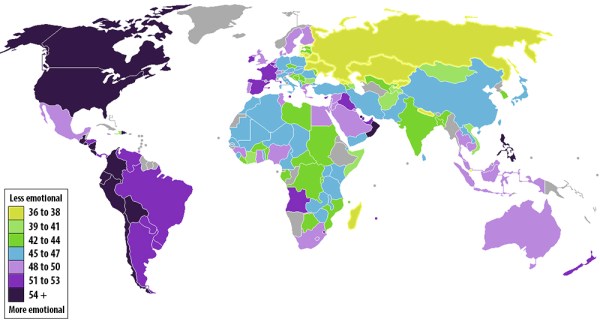
Here’s a lovely map by Max Fisher, based on new data from Gallup, from the Washington Post and brought to my attention via ET:

Emotion Map, by Max Fischer, based on Gallup data. // Source: Washington Post.

Fisher explains:

Since 2009, the Gallup polling firm has surveyed people in 150 countries and territories on, among other things, their daily emotional experience. Their survey asks five questions, meant to gauge whether the respondent felt significant positive or negative emotions the day prior to the survey. The more times that people answer “yes” to questions such as “Did you smile or laugh a lot yesterday?”, the more emotional they’re deemed to be.
Gallup has tallied up the average “yes” responses from respondents in almost every country on Earth. The results, which I’ve mapped out above, are as fascinating as they are indecipherable. The color-coded key in the map indicates the average percentage of people who answered “yes.” Dark purple countries are the most emotional, yellow the least.

Max Fisher, “A color-coded map of the world’s most and least emotional countries,” The Washington Post, November 28, 2012

The data is based on research described by Jon Clifton on Gallup’s website. The post also outlines the five questions used in the survey:

Did you feel well-rested yesterday?
Were you treated with respect all day yesterday?
Did you smile or laugh a lot yesterday?
Did you learn or do something interesting yesterday?
Did you experience the following feelings a lot of the day yesterday?
How about (enjoyment, physical pain, worry, sadness, stress, anger)?

Note that no question asks, “Are you happy?” Nor does it focus particularly on pleasure or cheerfulness, the most popular and basic associations of happiness. Instead, these questions get at more nuanced emotions and experiences explored in positive psychology—subjective well-being, enjoyment, competence, etc.

Standard
Research, Values

Off-Cuts, Part 1

In no particular order, I submit some exhibitions, passages, and ideas worth savoring. Get the stockpot ready;  offcuts are best after a low and slow simmer.

Richard Wilson’s 20:50 (1987/2012)

I’d only read about this installation involving tons of used sump oil in installation art books and on Matt’s Gallery’s website. It was a delight to stumble upon it in the Saatchi Gallery. It doesn’t look like much; but you have to be there to understand its depths (literally and figuratively).

Richard Wilson, 2050, 1987/2012. Saatchi Gallery, London.

Richard Wilson, 20:50, 1987/2012. Saatchi Gallery, London.

Sarah Bridgland’s papercut assemblages.

Sarah Bridgland, The Pier, 2012, paper, card, balsa wood, glue, thread, pencil, paint. On view in The First Cut, Manchester Art Gallery, Manchester, UK.

I loved this for the typographic exuberance, plus who can resist the miniature pennant flags? But have a look at Brigland’s site—the less figurative work is quieter yet lovely as well.

Seen at Manchester Art Gallery’s The First Cuts exhibition. A neat survey of works on paper by international artists. A lot of nature/tree/leaf and bird artworks—maybe too many.

Rob Ryan‘s paper cuts.

He works in a sweet, illustrative vein, making children’s books and gift cards. Not unlike Nikki McClure.

Rob Ryan, papercut, The First Cut, Manchester Art Gallery.

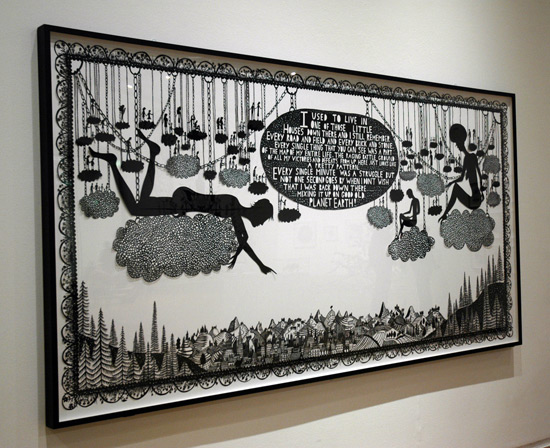
Rob Ryan, The Map of My Entire Life, framed papercut, 2012. The First Cut, Manchester Art Gallery, Manchester, UK.

VIEWER FAIL.

I had the sad experience of watching museum goers fail to engage meaningful artworks. I was able to find a silver lining—which could mean I’m an optimist, finding the positive, or maybe I’m a cynic, so low are my standards.

When a group of museum goers encountered  silhouettes by a well-regarded artist, they didn’t register the horrifying narratives of slavery, rape, mutilation and vengeance. Instead, they took photos of themselves mimicking the pose of one pair—a gentleman taking the hand of a Victorian lady. Ugh!

Though I was morally outraged, I was able to find a comforting logic: If even this artist’s work can be regarded so flippantly by “viewers” (the label seems to be an overstatement in this case), then it can happen to any artist’s work. So, if it happens to my artwork, I don’t have to take it personally. It’s not my problem.

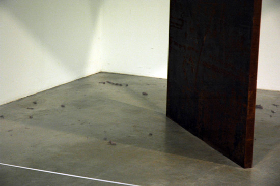
Dust bunnies under a Richard Serra sculpture at the Tate Modern. Good decision to leave it as is. Would you want to sweep under a massive sheet of steel that is not fastened to anything?

Dust bunnies under a Richard Serra sculpture at the Tate Modern. I’m glad I don’t have to sweep under gigantic, unfastened sheets of steel, and it looks like no one at TM does either.

Alfredo Jaar‘s kinetic lightbox sculpture

Brilliant. Two identical lightboxes; one hangs upside down from a motor on the ceiling. As it lowers, the room is washed with greater intensities of light, until the tables meet and seal the light inside, and the room goes dark, like a supernova, except for a fine horizon line encircling the room. A perfect Minimalist gesture, loaded with content if you consider Jaar’s interests in history, who tells it, etc.

Alfredo Jaar, Lament of the Images, 2002, motorized lightboxes. Tate Modern.

Alfredo Jaar, Lament of the Images, 2002, motorized lightboxes. Tate Modern.

Alfredo Jaar, Lament of the Images, 2002, motorized lightboxes. Tate Modern.

Alfredo Jaar, Lament of the Images, 2002, motorized lightboxes. Tate Modern.

Ewa Partum

When I think of early language and conceptual art, I think of b/w photos and videos, often of white, Western men. So learning about Partum, a female Polish artist pioneering conceptual art and feminist performance in the 1960s, is exciting. More info at tate.org.uk.

Still from Poem video documentation by Ewa Partum. Tate Modern.

Still from Poem video documentation by Ewa Partum. Tate Modern.

University of the Arts London's MA Textile Arts students' massive textile baobob.

University of the Arts London’s MA Textile Arts students’ massive textile baobob.

Yinka Shonabare had some amazing public installations (love the Fourth Plinth project!) in London, and when I saw this baobob tree covered in world textiles at the Southbank Centre, I assumed it was a work of his as well. But it’s not! It’s but MA Textile Arts students. I love it, I think it’s brilliant especially in connection with this summer’s Olympics, signaling a place for the whole world to gather.

Art Update

Really became a fan of Art Update’s booklet-format gallery guide. Each neighborhood in London had its own spread: maps right next to listings.

A spread from my well-travleed copy of Art Update: London.

A spread from my well-traveled copy of Art Update: London.

I hope I never have to open any more large maps standing in the middle of the sidewalk again. I also hope I never have to sort through gallery listings not separated by neighborhood. And I hope more gallery guides indicate locations with gallery names instead of numbers.

The Liverpool Biennial had a lovely identity, but way finding was not its best asset. Why separate the map from the listings in the brochure? Why put an arrow when a location was off the map, but omit the address? There were sandwich boards announcing that you’ve found a location, but not many signs helping you get there, or find the entrance (as much needed on the Cunard Building). I walked around Flag Exchange looking for flags or an exchange, only to see that the design-conference-y tents were the artworks… <disappointment> …I think?  <Uncertainty.> It was too cold (upper 30s, and I had only a light jacket on) for me to care <indifference>.

Cheryl Strayed

From “Tiny Beautiful Things: Advice on Life and Love from Dear Sugar” (2012):

Let whatever mysterious starlight that guided you this far guide you onward into whatever crazy beauty awaits….

Something to aspire to:

What do you do when you don’t know what to do about something?

…I attempt to analyze the situation from the perspective of my “best self”—the one that’s generous, reasonable, forgiving, loving, bighearted, and grateful. I think really hard about what I’ll wish I did a year from now…. I move towards the light, even if it’s a hard direction in which to move.

And, for artists (myself included) who think of themselves upon hearing of other artists’ successes:

You know what I do when I feel jealous? I tell myself not to feel jealous. I shut down the why not me? voice and replace it with one that says don’t be silly instead. It really is that easy. You actually do stop being an awful jealous person by stopping being an awful jealous person. When you feel terrible because someone has gotten something you want, you force yourself to remember how much you have been given. You remember that there is plenty for all of us. You remember that someone else’s success has absolutely no bearing on your own. You remember that a wonderful thing has happened to one of your … peers and maybe, if you keep working and if you get lucky, something wonderful may also someday happen to you.

And if you can’t muster that, you just stop. … There isn’t a thing to eat down in that rabbit hole of bitterness except your own desperate heart. If you let it, your jealously will devour you….

I know it’s not easy being an artist. I know the gulf between creation and commerce is so tremendously wide that it’s sometimes impossible not to feel annihilated by it. … the people who don’t give up are the people who find a way to believe in abundance rather than scarcity. They’ve taken into their hearts the idea that there is enough for all of us, that success will manifest itself in different ways for different sorts of artists, that keeping the faith is more important than cashing the check, that being genuinely happy for someone else who got something you hope to get makes you genuinely happier too.

Standard
Research

The future of the art map

Cheers to the NYTimes’s interactive team again. In “An Isle of Joy, for Art Lovers” (this week’s Special Gallery Issue), their information-dense, intuitive graphics are applied in the service of gallery-going. Maps of key NY gallery neighborhoods are loaded with icons, which, upon rollover, display a photograph and caption of a notable exhibition, along with a link to a blurb.

When there’s hundreds of galleries, each open for a few hours per day, and gallery go-ers must be selective about what shows are worth the trek. Updated, interactive exhibition maps like these would be brilliant on mobile devices — though I’d recommend the inclusion of gallery hours as well.

Standard