Tag Archives: information graphics
happiness is… research note #8
Here’s a lovely map by Max Fisher, based on new data from Gallup, from the Washington Post and brought to my attention via ET:
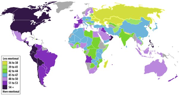
Emotion Map, by Max Fischer, based on Gallup data. // Source: Washington Post.
Fisher explains:
Since 2009, the Gallup polling firm has surveyed people in 150 countries and territories on, among other things, their daily emotional experience. Their survey asks five questions, meant to gauge whether the respondent felt significant positive or negative emotions the day prior to the survey. The more times that people answer “yes” to questions such as “Did you smile or laugh a lot yesterday?”, the more emotional they’re deemed to be.
Gallup has tallied up the average “yes” responses from respondents in almost every country on Earth. The results, which I’ve mapped out above, are as fascinating as they are indecipherable. The color-coded key in the map indicates the average percentage of people who answered “yes.” Dark purple countries are the most emotional, yellow the least.–Max Fisher, “A color-coded map of the world’s most and least emotional countries,” The Washington Post, November 28, 2012
The data is based on research described by Jon Clifton on Gallup’s website. The post also outlines the five questions used in the survey:
Did you feel well-rested yesterday?
Were you treated with respect all day yesterday?
Did you smile or laugh a lot yesterday?
Did you learn or do something interesting yesterday?
Did you experience the following feelings a lot of the day yesterday?
How about (enjoyment, physical pain, worry, sadness, stress, anger)?
Note that no question asks, “Are you happy?” Nor does it focus particularly on pleasure or cheerfulness, the most popular and basic associations of happiness. Instead, these questions get at more nuanced emotions and experiences explored in positive psychology—subjective well-being, enjoyment, competence, etc.
Happy Happy Joy Joy
A few questions about the intersection of art, design, and psychology.
Do you like your data:
[ ] Cheeky?
[ ] Data-rich?
Do you like your psychology:
[ ] Positive
[ ] Negative
[ ] Empirical
[ ] Practical
[ ] Experimental
[ ] Applied
Do you like your holiday cards:
[ ] Amusing
[ ] Informative
Do you want your ideas to:
[ ] Reinforce your brand
[ ] Enhance understanding
[ ] Enrich experience

GOOD and OPEN's Mean Happiness data visualization. April 6, 2010.

“Today I’m Feeling Turquoise,' Pentagram's holiday cards, pairing colors with moods.
Allan Sekula’s School is a Factory
. Courtesy of the artist. Photograph by Matthew Booth. Source: Gasworks' All I Can See is the Management exhibition page, gasworks.org.uk")
Allan Sekula, School is a Factory (1978-80). Courtesy of the artist. Photograph by Matthew Booth. Source: Gasworks' All I Can See is the Management exhibition page, gasworks.org.uk
When “artists” means 90% non-fine artists
Patricia Cohen reported that an NEA “Study Says Artists Have Higher Salaries” (NY Times, October 30)—in fact, claiming that the average artists’ earnings are higher than the average worker “by nearly $4,000.”
“Average” is not equivalent with “mean,” yet it would be very easy to misinterpret the headline that most artists are better paid than everyone else. Or to assume that the artists referred to are fine artists.
But the NEA’s “Artists and Arts Workers in the United States” report’s data sets (the US Census Bureau’s American Community Survey) are particular, and what it means—and what it doesn’t mean for visual artists—is quite revealing upon investigation.
First, the survey is based on those who identify primarily as artists:
To be counted as an artist, survey respondents must have identified a job within one of these 11 occupational categories as accounting for the most number of hours worked in a given week. In other words, being an artist is their “primary” job.
Many visual artists have day jobs; those who spend most of their time as teachers, curators, or art handlers would not be counted in the survey.
Second, the category “artist” is comprised of many who may not self-identify as artists.
There are 2.1 million artists in the United States.
· More than a third of those artists (39 percent, or 828,747 workers) are designers—a category that includes commercial and industrial designers, fashion designers, floral designers, graphic designers, interior designers, merchandise displayers, and set and exhibit designers.*
The idiosyncratic boundaries of inclusion is illustrated here: curators and art installers (who are often artists) are not be included, yet exhibit designers are. Almost half (49%) of respondents are in design and architecture—typically salaried occupations that are quite technical. Would the announcement that “Designers and Architects have Higher Salaries” be surprising?
How many survey respondents are visual artists? Less than 10%.
· Fine artists, art directors, and animators make up 10 percent of all artists (212,236 workers).

Whether fine artists make up 1% or 9% of survey respondents is impossible to tell. It’s even possible that, in this case, “artists” means 99% non-fine artists.
Mapping Well-Being
NYT does it again with killer infographics:
“Mapping the Nation’s Well-Being”
Three years X 100 American adults X Quality of life indicators ÷ Congressional districts.
