Art & Development

what I did today

Motor turning a piece of paper on ladder in studio = nearly a day's work.

Motor turning a piece of paper on ladder in studio

It’s not much, but this is what I have to show for today’s work in the studio.* In spite of my contemptible soldering ability, I finally got this little three-volt motor to work.

It sounds like little beast. I may regret my idea to make a kinetic light box in my bedroom window.

What I learned in the past few days: Motors are not easy to come by. I almost ordered another motor from Jameco, even though it’d ship from California to the UK, and I’d have to use an adapter b/c of the different current. Luckily, I learned about RS Components, Ltd., based in Stockport, just south of Manchester. Next-day delivery only cost £5. Sweet!

*I also wired a fluorescent fixture to be a plug-in appliance, but it’s not much to look at yet either.

Standard
Art & Development, Community, Travelogue

new manc art highlights

Islington Mill Studios; hallway.

Islington Mill Studios; hallway.

The Dilemma of Archive
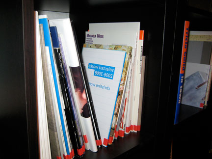
New library
Islington Mill

Islington Mill is a really cool artist-initiated studio compound with a gallery, performance venue, experimental school, and now, a new library focusing on art books. I find the whole idea of the place very grassroots, appealing and innovative.

detail of installation by Maurice Carlin

detail of installation by Maurice Carlin


detail of installation by Maurice Carlin

detail of installation by Maurice Carlin

Last night, I attended the opening of The Dilemma of Archive, a show featuring the work of Maurice Carlin and G. Leddington. The exhibition space is a disused studio — about the size of a bedroom, maybe 15×12 feet. But the modest space held a really tight grouping of four works, which were peculiar and quiet and rewarded sustained attention.

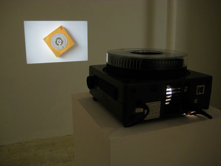
Slide show/installation by G. Leddington at Islington Mill

Slide show/installation by G. Leddington at Islington Mill

I really liked G. Leddington’s slide show of a turning carosel box, which reminded me of the work of Anne Collier and Tacita Dean. But Leddington’s accompanying works — photo prints of obscure articles, book plates and photos relating to Henri Michaux, art collector/smuggler swung the content away from the project of photography and back towards the archive.

My contribution to the new library.

My contribution to the new library.

The curatorial statement is quite smart, pointing out the paradoxes inherent in any archive — exhibitions, art collections or libraries. I really liked the high conceptual quality and grassroots venue partnered with the new library initiative. I keep telling people that Manchester is a cool city, and if they can look past the binge drinking and American-style malls, they’d see the local points of vibrance like Islington Mills.

Gregor Schneider‘s Kinderzimmer
Subversive Spaces
Whitworth Art Museum

I couldn’t be bothered to see this pitch-black, one-viewer-at-a-time installation — the wait times were always long, but today, by happenstance, I was able to get in after a brief 10-minute wait.

I won’t spoil what’s inside for those who yet to see it, but I will say this:

I found it extremely effective. It was emotional — the darkness was so complete it was terrifying, and upon exiting, my sense of relief gave way to a curious ecstasy. It was provocative and I experienced a sense of convergence between:

  • Dan Graham’s interest in the just-past
  • In Claire Bishop’s Installation Art: A Critical History (Tate 2005) darkness and the dissolution of self…
  • …and how Kinderzimmer manages to include pure phenomenology, mimesis and representation
  • how Schneider exploited the flaws in human hardware
  • how the installation achieved high aspirations in spite of the humble materials
  • grief and existential subjectivity
Standard
Art & Development, Community, Travelogue

thameside art highlights

Shadows and lights on the Queen's Walk, Thameside, London. Sorry, none of the exhibitions allowed photography. What you see is what you get.

Shadows and lights on the Queen's Walk, Thameside, London. Sorry, none of the exhibitions allowed photography. What you see is what you get.

Some highlights from my recent trip to visit museums in London. It seems like there’s never enough time in London, but I hope to make it back for galleries and more fun.

Annette Messenger
Mark Wallinger Curates The Russian Linesman
Hayward Gallery

Messenger is amazing. The exhibition makes evident how she was influential in the development of installation art. The work highly symbolic and theatrical — “a dreamscene tableaux,” as Claire Bishop might describe it — so it’s not exactly my favorite type of installation art, but I was profoundly moved nonetheless. In particular, I really liked “Articulated/Disarticulated,” (see a photo on Urban Landfill blog) a recent, room-sized installation where stuffed human and animal forms were mechanically tortured. It really captured the essence of her dichotomies — both comical and horrifying, humorous and tragic, magical and corporeal. “Casino” is a giant installation — the most phenomenological of the works on view, I think — and it’s stunning.

Wallinger curated a show that probed perception and thresholds. Artifacts are mixed in with contemporary and historical works. It’s a really perceptive show. Fred Sandback’s space delimitations looked fantastic. I knew that the rectangular outline was comprised purely of black string, not glass or some other solid surface, but I tried to bring myself to interrupt the immaterial plane and I couldn’t. Good stuff.

Wallinger’s also got some of his own work, mixed in with a series of 3-D viewfinders of historical photos. They set a high expectation for excellence for the show, and it doesn’t disappoint.

Roni Horn
Rodchenko & Popova
Tate Modern

Horn’s work is highly idiosyncratic. I’m still mulling it over — especially the strange groupings of photographs, including the signature weather/model image — but two things immediately stuck. First, of course, I enjoyed “The Opposite of White” dyad — giant, solid cast glass sculptures in transparent glass and opaque black. Two irreconcilable, but true facts: white reflects light, hence its opposite is transparency; or is its opposite that which absorbs light (black)? Second, you have to see Horn’s hermetic, strange drawings. Reproduction doesn’t do them justice. They’re extreme — a pattern is loose and gestural, pencil marks diagrammatic, and cuts and inlays mechanically precise. They’re astounding, quiet feats, really.

Rodchenko & Popova is a major survey of the dynamic output of two pre-Stalinist artists. Paintings, graphic works (pleasingly tight in pen, weirdly wonky in color crayon, of all things), letterpress publications, films, textile design, furniture, posters, 3-D constructions, photographs and did I mention motion graphics?—means that there is loads to look at and appreciate. I really ‘get’ the Constructions in Constructivism now, and formally appreciate the simple compositions of repeated lines and circles. Most of all, I came away with the sense of avant garde fearlessness, as the couple was unafraid to make clean breaks from previous art styles, even their own. They formulated many new platforms and embraced integration and service to the public.

Altermodern
Tate Britain

Nicolas Bourriaud curated this triennial of mostly British artists. Bourriaud has coined “Altermodern” to describe an in-progress theory about the globalized, interconnected epoch to follow Postmodernism. He casts the artist as “homo viator, a traveller whose passage through signs and formats reflect a contemporary experience of mobility.” When I turned my gaze from the Tate Britain’s impressive pediment towards the Thames (where it’s easy to recognize the seat of imperial power), I wondered how fully a British art institution could embrace a new, multi-polar, Zakarian world. My skepticism was corroborated, when, in Global Modernities, the coinciding symposium, Walter Mignolo labelled the theory “a Eurocentric critique of Eurocentrism.”

I think altermodern an interesting term, and it may be useful for categorizing some existing themes in art — transitional sites (e.g., Walead Beshty’s FedEx boxes, “transit-specific works” as Galleon Trade colleague Eric Estuar Reyes would put it, see video at the Whitney 2008 Biennial site) and liminal states (Spartacus Chetwynd’s beanbag installation with psychedelic performative video, or Gustav Metzger’s crystal light show — I shit you not). The triennial is sort of, well, triennial-y: giant, well-executed spectacular installations, some big names, and limited thematic connections. Here’s what stood out:

Franz Ackermann posits what seems to be a critique of immigration and national identity. (Pics on ArtNet.)

Darren Almond delivers surprising, stunning photographs as usual.

Peter Coffin‘s staged projection- and installation-based museum exhibition, where photos and videos are projected on works from museum collections, e.g., bees on a painting by Joseph Albers. A virulent strain of MJT uncanny.

Navin Rawanchaikul‘s hand-painted Indian-style movie billboard is a riot; the accompanying documentary video of interviews of Indians who’ve relocated to Thailand seems pedestrian and conventional by comparison.

Bob and Roberta Smith create a “junk space” (as identified by Irit Rogoff, the consequences of global modernity) littered with disused stuff and the characteristically ironically upbeat-but-sad-sack enamel signs. One, “I wish I could have voted for Barack Obama,” (pic on ArtNet) is paired with a colorful plastic tricycle, highlighting the wishful thoughts of Britons. Smith pointed out that the exhibition is meant to be interrogative, but I think it’s pretty cool to have an explicitly didactic space within it via his signs. Extra points to Mr. Smith for avoiding the common UK mispronunciation of Barack (“BER-rick,” as opposed to “Buh-RAWK).

Simon Starling illustrates his brilliant reduction of forms with a series of desks commissioned by emailing low-resolution photographs to furniture makers. There’s more to it, of course, having to do with Francis Bacon and others, but the gesture is pure poetry.

Tate-to-Tate ferry
Brilliant, easy, scenic, affordable. You know, art institutions usually have short hours, so minimized travel during open hours is appreciated. Also, “Tate-to-Tate” is a nice sounding phrase, like a mirror, and also reminds me of the 1980s TV show, “Hart to Hart.”

Reconnecting with Mediha

This quote.
As an existentialist, I tend to agonize about my art/legacy/life becoming fodder for “the dustbin of history,” so it was surprising to hear the ever-optimistic M.D. say: “The great thing about history is that things disappear” in regards to the dominating influence of Conceptualism and Minimalism in contemporary art today.

Standard
Art & Development

Art and Recession: Outlooks

Following Holland Cotter’s “The Boom is Over. Long Live Art!” (NYTimes.com, February 12, 2009), several more articles on the intersection of art and recession have cropped up.

Overly-optimistic authors suggest that a recession can be good for art and creativity.

In “Creative buds can bloom in a recession,” (Sydney Morning Herald, March 16, 2009), Marcus Westbury reiterates one of Cotter’s vague predictions:

[In a recession, artists] can daydream and concentrate. They can make nothing for a while, or make something and make it wrong, and fail in peace, and start again. (Cotter)

Higher levels of unemployment can mean that talent has more time to experiment and innovate… (Westbury)

I don’t know how other people feel about being unemployed, but I find being on a tight budget oppressive, not liberating. While I might have once romanticized Dumpster-diving as a rejection of over-consumption in my youth, I no longer idealize the “poetry of poverty” (author Marlon James on Studio 360), or subsidizing my practice with credit card debt.

So it grates, because when unemployment figures for the general public rise, politicians, the media and the public are obsessed with the stress, risk and instability. But these writers suggest that artists enjoy a magical, innate virtue that transforms penury into dreamy studio lives, with few consequences — financial, professional or personal — to pay.

In “Getting creative to survive” (Philadelphia Inquirer, March 4, 2009), Melanie Cox McCluskey wrote about creative agencies:

Being inventive comes in handy in a bad economy, and creative people are finding solutions to sluggish times. They are taking on every project that comes along.

Wrong! For a creative agency to accept every job that comes through the door — even if the client or project is a bad fit for the agency — is not being creative. It’s being desperate and financially conservative.

I think these authors are overestimating the power of creative traits like flexibility and spontaneity. As Philip Zimbardo and John Boyd explain in “The Time Paradox” (Rider, 2008), these traits are helpful in art-making, but they are present-oriented. And too much present-orientation can lead to imbalance and unhappiness:

In a society that is politically and economically unstable, you cannot predict the future from the vantage of the present…. Political and economic instability also causes instability within families…. The less people can rely on the promises of government, institutions, and families, the more they eschew the future and focus on the present, creating a world of yes and no, black and white, is and is not, rather than one filled with maybes, contingencies, and probabilities.

Zimbardo and Boyd advocate a more balanced time-perspective, which includes healthy past- and future-orientation. Planning for the future is related to hope, ambition, health, well-being and a sense of personal efficacy.

I think these realist writers, who argue that artist’s already-fragile positions become more vulnerable in a recession, would agree.

Charles Fleming, “For artists, the picture is bleak.” Los Angeles Times. March 10, 2009.

Matthew Shaer. “Artists in survival mode as market crumbles.” Christian Science Monitor. March 13, 2009.

Despite their optimism, it seems like Cotter, Westbury and McClusky believe that artists belong at society’s margins, where they can happily make work in spite of dire economic circumstances.

I differ.

Instead of encouraging artists to espouse scarcity and self-sacrifice from the margins, I’d rather see artists expressing leadership and generosity from the center. Professionalizing and de-marginalizing artists inspires good ethics, values, and sense of agency.

Standard
Art & Development, Citizenship

Shepard Fairy v. the Associated Press v. Mannie Garcia

The lawsuits over the Obama “Hope” poster questions fair use, what constitutes art, and ethics in commercial art (NYTimes.com article). Embroiled are arguably the world’s most famous semi-legal street artist, a previously under-the-radar freelance photographer, and one of America’s most trusted wire services.

WHYY’s Fresh Air attempted to present all sides of the story. Host Terry Gross interviewed Shepard Fairey, the poster artist; Mannie Garcia, the freelance photographer; and a lawyer on fair use. She also read a statement from the Associated Press.

As an artist, I am all for Fair Use and artistic appropriation. I think Fairey’s pre-emptive lawsuit against the A.P. is motivated primarily by self-interest, but he might also harbor a sense of duty and morality — he seems to recognize that few artists enjoy his enviable capacity to fight the A.P.

On the other hand, as a freelancer, I sympathize with the photographer’s right to be credited and compensated accordingly.

I don’t, however, feel for the A.P. Bullying Fairey, disputing their own freelancer*, and sending Fresh Air a statement instead of a representative (what kind of media company avoids other media outlets?) scream, “Evil corporation” to me.

[*Garcia and the A.P. are in a dispute over ownership of the photograph — Garcia claims he was a freelancer and so he owns the copyright; the A.P. maintains that Garcia was in their employ (a good reminder for freelancers to always insist on contracts).]

I’m indifferent to Fairey’s art, but I’m siding with his right to fair use in this case. I see the poster as a new work of graphic art in Fairey’s trademark stylized iconography. Garcia may deserve credit for the source photo, but the case for remuneration seems weak. It would have been polite for Fairey to ask, but I think it would be ridiculous for him to have to license the photo, because he isn’t reprinting or modifying the photo, but using it as a reference to create a transformed visual. If anything, Garcia’s photo has probably appreciated (it’s included in an exhibition at the National Portrait Gallery, and prints are available at Danziger Gallery, NYC) because of Fairey’s appropriation.

Illustrators have always used photographic reference materials. In the olden days, they kept file cabinets called “morgues” full of reference photos, clipped from every imaginable (and probably copyrighted) source. Google Images acts as a giant, searchable “morgue.” It’s a bane and a boon to illustration: it’s the largest, most accessible “morgue” illustrators have ever accessed, and it’s one more nail in the coffin of the industry.

One thing hasn’t changed: Fair Use allows for artists to appropriate existing images if the image is adequately transformed.

I reject the idea that digital processes are inherently less skilled or valid forms of transformation than manual drawing. Those old-tyme illustrators may not have had computers, but that doesn’t mean they didn’t have copying tools, like camera lucidas, tracing paper and light boxes. Drawing plot points over an photo onscreen is not much different than outlining a photo on tracing paper — both require technical skill, artistic decision-making, and manual dexterity (as anyone who’s tried a Bezier tool or Wacom tablet for the first time would agree).

For better or worse, Warhol and Winston Smith lend Fairey more artistic legitimacy. I think appropriation will never seem as subversive as it was during the emergence of Pop Art, but this imbroglio shows that fair use needs to be better understood by all content makers and borrowers. Democracy isn’t the eradication of difference, but the ongoing negotiations between parties to resolve their conflicts.

Standard
Art & Development

Sharon Kivland and the Whitworth’s Tuesday Talks

Britain and France-based artist Sharon Kivland spoke at the Whitworth Art Gallery’s Tuesday Talk lecture series today. She’s is a fierce intellect and flawless speaker with broad experiences to draw from as a researcher, curator and artist. Her practice is deep and vast, spanning psychoanalysis, language, typography and French revolutionary history. She characterizes her practice as one of precision, intellectual pretensions, and irony.

I really like Sharon Kivland’s Mon Abecedaire, a series of handkerchiefs embroidered with an alphabet of the artist’s personal flaws. The artist’s statement is really great too — light exposition conveying loads of irony. For pics and the statement, visit sharonkivland.com, click on exhibitions and scroll down.

I found Kivland’s broad experience and lecturing skill impressive and intimidating. Combined with other factors (low proportion of men in attendance, the fact that Kivland is the only female lecturer in the five-part series, and my observations of the local MA programs who’ve visited my studio — overwhelmingly female with only one or two men (sometimes including the TA), per class of 10+ students), I left with a nagging feeling about how much harder women have to work to gain respect and opportunities in the art world.

Standard
Art & Development, Research

artists talking about their own art

My appreciation for artists who talk about their practices with enthusiasm and curiosity, and are able to articulate their references and ideas, only intensifies. Last Tuesday, I heard the Scottish artist, Dave Sherry, present his work at the Tuesday Talks series at the Whitworth Gallery. Before his lecture, I poked around Sherry’s web site a little. The performances seemed so inconsequential, and drawings and documentation so haphazard, I was skeptical. Is this just another (white) jokey Conceptualist skating by on a boy-genius aura?, I thought. Fortunately, Sherry gave a great talk, interspersing images of his own work with historical reference points that lent his slight gestures the credibility of an established lineage, which includes Ceal Floyer, David Hammons, Bruce Nauman and Martin Creed. Sherry’s talk was well organized and extensive. He also went above the call of duty and conducted a live performance. It was short (maybe 5 minutes?) but with its Beckett-influenced repetition and absurdity, it demonstrated Sherry’s physical mastery and endurance. Learn more about Sherry at his site. I’m especially partial to “Looking through Tom Cruise’s Eyes” (2005) (rollover the thumbnails).

I’m also really impressed with Joseph Kosuth’s Meet the Artists lecture at the Hirshhorn Museum (mp4). Many artists present their work with only rote descriptions (“This slide is of a project I did in 1988”). Descriptions are often necessary, but without a narrative to stitch it together, the lecture can become soulless and awful. Kosuth, on the other hand, presented his work way of an astute art history and theory paper. It’s dense and I’d recommend it — if you can devote an hour of your full attention.

So I’m really excited to check out Verissage.TV art television.

Standard