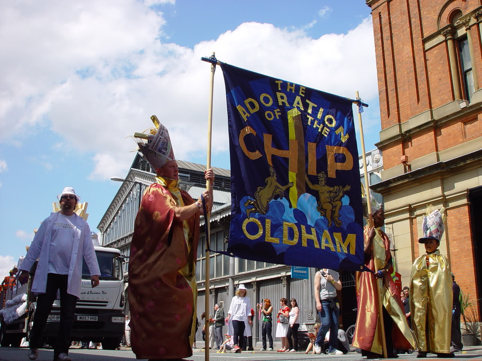
I just returned from the UK, where Chinese Arts Centre invited me to install Irrational Exuberance (Asst. Colors) in their new project space / pop-up shop. I had a fantastic trip, extended, at the last minute, by Hurricane Sandy.
I wish all those affected by the disaster a smooth, quick recovery. Cheers to first responders, volunteers, and everyday workers—like those at JFK who, by simply turning up to work despite hamstrung transportation, allow people like me to come home.
I spent a week installing the show and learning more about the art scene in Manchester. I also visited Liverpool, and spent six days in London. Here are my UK trip highlights.
—
#1 Being an artist.
Like most artists, the overlap between my practice and income is small, so increasing the amount of time I can be an artist is an ongoing process. That’s why the support of organizations like Chinese Arts Centre is so valuable—it scales up my work and exhibition opportunities. CAC shared their resources, space, talent, and time so that I could create and present my art. For that, I am unspeakably humbled and grateful.
I arrived a week ahead of the opening, and got to work right away prepping the newly remodeled space. I painted the walls and readied the space for Jon, the art technician, to help me mask and paint diagonal stripes. This exhibition design detail is important to me because it relates to a psychological study that found a correlation between upward movement and positive sentiment.

The stripey blue wall awaits art, as CAC Curator Ying Kwok and Programme and Engagement Co-ordinator Liz Wewiora make the final selections.
Cheers to Jon, Gass, and Lee, whose technical assistance was tremendous, as was their patience with English-American differences in units of measurements, names of tools and materials, etc. (FYI, Americans: If I understand correctly, joint compound, spackle, and filler area all simply known as fillers. Drywall and Sheetrock are gibberish terms to Brits. Ironmongery means hardware. Paint isn’t latex, but emulsion.)

Vinyl Posters in progress.
I also made new site-specific works—two Vinyl Posters using ribbon, thread, transparent vinyl and acrylic. They’re inspired by supermarket’s oversized sale posters, which were ubiquitous in my childhood but seem less common today.

Vinyl Poster #1 & 2, 2012, vinyl, acrylic, ribbon, thread, 36 x 45 inches each. View from the Thomas Street windows.
None of this would be possible without the vision of curator Ying Kwok, and the support of all of the staff. I’m especially grateful to the staff and volunteers for the lovely preview they hosted; I’m so honored to have been a part of it.

Opening reception of Irrational Exuberance (Asst. Colors) at Chinese Arts Centre, Manchester, UK on October 25, 2012.
The exhibition continues through February 16, 2013. More info at CAC’s exhibition page.
—
#2: Transparent democracy and the merging of art and life in Manchester.
Mike Chavez-Dawson is an artist and curator, an impresario of the contemporary art scene in Manchester, among many other things. He told me about the idea of ‘transparent democracy’ and how it shapes his practices. His art and curatorial work are integrated into his life and vice versa, and woven into the fabric of Manchester, too. For example, in addition to curating a show of propositional work by David Shrigley at Cornerhouse (through Jan. 6), he worked with Shrigley to create Shrigley’s Anti-Psychotic Brain Bread at Bakerie (with beets and ginko).

David Shrigley’s Anti-Psychotic Brain Bread at Bakerie, Northern Quarter, Manchester.
MCD’s the inaugural curator-in-residence at a cool new project space called Lionel Dobie. More on transparent democracy will be forthcoming in the form of MCD’s PhD and, surely, future exhibitions.

Drawing in the Sketch-O-Mat at Cornerhouse. Sitters drop a suggested donation of £1 for a 5-minute portrait.
MCD also let me trade off drawing with him during his Sketch-O-Matic session. The Sketch-O-Matic is like a photo booth, except an artist sits inside and makes a drawing of your likeness. It’s a brilliant idea, and I’d love to see it franchised in other places. Situated at Cornerhouse, which is really an intersection of food, drink, art, and film, the booth attracted a really wide audience. I had a lot of fun doing a public project that still allowed the privacy of a tiny studio.

My Sketch-O-Matic drawing of Mike Chavez-Dawson.

Mike Chavez-Dawson’s Sketch-O-Matic drawing of me. It’s with a digital collage of Noel Gallagher’s face.
(Plus, MCD invited David Byrne, who was in Manchester, to my preview. I’m a conceptualist, so the fact that the idea of my art has been thought, even for a millisecond, in that genius mind, is kind of an honor.)
—
#3 The Hospitality and Kindness of New Acquaintances and Old Friends
Huge thanks to Kate and Paul, muay thai buddy Mai and Danielle, and my Airbnb hosts. I’m so thankful for their hospitality in the days while I scrambled to re-schedule my flight home to NYC following Sandy.

Best sofa-surf ever: a view of the full moon (echoed by double glazing) from MW’s sunroom.
—
#4 The excellent curation of photography on in London right now.
Out of Focus: Photography
Saatchi Gallery
Partially on through Nov. 4
Maybe one of the best shows of photography I’ve seen ever. Saatchi’s perfect galleries help. But also the amount of space given over to individual artist’s projects, so that viewers get thorough looks at significant bodies of work, is really key.

Katy Grannan, Anonymous, Los Angeles, 2008, 2010, Archival pigment print on cotton rag paper mounted to plexiglass, 39 × 29 inches (99 × 74 cm) // Source: Salon94.com.
Katy Grannan‘s portraits of people in Los Angeles and San Francisco are stunning for the character of the individuals, who express aspirations of glamour and rude realities simultaneously. Shot in unforgiving sunlight, printed large, and hung on a very low centerline, every wrinkle and scar is on display. After my initial disgust wore off (if there were two empty seats on a bus, and one of them was next to one of these characters, you might opt for the other seat), I got a sense of Grannan’s sense of humanity for her subjects. It was a nice turn.

David Benjamin Sherry, Holy Holy Holy, 2009, traditional color print, 40 × 30 inches (102 × 76 cm) // Source: Salon94.com.
David Benjamin Sherry‘s lovely landscapes in color tints are majestic and somehow right, despite the unearthly color shifts.
 III 2008 Collage 10.31 x 8.46 inches // Source: Petzel.com.")
John Stezaker, Seat (Film Portrait Collage) III 2008 Collage 10.31 x 8.46 inches // Source: Petzel.com.
John Stezaker‘s collages of b/w head shots are compelling. They work, but it’s not clear why. We see two faces, then one, then two again. Other collages place non-portraits within portraits, yet the brain still seeks out facial features in the patterns. Even with dozens of photos on display, the ingeniousness doesn’t wear out.
Adam Broomberg and Oliver Chanarin‘s reprints of archived material demonstrates a keen eye, penchant for acts of omission, and attraction to social violence.
Unfortunately, the show was only partially on view, as many of the galleries had been changed over for Karl Lagerfield’s The Little Black Jacket photo show. As KD said, with the oversized portraits of models and celebrities printed with a visible halftone pattern, “It’s basically like being inside a fashion magazine.” Another room, featuring huge multi-color prints on perspex, was blatantly Warholian. Yawn.
Also on at Saatchi, Prix Pictet’s exhibition, Power (ended October 28), featured works from twelve photographers, with some very strong selections.
Seduced By Art
National Gallery
Through Jan. 20

Ori Gersht, Blow Up #1, 2007, c-print mounted to acrulic 98 x 74 1/2 x 1 3/4 inches // Source: CRGgallery.com
Seduced By Art exhibits traditional paintings alongside early and contemporary photographs that they inspired. It’s a beautifully installed exhibition, with tasteful black walls and spot lighting. The didactic texts were thankfully concise. There are a few works by photographers I recognized—Jeff Wall, Nan Goldin, Renee Dijkstra, Sam Taylor Wood—as well as many others new to me—Ori Gersht (awesome image of exploding flowers frozen with liquid nitrogen), and Helen Chadwick among others. I found it an enlightening exhibition whose premise seems obvious (unless you’re a whinging traditionalist), but whose execution is thoughtful.
Short and sweet, An Ode to Hill & Adamson is sure to charm. It’s a sped-up, making-of-a-photo video by Maisie Broadhead and Jack Cole, wherein a model and production crew re-stage a historical photo also on view in Seduced by Art. Watch it on Vimeo.
—
#5 The potent everydayness of the players of Tino Seghal’s show at Tate Modern.
I walked into the last night of Seghal’s show in the Tate’s Turbine Hall (closed Oct. 28) at just the right moment. There were clusters of people standing around. I stood among them and waited for something to happen. It was late, and already dark when I crossed Millenium Bridge to get here. I started to wonder if the performances had ended for the day.
Then, people started singing, en masse. People who I thought were the public were actually performers, while there where viewers like myself, and then members of the public just chitchatting. Soon the performers broke from their spots, and everyone began to disperse. As people passed me, I searched their faces for indications: Were they actor or viewer? It was a revelation—being in this situation created a change in me. I saw people differently; I saw their potential, and the possibilities for our interactions in a new way.
I observed as the ensemble walked in various formations, chanted statements, and made their way around the massive hall, while the lights went on and off at key junctures. I was attentive, but self-conscious, behaving in a way that says: I’m respectful of your performance, staying quiet and out of the way. There were only the walls of Turbine Hall, yet I remained behind the psychological fourth wall of the theater. Then, after the ensemble sang a composition from static positions, one of the activators walked straight up to me and, standing very closely and behaving as though we were very dear friends confiding in each other, she told me the story of her immigration and path towards finding confidence in herself. This was for an audience of one—me. I felt intensely honored to be engaged on this one-to-one level, with this larger exhibition, with this unique stranger who I might never meet again. It seemed to me a great act of generosity.
There was a statement, which I couldn’t quite remember, which seemed to be a central tenant of Seghal’s show, if not his entire purpose: that even in this technological age, the potential for humanity and human relations is great. In my words, it sounds trite, but it was enacted by such a moving, pitch-perfect ensemble that I felt like I was in a different place or time, like I was observing a super-race or our future selves, so unified and purposeful were the actions, despite the various ages and everyday appearances of the actors.
[Note: I did shoot many photos, but I decided not to include them here. These experiences and revelations are so much larger than what the work looks like; I can understand why Seghal doesn’t want his work photographed—it would reduce the gesture too much.]
—
#6 Painters of colorful texts. Two solo shows in London.
Mel Bochner: If the Colour Changes
Whitechapel Gallery
Through Dec. 30
Thank goodness for art capitals. I might have to go to London to see such an in-depth survey of a longtime New York conceptualist painter, but it’s a damn fine show and I’m glad someone organized it.
In the ground floor galleries, Bochner’s concern with the basics—texts, numbers, shapes, color, blocks and grids—is illustrated with experimental works and installations.
In the upper galleries, viewers encounter works that trace refining conceptual and textual interests.
If the Color Changes #4 (1998) features a brilliant text from Wittgenstein’s “Remarks on Color” (1950-1):
One observes in order to see what one would not see if one did not observe.
I love this text—it fuels the patience necessary for looking at art. Also, the form and content jackknife beautifully: Bochner painted this text in offset layers, so that the interactions of color provide countless opportunities for observation.
Meditation on the Theorum of Pythagorus (1974) is a surprise—it’s a series of shards of colored glass arranged on the floor in rectangles and squares, with an empty space for a right triangle.

Mel Bochner, Amazing!, 2011 oil and acrylic on canvas, two panels. Courtesy Peter Freeman // Source: nga.gov.

Mel Bochner, Oh Well, 2010, oil and acrylic on two canvases, 100 x 75 inches. Courtesy Peter Freeman Inc., New York © Mel Bochner 2011 // Source: http://jumpsuitsandteleporters.com/
Lastly, a gallery filled Bochner’s two signature styles. First, tidy lines of all-caps rounded sans serif texts, including thesaurus entries. I had much more engagement with the paintings than reproductions I’ve seen in the past. I especially resonated with a positive/negative pair, Oh Well and Amazing (both 2010) Second, colorful paintings that display their own dimensions, quite baffilingly, fill Whitechapel’s wall perfectly. I wonder if this conceptual piece is re-made for every institution that shows it? If so, it’s a brilliant, if time- and materials-intensive painting series.
Bob & Roberta Smith: The Art Party USA Comes to the UK
Hales Gallery
Through Nov. 17

Bob and Roberta Smith, The Art Party USA Comes to the UK, exhibition view, 2012, Hales Gallery, London.
Bob and Roberta Smith—a single artist that goes by the moniker of a duo—might be known primarily as a painter of signs, but there is much more (especially in contrast to the the nostalgic craft artifacts exhibited in art galleries by New Bohemian Signs-affiliated sign painters) to it. As this new show demonstrates, Bob and Roberta are even more political and topical now.

Bob and Roberta Smith, The Art Party USA Comes to the UK, detail.
Join the Art Party appeals directly towards Michael Gove, the Secretary of State for Education, to restore art education in the UK. Bob and Roberta encourages audiences to appeal to Gove as well.
The exhibition exudes cheeriness. The walls are lined with cloth pennants and several paintings. Kooky, folk-arty, figurative sculptures fill the space. Bob and Roberta appear in a sweet, educational-style video outlining the platforms of the Art Party (it’s shot in a small wooden shed capriciously labeled as an institute for contemporary art by the artist). The video is presented on a mobile screen, and viewers are offered brightly colored molded plastic chairs for seating. It evokes a schoolroom, gently nudging adult viewers to recall the art that lined their childhood classroom walls.

Bob and Roberta Smith, The Art Party USA Comes to the UK, 2012, Hales Gallery, London.
Bob and Roberta have a knack for stating truths simply: “All things are made,” he argues in the video in support of art education in UK schools. “Demand that all schools are art schools.”
The aesthetics and forms are endearing, optimistic, and winsome. It would be cloying but for the urgency of the message.
—
#7 Manchester’s growing contemporary art scene.
When I spent three months in Manchester in 2009, it seemed like a pretty good place to be an artist: cheap studio rent, active alternative and artist-run spaces, and vibrant activity via the universities. I was really inspired by artists’ mutual support.
This visit followed the Manchester Contemporary art fair weekend and coincided with the Free for Arts Festival. I also visited newer spaces Lionel Dobie Project and Malgras|Naudet.

Chris Kenny, Cultural Instructions, 2012, found text, scanned, enlarged, printed, mounted. On display in The First Cut at Manchester Art Gallery. Through Jan. 27.
I sensed more energy; indeed, momentum. MCD estimated that there are many more practicing artists now. There were three shows at three venues exhibiting the work of recent graduates (Bachelor’s degree students). (I liked the title of one, So Far, So Good.) The question that occurred to me, as more artists work to gain access to more exhibition opportunities, is to what degree with the mutual support continue, or give way to an atmosphere of competition?
Corridor8 is a new publication exposing the art scene in the NW. Issue #3 includes fascinating interviews with local leaders such as Whitworth Art Gallery Director and Manchester Art Gallery Director Dr. Maria Balshaw. Those interviews lend insight on the direction of major institutions.
One thing that seems missing, however, is critical writing on all these shows happening in Manchester. A weekly column in a paper would be too centralized and limited. Something like Art Practical, with a large, distributed base of writers comprised of artists, critics, and curators, with editorial excellence, and a fixed schedule, could do a lot to document the art scene and create more rigorous dialogue. There are plenty of very, very bright minds who can provide artists and venues with a feedback loop. They just need the right platform.
—
#8 Fallowfield Loop.
A railway line converted into a running and bicycling path through the southern part of Greater Manchester. Cool, damp, green, quiet. A place to run for miles, away from the traffic that baffles this American.
—
#9 Cheap Eats.
Currency conversion = constant sticker shock. Cheers for healthy, reasonably priced bites: This and That curry in the Northern Quarter. Sainsbury’s bag of pre-washed raw veg: green beans, mange tout (snap peas) and broccoli. Onogiri from Wasabi. Thai Pie (green curry in a English pie) from the Manchester Market in Piccadilly.
—
#10 Turner, not the one you’d think.
I went to see the Turner Prize show a the Tate Britain, which had great drawings by Paul Noble, who continues his uncanny text/architecture drawings.
But the JMW Turner show had some pleasant surprises for me.
Color and Line: Turner’s Experiments
Tate Britain
Through Spring 2013
These interpretive rooms are educational, accessible, and not overly complicated with digital gee-gaws. In fact, there weren’t any screens. There were static (!) texts, charts and some electrical displays showing the physical properties of light á la the Exploratorium. There was a suite of amazing intaglio prints that examined how Turner’s color was interpreted by printers working in etching, aquatint, and mezzotint. Spend some time with these if you can.
There was a time line which elaborated paint colors with their years of invention, and a map that showed how Turner adjusted his palette for different sites. Finally, there was a series of drawing tables, where viewers can sketch a Turner image and display their drawing. It was a wonderfully low-tech educational exhibit.
Celmins Selects Turner
and
Artist Rooms: Vija Celmins
There were two additional rooms that showed museological inventiveness: In the first, contemporary realist draughtsman Vija Celmins selected Turner’s sketches and underpaintings. It’s a really lovely, exceedingly elegant set of washes and expressions of light and weather that I think a lot of young artists would relate to today. In the second room are Celmins’ own works, always a treat in their mastery and unthinkable labor. Her drawings of starry skies are unbelievable.

Vija Celmins, Night Sky 3, 2002, Aquatint with burnishing and drypoint on paper, 37.20 x 47.10 cm // Source: NationalGalleries.org.