Art & Development

art that speaks for itself v. artist that speaks for herself

Rage is all the rage right now, particularly the populist sort.

–Geoff Nunberg, “The Ghost of Populism Walks Again, “Fresh Air” Commentary, 3/30/09 (Read the transcript or listen on NPR.org)

I prefer art that speaks for itself.

–Comment by Amateur on “Christine Wong Yap, Oakland, CA,” Artistaday.com, February 17, 2008.

To explain why artists who let the work “speak for itself” are vulnerable, Adrian Piper presents a hypothetical example of an artist whose work is misinterpreted by a critic:

The important point is that if you have not developed the tools–and guts–to correct this edgy, but mistaken, interpretation of your work…, you have effectively lost control of [your art’s] public meaning. You’ll become rich, inarticulate and misunderstood. If the systematic public misinterpretation of your artwork … worries you, then you better learn to write about it, the way art critics do, so as to correct the misunderstanding.

Once an artist has that tool in hand, she has a voice in the cycle of critical and institutional legitimation that may work to her benefit, or to her disadvantage. It may work to her artistic benefit, if her main interest is in encouraging accurate understanding of her intentions in doing the work. But for that very reason, it may work to her professional disadvantage, if her more spoiled critical fans get really excited [about their interpretations], but don’t want to hear about [her actual intentions]. An artist who publicly corrects a critic’s factual mistakes or mistaken interpretations of her work or even worse, the critic’s fuzzy thinking, bad grammar or sick personal agendas, may draw attention while she also makes a lot of enemies. So if you decide to speak up, just don’t expect to be loved. If you want to be loved, let everyone think [their own interpretations.]

Adrian Piper, “Criticizing the Critics,” keynote lecture at Frieze, 9/27/07

Standard
Art & Development, Community

the art community in manchester: all right!

I’ve had the good fortune of sharing my work and investigations with loads of local artists and curators in and around Manchester. For example, yesterday, artist and curator Paul Harfleet was nice enough to open Apartment for one last visit before it closes permanently. The Plaited Fog artist’s collective generously had me up to Preston for a chat and a curry. (Warm thanks to artist and curator Elaine Speight and Rebecca Chesney.)

People usually want to know what I think of Manchester. Invariably, I start by talking about what I’ve learned about Mancunian temperments. I try to contextualize my thoughts as observations. Still, it’s quite surreal — and perhaps a bit presumptuous — to tell people what I think of their attitudes.

While I notice the tendency to down-play enthusiasm, in all fairness I’d like to add that I’ve experienced tremendous hospitality, curiosity, and engagement here. One of the obvious best things about Manchester is its investment in culture; a less obvious (for tourists of only the briefest stays) best thing about Manchester is the local artists’ and curators’ investment in art, culture and community. The art community members I’ve met have been very generous with their time, energy, resources and knowledge, for which I’m very grateful.

Here’s a completely subjective, incomplete list of some of the amazing arts partners in Manchester:

Manchester Art Gallery
City art gallery/museum; like all civic museums in England, admission is free. And people go. Brilliant.

Chinese Arts Centre

Chinese Arts Centre

Chinese Arts Centre
Not-for-profit gallery, residency, tea shop

Urbis
Art/design/arch centre with exhibitions about the urban environment

Cornerhouse
Not-for-profit gallery/indie film house

Castlefield Gallery
Not-for-profit artist led gallery, run by the indubitable Kwong Lee. Castlefield also does TheArtGuide.co.uk, a terrific email newsletter about art events in and around Manchester.

International 3 Gallery
(Semi-)not-for-profit artist-led gallery. Feels like The Mission District.

Whitworth Art Gallery
University gallery; large exhibition space, great contemporary programming. Home of the terrific, but under-publicized, Tuesday Talks, organized by Mr Pavel Bucher.

Cube
Art/arch/design gallery

Detail from Johannes Zits' installation at 20+3 Projects

Detail from Johannes Zits' installation at 20+3 Projects

Post-opening imperial pints at Jam Street Cafe

Post-opening imperial pints at Jam Street Cafe

20+3 Projects
An artist-run gallery based in a Heidi Schaefer‘s house.

Islington Mill
Artist-led art studio compound with an experimental art school and library, and occasional exhibitions and short residencies. Also functions as a music venue. (Tomorrow, Thursday 4/16, AIR Tara Beall, will talk about her work at 6pm.)

Rogue Studios
Art studio compound with occasional exhibitions

jeremy deller procession 2009
Love love love this banner, esp given the socialist history of Manchester.

Manchester International Festival
OK, Kanye, Kraftwerk, Lou Reed, Laurie Anderson, De La Soul and the Happy Mondays might get the big headlines, but Marina Abramovic at the Whitworth, a video installation scored by Damon Albarn, and Jeremy Deller’s procession sound amazing…

Standard
Art & Development, Research, Travelogue

Mancunian slang and temperments

Mancunian Slang Adjective Flash Drawings: Stroppy, Naff, Scally, Grotty, Mardy Ink on six ready-made fluorescent yellow die-cut papers 12 x 7.5 inches each; 37 x 50 inches assembled. Produced during the Breathe Residency at Chinese Arts Centre

Mancunian Slang Adjective Flash Drawings: Stroppy, Naff, Scally, Grotty, Mardy Ink on six ready-made fluorescent yellow die-cut papers 12 x 7.5 inches each; 37 x 50 inches assembled

One of the things I’ve been researching during the Breathe Residency is Mancunian slang and temperaments. (Mancunian means of Manchester, for you Yanks). Manchester is known as a rainy post-industrial city, but I’ve found its emphasis on cultural life and development to be very forward-looking. It’s sort of like an English Detriot or Oakland–perpetually stuck between an unrecoverable past and a difficult-to-realize future, but with glimpses of hope all around.

The first thing I noticed about Manchester is the accent–broad, flat vowels, and the way words like “early” (“arr-lah”) feel flipped around to me. The next thing I noticed is the colorful slang.

I did some drawings that attempted to quantify the Mancunian temperment by taxonomizing the slang words that I heard by chance. In other words, I noticed that there were more slang words to describe displeasure, than there were to describe pleasure.

Above, an initial early version of the project. For the benefit of my fellow Americans, here’s a run-down:

Stroppy and mardy are both unpleasant characteristics, sort of irritable, uncommunicative, whiny. Many Brits are surprised that Americans don’t use the word stroppy. Maybe in an Anne of Green Gables book, but not in Oakland.

Naff means not good. Janky might be a good American corollary.

Scally means chav, a young Briton who’s adopted American hip-hop style, generally regarded as tacky, trashy, low-life. They are usually described as wearing trackie bottoms (track suit pants), flat caps (baseball hats), trainers (sneakers) and Burberry hats, though I haven’t seen any Burberry hats in Manchester. There are connotations of class, Northerner-ness (city mouse v. country mouse?), and probably racial ones, too, but I don’t know enough about it.

Grotty means dingy. It’s also used like the American slang adjective, ghetto.

Another word I heard was wanky, which is just a short way of saying like a wanker.

I only heard a few slang words that were positive:

Chuffed means enthusiastic, e.g., “I’m not too chuffed about it myself.”

As in America, Wicked means cool, e.g., “Hey, I’ve got an open studio coming up.” [Hands over a postcard.] “Wicked.” I’ve only heard it once or twice, which I attribute to a reluctance to express unbridled enthusiasm.

Sorted means sorted out, e.g., “Have you got it sorted?” or “Did you eat?” “Yeah, we went to Pizza Hut. Sorted.”

One more phrase is necessary to round out this list.

All right is the typically lukewarm, understated Mancunian way of expressing approval or appreciation. It can mean anything from OK to great. E.g., a Mancunian could enjoy an event, and describe it as “all right.”

This is in contrast with the American usage, which expresses neutrality or can even be a euphemism for bring underwhelmed, e.g., “How was ‘Marley and Me’?” “It was all right.” “Hm, didn’t really do it for you, huh?”

—–

The Manc temperment is partly explained by the Northern identity. In England, a North-South divide signifies cultural differences as well as disparate levels of prosperity and health indicators.

For those interested in learning more about the north of England, I’d recommend these starting points:

Stuart Maconie’s Pies and Prejudice: In Search of the Great North, which I blogged about before.

Time Shift – Series 8 – The North-South Divide, an interesting hour-long BBC documentary.

HearManchester.com, which I also mentioned in a previous blog

Zeitgeist, a Salford University-produced arts and entertainment TV program. Watch past episodes online.

Standard
Art & Development, News

upcoming: tech tools, open studio

dark into light christine wong yap
Dark into Light, 2008, mixed media installation: 100 night lights, par can, spot bulb, 10 x 10 x 8 feet. Swarm Gallery

Dark into Light, an installation I first showed at Swarm Gallery in Oakland, last year, will be included in Tech Tools of the Trade: Contemporary New Media Art at de Saisset Museum, April 17 – June 28, 2009.

I’ll still be here in the UK during the opening on Friday, April 17, 2009 from 7:00-9:00 pm, but that doesn’t mean you can’t be there!

It should be a great show; the other artists include Jim Campbell, Anthony Discenza, Rodney Ewing, Martha Gorzycki, Lynn Hershman, Scott Kildall, Nina Katchadourian, Andrew Kleindolph, Jill Miller, Deborah Oropallo, Alan Rath, Jackie Sumell, Stephanie Syjuco, Gail Wight.

I’m also really looking forward to the program on Wednesday, May 20, 2009 from 6:00-8:00 pm, Tactical Digital Aesthetics, an evening of art and conversation exploring new media, remediation, and cultural politics. Keynote by Johanna Drucker; roundtable by Ray Beldner, Stephanie Syjuco, Anthony Discenza, and Johanna Drucker; and moderated by Katie Vann and Kathy Aoki.

This survey exhibition features work produced by Bay Area-based or Bay Area-rooted artists using new media—defined in the context of this exhibition as electronic, digital, or web-based. Organized into accessible thematic sections, the work in this exhibition explores the ways that technology has shaped our sense of selves, our vision, our bodies, and our world. The exhibition examines our cultural fascination with technology (including our continued faith in its benefits), our myriad uses of the internet, as well as the potentially troubling applications of technology in simulation and surveillance.

While the work in the exhibition features a broad range of conceptual and artistic approaches, all of it is unified by its multidisciplinary content. As a result, the exhibition has been organized around thematic areas that highlight the works’ connections to contemporary cultural and social phenomena: Biomorph, Identity, Web Repurposing, New Light, Hope and Promise, Surveillance, and Simulation.

This exhibition is co-curated by the de Saisset Museum and SCU Assistant Professor Kathy Aoki.

Unlimited Promise, 2009, installation: foil paper, thread, light, shadow, 15 x 20 x 14 feet. Produced in the Breathe Residency at Chinese Art Centre.

Open Studio 23 – 30 April 2009
Reception: Thursday 23 April, 5.30-7.30pm

If you’re in Manchester, come to the Open Studio at Chinese Arts Centre! The reception co-incides with the preview for Ed Pien’s new installation in the Centres’ gallery.

Breathe Artist-in-Residence Christine Wong Yap, a multi-disciplinary visual artist from San Francisco, California, will open her studio to the public from April 23 – 30, 2009, with a public preview on Thursday, 23 April, 5.30-7.30 pm.

Christine Wong Yap’s art practice is an exploration of the competing pulls of optimism and pessimism. Using metaphors such as dark and light or words and meanings, Wong Yap explores the dialectical relationship between optimism and pessimism and its influence on our experience of the world. Her explorations take the form of installation, sculpture, multiples and works on paper.

Wong Yap, who has been in residence at the Chinese Arts Centre since 29 January, has immersed herself in art activity throughout the Northwest. She’s presented her work to MA students from local universities and reviewed art events and exhibitions from Barrow to Birmingham on her blog. She has also engaged in a self-directed course of study spanning British commemoratives, Roman typography, Mancunian slang and temperments, institutional signage, President Obama’s optimism, time perspectives and utopias. Her recent studio activities include text-based drawings, a installation of lights and shadows, and a light-box integrated into the Centre’s architecture. During the Open Studio, Wong Yap will share works-in-progress and release a new artist’s multiple.

Standard
Art & Development, Travelogue

State of the Art: New York at Urbis

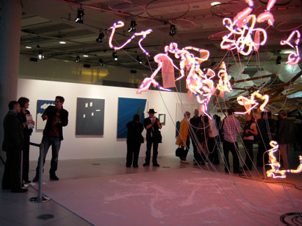
Tonight, Urbis unveiled State of the Art: New York, an exhibition featuring 16 “emerging”* contemporary artists or artists groups from New York City. The contributions are very high quality, conceptually tight and eminently desirable. With bright lights and flashing colors, the space pulsates with energy. There are videos to watch, installations to circumambulate, and opportunities for interactivity. The show inspired optimistic feelings within minutes…

Bruce

Bruce High Quality Foundation, The Rite of Spring

I noticed two themes. First, there seemed to be an attraction to work demonstrating “New York-ness.” Among the site-specific works were The Bruce High Quality Foundation’s The Rite of Spring, a series of photos and a video re-enacting the “Beaux-Arts Ball in 1931, where the giants of Modernist architecture dressed as the landmarks they created.” Think cardboard costumes and tights, like on Broadway or Conan O’Brien. Lovable, but as N.M. might say, “I get it. You’re quirky.” Another only-in-New-York project is a proposal for a thermodynamic stove powered by steam vents in the streets, by Forays (Geraldine Juarez & Adam Bobette). Of course, they cooked a hot dog. Resourceful, yes; palatable, not so much. Plus, I’m not sure that heating up a hot dog counts as “cooking.” Two other projects employ New York cultural phenomena—neighborhood gossips and hip-hop bling—but more on those later.

Gavan

Installation by Gandalf Gavan

Second, a lot of the work was explicitly post-modernist—directly referencing art and culture of the 20th century. This trend seems like it’s gone from interesting to nearly ubiquitous (and might soon verge on passé). Gandalf Gavan re-interprets Pollack’s drips in neon. He makes gestural concepts like “movement” and “energy” material, in squiggles of light and plaster splashes on the floor. It’s sort of garish and tacky, and flirts a little with corporate lobby light pieces and 1980s new wave decorating motifs. What differentiates Gavan’s work is its precariousness, matter-of-fact presentation of hardware and materials (such as the blue painter’s tape and bubble wrap), and, of course, references to aesthetic discourse.

Winter

Joe Winter’s Printershake/Earthquake, detail

Another work that seemed acutely aware of art history is Joe Winter’s Printershake/Earthquake project. It’s a new spin on action art and chance procedures in image making. He presented five prints (cyan, magenta, yellow, black, full color) and a b/w action photo of someone shaking a consumer-grade printer as it was printing. The display was straightforward, and the prints were surprising. There was also a performance by Matthew Lutz-Kinoy, whose musical, fashion and facial hair styles channeled Freddy Mercury. Why is it that when I see inscrutable performance art, I always feel like people want to re-create Soho in the 1980s?

Salas

Carolyn Salas and Adam Parker Smith, Holy Ghost

But the show wasn’t limited to these themes. When you first enter the space, your vantage is filled with a massive, spectacular fabric installation. Carolyn Salas & Adam Parker Smith’s Holy Ghost depicts a giant head of Jesus, in all its all guts and glory, in the midst of a tornado of lumber and human bones. It’s all made from fabric—even the firring strips and 2×4”s are covered in wood-grain-printed fabric—making the menacing supernatural weather event seem, conflictingly, cuddly.

LoVid's Network

LoVid, Network

Behind Holy Ghost, a digital projection of colorful static draws in viewers with its flashes and sizzles. It’s the contribution by LoVid (Tali Hinkis & Kyle Lapidus). NetWork is an interactive installation combining weaving and digital technology. By handling some fingerless-glove-like wire apparatus attached to a bird’s nest of electrical leads, participants can influence the colors and patterns of the projections. Visitors can also help weave a screen of electrical wires, to fill the space inhabited by the projection. NetWork makes high-tech low. It’s colorful and friendly, and sweetly reminds me of experimentation in the 1970s, and places like the Exploratorium. On the other hand, I found the interface to be haphazard. The instructions were singed into wood cut-outs that seemed visually, materially and conceptually incongruous. From a design standpoint, a call to action should be as clear as possible. Still, LoVid’s take on the intersection of old and new technologies is smart and pleasing.

eTeam's Second Life Dumpster

eTeam's Second Life Dumpster

A lot of people think contemporary art looks likes piles of junk, so for that reason alone, I like the pile of junk contributed by eTeam (Hajoe Moderegger & Franziska Lamprecht) in Second Life Dumpster. It’s the contents of a Dumpster in Second Life materialized with “First Life” counterparts. I had hoped the garbage from Second Life would look crappier—maybe covered in poorly rendered texture patterns, perhaps. I think there’s supposed to be a commentary about waste and obsolescence somewhere, but there’s also the irony that the objects were not disposed, but were re-purposed / recycled, at least for the duration of the exhibition. It’s sort of like tinkering with the past, and re-writing the future…

Tamy Ben-Tor does Engrish

Tamy Ben-Tor does Engrish

In her videos, Tamy Ben-Tor presents monologues as different archetypal characters (artist, art critic, etc.). My experience with them was one of uncomfortable self-consciousness, especially when she took the role of an artist with a thick Japanese accent and ridiculous glasses. The racial politics are so complicated—it’s a progressive thing, I suppose, that her range of exaggerated characters includes non-whites.

In Bonchinches / The Gossips, vignette videos by Michael Paul Britto, a series of New York women of color talk to, shout at, and mumble about off-screen passersby from a window. The framing (sorry about the pun) device is familiar and comedic, sort of Sesame Street, 227 and countless plays all at once. The actors nail the New Yorker characters spot-on, with fearsome nails, unrepentant bossiness and unveiled verbal aggression. Their loquaciousness is an art form. But I wonder about the reception of this work, and who its audience is. For New Yorkers, they may respond simply with recognition: “Yo, that’s my Tia!” But I wonder if Mancs can understand the accents and slang, and how they interpret the no-holds-barred mannerisms. Do they know that New Yorkers’ bad reputations belie some of the friendliest, nicest people in the world? That there’s more to these women than tough exteriors?

Leon Reid IV's True Yank

Leon Reid IV's True Yank

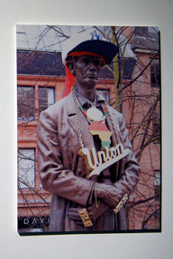
In the intervention True Yank, Leon Reid IV “blings” a statue of Lincoln in Manchester. The little-known history of the statue (having to do with the loss of tens of thousands of mill workers’ jobs due to an embargo on Southern cotton during the American Civil War) is really interesting. In comparison, the art project seems like little more than a prank, an irreverent gesture. In a video statement, the artist cited three motivations behind the work: to bring attention to the sculpture, to spark curiosity about Lincoln, and to “have a laugh.” I had expected more critical thinking—maybe around issues of appropriation, like the appropriation of hip-hop (read: black) style by white chavs? Or “bling” and materialism? Or the human costs of gold mining? Nope, just a non-committal stance behind satire…

Also in the exhibition: Kenneth Tin-Kin Hung’s completely bonkers, bombastic kitsch animations; Shelter Serra’s reduced-scale Styrofoam Hummer (see Andrew Junge’s actual-sized Styrofoam Hummer!); Graham Anderson’s formal yet cheeky paintings; Jennie C. Jones’s cassette tape obsolescence art; and Michael Schall’s meticulous drawings and prints.

*Urbis is pretty loose with this. Some of the artists are in their 40s and have quite extensive, international exhibition histories.

Standard
Art & Development, Community, Travelogue

Great Northern Art

AKA, “My Art Highlights from Birmingham, Liverpool, Stoke-on-Trent, Manchester and Leeds.”
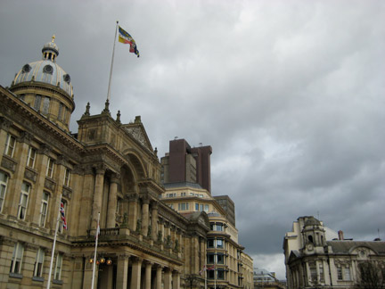
Grey clouds in Birmingham, UK

Grey clouds in Birmingham, UK

The Chinese Arts Centre offers a travel stipend for Breathe artists-in-residence to conduct research within the U.K. Earlier, I attended the Fly Eric symposium in Barrow, and the Global Modernities symposium in London. This past weekend, I, along with the good-humored traveler N.M., sought out contemporary art in Birmingham, Liverpool and Leeds. The skies were grey and misting, and clocks would not cooperate with us, but we pushed onwards and we were rewarded with some gems among these Northern industrial cities.

Birmingham & Stoke-on-Trent

I’ve heard that just as cars represent freedom to Americans, the rails are a symbol of escape for the British. I can see why: On the train to Birmingham, I found a quiet car, opened a good book, and felt that my modest expectations—passing scenery and a period of uninterrupted time to think—were all fulfilled. I was flooded with a sense of contentment.

Since I visited Annette Messenger’s exhibition at the Hayward Gallery in London, I’ve been thinking about her premise that one cannot talk about happiness without clichés. It’s a maxim I find both truthful and discouraging, so unexpected contentment, in its minor way, is somewhat miraculous.
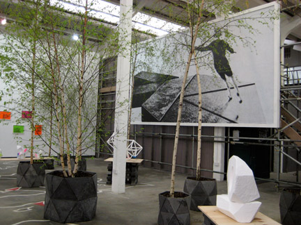
Simon and Tom Bloor's exhibition at Eastside Projects

Simon and Tom Bloor's exhibition at Eastside Projects

Contemporary art can require a sense of adventure—sometimes quite literally. On the quest for it, you will find yourself on the ‘wrong’ side of the tracks in strange cities, seeking out alternative art spaces with little to no signage, and having faith that the artwork will be cutting edge and worth the effort. Such was the case with Eastside Projects. Nestled between junkyards and auto shops, this artist-led gallery is a spacious, high-ceilinged warehouse showing top-notch contemporary projects. It’s keen on conceptualism and new media (it features a semi-permanent Lawrence Weiner text work and a large video screening room, and the office is housed in an absurdly impractical structure made by artists). The current exhibit, Simon and Tom Bloor’s “As Long As It Takes,” is visually attractive, conceptually rigorous, and cunningly specific to Birmingham. The twins present new sculptures, watercolors, drawings, a billboard and a limited edition print around the history of local modernist public sculptures. The shapes of the geometric models are strangely familiar—one recalls the structure in San Francisco’s Justin Herman Plaza. Like Aaron Curry, the Bloors use spray paint to defile Modernist purity. But a series of hand-painted watercolors, reproducing satirical newspaper cartoons complete with halftone dots, makes clear that the process of appropriation transforms the originals. Here’s what I mean: “high” modernist sculptures were parodied in a “low” editorial art from, which the Bloors re-made as “high” conceptual art. Brilliant! I really enjoyed the show, as well as Eastside Projects’ founder’s eclectic publications, including a series responding to R. Buckminster Fuller’s 40 Strategic Questions.

Armando Andrade Tudela. Untitled (Rattan 4), 2009, Rattan, metal, wood, Installation view, Ikon Gallery, 2009, Photo: Stuart Whipps
Armando Andrade Tudela. Untitled (Rattan 4), 2009, Rattan, metal, wood, Installation view, Ikon Gallery, 2009, Photo: Stuart Whipps.
Source: IKON Gallery.

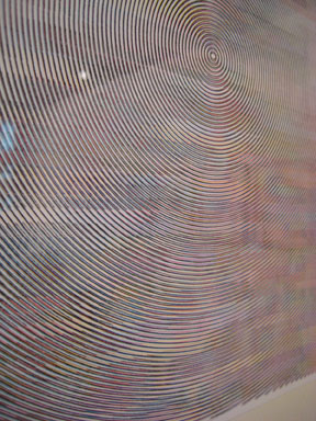
In the sunny side of town, IKON Gallery is an ICA in a converted cathedral, and it had the rare distinction (for this part of the U.K., anyway) of showing projects by three international artists. I was most impressed with the work of Armando Andrade Tudela, a Peruvian video/sculpture/installation artist. I really liked his installation involving only a sheet of survival-blanket mylar pinned to the wall by an industrial sheet of glass. It created two overlaid reflections: the glass offered a barely perceptible, but undistorted, reflection; the mylar, a picture of a fractured self. It made me think of Dan Graham’s use of sheet glass as a metonym for corporate power. This wasn’t Tudela’s expressed intention, but I noticed that other works, including walls skinned with pegboard, and woven works that were equal parts baskets and paintings, played with moiré patterns and perceptions too.

Also at the IKON, Manthia Diawara presented “Maison Tropicale,” a documentary video airing the perspectives of the former owners of Modernist prototype homes, which were later purchased by Ângela Ferreira for an exhibition at the Venice Biennale and re-sold at much higher prices. I found the story captivating, though the art and post-colonial politics were a mess, underscoring that there are no easy solutions, but an excess of guilt to go around.

Stoke-on-Trent

Richard T. Walker's   it’s hard to find you because i can’t quite see what you mean to me.  2009

Richard T. Walker's it’s hard to find you because i can’t quite see what you mean to me. 2009

Just before my residency, I was so busy I missed “Trying to Cope with Things that Aren’t Human (Part One)” at David Cunningham Projects in San Francisco. Luckily, the curator, Ian Brown, is based in this part of England, and brought the exhibition to Stoke-on-Trent’s airspace gallery. Richard T. Walker’s slide show of waving “hi” and “bye” to the sun is endearing. In the back room, two identical glass spheres are topped with polar caps that are revealed inside as icebergs.

Liverpool

Markus Hansen's Other People's Feelings, Courtesy of VirgilGallery.com
Markus Hansen’s Other People’s Feelings. Source: VirgilGallery.com

“Until it Hurts”, a four-person exhibition at Open Eye Gallery, is organized around the mutability of identity, a theme in photography that can seem exhausted or obvious. Thankfully, two particular works in the show are precise and effective. Josh Weinstein’s video, “Cross Examination” (2005), is a quirky, feel-good documentary of strangers on the streets of New York hazarding guesses about the artist based on his, how do you say, humble appearance. The responses are weird, wonderful, presumptive and sometimes rude, but the artist maintains a disarming smile throughout. The effect is that viewers learn very little about the artist (except, maybe, that he’s enormously self-composed, and his art is rather generous), and a lot about the assumptions of others. Markus Hansen‘s “Other People’s Feelings” (2000-5) sequences pairs self-portraits with headshots of others as a video. In each self-portrait, the artist mimics the other people. It’s enchanting to compare and contrast Hansen’s feat of emoting, acting and photographing.

David Osbaldeston's Your Answer is Mine, 2006. Source: MattsGallery.org
David Osbaldeston’s Your Answer is Mine, 2006. Source: MattsGallery.org

In 4×4 at the Bluecoat, David Osbaldeston presents a text-based billboard in mixed media, combining intaglio with digital reproduction, 19th century letterpress style with 21st century hand-done graphic design, and critical theory with vaguely subjective pie charts. The billboard’s lack of color, but richness of grey, is startling. Its paradoxes engage.

N.M. and I also stopped at the Tate Liverpool (Melanie Smith’s painting/video/installation in the DLA Piper show is still fantastic, as are William Blake’s bookplates) and the International Slavery Museum, which takes a frank look at how English slave traders and industrialists participated in and profited from slavery in the American South like cotton and sugar. (A U.S. National Slavery Museum, long overdue, is being constructed in Fredricksberg, VA, by the way.)

Manchester

“Small world.”

I am always surprised—though I shouldn’t be —when I come across references to the San Francisco Bay Area here in Manchester. For example, by chance, I read a book in Birmingham in which the narrator attends a lecture at CCA. And the traveling exhibition on Emory Douglas, Minister of Culture for the Black Panther Party, is now at URBIS, just a few blocks from the Chinese Arts Centre. I met Emory in Oakland years ago. I never would have put “Emory Douglas” and “Manchester” together. Luckily, someone at URBIS did. The quality of the exhibition is phenomenal, and Mancs should take note.

The whole exhibition—art, graphics, displays, historical context, and multiple voices and personalities—makes for a vibrant, thorough, interactive experience. I was happy to see lots of visitors taking their time absorbing the show, which in turns inspires shock, rage, pride, admiration, outrage, grief, and gratitude.

At Cornerhouse, I watched 24 Hour Party People, a movie about the early nineties Madchester music scene. I loved every minute of it. It’s the story of Tony Wilson—impresario, BBC personality and music promoter. He is portrayed with searing wit, a touch of madness, egomania, and an unflappably stiff upper lip. When he breaks the “fourth wall” of the film, it doesn’t make you feel like he’s over-explaining the narrative, but somehow helps to speed it up; aware, as brilliance is, of the fleeting nature of good times.

Leeds

Perhaps my art tolerance was starting to flag, but Leeds bore the brunt of a more intensely critical eye. Asta Gröting’s exhibition at Henry Moore Institute was pretty good, even if I felt mostly pushed away by the hermetic sculptures, which varied wildly from spooky kinetic hemispheres around office chairs, to brass “potatoes” in chiseled angles, to an oversized clod of earth with no discernible referent, to a silicon cast of intercourse, to a Mona Hatoum-like beaded cage. I couldn’t sew it all together; the works seemed completely discrete in form, content, concerns. The only thing I could make sense of is the fact that Gröting was a student of Joseph Beuys; this may be stereotypical, but I find some meaning in the fact of her German-ness, as I’ve felt similarly—locked out of deadly-serious Art with a sense of mirthless laughter—about Martin Kippenberger’s work too.

Keith Arnatt, from Self-Burial in 9 photographs, courtesy MediaArtNet.org
Keith Arnatt, from Self-Burial in 9 photographs. Source: MediaArtNet.org

Upstairs, the work of Keith Arnatt, an early adopter of American Minimalism, Conceptualism and Performance Art in Britain, is represented with a modest selection of black-and-white photographs, a text work, and a series of color sketches of geometric sculptures. I liked the photograph documenting a cubic hole in the earth lined with mirrors. Very simple stuff that any art student today might come up with, but at the time it was on the pulse of a movement, or two. I also liked “Self-Burial in 9 Stages,” a series of photographs documenting, well, the artist burying himself standing up, until only a patch of wavy hair is visible in the newly-turned earth. It really resonated with my recent thoughts about the dissolution of self in installations like Gregor Schneider’s Kinderzimmer (see Claire Bishop’s Installation Art, Tate, 2005), or the dissolution of the artist as in Josh Weinstein’s video at Open Eye Gallery, or the implicit denial in Chu Yun’s work (see Philip Tinari’s profile in the March Artforum, or this year’s Venice Biennale, whichever is handier). Incidentally, the trooper N.M. had a complimentary experience, engaging the drawings and passing more quickly over the photographs. Admittedly, given the chronological distance, the photos lack urgency, and while I’m usually not bothered by a gallery’s white-cube-ness, the presence of earthworks by way of only photos made the gallery seem especially sterile.

At the Leeds Art Gallery, I was intrigued by Shahin Afrassiabi’s installation, “Jalousie Gelocht, Als Blend Schultz” (2003), which is comprised of mundane objects like a television with nothing in particular onscreen, a roll of wallpaper, a table, a lamp, a funny blue geometric painting, etc. It was memorable because the TV emitted a brief, cheerful instrumental song. The pleasure was surprising, because I find that many installation artists create theatrical tableaux that rely too heavily on a “reading” of pathos to be meaningful.

I also enjoyed Angela Bulloch’s cubic sculpture, “Extra Time 8:5,” which was reminiscent of both Minimalism and sort of also a TV set. Furthering this mimesis is the fact that the single-pixel screen changed colors according to a BBC program.

Standard
Art & Development

Not So Great Northern Art

AKA, “When Poor Curation Meets Bad Design and the Idea For an Art Show”

Before I go on an art trip, I try to weed out bad venues or weak exhibitions by scanning the web. In the case of Leeds Art Gallery’s “Rank: Picturing The Social Order 1615-2009,” the social premise sounded interesting and contemporary art was promised. Plus, an art blogger slammed the show so violently my curiosity was piqued. “Rank” was duly noted on my map.

Unfortunately, I left the show quite angry, and I had to side with the foaming-at-the-mouth blogger. I think the main problem is one of identity: the exhibition was advertised on art websites and mounted at the an art gallery, but “Rank” is not an art show.

“Rank” is a discursive educational exhibit dressed as an art show. The show’s organizers seem more invested in the wall texts than discriminating curatorial decisions. They would have benefited from looking to Britain’s wealth of great natural history and science museums for inspired exhibition displays, instead of making an art exhibition of not very much art.

Instead of changing tactics, the organizers filled the gallery with faux “works”—interpretative footnotes made by contractors. These contractors’ poorly-fabricated cakes (to illustrate pie charts) made me suspect they’re not artists. If they were exhibition designers, I suspect they would have better integrated the interpretations and didactic texts (like in the text-heavy yet eye-catching displays about inventors at the Museum of Science and Industry, or the energetic money exhibit at the Manchester Museum). Instead, putting interpretive works in picture frames caused confusion. Judging by the poor resolution of data (see Edward Tufte), and the odd choices of materials, I’d wager that they’re designers. (No offense. It’s my high esteem of design that makes poor design inexcusable).

display at MOSI
Back-lit exhibit display at MOSI, Manchester.

I don’t blame the contractors, however, so much as the show’s organizers, who probably offered the contractors a budget and free rein, and not enough direction or quality control.

Why did the show’s organizers commission these non-art interpretive footnotes? To present data borrowed from academics or print sources like The Economist. To pique interest in wordy didactic texts, abusing viewers’ inclinations to seek exposition about images, and supplying instead the organizers’ postulations. The information about the work seemed secondary—or, better yet, tertiary, as it was often buried in a text following a quote. (See burying the lede.)

I don’t mean to dismiss the art by contemporary artists in the show; they never stood a chance. The show’s organizers devalued the artist’s contributions by installing the artworks alongside everything else, and not naming the artists in press materials or exhibition signage. They could have easily distinguished the art works from the non-art works. A little typographic contrast never hurt anybody.

Finally, the didactic texts were under-designed. In an art exhibition, wall labels should be quiet, so viewers can focus on the art. But in a show featuring information graphics, the wall label design could bear more visual appeal and graphics. For example, one chart that distinguished data with color lacked a key. The accompanying wall label should have included a color key; instead, the colors were explained in a block of text. What should be a holistic visual experience becomes severed and slowed. In another forehead-smacking move, four brilliant maps of global wealth were installed in a grid, but their corresponding years appeared in the wall label as a sequential list. Duh! Viewers had to guess the correspondence between maps and years. Again, a simple key would have sufficed. The researchers’ efforts—the quality of their data and cartography—are put at risk by the poor wall text.

Had “Rank”’s organizers conceived of the show for what it was—an educational exhibit, with some artworks thrown in—I think it could have avoided some of its major failures.

Standard
Art & Development

strange coincidences

Great Art + Strange Coincidences = Pretty Cool.

Strange Coincidence #1


Pavel Büchler, Eclipse, installation source

Strange Coincidence #2


Simon & Tom Bloor’s “As long as it lasts” exhibition at Eastside Projects, Birmhingham, UK. source

I came across images of “As long as it lasts”, a new exhibition by Simon & Tom Bloor at the Eastside Projects. It is an installation incorporating potted plants, birch trees, and text art. Yes!

  • One of the first things I did upon arriving for the Breathe Residency is buy a potted plant with the idea of incorporating it into an installation.
  • Christine Wong Yap, work in progress, 2009, light, potted plant. dim. var.*

    Christine Wong Yap, work in progress, 2009, light, potted plant. dim. var.*

  • The Bloor brothers’ past work includes really great text-based flyers. I’ve also been drawing little signs lately.
  • Fig. 2. Christine Wong Yap, Work in progress, 2009, papercut, vellum, light, 33.25 x 23.325 inches.*

    Christine Wong Yap, Work in progress, 2009, paper cut, vellum, light, 33.25 x 23.325 inches.*

    Fig. 3. Christine Wong Yap, untitled pair of drawings, ink on paper 7.625 x 11.5 inches each

    Christine Wong Yap, untitled pair of drawings, ink on paper 7.625 x 11.5 inches each*

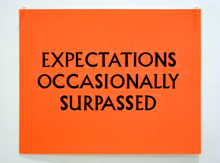
    Fig. 4. Christine Wong Yap, "Expectations Occasionally Surpassed," Ink on poster board, 25 x 20 inches*

    Christine Wong Yap,Expectations Occasionally Surpassed, Ink on poster board, 25 x 20 inches*

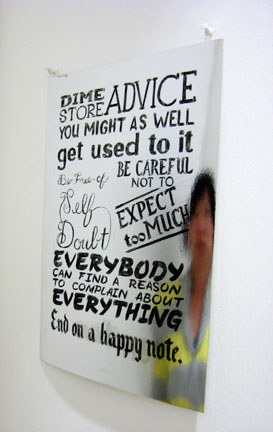
    Fig. 5. Christine Wong Yap, "Dime Store Advice," china marker on foil-laminated cardstock, 11.75 x 16.5 inches*

    Christine Wong Yap, Dime Store Advice, china marker on foil-laminated cardstock, 11.75 x 16.5 inches*

  • The Bloor brothers are also exhibiting billboards in Leicester, and one of the other billboard artists is April Gertler, who I went to school with in Oakland, CA in the late 1990s.

*Produced in the Breathe Residency at Chinese Arts Centre.

Standard