
Christine Wong Yap, Irrational Exuberance (Asst. Colors), installation view at Sight School, Oakland, CA. 2010.
It’s been three years since I created Irrational Exuberance (Asst. Colors), a body of work inspired by discount store culture, pleasure and decoration. Recently, I’ve encountered salient art and writings related to those ideas. These references are not too late—in fact, they are perfectly on time, as I’m currently revisiting Irrational Exuberance to envision a new body of work and self-initiated project.
The references are like three planets with shared orbits:
—
A Two-Hour Drive. A Three-Year Journey.

Featured guests at As Is, the dialogue at Irrational Exuberance at Sigh School (L-R): artist, writer and theorist Ginger Wolfe-Suarez, curator and critic Glen Helfand, and writer and curator Patricia Maloney.
In the dialogue that accompanied Irrational Exuberance in 2010, artist and theorist Ginger Wolfe-Suarez cited Steinbach’s work (download her interview with Steinbach from his site):
I’m interested in looking at Christine’s work, and work like Christine’s, that transcends consumption as a closed system of signs and symbols. That conversation can be transformative. … I was really interested in how [Haim Steinbach and Allan McCollum’ talked about their objects. …. There are political ramifications for words like consumption—like nihilation—so I think the ability to tackle, and transcend, those conversations is really exciting for me.
I had looked at reproductions of Steinbach’s most iconic works: found objects displayed on shelves. I was inspired by how modest they were, but also found the objects un-transformed, recognizable identities difficult to overcome. Like the drawing instruction, “Draw what you see, not what you know,” when I as faced with Steinbach’s artworks, it was hard to see what was in front of me when it kept on insisting to be what I knew it to be. I couldn’t find the space for visual or conceptual discovery at the time.

Haim Steinbach, Untitled (bird, nesting dolls, vase), 2006 MDF shelf; ceramic bird; wooden nesting dolls; Korean ceramic vase 11-3/4 x 33 x 10-1/2 in. (30 x 84 x 27 cm). // Source: HaimSteinbach.net.
I was still curious to learn more, so I visited once again the world is flat. Bard is a two-hour drive from NYC, but it was worth the trek. I gained a profound appreciation for Steinbach’s work by seeing it in person, in abundance, and with exceptionally keen curatorial direction by Tom Eccles and Johanna Burton united with spot-on exhibition design for maximum effect. I didn’t love all the work, or completely understand it, but I fully respected it. I had to wrestle with what Steinbach was doing, what the viewers are meant to do or experience, and what I felt, which was at times pleasure, bafflement, and also despair—the world is flat, leaving my preconceptions about value in limbo. While Steinbach’s work is still potently mysterious to me, I found the accompanying catalog to set interesting parameters about what, exactly, Steinbach’s ideas and works are.
—
Brute Material Facts
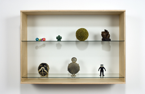
Haim Steinbach, Untitled (skull, vessel, figurine, toy, fruit bowl, sphere, peasant), 2006 Birch plywood, plastic laminate and glass box; synthetic polymer skull; Korean ceramic vessel; plastic figurine; plastic baby toy; Chinese fruit bowl; straw ball; Chinese ceramic statuette 37-3/4 x 53-3/4 x 14-3/4 in. (95.8 x 136.6 x 37.5 cm) // Source: HaimSteinbach.net.
The aesthetic experience of contemporary art is often like an act of unraveling a riddle. Familiarity with the tropes usually leads towards plausible hypotheses: commenting on this, re-contextualizing that, hybridizing this plus that—you get the idea. Steinbach’s work is more abstruse. It offers no Tootsie Roll center like the center of a Tootsie Pop. In her essay, “Some Collectables,” from the exhibition catalogue for once again the world is flat., curator Johanna Burton points out:
These are not … representations of things, but rather presentations of them.
Steinbach’s objects are not metaphors or symbols to be deciphered. They are all surfaces and cultural associations. They are the point. Whereas, discussions of the readymade, appropriation, and mass production, Burton states,
are only tangential to the brute material fact of what’s actually there.
That “brute material fact” is exactly what I couldn’t overcome initially. And this may also be another point of Steinbach’s—for me, as a viewer, to look at what’s there and to forget habits of looking. As Burton says, the very title
asks us to reconsider what we think we know, and to survey the terrain around us, as if we were seeing it for the first time again.
In other words, Steinbach is asking viewers to move beyond recognition to perception. In The Meaning of Things, Csikszentmihalyi and Rochberg-Halton explain John Dewey’s ideas of perception versus recognition. Recognition is
when we experience a thing and interpret it only as something we already know
Hence, there is no new organization of feeling, attention or intentions within the viewer. Just as I could only see the objects’ identities when I first encountered Steinbach’s work, I could not garner a meaningful aesthetic experience from them. On the other hand, perception is
when we experience a thing and realize its own inherent character … [the] object imposes certain qualities on the viewer that create new insights.
Certainly art objects are intended to create aesthetic experiences that “create new insights” on the viewer; Steinbach challenges viewers to perceive quotidian objects anew.
—
The Quotidian
In Irrational Exuberance, I sought to question class and value distinctions inherent in decorative objects. Many of the works in Irrational Exuberance are multiples, reinforcing discount stores’ feelings of immediacy and abundance. The subtext is that idea serialized objects can also be personally meaningful. Burton explains that this holds true for Steinbach too:
Steinbach’s interest … in collecting as a mode of production would seem to court the individualistic, affective drive toward objects, while also acknowledging the serial nature of every such ‘special’ object.
For the Things authors, everyday objects bring together the self and the world:
household objects become sights of a wider network of meanings that embrace the whole world.
echoing the very title of the Steinbach show: once again the world is flat. This leveling works two ways: bringing art objects ‘down’ to the same level as quotidian objects and elevating everyday things ‘up’ to the rarified realm of artworks.
In “Not a Readymade” (reprinted in the exhibition catalog and also downloadable from Steinbach’s site) Anthony Huberman interviews Steinbach, who reveals that his work
embraces the idea that art is always with us, a function of the everyday.

Christine Wong Yap, Vinyl Ficus #3 & 4, 2010, vinyl, mylar, thread, lacing, wire, ~18 x 12 x 12 inches / 45 x 30 x30 cm each
The Things authors even wrote about the role of objects in visual art thusly:
Creative artists are those who can find a convincing visual solution to a problem that was never previously formulated. In the solution, and even in the formulation of creative problems, objects stimulate and help develop the artist’s thought.
In 1980, they could not known to what extent Steinbach would use objects expressly to advance thought.
—
Sentiment

Christine Wong Yap, Cute ___ Calendar, 2010, collage of found calendars, 12 x 12 x 0.5 inches / 30 x 30 x 1.2 cm
In 2010, I wrote that Irrational Exuberance was an immersion in sentiment:
… an exercise in pleasure, modest expectations and accessibility.
With its unabashed enthusiasm, … Irrational Exuberance (Asst. Colors) marks a shift … I became enamored with the aesthetic, symbolic and conceptual potential of discount store culture, the decorative impulse, and the search for happiness.
…sentiment and immediacy are embraced. The exhibition’s title highlights the paradox of thinking rationally about emotional and internal experiences.
My previous work had been “cool”—often black-and-white, reserved, and materially minimal. I found kinship in a quote attributed to G. K. Chesterton:
The meanest habit of humankind is to be skeptical of sentiment.
In the public dialogue, sentimentality appeared divisive; perhaps in the age of irony, audiences automatically assume that elation and enthusiasm cannot be sincere. It’s a comfort to me that Steinbach does not shy from sentiment either. In Giorgio Verzotti’s “Object, Sign, Community: On the Art of Haim Steinbach” (reprinted in the exhibition catalog and also downloadable from Steinbach’s site), he states:
What Steinbach highlights …. is the object as a focus of emotion.
—
The Reciprocal Relationship Between Objects and Selfhood
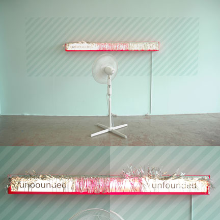
Christine Wong Yap, Unbounded/Unfounded, 2010, fan, metallic fringe and light box: pegboard, wood, acrylic, vinyl, lights, paint, 73 x 60 x 48 inches / 1.8 x 1.5 x 1.2 m.
I’m interested in how objects accrue meaning or sentiment. Are objects merely containers for human associations? Or do they “act” as well? This transaction may be more reciprocal than I think, as objects can also shape humans.
Verzotti describes the link between objects shape the self:
An object, inasmuch as it forms part of our daily lives … to satisfy certain needs, becomes, Steinbach says, vital to the construction of our identity.
This is essentially what the authors of Things set out to study:
how the most complex pattern of emotion and thought can become embedded in and symbolized by concrete things, that is how things themselves are part of the interpretive sign process that constitutes meaning.
They elaborate:
Things actively change the content of what we think is our self and thus perform a creative as well as reflexive function….
Objects affect what a person can do, either by expanding or restricting the scope of that person’s actions and thoughts…. Objects have a determining effect on the development of the self.
According to Burton, Steinbach’s work conjures very similar ideas:
Objects are less about their owners, … and more about the circulations they make…. Objects reflect much of their owners’ beliefs, systems of faith, and measures of value… [and] also produce [them].
The overlap in the ideas between the Things authors, Burton, and Irrational Exuberance are abundant. One of Burton’s paragraphs in particular is especially sociological and psychological:
Our drive to acquire and organize things is, in part, how we understand ourselves. Less a comment on capitalism than an investigation of the production of self, Steinbach’s work acknowledges the fragility of subjecthood—that our funny, fragile egos are bound up in the unexpectedly rich terrain of the knickknacks and bric-a-brac, to say nothing of priceless mementos, we collect and covet.
This is a sequence of ideas that are relevant even line by line. First, she writes,
Our drive to acquire and organize things is, in part, how we understand ourselves. …[Steinbach’s work is] an investigation of the production of self…
This echoes the Things authors:
the potential significance of things is realized in a process of actively cultivating a world of meanings, which both reflect and help create the ultimate goals of one’s existence.
Next, Burton specifies that Steinbach’s work is
Less a comment on capitalism
This, too, came up at the dialogue at Irrational Exuberance (Asst. Colors). Some viewers assumed a negative, oppositional critique on my part where there was none. I embraced the bright colors and cheap materiality as sincere expressions of enthusiasm and pleasure, so this perspective was confounding. Where was it coming from? I had theorized that works of art can operate like barometers for optimism and pessimism, and this seemed further evidence that viewer’s projections are just as integral to the reading of the work as the work itself.
Last, Burton writes
our funny, fragile egos are bound up in the unexpectedly rich terrain of the knickknacks and bric-a-brac
This could very well be a statement for Irrational Exuberance.
—
The Social Life of Objects

Christine Wong Yap, Irrational Exuberance (Asst. Colors) buttons #1–3, 2010, badges, 1–1.75 inches / 2.5 x 4.5 cm dia. each.
In the study of positive psychology, improving one’s subjective wellbeing seems to always begin with the self and expand towards the social. There seems to be a parallel here: beginning with the habits of mind such as recognition and perception, acknowledging the everyday, and considering the organization of the self, and moving on to relationships.
In Steinbach’s interview with Huberman, he states
my practice is directly committed to the social.
How is it that inanimate objects can be social? Steinbach suggests how can they not:
There’s always more than one object at hand. Being here means you and here.
Verzotti’s points out the relational aspect of things between people:
Each object is both an object and a sign associated with a specific social dynamic, a token of exchange with we weave our interpersonal relations…
I’d thought about art objects as props that mediate relationships. Now it appears that objects might function similarly.

Christine Wong Yap, a diagram of how artists and viewers inform works of art and thereby mediate relationships between artists and viewers.
Csikszentmihalyi and Rochberg-Halton elaborate on the many levels of this social potential:
Objects … serve to express dynamic processes within people, among people, and between people and the total environment. These processes might lead to a more and more specific differentiation or increasing integration…
by which they mean, the individuation of the self or alignment with others. They add:
Differentiation is the result of control, whereas integration is based on participation.
This calls to mind my idea that art experiences are opportunities for enacting trust or skepticism. Perhaps another way to think of art experiences is as opportunities for expressing differentiation/control or integration/participation.
—
Integration and Differentiation
When I read the once again the world is flat. exhibition catalog, so many points seemed to overlap with my own interests in Irrational Exuberance that I became nervous—which I self-diagnosed as the anxiety of influence.
An obvious similarity between once again the world is flat. and Irrational Exuberance is the use of common objects displayed on shelves. Though I used found objects in non-shelf displays, I collaged, sewed, and constructed most of the objects in Irrational Exuberance. My work conveys “craft” more than “brute materiality.” Further, Steinbach invests much of his constructive energy in the shelves, not the objects on display; in my work, the attention is reversed.
I like to think that I’m forging a different path on shared terrain. Or to use a different metaphor (same idea, different things), since orbits have different trajectories, coincidental moments of proximity are the result of traveling great distances.


.")


. Collection Art Gallery of Ontario, Toronto. Purchase, 1967. © 1962 Claes Oldenburg. Photo: Sean Weaver. // Source: moma.org.")
