Research

Optimism in the news!?

“Scientists have identified the neural networks in the human brain that generate feelings of optimism in a person….”
“Cradle of optimism pinpointed in the brain,” DailyIndia.com, October 25, 2007

Americans are, characteristically, optimistic about thier lives, but pessimistic about our institutions.
“The Happiness Gap,” by David Brooks, NYTimes.com, October 30, 2007
A few good lines:
“This happiness gap between the private and the public creates a treacherous political vortex. On the one hand, it means voters are desperate for change. On the other hand, they don’t want a change that will upset the lives they have built for themselves.”
“In a segmented nation, [Americans] have built lifestyle niches for themselves where they feel optimistic and fulfilled.”
“[Political candidates:] don’t try to be inspiring or rely on the pure power of authenticity. In these cynical days, voters are not interested in uplift.”

Standard
Art & Development, Research

Ephemera

Making ephemera has become an important part of my art practice. I began by making small batches of laser-printed posters, which fold to become brochures. They supply additional texts outside of the work and the wall texts, yet within the gallery space. They draw attention to the concepts behind the works without literalizing them in an artist’s statement.

I think making collateral and multiples is related to my background as a printmaker. But though I know how, I don’t print this collateral by hand, because they are free for anyone to take, because I can easily make more at any time.

This is one example of the glacial change my work seems to be undergoing. Like my other work, the brochures de-emphasize visuality, so the word “visual” in “visual art” seems too finite to describe what do.

I suppose that I’ve always been interested in ephemera, but had previous notions about graphic design, printmaking and zines. Thankfully, Ted Purves and Steven Leiber helped me to embrace ephemera as a legitimate form in itself.

Ted, by the way, also contributed an essay to Extra Art: A Survey of Artists’ Ephemera, 1960-1999, a beautiful catalog of thousands of inventive invitations, posters, buttons and wacky one-off objects in a show curated by Steven Lieber…

You might find Extra Art in the stacks at 871 Fine Arts at 49 Geary Street, Suite 513 in San Francisco. Unlike the boutique-like museum stores I’ve visited lately, this book seller and gallery has a drool-worthy selection of art books and catalogs. Their gallery seems to show only works on paper or ephemera, focusing on minimalism, concrete poetry and fluxism, with a few contemporary artists like writer/designer/book artist Emily McVarish. During First Thursday gallery openings (No! More! Paintings!), 871’s idiosyncratic shows can be quite refreshing.

In September, I was delighted to see an exhibition of art posters at 871. What follows are my awful photos of some of my favorite posters. Sorry I didn’t get information about the designers.

duchamp
This is my favorite by far. It’s of Marcel Duchamp with a piece from “The Bride Stripped Bare.” Like Duchamp, the poster designer selected materials minimally and purposefully, using foil stamping to represent the metalwork, and a high-gloss spot varnish only where the sheet glass appears. The rest of the poster is printed in economical evergreen and carmine red inks.

paik
A really handsome Naim June Paik poster. It’s just a black and white portrait of the artist with text set in Helvetica: two sizes, two weights. And while the photography and typography are perfect, the whole thing is restrained but somehow avant garde.

weiner
I’m not a big Lawrence Weiner fan (the unblinking monotone!) but the use of selectively-placed die cuts are satisfyingly conceptually-sound.

sandback
I was really happy to see this Fred Sandback poster, because it’s an elegant conveyence of the ideas in minimal work. Also, many artists find gridded paper attractive, but in Sandback’s case, it seems to be an entirely appropriate usage.

What I really love about these posters is that the designers understand that it’s not possible or desirable to represent conceptual art in purely visual terms. All the posters do is suggest or supplement.

Standard
Activist Imagination, Research

Art ideas

1.
Write “Come up with a good idea for an art piece and write it down. Mail it to myself, as I could use the postmark date to show that I had the idea first” on a piece of paper. Mail it to myself.

2.
Invite Kearny Street Workshop’s audience to edit the Wikipedia page on Kearny Street Workshop.

3.
Address the ideas of celebrationism and nostalgia, political rigor vs moral outrage, in APA activist art.

Standard
Research, Travelogue

Art I Saw and Really Liked in England

Sao Paolo-based Carla Zaccagnini at Blow de la Barra, London
A restrained show of a selection of curious objects — which were slightly reminiscent of Surrealism and Fluxism, in very good ways — united by heady concepts. From the press release: “‘Wish’… is mainly based on works that deal with desire and its necessary insatisfaction.”

Travel Guide by Matei Bejenaru, which was part of The Irresistable Force at the Tate Modern, London
A fold-out map with detailed instructions for a successful border-crossing into Great Britain or Ireland from Romania. It documents the physical and legal dangers. This content was an eye-opener for me — I have only a vague understanding of immigration in the European Union, as membership frees up the movement of people, to dramatic effects. I also liked the restrained form of display, limited to one floor graphic and take-away brochures.

I enjoyed Outside the Box at Cornerhouse very much. Almost every work in the show was a thought-provoking contribution. Gallery 2 (there are three) was my favorite, because it included Jim Campbells’s low-res screens of LED lights, Daniel Canogar’s fantastic fiber-optic projector and projections and Christopher Thomas Allen’s Dialogue, a theatrical replica of two adjoining office desks, whose computer monitors appeared to engage in a debate, flashing Google-image-searched pictures based on the words in an audio track.

Standard
Community, Research

Tastes in art: what I learned from two videos

My generous host in London, curator and artist Rico Reyes, posed a thought-provoking question. We were visiting galleries, and I had something like an allergic reaction to psychedelic self-portrait videos at a gallery in London’s chi-chi West End (think: garish tie-dye animation superimposed on a bodysuit, with an Enya-like house music soundtrack, and hideous picture quality). I couldn’t hang, so I waited for Rico outside.

He asked: Do you look at art that is similiar to yours, or dissimilar?

Clearly my estimation of art is influenced by my tastes, and of course any artist would be happy to discover art that resonates with one’s own. So I admitted I usually look longest at art that is similar to mine. For example, I tend to spend less time with photographs and videos.

But I don’t feel that this is too limiting, because Jordan Kantor, a professor of mine in grad school, pointed out that art can look or think like one’s own. So while I headed out to the V&A just to see Simon Perriton’s installation just because its medium is papercuts, I’ll also happily perform actions with built-in futility in Jon Brumit‘s Vendetta Clinic, which was on view in Yerba Buena Center for the Arts earlier this year.

Which is not to mean that I don’t appreciate art that’s dissimilar to my own. I was recently surprised and impressed with a short video by Michelle Blade. Her work is on display in “I’m OK, You’re OK” (a group show I’m also in) at Playspace, the graduate gallery at CCA. (While our work can be tied together curatorially, I find her work different than mine because it seems uniformly optimistic.)

Michelle’s video consisted of a single shot of a gathering at Golden Gate Park. In the video, dozens of people, organized as a color spectrum of brightly hued shirts, hold hands and run in a winding spiral until they form a tightly knit column. And then they disperse. If you view the work as an abstraction, the colors advance in an orderly, quick pace, slow to a graceful endpoint, and then re-animate in disorderly joy. Colors overlap, the action reveals itself, and the activity disperses. It’s utopic — like the previously mentioned video — but Michelle’s is simple, short, endearing, unpretentious and pleasingly self-contained. While the video employs simple parameters, the social sculpture depicted in it is a fertile catalyst for ideas about art, painting, abstraction and social actions.

Though I tend to look for work that is similar to my own, I’m most interested in the elegant conveyance of complex ideas.

Standard
Art & Development, Research, Travelogue

Travelogue Entry No. 2: Manchester, London

My last day of four in London. Too premature to sum up any concrete ideas. Immediate impressions follow:

-Manchester’s great. I was really impressed with the city’s investment in culture. Saw “Outside of the Box,” a knock-out show of media art at Cornerhouse, an contemporary art gallery and film hub, as well as a cool retrospective of work by SF-based Lynn Hershman Leeson at the Whitworth Gallery at the University of Manchester. I was so impressed with the city’s vibrance that I found the constant refrain that Manchester was trying to shake off its industrial reputation to seem outdated, but a Londoner’s slight scoff at Manchester proved me that other minds have yet to be opened.

-London has looked like this in my visit:

–Lewisham Road feels remarkably similar, at least on appearances to parts of Brooklyn: lots of immigrants from all over the world, internet cafes/call centers, low storefronts with lightboxes, fried chicken, mattress retailers. Of course on the other side of Lewisham Road is Goldsmith’s, where I’ve stumbled upon a small community of Filipino and Fil-Am expats. How funny it is to sit in a Morrocan cafe in punk-rock Camden-town and listen to Taglish.

–Quiet opulence everywhere. The city is not especially pretty, but the remarkable architecture always gives me an awareness of a sensibility of being in the seat of an Imperial power, however faded it may be in the shadow of the U.S. superpower. Even as I snap my tourist photos of Parliament and Big Ben, I’m thinking: what were the conditions that made all of this possible? The finest building materials: gold, marble. The huge consumption of tea from China, chocolate from Latin America, sugar from the West Indies? I like the idea that somehow I can subvert something by being here and sitting in Royal parks, walking through the free museums… but of course what’s more important is what I can bring home as a citizen, not just a consumer, of the United States.

I was startled and amazed and angered when, lost in the Victoria & Albert Museum in London’s swank South Kensington, I stumbled upon a view of two great halls. In one hall sat two monumental columns, which soared to the atrium several stories above. They were the two halves of Trajan’s Column, built in Rome in AD 131. On the other side sat a conservatory for antiquities, with a replica of Michalangelo’s David sitting among dozens of partially crated busts, statues and reliquaries. The view of these priceless antiquities was awe-inspiring. And I mean awe in the sense of terrific, and terrible. I am only surmising the conditions that made it possible for the Column to be cut in half and moved to South Kensington from Rome. And there are so many layers of meaning to explore: the collapse of the Roman empire, the past greatness of the British Empire, the vulnerability in the consolidation of wealth and power of that magnitude.

View of amusement park
My DIY Burtynsky. Visited the Mall of America — mega-church of consumerism and diversions — on an unplanned overnight layover in Minneapolis (Tip: Flying to London? Fly direct and avoid Northwest Air).

Victoria and Albert Museum
The wealth of nations at the Victoria and Albert Museum.

–In addition to some art and history museums, I’ve been visiting as many contemporary art spaces as possible, seeing everything from Doris Salcedo’s unsettling exhibition at White Cube on Hoxton Square to Ed Ruscha’s stunning watercolors at Gagosian on Oxford street — about £1m in small photorealist watercolors were watched over by two suited and booted guards who found my photo-taking suspicious — to group shows at Alma Enterprises, which has all the atmosphere of a decaying public high school, in up-and-coming  Bethnel Green. The standout space, however, is inIVA, the Institute for International Visual Arts, spearheaded by an international consortium of artists, thinkers and business leaders of color. It’s brand new, on a smelly alley in Hoxton, with a largish gallery, project space, and library that collects catalogs by artists of color only. I love it. It’s a beautiful building in a great location with top-notch art and huge potential to be a formidible force in London, and hopefully, the world. I find it hope-inspiring.

Rico Reyes (artist, curator, theorist and my generous host in London) and I had the good fortune of participating in Leticia Valverdes’ project, “Is London the Place for Me?” As I’ve been travelling and shooting photos of landscapes of sheeps and stone walls, neo-Gothic cathedrals and plates of bangers and mash, I’d been wondering how much I’m looking for experiences that fit my expectations of England, instead of seeing England as it is. But with Valverdes’ props and a digital studio, we were able to play with the cliches. We placed ourselves — Chinese American and Filipino American artists — into a tea room designed to display wealth and refinement. It’s a simple, ironic gesture, and I enjoyed it very much.

Standard
Activist Imagination, Research

The Stone Age

“We’re in the Stone Age of environmental consciousness.”

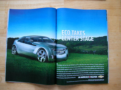
That’s what I thought the other day when I saw a recent print advertisement for Chevrolet’s new hybrid vehicles. In the full-spread photo, a mean-looking concept car with oversized rims sits on a grassy meadow surrounded by rolling, tree-covered hills.

car ad

The ad rings false for me because American car manufacturers have been slow to release hybrid vehicles and adopt alternative technologies. The big 3 automakers are, as many others have pointed out, dinosaurs of the Industrial age, who ruled by the might of mass production. The sweet irony is that one can ‘buy American’ — and purchase a Toyota made in Fremont, CA. Dinosaurs, after all, are slow on the uptake of the ‘adapt or perish’ idea.

And so with the art direction here. Every element of this ad is a cliché. The message — “Chevy’s gone ‘green'” — has been clunkily literalized: Take a Chevy. Put it in a leafy locale.

What’s missing is a critical visual and conceptual analysis.

First, to point out the obvious: parking a car on a meadow isn’t environmentally friendly. Most meadows function as natural water filters for underground streams, so oil leaks are bad news blues. And driving on critters’ homes can’t be fair play.

Second, the grass’s cut tips give away that it’s not a meadow, but a lawn that was recently mowed. Since manicured lawns suck up water and pesticides, they don’t make good symbols for ecological health, either.

What makes it necessary to convey environmental soundness so literally? The car’s engine may be green, but that’s not reflected in its design. Outwards, it’s conventionally stylish. The bullish front-end and low-slung cab references the gas-guzzling muscle cars of yesteryear. In fact, for a futuristic prototype, it looks a lot like today’s Dodge Charger. Oversized rims and minimized tires give away Chevy’s conceit to style over function. I thought green meant you take only what you need, and you don’t need huge alloy rims.

The problem is that the fear of crunchy-granola designs has overshadowed the imaginative possibilities for what a green car could look like. And imagining change is the first step in making change, as Angela Davis recently discussed at Los Angeles’ Museum of Contemporary Arts (check out a podcast of Angela Davis’ lecture on contributions to feminism from theorists of color). Green can, and should, look different. I’m sure that environmental concerns will force the tide of mass opinion to turn towards an attitude that desires green inside and out. We won’t have a choice: either we choose green, or Mother Nature will choose it for us.

Of course, the ad itself is printed on paper, which is gloss-coated and therefore probably not recyclable. Worse, the ad appeared in a special supplement, of which this reader received two unsolicited copies. By extraction, I’d guess that thousands, if not tens of thousands, of these ad-revenue-driven publications have entered the waste stream, courtesy of a giant publishing house.

This ad reminds me of old advertisements with laughable premises — like the young actor Ronald Reagan endorsing smoking as healthful. I’m looking forward to the day when green visual literacy is so prevalent that corporations can no longer pass off half-hearted attempts at consciousness.

. . . . .

Similarly, I sometimes feel like we’re in the Stone Age when it comes to identity and art. The critique of formulaic Identity Art is that it operates on a one-plus-one equation, like the ad above:
green + car = green car

Its corrolary, so to speak:
identity + art = Identity Art

such as,
asian design motifs + painting
Or
migration story + photo-collage

Thankfully, postcolonial theorists provide a critique of essentialism, the idea that certain groups carry innate characteristics, implying the inability to transcend one’s traits. In art, essentialism is when artists “get put in a box” or marginalized, and it feels like, well, being stuck in the Stone Age. There’s some validity to this feeling, considering that women and people of color have had a relatively short history of participating in “high” art discourses in the US (and we are still struggling for control over the modes of our self-representation). So in the US we are in an early era of art that can emcompass the voices of women, people of color, the working classes, immigrants, etc. I think the first task is to debunk the perception that art by certain groups should look a certain way. I was reminded of this earlier today.

In To Hedonopolis, From Melancolony, curator Rico Reyes explores the emergence of two thematic strains in art works by Filipino and Fil-Am contemporary artists. So the show brings light to two distinct perspectives. The works are in diverse styles and media, but the artists are uniformly confident and adept. Some, but not all, of the content transparently corresponds to aspects of Filipino identity.

I was admiring an abstract painting by Reanne Estrada, when an agitated stranger next to me asked aloud, “How is this Filipino?”

I wish I could say that I helped the young viewer critically engage with Reanne’s work (afterall, he’s an APA, I’m an APA, he’s a student, we were on a university campus), but I’d be lying. Instead, I was flabbergasted that an APA would suggest that art that isn’t overtly Filipino isn’t Filipino enough.

When I was in Manila, the question of “What is Filipino?” followed us Galleon Traders around like white on rice. I didn’t learn an answer so much as gain a comfort with the standing question (not unsimilar to an ‘intersectional’ position advanced by feminist theorists of color, described in Davis’ lecture). To leave the question unanswered acknowledged the Philippines’ complex history of colonization and its people’s ongoing perserverance and shifting identities. To attempt to answer it, and make “capital-F” Filipino art (i.e., as Carlos Celdran joked, nailing a bangus to a wall), would be to ascribe to an essentialist point of view.

Which relates to ideas I’m thinking about now for Activist Imagination. I think it’s time to start reimagining the blanket term “APA” (Asian Pacific American) for the future: APA can, and should, look different. But how?

And how will this change the function of an APA arts organization?

Standard
Community, Research

A blip on the APA media sonar

Three years ago, when Bollywood seemed poised to take America by storm, I published an op-ed that warned South Asians that increased media attention isn’t the same as improved representation (“Come on Down [Expect Stereotypes as South Asians Make U.S. Film, TV Debuts]” Oakland Tribune, KALW radio). I used examples of East Asians in mass media to show how little progress towards accurate representation has been achieved. Little has changed since then.

Though working towards institutional social change will always be more pressing than issues of representation, I always register APAs in the media on my mental sonar. The Korean actor on Heroes? Blip. Kal Penn in a leading role? Blip! Kenneth Eng? Ugh—blip!

Recently, a blip popped up–it may not be significant, but it was new, and it made me laugh. In a comedic situation typical of white “politically correct” middle classes, the narrator of Scrubs, played by Zach Braff (himself hamming up the neurotic white man who warrants the cool-begetting approval of an African American buddy) is mistaken for a racist after offering the word “chink” as a crossword puzzle solution.

In a subsequent scene, Asian doctors and Filipina nurses give the increasingly uncomfortable protagonist the stink eye. They’re pissed, and the APA stink eyes keep coming for several hilarious seconds. Too mortified by his breach of “political correctness” to attempt a clarification, Braff’s character feigns ignorance of the hostility, until a linebacker sized Pacific Islander violently jostles him with an contemptuous screw face.

The representation is not unproblematic (Non-speaking roles? C’mon!). Still, in a refreshing contrast to the stereotypes of demure APA women and emasculated APA men, Scrubs’ Angry Asians showed some serious indignation, even if it was based on a comedic premise. Better yet, the Angry Asians–of the various ethnicities and professions you would find in a real hospital–expressed solidarity. BLIP!

On a somewhat related note, Colma: The Musical is playing at the Embarcadero Center Cinema in San Francisco this week. I’m proud to big-up my hometown hero, H.P. Mendoza, who wrote the screenplay, music and lyrics and stars in the film. It’s directed by Richard Wong. The movie’s been written up in many local rags, but I really liked Glen Helfand’s review in the San Francisco Bay Guardian.

Standard