Research

points of reference: work

Late nights at the studio are like a "second shift" that artists often work.

Late nights at the studio are like a “second shift” that artists often work.

A cardio machine display of an interval workout, where high-intensity activity is interspersed with recovery periods.

A cardio machine display of an interval workout, where high-intensity activity is interspersed with recovery periods.

An endless dilemma for working artists: How do you balance studio art and income-generation?

Are you a “second-shift” artist? Do you find your passion and then do it on nights and weekends on it for the rest of your life, as a recent Onion op-ed potently parodied?

Are you an “aerobic” artist? Do you break up your life into deadline-driven seasons? Like month-to-month tempo training, do you work in high-intensity intervals—at paces impossible to maintain longterm—interspersed with physical and financial recovery periods?

Are you both? Is the combination wise? Or combustible?

I’ve been a “second-shift” artist in the past. For some reason I find the idea of it slightly depressing, maybe because it implies a 9-to-5 type of job. (Also, a ridiculous phobia of clichés makes literally going to the studio to paint on Sundays especially painful.)

More recently, I’ve become an “aerobic” artist. I’ve found that residencies are fantastic for intense periods of production, but are only sustainable in modest bursts, say, 4–6 weeks at a time. Longer periods are too hard to maintain personally and financially. They take a toll on my relationships with my partner, family, and employers. Upon return from a residency, I usually have to focus on income generation to pay debts and regain financial stability. Then, working so much, I’m unable to pull a “second shift” as an artist. Indeed, in the past three weeks, I’ve worked some 11-, 12- and 16-hour days, partly out of loyalty to the institution or artist, partly just because it’s work. It was impossible to get enough sleep (so much so that I felt jetlagged days later)—much less ecke out time for in-depth studio experimentation.

I’m not complaining. Just observing the pros and cons of second shifts versus aerobic intervals. I’m very grateful for all the exhibition and residencies opportunities I’ve had. The goal, ultimately, is for me to convert more of the hours in my life towards making art, and right now, intervals seem more productive.

The Ethics of Overtime

I’ve had lots of opportunities to think about this in the past few weeks. I think institutions and employers should pay their hourly workers overtime, though art institutions sometimes are loose with rules. But labor unions fought for this right. And what exactly should workers be paid overtime for? For working harder to stay focused after eight hours? For the lingering aches and pains that a long day of physical work compounds onto tomorrow’s tasks? To incentivize businesses to better structure the work and respect workers’ schedules? For the higher risks of injuries or accidents when workers are tired? (And how is that even ethical to value in monetary terms?)

New Skills: Get Excited and Make Things

As psychologist Edward Deci found:

People find the most enjoyment when they learning new things and get to use those skills today.

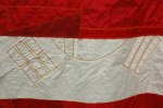
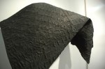
I started assisting a sculptor recently, and it’s been a lot of fun. In three days I learned how to make foam molds, cast concrete, and, most excitingly, assist with sand-casting metal sculptures.

In school, casting sculptures didn’t appeal to me at all. The dust. The plaster mold-making. The possibility of bacterial mold in the plaster molds (yuck!). But mostly, the indirectness and the cost of maintaining such a studio never made the process seem realistic for me.

But this artist is scrappy and experimental. Most of the foam and concrete needed is available at Home Depot. Working with more common materials, and more loosely, the process seem not as far-fetched, and not nearly as academic as plaster usually seems.

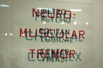
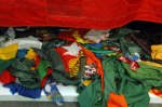
Thinking Big: What Artists Make Happen

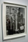
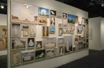
In recently assisting with the installation of another artist’s work, I thought about ambition. There was a lot of large-scale and site-specific work which had to be built on-site. It required a lot of problem-solving, flexibility, and those above-mentioned long hours. I came away from the experience very inspired. And though the show is a solo show—it is indeed one woman’s vision—it came to fruition with a lot of people’s help: artist’s assistants, art installers, interns, friends, fabricators, printers, and so on. I’ve never been to an old-fashioned house-raising, but I imagine that it felt something like that. That what artists make—what you see in the gallery come the opening reception—is a small part of what artists make happen—behind the scenes, in the studio, late nights installing in the gallery, or far away on site where the work first sparked as an idea.

Standard
Sights

see: Letha Wilson @ Art in General, NYC, through June 30

Letha Wilson, Ghost of a Tree, 2012. Digital print on vinyl, drywall, wood, wood column, 10 × 8 × 14 feet (image size 13 ¾ x 8 feet). Installation view at Bemis Center for Contemporary Art, Omaha, NE.

Letha Wilson, Ghost of a Tree, 2012. Digital print on vinyl, drywall, wood, wood column, 10 × 8 × 14 feet (image size 13 ¾ x 8 feet). Installation view at Bemis Center for Contemporary Art, Omaha, NE.


I work at Art in General as an installer, but I recommend Letha’s show because her work is not only interesting formally in marrying photography and sculptural materials, but beyond that, it helped me come to see her work as interventions, in the context of Land Art. Don’t miss the beautiful book on display too, which elegantly translates her gestures into the printed page. Allow yourself lots of time to look, breathe, and think.

Now through June 30, 2013
Letha Wilson:
Landmarks and Monuments
Art in General
79 Walker Street (off Broadway and Canal), NYC

Standard
Impressions

nyc art itinerary: Museum of the Moving Image

M surprised me by suggesting a visit to the Museum of the Moving Image. Though it’s in Queens, I’d never made it there, so it found its way onto my 2013 NYC art itinerary.

M had heard that the exhibition design is particularly good, which turned out to be delightfully true. But let me start with the bigger picture.

First, the building itself is really cool: beautiful typographic and graphic storefront window treatment, intriguing angles, gleaming white surfaces, spacious, modern and LEED-certified. The gallery spaces were full of character, yet allowed the artifacts, photos, and videos proper presentation. For example, there was a GIF project in the foyer; sometimes foyer projects get the short shrift in presentation—like a flat-screen installed randomly in an imposing antechamber. Here, five projectors screened a massive three-part composition, plus a didactic text. It was seamless, huge, yet because of the pace of the animations, it was not overwhelming—I thought it was perfectly installed and curated. It set the tone for the ambition of the institution nicely.

Second, the exhibition design is super cool. Clearly they are not skimping on signage, wall graphics, dramatic paint treatments, etc. Typographically the Spectacle: The Music Video exhibition was stellar—the exhibition title was in neon (!) while a historical section used hundreds of square feet of printed vinyl to add loads of charm to older videos. (Queen’s Bohemian Rhapsody, did you know, was shot in 4 hours and edited in 5? No excuses!)

One challenge with media shows is audio-bleed—and the museum was managed it in a variety of ways. On the first level of the show, a lot of restraint was used, allowing the sound from large theater to spill over into the exhibition area, where all videos were on headsets (though the light-bleed on the projection was less than desirable). On the second level, parabolic speakers, as well as speakers set in long boxes, like pedestals mounted to the ceiling, directed the sound to specific areas.

Overall I was really impressed with how beautifully everything was staged—the lighting and spatial design was directed, soft, yet dramatic. There was stagecraft, such as a neat short-throw projector that used a mirror to cast a huge projection just a few feet from the lens. I also appreciated a captivating edit of Beyoncé’s Single Ladies video with its dozens if not hundreds of YouTube re-makes. By presenting a video mosaic, which scrolled to different sections and zoomed into individual videos, viewers got a sense of the global popularity. It brilliantly unified a ton of user-generated content, but it took directorial and editorial vision to get there. Money, time, and expertise went into all of these strategies. For installers like me, it is appreciated, while visitors value it by way of just seeing the content, vibrantly displayed.

There is a lot to see, beyond the temporary exhibitions. The permanent exhibition, with vintage film cameras, cathode ray tubes, mics, and even some Muybridges and a zoetrope, will be educational and fun next time I return, which I surely will.

Standard
Impressions

nyc art itinerary: Museum of the City of New York

It’s been over a month since I wrote a list of NYC art places I aim to visit in 2013. Today I ticked off my first of seven sites when I visited the Museum of the City of New York for the Designing Tomorrow exhibition on the 1939 World’s Fair.

The exhibition was a good overview for the World’s Fairs in the 1930s, spanning San Francisco, San Diego, Cleveland, Chicago, and of course, Queens. I came away with some interesting info:

  • Robert Moses’ initiative to convert the area that is now Flushing-Corona Meadows Park from marsh and dumping ground into a World’s Fair site and park was the largest reclamation project ever undertaken.
  •  The Panorama, now housed at the Queens Museum of Art, is over 9,000 square feet, and is the result of the labor of 100 people working for three years.
  • ConEdison commissioned a diorama that showed the lights of NYC going on and off in a 12-minute cycle. It was three stories high and a block long.

But, overall, I was a little let down. The artifacts seemed outnumbered by tiled photos and didactic texts. I missed the awe,  excitement, and interactivity that all these inert things were trying so hard to convey. Further, many photos were reproduced, either as part of the signage, or in digital slideshows. For example, rare color photos were projected on a standard-definition projector in a too-bright hallway, while photos of illuminated pavilions were shown on a monitor with annoyingly long crossfade transitions. While the graphic designers made chronologically consistent typographic choices, the photos were presented in 21st century means, and the precision and luminosity of the original prints or slides were lost. The exhibition also seemed soft on social history; I would have loved to hear more about how Depression-era audiences, NYC’s disparate communities or the US’ progressive movement engaged the Fairs.

The main things I enjoyed were:

1. Loads of examples of lovely typography—off-set printed on brochures, as well as hand-painted in proposal drawings.

2. Some of the original proposal drawings were truly stunning. This one, in particular, is fantastic in real life:

Micromegas proprosal drawing by Frank Paul.
Standard
Impressions

Armory Art Fair fly-by

I visited the Armory Art Fair yesterday, thanks to the largesse of HWT (general admission, $30). I was glad I went—I saw some work I liked, some materials that might be useful to know about, and got to see what galleries are participating. Of Bay Area galleries, Wendi Norris moved from the Modern pier to the Contemporary pier; Silverman Gallery had a nice booth with staff smartly suited and booted; Haines had nearly the same location and similar works as last year. I liked the conceptually-oriented galleries Ingleby, Sies & Höke, Max Wigram and Tanya Leighton (European, no suprise). I also noticed that there were quite a few works related to flags; whether this is a trend or a result of finding what I’m seeking is hard to say.

In no particular order, some hasty snapshots of artworks that caught my eye.

Standard
Impressions, Sights

NYC Art Itinerary

"Migration Patterns" map by an anonymous contributor, sent to Becky Cooper, and printed in "Manhattan of the Mind" by Zachary Sniderman, New York Times Magazine, Feb. 17, 2013.

“Migration Patterns” map by an anonymous contributor, sent to Becky Cooper, and printed in “Manhattan of the Mind” by Zachary Sniderman, New York Times Magazine, Feb. 17, 2013.

When MA visited NYC last week, he filled each day with an ambitious art itinerary. It reminded me that I used to try to make the most of of my trips to New York. But since moving here, I’ve become lazy, and too borough- and subway-line-centric. I’ll take MA’s inspiring lead and resolve to get out into my own city more often. Here’s a list of places that I would like to visit, but have not yet been—and which I hope to see in 2013.

It’s better to set goals along with strategies, so I’ll include personal notes to make getting there easier.

The Morgan Library
225 Madison Avenue at 36th Street 
A short walk from one of my favorite places to eat, Koreatown. Also, not far from Grand Central Station where Nick Cave’s horses will be on view March 25–31 as part of its centennial celebrations.

The Cloisters
99 Margaret Corbin Drive, Fort Tryon Park
A bit out of the way, in a northernmost part of Manhattan—yet by bicycle, it turns out to be just 10 miles from my house.

Wave Hill
West 249th Street and Independence Avenue, Bronx
This is even further out of the way in the western edge of the Bronx, but I could make a longer bike and art day out of it, as it’s only 5.2 miles north of The Cloisters. Thirty miles round trip is nothing for serious riders; I am not a serious rider, but maybe I’ll start to up my mileage come spring.

1939 World Fair collectibles, collection of Kyle Supley, on Designing Tomorrow's Tumblr.

1939 World Fair collectibles, collection of Kyle Supley, on Designing Tomorrow’s Tumblr.

Museum of the City of New York
1220 Fifth Avenue at 103rd Street

This was not high on my list of places to visit, but it turns out that they’ve got a current exhibition on the 1930s World Fairs called Designing Tomorrow. World fairs are generally fascinating to me, but I am especially keen to learn more about the 1930s fairs in Queens (Didn’t I mention I’ve become borough-centric?) for their spectacle, futurism, modern design, typography, as well as the numerous bits and bobs of memorabilia.

 
e-flux

311 East Broadway
Who knows why East Broadway runs at an angle to, and detached from, Broadway. But I know where e-flux is, having made a pilgrimage to its neighboring dumpling restaurant. Now I just need to combine my dumpling craving with astute contemporary discourse.

Museum of the Moving Image
36-01 35th Avenue at 37th Street, Astoria, Queens
My own borough; I hang my head to admit that I’ve been to the multiplex around the corner.

 
Brooklyn Botanical Garden

150 Eastern Parkway, Brooklyn

Not art; visual nonetheless. In Prospect Park next to the Brooklyn Museum. Another nice bike adventure come warmer weather and new blooms.

  • Visited May 17. Huge, lovely, and well worth a visit.


Continue reading

Standard
Impressions

303 Gallery – Doug Aitken – 100 YRS

Doug Aitken, still from 100 Years gallery walk-through, 303 Gallery, NYC.

Doug Aitken, still from 100 Years gallery walk-through, 303 Gallery, NYC.


Doug Aitken usually makes big videos, but his current show at 303 Gallery in Chelsea looks full of installations including large sculptural text works. I’m excited to see it in person. Have a look at the really nicely produced video:
 303 Gallery – Doug Aitken – 100 YRS.

Standard
Research

Happiness exhibitions

Thrift Radiates Happiness inscription

Forthcoming:

This exhibition, the first to be housed in this disused bank, will be focused on finance and investment. The title is taken from an inscription inside the bank. It’s a neat example of a non-traditional exhibition space. Plus, the line-up of artists is getting interesting…
Opening March 14–17, 2013

Thrift Radiates Happiness
Municipal Bank, Birmingham, UK

Past:

Thrift Radiates Happiness

December 9, 2012–January 27, 2013
Nady Azhry: Sharing Happiness
TRYSTLIVING, Jakarta, Indonesia

Standard