I visited the Armory Art Fair yesterday, thanks to the largesse of HWT (general admission, $30). I was glad I went—I saw some work I liked, some materials that might be useful to know about, and got to see what galleries are participating. Of Bay Area galleries, Wendi Norris moved from the Modern pier to the Contemporary pier; Silverman Gallery had a nice booth with staff smartly suited and booted; Haines had nearly the same location and similar works as last year. I liked the conceptually-oriented galleries Ingleby, Sies & Höke, Max Wigram and Tanya Leighton (European, no suprise). I also noticed that there were quite a few works related to flags; whether this is a trend or a result of finding what I’m seeking is hard to say.
In no particular order, some hasty snapshots of artworks that caught my eye.
-
- It took some looking to realize that these were book pages that were partially erased and then photo-realistically filled back in. Adding some feat of drawing back to the act of erasure underscores the erasure. Good job. Jonathan Owen at the conceptually-inclined Ingleby Gallery, Edinburgh. Further proof that I need to visit Scotland and learn more about its contemporary art scene.
-

- Detail. Jonathan Owen, Ingleby Gallery, Edinburgh.
-
- Jose Dávila’s A Brief History of Sculpture, 2012, at another conceptually-leaning gallery, Max Wigram of London. It’s a fun game, testing one’s art history knowledge.
-

- Void voided. Urs Fisher, I think?
-

- Robert Smithson’s Spiral Jetty, rendered absent.
-

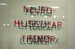
- Pavel Buchler’s wood type prints: perfect gestures. Tanya Leighton Gallery, Berlin.
-

- Lenticular of a sun setting, made with slightly offset images, as if shot without a tripod. It’s grainy and filmic, and therefore moody. The ghosting of the lenticular works with the piece, I think. Vistamare, Pescara.
-

- Old landscape paintings with the landscapes cut out. Moris, Baró Galeria, Sào Paolo.
-

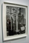
- One thing I like about art fairs is that you can always photograph the art, and get really close to them. No photos of Mel Bochner’s work were allowed when I saw his large survey at Whitechapel Gallery in London a few months back, but at Two Palms Press you could get up close (not that there was much room to maneuver in their packed booth anyway). This is a detail from a massive print, maybe 6 or 7′ tall…
-

- Shirana Shahbazi’s C-prints at Cardi Black Box from Milan. These look like paintings or prints from afar, but they’re photos of pieces of paper. Nice compositions and colors.
-
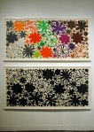
- This is kind of smart: a colorful print and its rotated black only version. You could learn a lot from studying this pair of prints. Polly Apfelbaum, Durham Press, Durham, NC.
-

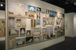
- I’ve really, really enjoyed looking at Cary Leibowitz work online for many years. His installation at Invisible Exports, NYC, was a mix of early 1990s stuff and more recent versions of the same sad sack signs.
-
- Another detail of Cary Leibowitz’ installation at Invisible Exports, NYC
-
- Ed Ruscha’s print at Crown Point Press from San Francisco. I have admired Ruscha’s work since I was exposed to it in undergrad. Ruscha is one of the few touchstones for me that I’ve continued to reference. His work has always been enigmatic to me, and even after attending a delightful lecture of his at NYPL Live the other night, it remains even more powerfully so. This piece in particular sort of ties him even closer in my mind to that other great enigma of his generation, Bruce Naumann.
-

- Tim Noble and Sue Webster. Blain Southern, London.
-

- Tim Noble and Sue Webster. Blain Southern, London.
-

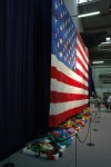
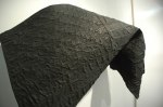
- Lots of flags at the Armory this year, including this giant one by Dave Cole. A US flag sewn from other flags, it’s quite brilliant. It could be pat multiculturalism, but I’m reading it as a political statement about the vampiric forces of our empire. Courtesy of Dodge Gallery, NYC.
-
- Side view, with cannibalized flags at bottom.
-
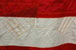
- Zigzag stitch in gold helps highlights the excised flags’ designs, such as this Korean flag.
-
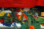
- Flag remains. Imagine if the US flag was cannibalized in such a way to sew another nation’s flag! Americans would lose it.
-
- Robert Longo’s cast bronze US flag from 1990. Interestingly, its title reflects Malcolm X’s quote about “any way necessary.” Still, when you use a US flag in a work of art, it’s going to be pretty heavy handed.
-

- Perhaps the only thing more heavy handed is using currency in art. Unidentified artist, Baró Gallery, São Paolo.
-
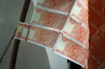
- Hand stitched currency, and a staff made of stacked coins. Unidentified artist, Baró Gallery, São Paolo.
-

- Duke Riley makes insanely detailed and stylish drawings. At the fair, Magnan Metz had him transform the entire booth with a full installation, complete with salvaged wood flooring and some kind of memorial stone that visitors could take rubbings of. And, going along with his nautical interests, semaphores appeared in one of his drawings.
-

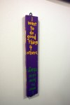
- Terry Fox had these fabric color panels (yes, flags) in his solo presentation at Ronald Feldman Gallery, though I’m not sure why.
-
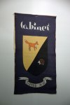
- Cabinet is too smart; their booth signage is a woven banner, complete with a shield, and a banner on the banner. My next project will involve commemorative banners, actually. It’s either the next logical step from flags, or the only possible outcome after a childhood fascination with calligraphy and medieval stuff.
-

- Sometimes I just like to look at materials and techniques. This is UV inkjet (I think it’s direct to substrate printing available at sign maker shops) on mirrored plexi on Dibond. Silvio Wolf at Bruce Silverstein, NY.
-

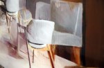
- I like how this photo looks like a charcoal drawing. A staged still life like that, shot in black and white, seems very modern and tasteful. I haven’t got a clue about the artist’s work or intent, it’s just the physical response to the form and materials that worked for me. Ji Zhou, pigment print on linen paper, Tang Contemporary, Beijing.
-

- Rob Wynne’s globby mirrored glass texts appeared in two different booths at the Armory, and both times they failed to charm me. Apparently limning decoration and tastelessness, he works with butterflies and flowers too. This trippy text style is a bit repellant to me, but I just wanted to note the bead and visible thread work on this vellum piece, if only because I’ve also been using “craft” materials as well, and thinking through how these materials work in art contexts.
-

- These perfectly straight, unvarying lines are crisp and precise. You have to get up really close to see that they’re thread, which explains why the saturation and reflections seem outsized for the line weight.. Large painting with thread, Frank Ammeriaan, Upstream Gallery, Amsterdam.
-

- Everybody loves these iridescent rainbows that show up on oil slicks; they’re the perfect metaphor for finding beauty in the everyday. Frank Ammeriaan has found a way to recreate the effect using “chemicals on canvas.” Touché. Frank Ammeriaan, Upstream Gallery, Amsterdam.
-

- Detail of chem spill. Frank Ammeriaan, Upstream Gallery, Amsterdam.
-

- Another illusion that rewarded a second look. This looks a lot like a face-mounted print but it’s actually a rear-painted sheet of plexiglass. I’ve always appreciated the vividness that rear-painted glass works have after seeing them at the Corning Museum. This is a nice spin in subject matter, photo realism, and materials. Gil Heitor Cortesao. Galeria Pedro Cera, Lisbon.
-
- Detail of a reverse painted oil-on-plexiglas work by Gil Heitor Cortesao. Galeria Pedro Cera, Lisbon.
-

- Raphael Zarka’s poster of examples of rhombicuboctahedrons from ancient times, from architecture to contemporary consumer goods. Loved this poster, but it was situated behind a seated gallerist, and I couldn’t get a decent photo. This JPG is borrowed from the website of Bischoff Weiss gallery in London, though the work was seen at the Baró Gallery’s booth.
