Art & Development

Unmonumental Tendencies

Would love to see Unmonumental, the inaugural exhibition at the New Museum of Contemporary Art in New York. It sounds like a really smart, timely curatorial proposition around un-heroic, modest tendencies in sculptural assemblage. 

In my own work, I’ve become more interested in art that just is, and doesn’t attempt to transcend its base materiality with illusion. Or allusion.

When I look at art now, I’m hyper-aware of artistic decisions that beg viewers to ignore conceptual or material details. I’m skeptical of modest scales that seem more to do with an economy of means, than how a work interacts with a space. I’m especially skeptical of materials that don’t reinforce content or concept. Objects (and art materials) have a life of their own — a manufactured history, a cultural value — and the act of incorporating something into one’s art doesn’t mean it’s become an object limited to visual significance. This is why I responded negatively to Louise Nevelson’s work at the De Young Museum: as a viewer, I felt compelled to ignore the spray paint, moulding and table legs, and felt that I would only “get it” if I could see compositions of shape and gradients of light. In contrast, Isa Genzkin, whose work is in the New Museum show, allows the viewer to see the crappy objects of her assemblage as what they are: blinds, PVC hose, all the useless junk crowding our garages and filling our landfills. 

This is in contrast with engaging with art on visual or formal terms. Sure, I’m still interested in how a thing looks or how it’s made, but using those criteria only can result in seeking only the most visually stunning or technically baffling. This feels to me more like channel surfing, than really engaging with art.

Standard
Art & Development

Back on the Screen Print Horse, Part II

studio_screen.jpg
Creative Screen Tech burned a meticulous stencil. I would never have guessed that I could screen print 1 pt. line weights or 12 pt. text. Who knew? The services cost more than I expected ($50 to reclaim the screen, output film and burn a stencil), but I got a great deal on a squeegee with a chipped handle ($5). Sixty prints took no time at all. See a preview image on the home page of my site. Details of the finished project will be posted in February.  

Standard
Art & Development

Oh — it’s a drawing!

Went to the opening of The Little Show at Swarm Gallery in Oakland last night. I thought Swarm directors Svea and Andrea did a great job making sense of the huge amount of work (75+ artists!). Earlier that day I just moped around the house with a sore throat, but I was glad I made it out… Oakland people out at a great time in an Oakland gallery. 

loremipsum_no3_courier.jpg
Lorem Ipsum #3, 2007, graphite, vellum, acrylic sheet, nails, 4.5 x 5.5 inches

Ran into Casey Jex Smith, who asked me about my contribution to The Little Show. I selected a piece from a new project called Lorem Ipsum. The work is meant to look like a wall text. I wasn’t worried about it looking too much like a print — until Casey mentioned that he didn’t know it’s actually a drawing!So, erm, in case you, too, were wondering — it’s a drawing. Cheers!

Standard
Art & Development, Travelogue

Art Highlights: Los Angeles

Santa Monica • Chinatown • Culver City • Fairfax

Click on the images to see a larger file.
gallery_la_art_p1_sm.jpg

gallery_la_art_p2_sm.jpg

Two days, 50+ galleries, 4 museums. Here’s what stood out:

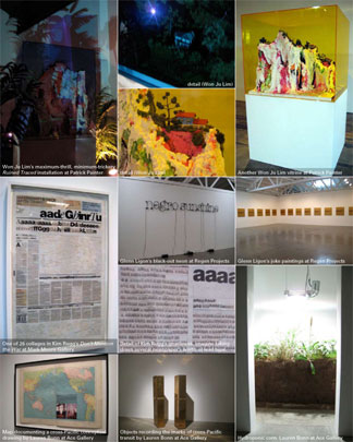
Won Ju Lim at Patrick Painter
Maximum effect with minimum trickery: digital projectors, colored plexi vitrines, poured paint sculptures, and some fake plants with gooseneck clamp lamps. The effect is truly astounding, and somehow very pertinent after the Southland fires. Lim may be my new favorite artist.
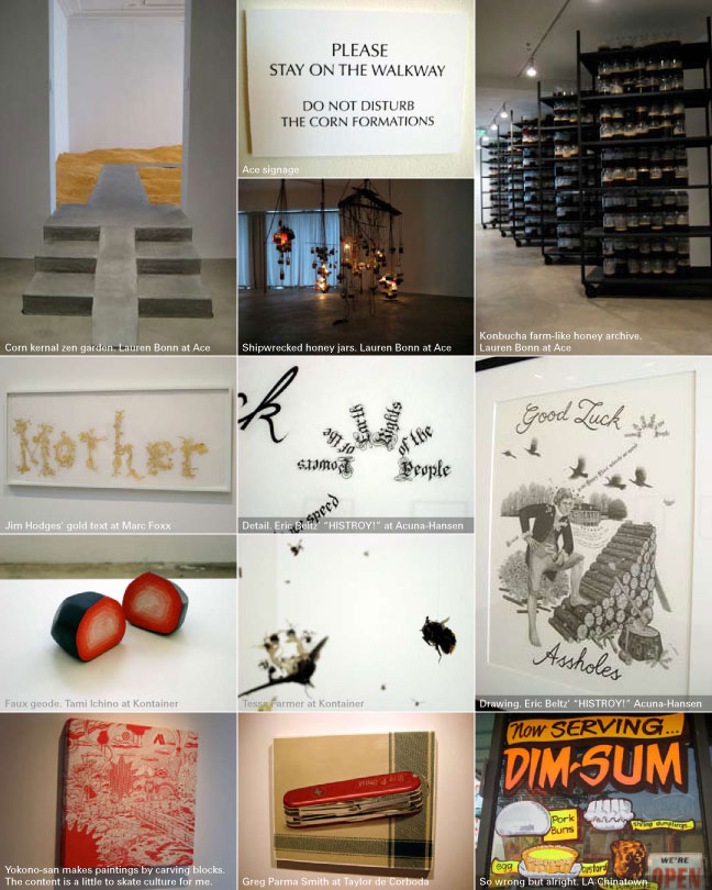
Lauren Bonn at Ace
Bonn’s Not a Cornfield cornfield was massive in scope and social programming, and she fills Ace with massive and terrifying psychic spaces which are somehow related to the cornfield and her study of bees. The scale is stupefying. I don’t know how Bonn orchestrates it, or Ace sustains it. But it’s amazing.
A side note: Bonn is also exhibiting the residue of a conceptual drawing piece involving an object recording the marks of a cross-Pacific passage. Sounds very similar to my Regalos project, doesn’t it?

Glenn Ligon at Regen Projects
A perfect example of why object-based conceptual practice is great: there’s so little mass in Ligon’s show, but there’s so much to think about. Thirty-six near-identical gold and black text paintings and one black-out neon text sculpture. Joke paintings invoke Richard Prince, but the racial content begs more conflicted social terrain. The neon text sculpture, of course, resonates with other (White) Conceptualists’ work, but again, Ligon’s content diverges into a realm of his own determination. My next stop was to look up Ligon’s article, “Black Light: David Hammons and The Poetics of Emptiness” (Artforum, Sept. 2004), a really beautiful artist’s writing/critical essay/statement about making art, resistance, the artist’s refusal, the “emptying out the self as a critical strategy,” and light as a material.

Kim Rugg at Mark Moore
Twenty-six re-assembled newspaper covers comprise Rugg’s “Don’t Mention the War,” in which she’s sliced and diced single letters and alphabetized them. I think she’s set a record; she’s broken an OCD-Art barrier. I’m impressed with the artist’s commitment to this massive project in an non-archival, unstable material. Furthermore, the craftsmanship is amazing, with hardly any relief in the collage.
Also at Mark Moore was Kenichi Yokono. I’m including this because I would have liked to explore this medium about ten years ago, when I was really into carving woodcuts, but not only interested in making prints. Yokono carves wood as if for printing, then displays the blocks as paintings, screens or skateboard decks. The content is punk-skate-pop culture, and the cut-out forms seem a little all over the place to me, veering towards hand-carved souvenir shop variety.

Group show at Marc Foxx
Lots of text-based work floated my boat here, including Jim Hodges‘ gold-leaf “Mother” on vellum. Francis Stark exhibited more good-bad-ugly work, which was awkward but intriguing nonetheless with its Alhambra delivery truck sized hanging sequins. While some artists cultivate the artistic persona of a naif through the use of odd materials, you get the sense that she isn’t faking her intuitive process.

Wild Women group show at Kontainer
This quietly installed group show was very smart. Tessa Farmer has assigned herself the dreadful task of creating minature (think: convert to microns) skeletons and attaching them to insects, and then hanging the dead bugs from monofilament. It’s a mind-blowing artistic practice. Tami Ichino‘s ceramic faux geodes are beautiful objects that manifested her paintings’ spacey psychedelia into three dimensions.

Eric Beltz’ “HISTROY!” at Acuna-Hansen
I resisted these drawings. They’re too slick: the gothic calligraphy and cursive script is too cool, the dead presidents theme seems so trendy, the literary references are very pop-goth. But these drawings have to be seen in the flesh, and I have to admit, Beltz’ self-described “high definition drawing” provides a truly enjoyable, memorable experience. Bonus: the title is wickedly funny, yet fitting.

A Great Delicacy group show at Taylor de Cordoba
Clearly I don’t connect often with paintings these days, but Greg Parma Smith‘s painting of a Swiss Army knife with a fabric pattern that escapes the still-life’s margins surprised me. It didn’t seem to take itself so seriously, which is hard to find among photo realist works. Rebecca Veit‘s and Kathryn Hillier‘s tense food-porn photos were convincingly reminiscent of Sunset Magazine, and Danica Phelp‘s charts were pleasingly ‘drawing-ly,’ if one could make up a graphite corollary to ‘painterly.’ McKendree Key‘s color photocopy stop-motion animation had a nice storm-at-sea rhythm while man-made garbage tumbled by as if on a watery freeway.

I had the pleasure of crossing paths with some Halloween- and Thanksgiving-themed sponge painting on the tinted windows of a dim sum shop in Chinatown. You haven’t lived until you’ve seen sio mai rendered in florescent sponge paint.

No photos, just strong impressions:

Slater Bradley‘s CGI rain cloud and singin’ in the rain dandy at Blum and Poe.

William Pope.L‘s show at the Santa Monica Museum of Art, “Art After White People.” Think about it.

Jamie Isenstein‘s deliciously restrained and curious “Welcome to the Egress” at Hammer Projects.

Francis Alÿs‘ “When Faith Moves Mountains,” also at the Hammer (whose exhibition title, “Politics of Rehearsal” could also be “Poetics of Reversals”).

Standard
Art & Development, Research

Ephemera

Making ephemera has become an important part of my art practice. I began by making small batches of laser-printed posters, which fold to become brochures. They supply additional texts outside of the work and the wall texts, yet within the gallery space. They draw attention to the concepts behind the works without literalizing them in an artist’s statement.

I think making collateral and multiples is related to my background as a printmaker. But though I know how, I don’t print this collateral by hand, because they are free for anyone to take, because I can easily make more at any time.

This is one example of the glacial change my work seems to be undergoing. Like my other work, the brochures de-emphasize visuality, so the word “visual” in “visual art” seems too finite to describe what do.

I suppose that I’ve always been interested in ephemera, but had previous notions about graphic design, printmaking and zines. Thankfully, Ted Purves and Steven Leiber helped me to embrace ephemera as a legitimate form in itself.

Ted, by the way, also contributed an essay to Extra Art: A Survey of Artists’ Ephemera, 1960-1999, a beautiful catalog of thousands of inventive invitations, posters, buttons and wacky one-off objects in a show curated by Steven Lieber…

You might find Extra Art in the stacks at 871 Fine Arts at 49 Geary Street, Suite 513 in San Francisco. Unlike the boutique-like museum stores I’ve visited lately, this book seller and gallery has a drool-worthy selection of art books and catalogs. Their gallery seems to show only works on paper or ephemera, focusing on minimalism, concrete poetry and fluxism, with a few contemporary artists like writer/designer/book artist Emily McVarish. During First Thursday gallery openings (No! More! Paintings!), 871’s idiosyncratic shows can be quite refreshing.

In September, I was delighted to see an exhibition of art posters at 871. What follows are my awful photos of some of my favorite posters. Sorry I didn’t get information about the designers.

duchamp
This is my favorite by far. It’s of Marcel Duchamp with a piece from “The Bride Stripped Bare.” Like Duchamp, the poster designer selected materials minimally and purposefully, using foil stamping to represent the metalwork, and a high-gloss spot varnish only where the sheet glass appears. The rest of the poster is printed in economical evergreen and carmine red inks.

paik
A really handsome Naim June Paik poster. It’s just a black and white portrait of the artist with text set in Helvetica: two sizes, two weights. And while the photography and typography are perfect, the whole thing is restrained but somehow avant garde.

weiner
I’m not a big Lawrence Weiner fan (the unblinking monotone!) but the use of selectively-placed die cuts are satisfyingly conceptually-sound.

sandback
I was really happy to see this Fred Sandback poster, because it’s an elegant conveyence of the ideas in minimal work. Also, many artists find gridded paper attractive, but in Sandback’s case, it seems to be an entirely appropriate usage.

What I really love about these posters is that the designers understand that it’s not possible or desirable to represent conceptual art in purely visual terms. All the posters do is suggest or supplement.

Standard
Art & Development, Community

Headlands Open House

Join me at the Headlands’ Open House.

It’s a privilege for me to be an Affiliate Artist at the Headlands, a vibrant community of national and international artists, writers, composers, musicians and dancers in residence.

I value being a member of a community where colleagues live, work, and breathe their creative practices.

The Headlands Open House happens three times a year, and it’s a great opportunity to visit studios and meet artists. I find open studios to be nice, informal settings for conversations about art. The current bunch is a varied and interesting, and includes tech-savvy object-makers like Chris Bell and David Gurman (who will present a large installation of photographs in Building 961) and conceptually-driven photo and video artist Hank Willis Thomas. I’m also really looking forward to seeing the finessed video work of UK-transplant Richard T. Walker (Affiliate Building, 960).

It’s a long haul out to the Marin Headlands, but the setting is gorgeous: fresh air, ocean salt. Just the other night I saw more stars that I have in all my years living in Oakland.

My studio is in the basement of the Affiliate Building (960, around the bend and up the hill, behind the Nike missle. Seriously.). Coats imperative, scarves recommended. See you there.

Standard
Art & Development, Research, Travelogue

Travelogue Entry No. 2: Manchester, London

My last day of four in London. Too premature to sum up any concrete ideas. Immediate impressions follow:

-Manchester’s great. I was really impressed with the city’s investment in culture. Saw “Outside of the Box,” a knock-out show of media art at Cornerhouse, an contemporary art gallery and film hub, as well as a cool retrospective of work by SF-based Lynn Hershman Leeson at the Whitworth Gallery at the University of Manchester. I was so impressed with the city’s vibrance that I found the constant refrain that Manchester was trying to shake off its industrial reputation to seem outdated, but a Londoner’s slight scoff at Manchester proved me that other minds have yet to be opened.

-London has looked like this in my visit:

–Lewisham Road feels remarkably similar, at least on appearances to parts of Brooklyn: lots of immigrants from all over the world, internet cafes/call centers, low storefronts with lightboxes, fried chicken, mattress retailers. Of course on the other side of Lewisham Road is Goldsmith’s, where I’ve stumbled upon a small community of Filipino and Fil-Am expats. How funny it is to sit in a Morrocan cafe in punk-rock Camden-town and listen to Taglish.

–Quiet opulence everywhere. The city is not especially pretty, but the remarkable architecture always gives me an awareness of a sensibility of being in the seat of an Imperial power, however faded it may be in the shadow of the U.S. superpower. Even as I snap my tourist photos of Parliament and Big Ben, I’m thinking: what were the conditions that made all of this possible? The finest building materials: gold, marble. The huge consumption of tea from China, chocolate from Latin America, sugar from the West Indies? I like the idea that somehow I can subvert something by being here and sitting in Royal parks, walking through the free museums… but of course what’s more important is what I can bring home as a citizen, not just a consumer, of the United States.

I was startled and amazed and angered when, lost in the Victoria & Albert Museum in London’s swank South Kensington, I stumbled upon a view of two great halls. In one hall sat two monumental columns, which soared to the atrium several stories above. They were the two halves of Trajan’s Column, built in Rome in AD 131. On the other side sat a conservatory for antiquities, with a replica of Michalangelo’s David sitting among dozens of partially crated busts, statues and reliquaries. The view of these priceless antiquities was awe-inspiring. And I mean awe in the sense of terrific, and terrible. I am only surmising the conditions that made it possible for the Column to be cut in half and moved to South Kensington from Rome. And there are so many layers of meaning to explore: the collapse of the Roman empire, the past greatness of the British Empire, the vulnerability in the consolidation of wealth and power of that magnitude.

View of amusement park
My DIY Burtynsky. Visited the Mall of America — mega-church of consumerism and diversions — on an unplanned overnight layover in Minneapolis (Tip: Flying to London? Fly direct and avoid Northwest Air).

Victoria and Albert Museum
The wealth of nations at the Victoria and Albert Museum.

–In addition to some art and history museums, I’ve been visiting as many contemporary art spaces as possible, seeing everything from Doris Salcedo’s unsettling exhibition at White Cube on Hoxton Square to Ed Ruscha’s stunning watercolors at Gagosian on Oxford street — about £1m in small photorealist watercolors were watched over by two suited and booted guards who found my photo-taking suspicious — to group shows at Alma Enterprises, which has all the atmosphere of a decaying public high school, in up-and-coming  Bethnel Green. The standout space, however, is inIVA, the Institute for International Visual Arts, spearheaded by an international consortium of artists, thinkers and business leaders of color. It’s brand new, on a smelly alley in Hoxton, with a largish gallery, project space, and library that collects catalogs by artists of color only. I love it. It’s a beautiful building in a great location with top-notch art and huge potential to be a formidible force in London, and hopefully, the world. I find it hope-inspiring.

Rico Reyes (artist, curator, theorist and my generous host in London) and I had the good fortune of participating in Leticia Valverdes’ project, “Is London the Place for Me?” As I’ve been travelling and shooting photos of landscapes of sheeps and stone walls, neo-Gothic cathedrals and plates of bangers and mash, I’d been wondering how much I’m looking for experiences that fit my expectations of England, instead of seeing England as it is. But with Valverdes’ props and a digital studio, we were able to play with the cliches. We placed ourselves — Chinese American and Filipino American artists — into a tea room designed to display wealth and refinement. It’s a simple, ironic gesture, and I enjoyed it very much.

Standard