Impressions, Travelogue

Impressions of Amsterdam

Exhibitions by Matisse, Goedel, and Kentridge.

A few months after I put up a map of the world with the loose intention of inspiring more travel, M surprised me with a short, spontaneous trip to Amsterdam for two of our favorite things—riding bicycles and seeing art and design. Here are my highlights.

The Oasis of Matisse, installation view. Photo: Gert Jan van Rooij. ©Succession H. Matisse, c/o Pictoright Amsterdam 2014

The Oasis of Matisse, installation view. Photo: Gert Jan van Rooij. ©Succession H. Matisse, c/o Pictoright Amsterdam 2014 // Source: stedelijk.nl

The Oasis of Matisse at the Stedelijk Museum

As a young art student I was deeply inspired by Matisse’s paper cutout collage. I loved how they were joyful and expressive, and full of movement and freedom. I missed them when they were at the MoMA, but it is just as well as the Stedelijk wasn’t very crowded last Friday afternoon.

There are two segments of the show. Downstairs, smaller galleries identify Matisse’s stages of development, often correlated to periods of travel, and show works alongside others by Matisse’s contemporaries. It was like a who’s who of early 20th century art, with Fauvists, German Expressionists, Supremetists, and more. I thought a lot about luck and privilege—the happenstances and conditions that contributed to Matisse’s development—being born in a certain country and period, of a particular race and gender, with the means to travel and devote oneself entirely to studying and making art, within a milieu of likewise-enabled artists, interested patrons, and a tolerant government. I thought about how these probably shaped Matisse’s psyche, and his confidence and ambition—the aspects of his art that are most striking. The exhibition leads up to Matisse’s late-in-life cutouts. It seemed that every stage was a step towards this fullest expression of the master artist. I couldn’t help but feel a pang of jealousy, of all the time he was able to devote to his own artistic development.

Upstairs, a large gallery displays Matisse’s cutouts, often using his signature fig leaf motif. I loved the color palette: rich, vibrant ultramarine, an even more vibrant magenta, black, red, yellow. These high-key colors underscore the graphic sensibility, yet the papers are hand-painted and improvised—you can see where the cutouts were cut and moved around again. Some of the collages are massive. You could spend a long time in this gallery, noticing how one’s eye moves around the musical compositions.

The Oasis of Matisse, installation view. Photo: Gert Jan van Rooij. ©Succession H. Matisse, c/o Pictoright Amsterdam 2014

The Oasis of Matisse, installation view. Photo: Gert Jan van Rooij. ©Succession H. Matisse, c/o Pictoright Amsterdam 2014 // Source: stedelijk.nl

While I was familiar with many of Matisse’s works, including his design for a stained glass window (above, left), I was surprised to see a number of ceremonial capes. These were lovely translations of Matisse’s free, expressive cutouts in satin appliqués. The palettes, designs, and relation to the body were satisfyingly unified wholes.

Finally, another large gallery is devoted to Jazz, Matisse’s book of cutouts and handwritten pages. While I admired how the cutouts were slightly textured as prints (and appreciated the validation that handwritten pages could make an interesting exhibition), I was interested to read that Matisse was disappointed in the result—he found the prints lifeless, and the experience helped him realize that the cutouts could work as artworks in their own rights. Even “master” artists have to take risks and fail (even if such works are not perceived by others as failures). It underscored the sense that one could use a whole lifetime to fully realize one’s potential as an artist.

Observatorie VII, 2013 © Noémie Goudal // Source: http://www.foam.org/museum/programme/noemie-goudal

Observatorie VII, 2013 © Noémie Goudal // Source: foam.org

Noémie Goudal: The Geometrical Determination of the Sunrise at FOAM

This show—with a series of large photographs, a photo-installation, stereoscopic images, and two short videos—was a stunning introduction for me to this young French artist’s work. She’s concerned with architecture that is related to the sun, and fabricates what look like xerographic constructions that she shoots as immaculate black and white analog photographs. They’re quiet and wonderfully strange.

There’s also an anamorphic installation of pieces of plate glass with cutout photographic imagery of an interior space. There are stereoscopic images of natural landscapes, like snowy peaks shrouded in clouds.

The exhibition is really rounded out by two short videos. Both are single, continuous shots from afar of a large architectural structure, wherein identically costumed humans commence and end a repetitive task. In the first, workers in white bunny suits descend ladders inside a massive, dark factory space, coming from a skylight and dropping beneath the floor. In the second, divers climb up and dive from a diving tower in a river foregrounding a distant mountain. There’s only about a half-dozen of them, and they cycle on for minutes, becoming more tired, and finally stopping. The videos function like moving image photographs of an architectural space, or like little scenes about an unidentified place. There is a sense of myth, detached from any specific time and place.

The Goudal show is excellently paired with Katy Grannan’s The Nine and The Ninety-Nine, portraits and scenes from a video-in-progress of the down-and-out in and around Modesto, CA.

William Kentridge, If We Ever Get to Heaven, installation view at Eye Film Institute

William Kentridge, More Sweetly Play the Dance, installation view at Eye Film Institute

William Kentridge: If We Ever Get to Heaven at the Eye Film Institute

There are three works in this knockout show: a 2008 single-channel stop-motion animation, a 2011 video installation with multiple channels, More Sweetly Play the Dance, a new commission especially for the Eye that is a 45-meter-long, multi-channel, synced panorama. The first two contextualize how Kentridge arrived at the third.

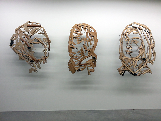
The video is a blend of Kentridge’s characteristic charcoal animation forming the background (I liked the restrained use of his signature style), a few puppets, and many live actors carrying props made by Kentridge. (The props are on view in an adjacent gallery, and are totally scrappy. A few are installed with the back towards viewers, to show their fabrication of corrugated cardboard, ink, hot glue, and bits of wood for reinforcement and handles.)

kentridge-prop-backs

William Kentridge, If We Ever Get to Heaven, installation view at Eye Film Institute

kentridge-prop-gallery

William Kentridge, If We Ever Get to Heaven, installation view at Eye Film Institute

The actors form a parade, which starts out with a brass band in ornate dress and dancers. The tone is joyful. I appreciated the combination of expressive looseness and high-production value. The staging of the filming must have been a massive undertaking, yet the props are simple, roughshod cardboard elements. The score, audio recording, and audio playback are very well done, yet the projections do not match up edge-to-edge, echoing the collage-like feeling of Kentridge’s animations.

As the film continues, however, the parade morphs into a darker, mournful procession. The sick push IVs, goaded along by others wearing head to toe plastic protection gear. There are gravediggers carrying shovels. One might think of Kentridge’s work in the context of the fallout of apartheid—something of the past, of a specific nation (though there’s a different resonance in the Netherlands, as South Africa was colonized by the Dutch)—but there are larger narratives, having to do with Ebola throughout Africa, that implicate all of us. More Sweetly Play the Dance is a powerful example of Kentridge’s ability to blend the specific, the poetic, and the topical.

In the exhibition essay, Kentridge is quoted as saying:

Every act of enlightenment, all the missions to save souls, all the best impulses, are so dogged by the weight of what follows them; their shadow, the violence that has accompanied enlightenment.

While I’m not totally comfortable with the futility and pessimism in the statement, it made me think about the Truth and Reconciliation process in South Africa, in contrast with the persistent institutional racism and denial of privilege going on in the US now.

A few asides:

We also went to De Appel Arts Centre, the Stedelijk Museum Bureau Amsterdam (project space) and the Huis Marseille Museum of Photography. Cool spaces, but I personally didn’t connect with the current exhibitions.

Privilege the viewing experience. While I had aspirations to visit the Van Gogh Museum, I just couldn’t bring myself to deal with the long lines and crowds. I’m not interested in elbowing my way into a clear sightline around a famous, expensive painting as other tourists snap photos. It’s too stressful and unpleasant. It’s not a good way to experience a work of art, and I am glad that I know myself well enough not to visit out of a sense of duty only.

I did have the odd feeling of recognizing works from art history books at the Matisse show. The reproduction does detract from the aura of the original, but more so does hype.

Safety first, and all that follows. I really like riding a bicycle but I rarely do. There are too many reasons not to—fear of being hit by a car, truck, or bus; concerns about personal safety after nightfall; poor bike lanes; not enough bike parking; bike theft; and aggressively car-centric attitudes in general. When you eliminate or minimize such reasons, it’s liberating. I enjoyed the integration and espousal of bike culture in Amsterdam during my short stay, and wonder how living in such a bike-friendly place impacts your lifestyle and psyche over the long term. We saw thousands of bicyclists everyday, including parents toting one or more children, and very few private cars on the road. Bike lanes were protected and clearly marked. When lanes are shared, drivers were almost always patient and respectful. A tram stopped to let us cross the street. That feeling of safety is maybe one of the most foreign and novel things I experienced—such a contrast from the outright aggression that cyclists face and have to psychologically armor themselves against when riding in NYC.

This pretty much sums it up. Life's too short to hate your commute.

This pretty much sums it up. Life’s too short to hate your commute.

Standard
Art & Development, Community, Travelogue

Late Summer, Cross-Country Points of Reference

I’ve just crossed the country from San Francisco to New York by car. That’s three thousand, eight hundred miles in 14 days: camping, sightseeing, a few gallery visits and more than a few BBQ meals. The experience increased my appreciation for friendliness, waving at strangers, America, the grandeur of the West, the rich musical history of Tennessee, the quaint main streets of the lush Eastern seaboard—and most of all, the astounding diversity. I love that so many people can epitomize being American, while freely espousing indigenous, foreign, and home-spun cultures without a sense of paradox. From West to East, a few of my strongest visual impressions:

Dockside with Friends
Lake Merritt, Oakland, CA

A gathering of friends on a beautiful July evening at sunset. Celebrating friendships and the blessed life I’ve enjoyed since moving to Oakland in 1994.

landscape with road, arizona
The West
I’m California-born and raised, but I haven’t really seen the “West until now. It’s stunning. My fears that the world is crisscrossed with interstates and civilized with Walmarts are not completely warranted. The drive from Las Vegas, N.V. to Santa Fe, N.M. showed me that much of the West is still wild; the dramatic red bluffs are nothing short of breathtaking. I snapped some pics, but they fall terribly short; you have to be there to experience sense of scale and grandeur.

Santa Fe paper mache
Santa Fe, New Mexico, America
M and I played tourist in Santa Fe, seeing sites in the historic downtown (and crashing a church festival for some G.O.A.T. carne asada tacos). Santa Fe is gorgeous, scenic, historic, and bursting with culture. Tons of visual art, Native American art (so many images from art history classes come to life: black-on-black pots by Maria Martinez, squash blossom turquoise-and-silver-necklaces), Spanish colonial architecture, and fun stuff like Native American papercuts, paper machê crafts, and—yes, ya’ll—Southwestern regional woodcut artists (and why not?). Our brief visit was far too short; I was struck with the feeling that I could easily spend more time there. So I’m putting it out there, Universe: Have Me Back To Santa Fe.

The Dissolve: SITE Santa Fe’s 2010 biennial
Santa Fe, NM

A strong show of videos made and manipulated by 30 contemporary international artists, including biennial-circuit usual suspects (Kara Walker, Paul Chan, William Kentridge) and more. Thomas Demand’s video of raindrops hitting a glossy concrete floor is another impressive feat of stop-motion paper animation, very sweet in its mundanity. Robin Rhode’s short video in black and white, largely about inversions, race and light, is another favorite of mine. I just didn’t have time to see the whole show (which would have taken days), but many of my impressions were influenced by the forceful exhibition design, for better and worse. The first room successfully featured scrims dividing roughly equal-sized screening rooms.* But the exhibition design of later rooms overpowered the ther works. The light and audio seepage in the cyclorama-like oval were missteps, as was the integration of solo viewing booths into a bench in theater with one dominant screen. The experience was unpleasantly akin to screen-in-screen browsing; I could focus on neither screen in front of me. I think this kind of overwhelming media experience is fine for solo shows, but in a group show, it shafts the artists who’ve drawn short straws. It’s a strong curatorial statement to feature 30 videos, and it would be a challenge to any institution, but you have to wonder what the architects were thinking. SITE Santa Fe had some flaws but it was energetic, now, and smart.

Who Shot Rock & Roll?: A Photographic History, 1955 to the Present
Brooks Museum, Memphis, TN
Organized by the Brooklyn Museum with guest curator Gail Buckland

Who Shot Rock & Roll is a large, highly enjoyable exhibition of photographs of rock and pop musicians from the last half-century. The celebrity, glamor, pop culture, and sensationalism appeals. Those who dig deeper will find insightful captions about the technique, ingenuity and chance that went into the making of the famous photographs. Having spent my fair share of adolescence studying trippy album covers, I also appreciated the didactic texts and displays about the surreal, pre-Photoshop images by artist-designer Storm Thorgersen and Jean-Paul Goude (of superhuman Grace Jones, natch).

Hatch Show Print

Photo: Michael Yap

Hatch Show Print
Broadway, Nashville, TN

In our improvised gander at Nashville, we stumbled into a beautiful, huge, working letterpress shop and storefront. Downtown Nashville is anchored by a shiny new country music museum, the usual Hard Rock Cafe and BB King blues club, so I wasn’t expecting to see such historic, indie culture. But there it was on touristy Broadway, with its fittingly nostalgic relief prints, cheeky and upbeat typography, and endearingly worn sign type. While we were browsing the wares, I overheard the proprietor mentioning CCA and the SF Center for the Book!

Roanoke, VA
That the two most interesting contemporary art exhibits on my eastern migration (the SITE Santa Fe biennial and Rock & Roll) were curated by New York curators/institutions was not a good sign for the idea of a de-centralized contemporary art world. So it was a pleasant surprise to come across SF Bay Area artists Binh Danh and Primitivo Suarez in, of all places, Roanoke, VA. Danh (whose solo show opens at Mills College Art Museum August 21) mentioned that he was doing a residency, but I forgot until I saw his artist’s talk advertised in the local paper. Suarez has a large installation on view at the Taubman Museum of Art, a swooping steel-and-glass trifle that contrasts sharply with the colonial railroad town.

roadside America
roadside America
Roadside America
Shartlesville, PA

Perhaps M was right—this is a tourist trap. Or maybe I’m right—a miniature village hand-crafted by two brothers at mid-century, which sprawls over several thousand square feet, loaded with electric trains, lights, fountains and a waterfall is art. Or at least it is artistic production worth a visit, because it says something about tinkerers, hobbyists, miniature culture, maker culture, and the urge to create and reflect the world you see. In either case it is odd and wonderfully preserved, though you get the sense that it is anachronistic enough that its future is in jeopardy, and you feel lucky to have seen it.

Brushy Lake State Park, Oklahoma

National Forests and State Parks
Despite serious weather (lots of thunderstorms, and threats of flash floods, hail, tornadoes and severe heat), our car-camping trip was safe, fun, and scenic. Here’s a brief round-up of our stays made possible by the U. S. of A.’s government-run, social programs:
·Coconino National Forest, A.Z.: Friendly park hosts, beautiful pine grove at elevation that brought the oven-like southwestern heat to nice cool temps. Absolutely pristine and sparsely populated in a way that you’d never see in California.
·Ute Lake State Park, N.M.: Your basic horseshoe campground in a great plain. Curious and friendly park hosts and RV campers. Apparently we visited during monsoon season; hot, humid, windy.
·Foss Lake State Park, western O.K., and Brushy Lake State Park, eastern O.K. Oklahoman reservoirs tricked out for RV camping and water sports, a study in contrasts. The former filled with empties-throwing, nappies-leaving, jet-skiing yahoos and not a ranger in sight; the latter, alcohol prohibited, but quiet, scenic, clean and staffed by a generous host.
·Edgar Evins State Park, T.N.: A unique campground situated on a steep hillside. Sites were wood-plank and I-beam pads jutting out from the road. The reservoir was clean and calm, great for swimming. Fireflies abounded.
·Hungry Mother State Park, V.A.: Hands down the best park: natural lake with diving boards, lots of swimming, lots to explore, cute discovery center. The only downside was that the sites were too close together, but the neighbors in our RV subdivision were nice enough.
·Fort Frederick, M.D. Self-pay, no water, no bathrooms, lots of rules, and a train passing nearby. The fort itself had a neat history (at one time owned by a formed slave) but the campsites weren’t nothing special.

A pleasant greeting
Queens, NY

My new neighbors shouting from the patios of their tidy brick townhouses:
“Welcome to Astoria!”

[*In a previous version I got my German filmmakers with the initials L.R. mixed up, committing a cardinal sin of be-smirching an innocent leftist with Nazi support. It was a mistake. Apologies.]

Standard
Research

Drawing, the start of it all

Ooooooooh! The Guardian just launched a series of photos and first-person essays on drawing! It looks fantastic! Highlights include William Kentridge on the mystique of charcoal, David Shrigley on his idiosyncratic ink doodles, graphite master Paul Noble on his rather technical fictive drawings, and Ingrid Calame on her vector-y vellum tracings.

The timing’s great because I just taught the first session of my Sketchbook Drawing class at the Associate Student Union at U.C. Berkeley. It had been a while since I’d been in a figure drawing set-up, and I had a blast and I think my students enjoyed it too. I’m inspired to spend more time with my sketchbook soon.

Sometimes I find the idea of picture-making to be quite conventional, so it’s nice to be reminded of the immediacy and rewards of a fundamental mark-making practice.

Standard