Carlos Cruz-Diez, Transcromía, 1981, in the “Cruz-Diez” exhibition, Museo de Arte Contemporáneo de Caracas, Venezuela // Source: Cruz-Diez.com
Carlos Cruz-Diez, Transcromía, 1981, in the “Cruz-Diez” exhibition, Museo de Arte Contemporáneo de Caracas, Venezuela // Source: Cruz-Diez.com

People paint rainbow-colored stairs on August 31, 2013 in Istanbul. Stairs in the Cihangir and Findikli neighborhoods, which attracted attention after being painted in rainbow colors by a local man on August 27, were all painted grey on the night of August 29, and following comments on social media, the municipality of Beyoglu immediately painted them again in rainbow colors. // Source: Ozan Kose / AFP / Getty Images. From Huffington Post.
A set of public stairs in Turkey has arguably been the site of:
It goes to show how using vibrant colors and promoting happiness may seem like simple gestures, but they can be powerful and meaningful actions for people and cities too.
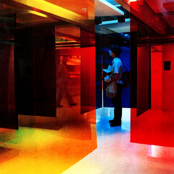
I like the curious images for David Maljkovic’s solo show at Annet Gelink Gallery in Amsterdam.

I think the above use of slides that are removed from the viewer’s natural sightline is brilliant.
The other works use photographs, colored gels, historical bits of typography, site interventions, a little bit of painting and an oppressive grey collage material, it appeals to me visually with its open-endedness, while emotionally conveys longing for pleasure.
Josiah McElheny is a great contemporary artist and thinker. His latest contribution to Artforum elegantly sums up some of my thoughts about art experiences; that art, too, is a visual as well as cognitive experience.
Surprisingly, though, [Josef Alber’s Interaction of Color] is not really a pedagogical treatise on the modernist use of color. Instead, it is an argument against color systems of all types: It proposes a practice of looking at and working with color that understands it to be constantly in flux. The reader, attentively going back and forth between text and image, is confronted by disturbingly mutable visual and cognitive experience, by the deep instability of color….
[Albers wrote:] “By giving up preference for harmony, we accept dissonance to be as desirable as consonance.”
…”[P]references and dislikes—as in life so with color—usually result from prejudices, from lack of experience and insight.”
…[Albers] argues that perception is contextual; he wants to encourage ‘thinking in situations.’ When he says that ‘interaction’ can be restated as ‘interdependence,’ he implies that what color is is defined by where, when, and how it is—otherwise it is relegated to the abstract, symbolic, theoretical….
In our active, physical engagement with [Alber’s color] tests, we are made aware of the slippery nature of looking—even identifying simple difference is fraught—an experience recalling Ludwig Wittgenstein’s language games.
—Josiah McElheny, “The Spectrum of Possibility.” Book review of Josef Alber’s Interaction of Color: New Complete Edition. New Haven: Yale University Press, 2009. Artforum. April 2010. p. 55.
