I’m feeling very grateful to be in New York right now. Today was 48º and brisk; my hands were numb but the sun was shining, and among the spirited events I attended today were the NYC marathon and the NY Art Book Fair at PS1. This morning, I took a commemorative run (my own personal best, yet far less than 26 miles) and headed out to Long Island City to see how the pros do it.
The ING New York City Marathon

NYC Marathon, November 7, 2010, from Queensboro Station

NYC Marathon, November 7, 2010. Runners heading up Queensboro Bridge.
Stepping out of the Queensboro Station, I heard cheering and turned to see a huge mass of humanity running up the incline of the lower deck of the Queensboro Bridge. The marathon. I felt like I could see thousands of runners, and something about the cheering, for strangers, fellow New Yorkers, and marathon guests—”Good work, runners!” “Go Alli!”—got me all teary eyed. There were no losing teams, no dirty tricks. Just running through all five boroughs of NYC. It was exhilarating to see runners of all ages pounding the pavement. They were on mile 15 or so, and their faces transparently conveyed their exhaustion, determination, pain, and heart. I found it wonderfully compelling. You really wanted each and every one of them to make it, to push through, and finish.
Printed Matter’s NY Art Book Fair at PS1 in Long Island City, Queens
Heading towards the Chase tower—the lighthouse of Queens—I made my way to PS1, where the marathon crowds’ ear muffs and signs gave way to creative make-up and pegged pants. Printed Matter’s NY Art Book Fair was housed in all of PS1’s galleries; there were too many vendors to count, and plenty of visitors. It was a madhouse, and it looked like many vendors were doing brisk business.
I failed to browse wares of all of the vendors; there were just too many. From what I did see, here are some of my favorites sights.
I also started to lose track of what vendors’ booths I was at. Too overstimulated to browse many books, I just let things catch my eye.

Artist & vendor unknown.

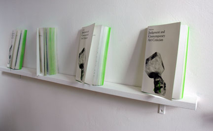
Some designer had a stroke of genius with these green edges.

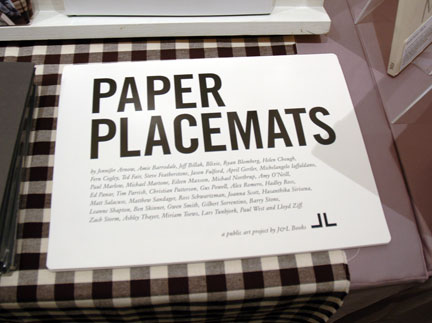
Here’s a neat idea for a printed book-like thing with art that’s not an art book, from J&L Books.


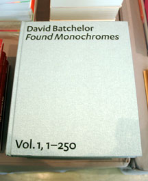
A neat book of “found monochromes” around London by David Batchelor at the RAM Publications booth.

The display and vast scholarship at E-flux, like their email list and magazine, were great all around. I missed editor Boris Groy’s talk, so I picked up “Going Public,” a book of his essays on the same subject.

Werkplaats Typografie offered funny multiples in exchange for must-read art and design books. In the distance are the books that visitors contributed. In the foreground, on this side of the monstrous Ping Pong table, are the goods to trade for, sort of like the goodie counter at an arcade. The red-shirted negotiators were busy wheeling and dealing.

Werkplaats Typografie left a lot of room for interpretation, encouraging interaction. This pyramid of boxes of bread is positively curious.

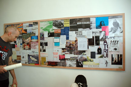
Here’s an interesting project: artist Joseph Grigely is interested in ‘exhibition prosthetics,’ the collateral involved in making and marketing exhibitions. Here, he presented a photograph of a bulletin board. (Teaser: It’s not unlike a sight you might see in Shadowshop, Stephanie Syjuco’s emporium of artists’ wares at SFMOMA, to which I’ve contributed multiples.)

I was so excited to see Eastside Projects at PS1. I loved Simon and Tom Bloors‘ exhibition at the gallery in Birmhingham, UK. There were great drawings and sculptures about the intersection of modernism and children’s play structures.

I couldn’t resist Simon and Tom Bloor’s activity book for children, which posed complex art questions as fun, accomplishable drawing assignments.
There were some spectacular names of projects too:

Lines and Shapes wins the award for best name of a publication. The magazine also scores high in the feminine and beautiful metric. It’s the kind of art book you could get for your mom.

Running in a very close second in the name contest is The Most Beautiful Swiss Books. If you think it sounds self-aggrandizing, look at the wares!

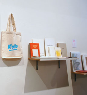
Naming your distribution company “Motto” makes for killer tote bags.
I also appreciated novel display strategies. (Again, maybe it’s because the next show my work is in is Shadowshop.)

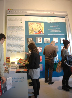
DAP‘s cheeky meatspace browser window. The text is all painted by hand.

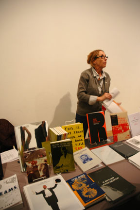
Check out the cream and black palette, extending to the shopgirl, and the circle of books on the wall echoed by the hair clip.

This vendor’s room-in-a-picture/box idea reminded me of a work of art I saw at the Walker Art Center (I can’t look up the name because I managed to lose that notebook somewhere in the gallery). Still, must the shop girl be on display like merchandise too? (Although the visitor with the party jacket probably wouldn’t have minded?)
Also, you gotta love fun graphic design:

Poster for Amsterdam-based Idea Books.

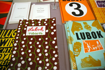
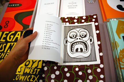
Lubok‘s woodcuts, books and posters were adorable!

Gigantic posters (5′ tall?) in the Dutch Pavilion.
And how about fashion?

I liked this lady’s outfit: a menswear dress shirt under a grey cardigan made of sweatshirt material, with a string of “pearls” in glossy silver. Plus bold glasses. New York is good for learning how ladies mature with aplomb.

This blasted photo was meant to share with you an awesome puffer jacket, printed with photos of fruit (on chair)!

What’s more exciting: Toronto’s awesome Art Metropole in NYC, or this guy’s Le Tigre shirt’s tiger’s friends?

Lubok‘s sellers of woodcut prints and books wearing graphic stripes and red-black-and-white patterns? Coincidence? Methinks not.
After browsing several rooms full of rare books—too expensive for me to buy, and too fragile for me to browse as I juggled coat and camera—I realized that I love reading books, but I don’t have to collect them. Maybe it’s because my recent cross-country-move has instilled a phobia of accumulation, or maybe I’d rather make use of the city’s libraries. More likely, I’m a cheapskate, and I’m plagued with guilt about the stack of unread books sitting on the shelf above my desk.
Whatever the reason, I found myself most attracted to prints and multiples. (Am I so transparent, to only like the things I like to make?)


Wares from the German company, Lubok Books.

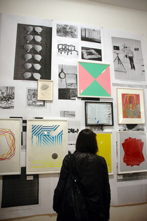
DISPATCH, “a New York-based curatorial partnership between Howie Chen and Gabrielle Giattino,” had some really fantastic screenprints. I love how they exhibited them: framed, over a crazy photocopy-like montage.

Among my favorites was this screen print on acetate (2008) by Jose Leon Cerrillo.

“Where were we” (2008), a screenprint by Matthew Brannon. These prints by Brannon are so cool, I try to resist liking them, but it’s not easy.
So when I rounded a corner and saw Jonn Herschend at his booth of The Thing Quarterly, subscription-based multiples, I knew I would fail to control my impulse buys.

Artist Jonn Herschend at The Thing Quarterly’s booth.
I realized, a few years ago, that I need to put my money where my mouth is. If I think more people should buy, own, and enjoy art, I need to do the same. Bartering with other artists is great, but it’s also nice to show that you really support and believe in an artist with your wallet too. My budget is small, which means that my taste for multiples (which are generally more affordable) is perfect, and so I finally accepted that there were plenty of rationales for subscribing:
1. The Thing is an awesome idea.
2. The artists involved in The Thing are uniformly interesting and exciting.
3. I’m lucky to know one-half of the duo behind The Thing.
4. I’m proud of the fact that The Thing is from San Francisco, CA.
If that weren’t enough:
5. The Thing is super affordable: $200 for 4 limited edition multiples; that’s only $50/multiple. You could spend that on pints (!) in Manhattan.
6. The upcoming artists blow my mind!

Matthew Higgs + Martin Creed (LOVE Martin Creed’s work!); James Franco (Sometimes his stony delivery makes me think that he’s new Keanu, but then I read about his fine art hijinx and suspect that he’s a performance art polymath. Also, M approves of his next movie.); Shannon Ebner (whose text-based work is great); and MacFadden & Thorpe (SF graphic designers who are so good, seeing their projects makes me raise my fists in mock-envy to the sky).


