Insights, artworks, and other recent ignition sparks.
—

AIMers watching Brian Zegeer’s 3D animation/video installation at his Chashama studio at Brooklyn Army Terminal. See clips of Brian’s Book of Khalid project.
Last weekend, I shared my work with fellow Bronx AIM program participants. Among smart, interested friends, I spoke honestly about where I’m at in my studio practice, leading up to current work-in-progress and the questions that surround them.
I got great feedback. It was fantastic. A mutually supportive community can make an incredible difference. So I highly recommend:
Organizing studio visits with likeminded artists.
Though I procrastinate on organizing visits to my studio, the AIM program was a perfect foil for my hang-ups, with the added benefit of learning about great artists’ work too. So, artists: Just do it! Get a group together, set up a schedule—maybe every two weeks or once a month, and create conditions for great conversations to take place! It’s important! If it seems that it’s not a great time, be forgiving—there’s hardly ever a perfect time, so better now than never.
After my visit, I started thinking about:
Not taking myself too seriously.
The tone of my presentation was blunt and vulnerable, but also (sometimes unintentionally) funny. My colleagues really “got” me and where I’m coming from. I’d love it if my audience also had this perspective. I wonder how to incorporate this further into the reading of my work? For starters, it’d help me keep approaching:
Art-making as a way to test ideas.
In grad school, I allowed works to be resolved to varying degrees. Maybe I’ve drifted towards the dominant market-oriented inclination to make things that are more polished, impressive, “accomplished,” and intelligible to selection review committees, gallerists, etc.
So Ernesto Pujol’s writing resonated with me on many fronts:
I… practice with the belief that there is enough art, feeling no pressure to create more art, so what excites me is to create something ambiguous, something liminal, so that it has the effect of art, regardless of its final label.
—Ernesto Pujol, in Mary Jane Jacobs and Jacqueline Baas, eds., Learning Mind: Experience Into Art [Berkeley: UC Press] 2009
Time to re-set.
If I am to re-orient my approach, it’ll make the way I relate to viewers more open-ended. I’ll be able to:
Speak openly about unintended receptions of artworks.
How viewers interact, interpret, and experience the work—in a full range of successes and failures—could be embraced.
We must risk and endure misunderstanding, even by those who supposedly support us, which is the most painful of all misinterpretation, because we still create and promote all this mainly through art world channels.
—Ernesto Pujol, in Learning Mind
Which implies:
Embracing middle grounds
[Artists] should regard ourselves as writers of novels for smaller but more substantial audiences, even as we would like to make them accessible and meaningful to all.
—Ernesto Pujol, in Learning Mind
—
JHK Activity—Collection & Research on J H Kocman
My influential grad school advisers Ted Purves and the late Steven Lieber helped me stop worrying about making grand statements, and appreciate modest gestures such as ephemera. Just as I was thinking about becoming more process- and less results-oriented, I learned about Ted’s latest project—a blog documenting the works of Czech conceptualist J H Kochman. This work, in particular, exemplifies what I gained from Ted and Steven, and my “un-aspirational” aspirations:

J. H. Kocman, Bipolar Analysis of a Square, offset print, A4, signed/numbered. // Source: jhkactivity.wordpress.com.
—
Pae White: In Between the Inside Out

Pae White: In Between the Inside Out, Installation view, Mills College Art Museum, 2009 // Photo: Paul Kuroda // Source: ArtandEducation.net
Five years later,* still thinking about White’s 3-D rendering video projected inside enclosures made of two-way mirrors. First seen at New Langton Arts (RIP) and Mills College Art Museum.
*Read my enthusiastic 2009 response—sorry about the link-rotted images. (FYI, I’ve improved my image linking now.)
—
To re-orient to the studio, I’ve enjoyed diving into books by artists. They counterbalance criticism and theory, and can be an antidote to market orientations.
The Human Argument by Agnes Denes
Excited to grow my appreciation of Agnes Denes’ work with a book of her writings:
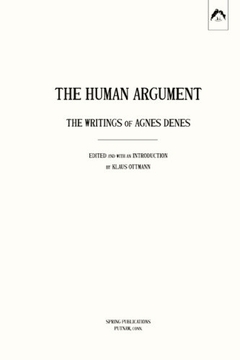
The Human Argument, The Writings of Agnes Denes
See ArtBook for the description (though it’s out of stock there; I found a used copy on ABEBooks).
Don’t know why I never got around to this one, either. The oversight that shall be redressed shortly.

Allan Kaprow (Jeff Kelley, ed.), Essays on the Blurring of Art and Life
—
A reminder about the centrality of studio practice:
A life of making isn’t a series of shows, or projects, or productions, or things; it is an everyday practice.
…It isn’t necessarily the objects of art in their many forms that we are here to support, it is the possibility of art, the question of art, the place it makes in the culture for those acts which ‘just are’ and, in their being just for the sake of themselves, can open worlds in which we might listen differently.
—Ann Hamilton, in Learning Mind
Hamilton also shared this lovely quote from Ralph Waldo Emerson:
Let me remind the reader that I am only an experimenter. Do not set the least value on what I do, or the least discredit on what I do not, as if I pretended to settle anything as true or false. I unsettle all things. No facts are to me sacred, none are profane; I simply experiment, an endless seeker with no past.”


, 2008 Multichannel audio-video installation Installation view, Museum of Modern Art, New York. Photo: Frederick Charles, fcharles.com. Image Source: HauserWirth.com")


