Among so many gallery booths, the artwork at art fairs suffers from little context, quietude, and time for reflection–but I still managed to enjoy myself at Armory, VOLTA, Independent, and Pulse (I missed Scope and the others; sorry). I assessed galleries rather than artwork, and looked at art to learn about artists and techniques. In short, I went as an artist, not a critic.
What caught my eye?
Recent Works by Artists I Like:

A painting by Kerry James Marshall at Jack Shainman Gallery, New York (Armory).

I love this stylish signature for this narrative “period” painting.

A lightbox by Kota Ezawa at Murray Guy, New York (Armory). He’s got a solo show at the gallery through April 9th.

Brion Nuda Rosch‘s collages, which I have seen around San Francisco, looked nice at DCKT Contemporary (Armory). They remind me of Ed Ruscha‘s work, while remaining their own discrete investigation.

Photo by Anne Collier from Marc Foxx Gallery, Los Angeles (Armory). I saw another photo from this series of handouts at another booth at Independent. The list of questions are fitting for art fairs—the second question here is, “Where have I seen this before?”

High-relief, impasto monoprints by Mel Bochner from Two Palms, New York (Armory).
—
Artists who piqued my curiosity:

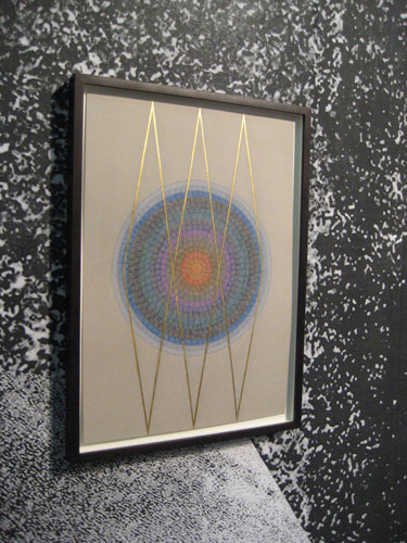
Mirrored installation and colored pencil drawings on black paper by Claudia Weiser from Sies and Höke, Düsseldorf (Armory). I think a lot of my neo-hippie/Romanticist/mystic artist friends in California would love this work.
A nice colored pencil drawing by Claudia Weiser.

Cheeky illustration-inspired watercolor by David Kramer from Galerie Laurent Godin, Paris (Armory). The text reads, “I always like it better… when things are shiny and new.”
More Kramer.
A second look: Lots of pictures, including some glorious Mad Men meets Flintstones installations. Colorful, ironic, likable pathetic-aesthetic. I can see why this work would be popular, in a Judd Apatow sort of way. Tongue-in-cheek tropes of male identity means you can have your bar cart and wink-wink humor too.
A milk crate carved of black marble by Fabio Viale from The Pool, NYC (VOLTA).
A second look: Rendering everyday objects in luxe materials is not very original, but the inanity still struck me. Craft suggests time and labor—human energy—thus imbuing objects with meaning (or the idea of meaning). Yet does meaning always equate to significance…?
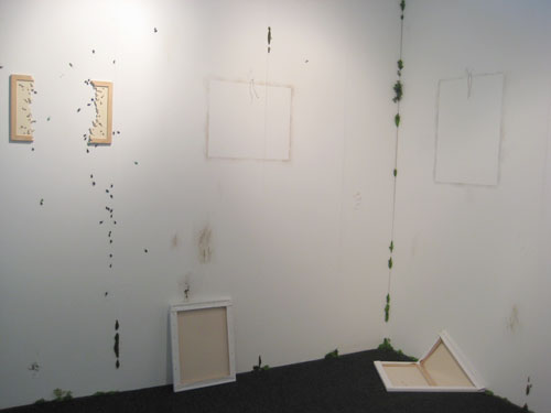
You would think that only a few days after seeing the biggest cockroach in my life that I wouldn’t enjoy these pest-infested paintings by Jorge Perianes from Galeria Adhoc, Vigo (Volta). But fake bugs that don’t move are much more fun and funny than real NYC bugs. [The gallery’s site uses frames, so links to the artist’s page are not available.]
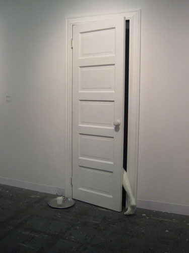
Installation by Julião Sarmento from Pilar Corrias Gallery, London (Armory).
A second look: A quick glance at the gallery site suggests that this type of surrealist installation is atypical for the artist. Perhaps more is forthcoming.

Paintings of bandaged and decorated military officers by Willem Andersson from Gallery Niklas Belenius, Stockholm (VOLTA). Of course these are of grave implications, but there’s something comical about the proliferation of the medals. The complete bandaging is also reminiscent of Georgio de Chirico‘s canvas-covered manequins, and The Invisible Man TV series.

A project by Peter Liversidge from Ingleby Gallery, Edinburgh (Armory). Yes, that is a neon ampersand and a two-way mirror. And 10 proposals for projects.
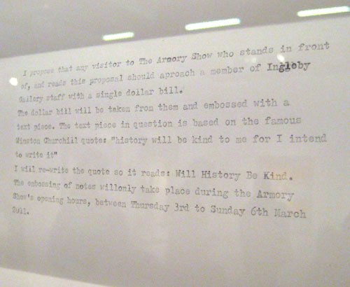
Not more than three days had passed since I told RR how no one actually types out their conceptual projects on a typewriter anymore. Above, Liversidge proves me wrong. To boot, the gallery’s site states that Liversidge types these at his kitchen table.
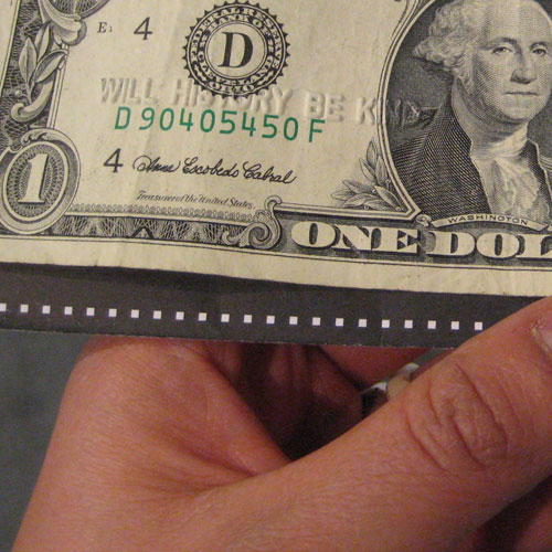
Per the typewritten instructions above, I stood before and read the proposal, presented a dollar bill to the gallery staff, who embossed my bill with the text. I love the site-specific, limited-duration aspect of the project. And I’m eager to learn more about Liversidge, to gain insight on the possible explanations for the text.
Will history be kind to me? Will I write history? And since the project is limited to the Armory Fair, and only US dollar bills were proscribed, What are the consequences of how I spend my money on writing history?
A second look: As it turns out, Liversidge makes text installations that completely appeal to my tastes. We’ve even used similar, ambivalent/psychological texts; the same maxim inspired his project, The Darkest Hour is Just Before the Dawn and my installation, Binary Pair. He also uses flowers to spell out advice that positive psychologists would agree with. Fantastic!
[Also, Ingleby Gallery also represents Ian Hamilton Finlay’s estate and Iran do Espírito Santo (check out this lovely photogram).]

A flame-worked tube glass conversation chair by Valeska Soares from Eleven Rivington, NYC (Armory).

A collage of book dedications also by Valeska Soares from Eleven Rivington, NYC (Armory).

Soares detail: “For KATHERINA v. F. who taught me / that love is more / than the longing / to be together.” A brilliant project that compiles uses a few words to convey unknowable authors’ love and gratitude.
—
Artworks relating to themes in my current work—happiness, exuberance, decoration, cheap plastic, mythologized interiors:

Photo by Alex McLeod from Angell Gallery, Toronto (Pulse: Impulse). This is like a still-life equivalent of Owl City—super cute verging on twee, appealing to many and possibly grotesque to cynics. I think it’s adorable, and also interesting in how it balances extraordinary cuteness and good taste.
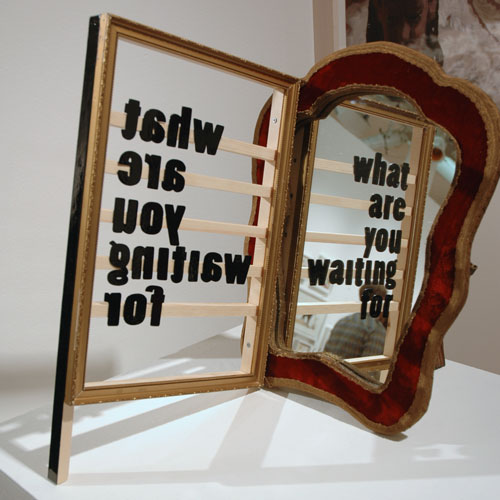
A mirror and text by Birgit Verwer from Livingstone Gallery, The Hague (Pulse).
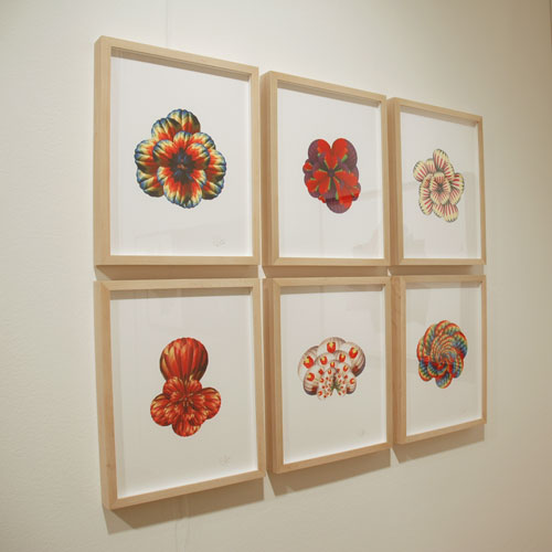
Rainbow balloon prints by Cassandra C. Jones from Baer/Ridgeway, San Francisco (Pulse).
Image Source: Artist’s section at MorganLehmanGallery.com
Drawing of an embroidery by Eric Beltz from Morgan Lehman, NYC (Pulse).

Garage-inspired installation by Joseph Burwell from Miyako Yoshinaga Art Prospects, Tokyo (Pulse: Impulse). Though there is a high proportion of 2-D art in the installation, it appeals to my interest in the domestic and decoration—what is art and not art, why, and how each functions to provide pleasure or happiness.
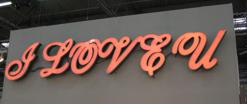
Color-shifting LED signage by Kira Kim from Kukje Gallery/Tina Kim Gallery, Seoul/NYC (Armory). Cursive scripts were never meant to be set in all capitals like this. The typographic awkwardness is part of the ridiculousness of such a sign.
A second look: Oddly, Kim’s work is completely different on the site. No textual works or signs and no discernable ties to love.
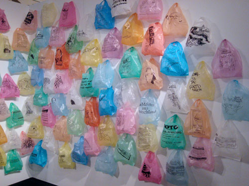
Hand-drawn plastic bag installation reflecting Paris’ diversity, by Katrin Ströbel from Galerie Heike Strelow, Frankfurt (VOLTA).

A map made with stickers by Nelson Lierner from Galerie Gabrielle Maubre, Paris (Armory). [I’d link to the artist’s page, but there isn’t one.] That’s Micky and Minnie Mouse on North America, kangaroos on Australia, and—yes—gorillas on Africa.
A second look: I’m all for experimentation, but when the results go horribly wrong, as it did with the gallery’s ugly Google-based website, conventional HTML seems not so bad.

Detail.
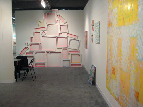
Keltie Ferris seems like primarily a painter, but I liked these framed hot pink spaces from Horton Gallery, NYC (Armory).

Beads, sequins and styrofoam by Sarah Pucci from Air de Paris, Paris (Armory). [Frame-based site—no link to artist’s page available. From the home page, click on news to access main navigation.]
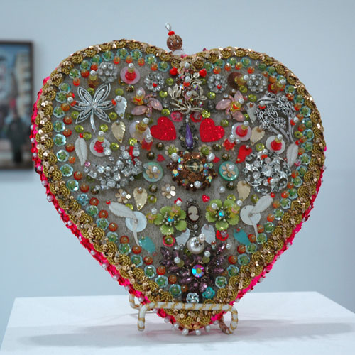
Another Pucci. I like how it looks so ornate and rich with such common materials. In viewing her other work, she seems to reference the Baroque, but there’s something crafty that speak to heavily beaded garments from many cultures too.

I like these funny “gift” collages by Fiona Rae from the Buchmann Gallery, Berlin (Armory). They both feature bows of ribbon.
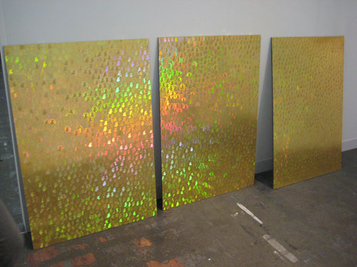
No labels identified these holographic sticker sheets from Seventeen Gallery, London (Armory). It was adjacent to Abigail Reynold’s collages, however.
—
Conceptual and textual works:

Antoni Muntadas’ Project involved framed texts with the 5W’s and other basic questions. Gabrielle Maubrie, Paris (Armory).

Text panels by Fia Backström, Murray Guy, NYC (Armory).

Paintings (not vinyl) describing toxic properties of the pigments by Gustavo Artigasi from Caja Blanca, Mexico City (Armory).

Assorted toxins. Gustavo Artigasi.

Textual by association: bookcase of wood planks by Ulrik Weck from Galleri Christina Wilson, Copenhagen (Armory). [This idea of planks standing in for books will be echoed in Re-Covering, a group exhibition curated by Mike Chavez-Dawson at Untitled Gallery in Manchester this summer.]

Thick felt letters by an unidentified artist, Sutton Lane, London/Paris/Brussels (Independent).

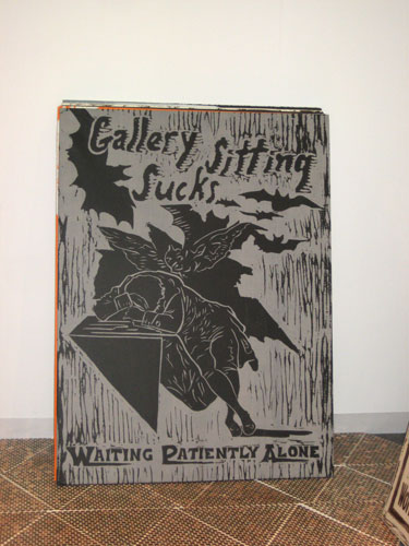
Oversized prints/posters on a tiled penny floor. Artist(s) unidentified, Untitled Gallery, NY (Armory).

—
Nice materials:

Projector with a loop that shows only light, on a silver metallic canvas. Artist unknown, from Sprueth Magers, Berlin/London (Independent).

Screenprint on brushed metal by Alberto Borea from Isabel Hurley, Málaga (VOLTA).

In commercial printing, foil printing has been around a long time, but only recently has it been developed for fine art printmaking workshops. If you’re Damien Hirst or Other Criteria, however, you can employ commercial printing techniques for fine art editions.
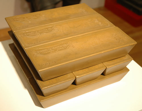
Gold brick crayons by Andrew Lewicki from Charles James Gallery, Los Angeles (Pulse).
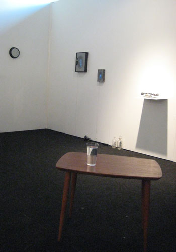
Installation view of assorted works by Ken Matsubara from MA2 Gallery, Tokyo (VOLTA).

Detail of a Matsubara sculpture. Video displayed beneath a cup of water.

Source: MA2 Gallery website.
Black and white video of a ring of fire. What you can’t see from the photo is that the video is behind a piece of two-way mirror. In a white gallery, it’s only when dark reflections—such as the viewer’s face—appear in the mirror that the video becomes visible. Matsubara’s work is impressively slick—few pieces had visible electrical leads, and it’s evident that many of his pieces use the latest, thinnest and smallest screen technologies. There was a Gothic/cabinet of curiosity/black mirror feel to the works that would appeal to many people.

By Michael Wilkinson from The Modern Institute/Toby Webster Limited, Glasgow (Armory).
I’m thoroughly perplexed by this piece. The wall label ascribes the material as “etched mirror,” but etching is done with acid, which would leave a frosted surface, which the glass does not have on either side. The pattern suggests that the hot, liquid silvering was dripped or thrown at the glass. Typically, glass is not meant to withstand sudden changes in temperature, so that it might survive partial silvering is really interesting…
[A look at the gallery site brought me to this installation…
Source: Jim Lambie’s secion on themoderninstitute.com.
…by Jim Lambie. Those papery things are aluminum sheets with fluorescent paint. Love it!]

Hand-drawn posters by Charles Avery from Pilar Corrias Gallery, London (Armory).

A sculpture with Plexiglas Radiant, whose colors change upon reflection and transparency, sort of like Golden Paint’s Interference Colors. By Patrick Aarnivaara from Galleri Charlotte Lund, Stockholm (Armory).

More Plexiglas Radiant. Artist unidentified, Casa Triângulo, Saõ Paulo (Armory).

Another unidentified artist, I believe, from Casa Triângulo, Saõ Paulo (Armory).
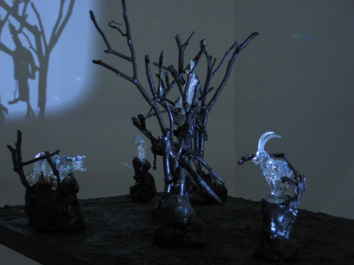
The installation featured a flash of projected light onto kinetic crystal sculptures.
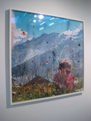
This made me want to paint on photos. I’ve done it in the past, but adding only a layer of colorful dots is really sweet and playful. Photo with paint and ink by Sebastiaan Bremmer from Hales Gallery, London (Pulse). Hales’ site features other photos with dots by Bremmer.
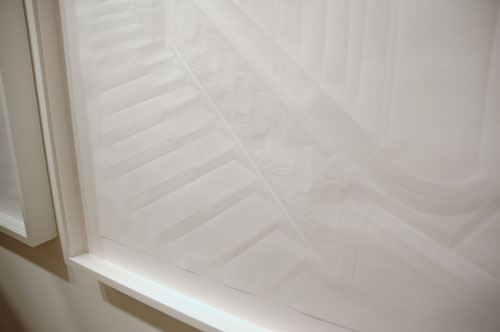
Realist interiors rendered only in subtly-folded paper by Simon Schubert from Patrick Heide Contemporary Art, London (Pulse). Looks like Heide doesn’t represent Schubert. For more pics, visit the artist’s site.
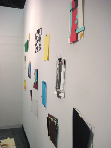
Paper sculptures of paper crafts. Artist unknown, Galeria Casas Riegner, Bogotá (Armory).

The binder clip is made of paper. Artist unknown, Galeria Casas Riegner, Bogotá (Armory).

The triangle and stool is made of wood. But the tapes, razor and eraser are made of paper. Artist unknown, Galeria Casas Riegner, Bogotá (Armory).
—
Interesting display strategies:
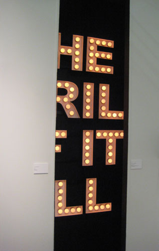
Illuminated signage, “The Thrill of it All,” tucked behind two partial walls. By Peter Liversidge from Ingleby Gallery, Edinburgh (Armory).

Using frames-as-unordered-vitrines is super smart. By Étienne Chambaud from Bugada & Cargnel, Paris (Armory).
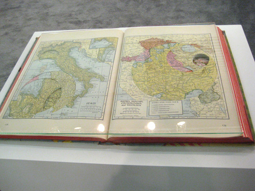
Glass: slimmer and cheaper than a vitrine; the object is not encased, but its surface is protected. There’s something nice, too, about how it’s flattened into an image. Étienne Chambaud from Bugada & Cargnel, Paris (Armory).
—
Apologies to artists and their galleries for the quality of my snapshots. I know many artists dislike poor documentation of their work (myself included), but bear in mind that the purpose of my posts is to share my enthusiasm. Linking to galleries’ websites is a time-consuming task I could do without, but I do it so that readers can learn more about the artists, and hopefully, see more photos of the works, or perhaps even see the work in person one day.
I collected information from wall labels, which were not always available. Booth signage was sometimes confusing. Sorry for any incomplete or incorrect information. Corrections welcome.
